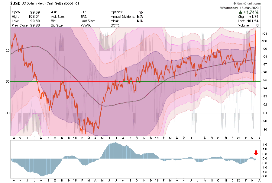
Over the last two weeks, the U.S. dollar index has risen by 6%. That may not seem like much to investors who are watching stocks rise and fall by that amount, and even more daily or bond yields falling in half and then doubling, but trust us; it is.
The dollar is unlike any other asset because it is the world’s reserve currency. When a Canadian tire company buys rubber from a Philippine rubber company, the payment occurs in U.S. dollars. Both countries have their own currencies, but neither currency has the liquidity, deep credit markets, and quite frankly, the world’s largest economy and military power backing it.
Because so many foreign countries and companies transact with dollars, they need to borrow in dollars, despite the fact their revenue is often not in dollars. This creates a mismatch between revenues and expenses as currency values fluctuate. If the mismatch is not hedged, as is frequently the case, foreign borrowers of U.S. dollars are subject to higher borrowing costs if the dollar rises versus their local currency. Simply the local currency depreciates versus the dollar; therefore, they need more of the local currency to make good on their debt. Because of this construct, a stronger dollar is effectively a tightening of financial conditions on the rest of the world.
This is what is occurring today as the virus is severely impacting the global economy. Revenues are deteriorating and the cost of dollar-denominated foreign debt is rising rapidly. As borrowers scramble to raise more dollars to meet their obligations, the situation worsens as the demand for dollars forces the dollar higher. In layman’s terms, there is a global run on the dollar and, in circular fashion, the run is pushing the dollar higher. Either the global economy will break or the dollar. Right now it seems that despite massive liquidity from the Fed the dollar does not want to back down.
How Far Can Stocks Fall?
The question repeatedly asked of us last week is how much more can the stock market fall? We don’t have a crystal ball and we cannot predict the future but we can take steps to prepare for it. Our analysis and understanding of history allow us to use many different fundamental and technical models to create a broad range of possible answers to the question. With that range of potential outcomes we adjust our risk tolerance as appropriate.
For example, in our daily series of RIA Pro charts and the weekly Newsletter, we lay out key technical, sentiment, and momentum measures for many markets, sectors, and stocks. In doing so, we provide a range of potential shorter-term outcomes. We also depend on feedback from other reliable independent services such as Brett Freeze at Global Technical Analysis. His work is exclusively and routinely featured every month in Cartography Corner on RIA Pro.
In this article, we move beyond technical analysis and share a simple fundamental valuation analysis to help provide more guidance as to where the market may trade in the coming months and even years. This analysis can be viewed as bullish or bearish. Our goal is not to persuade you towards one direction or the other, but to open your eyes to the wide range of possibilities.
CAPE
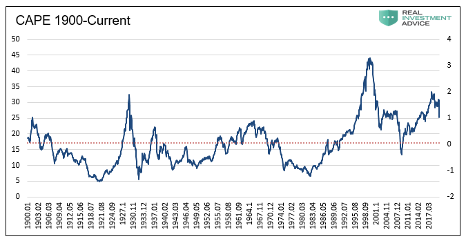
The data employed in this analysis is as of the market close on March 13, 2020.
Shiller’s Cyclically Adjusted Price to Earnings (CAPE 10) is one of our preferred valuation measures. Robert Shiller developed the CAPE 10 model to help investors assess valuations based on dependable, longer-term earnings trends. The most common CAPE analysis uses ten years of earnings data. The period is not too sensitive to transitory gyrations in earnings and it frequently includes a full economic cycle.
As shown below, monthly readings of CAPE fluctuate around the historical average (dotted line). The variance of valuations around the mean is put into further context with the right side y-axis, which shows how many sigma’s (standard deviations) each reading is from the average. The current CAPE of 25.36, or +1.10 sigma’s from the mean.
Data Courtesy Robert Shiller
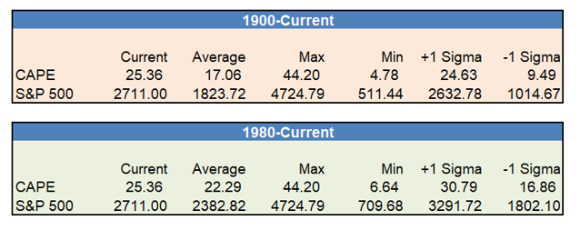
The average CAPE over the 120+ years is 17.06, the maximum was 44.20, and the minimum was 4.78.
If we use more recent data, say from 1980 to current, the average CAPE is 22.29. Due to the higher average over the period, which includes the late 90s dot com bubble and the housing bubble, the current reading is only .36 sigma’s above its average.
The following tables, using both time frames, provide price guidance based on where the S&P 500 would need to be if CAPE were to move to its average, maximum, and minimum, as well as plus or minus one sigma from the mean.
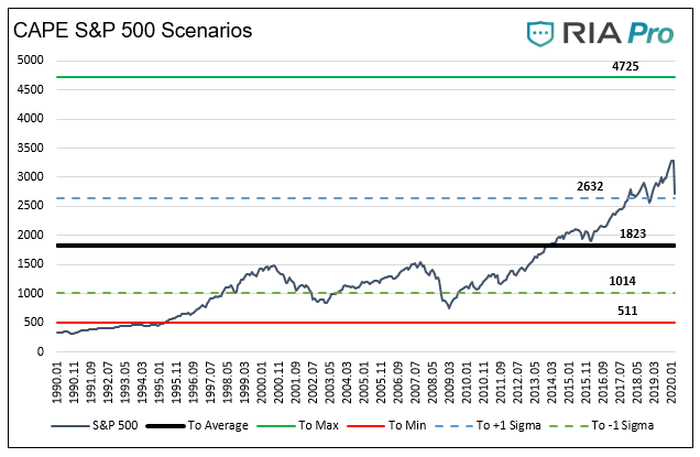
The graph below shows the S&P 500 price in relation to that which would occur if the CAPE ratio went to its average, maximum, minimum, and plus or minus one sigma from the last 120 years.
It is important to stress that the denominator, earnings, includes data from March 2010 to February 2020. That ten years did not include a recession, which, over the 120+ years in this analysis, only happened briefly one other time, the late 1990’s.
The Corona Virus will no doubt hurt earnings for at least a few quarters and could push the economy into a recession. Accordingly, the denominator in CAPE will likely be declining. Whether or not CAPE rises for falls depends on the price action of the index.
Summary
Stocks are not cheap. As shown, a reversion to the average of the last 120 years, would result in an additional 33% decline from current levels. While the massive range of outcomes may appear daunting, this analysis is designed to help better understand the bounds of the market.
The S&P 500 certainly has room to trade much lower. It can also double in price and stay within the bounds of history. Lastly, given the unprecedented nature of current circumstances, it may be different this time and write new history.
McDonald’s, Not A Shelter In The Coming Storm
The amount
of time and effort that investors spend assessing the risks versus the potential
returns of their portfolio should shift as the economy and markets cycle over
time. For example, when an economic recovery finally breaks the grip of a
recession, and asset prices and valuations have fallen to average or below-average
levels, price and economic risks are greatly diminished. That is not to say
there is no risk, just less risk.
Market and
economic troughs are akin to the aftermath of a forest fire. After a fire has
ravaged a forest, the risks for another fire are not zero, but they are below
average. Counter-intuitively, it is at these points in time when people are
most fearful of fire or, in the case of investing, most worried about losses. With
reduced risks, investors during these times should be more focused on the better
than average rewards offered by the markets and not as concerned with the risks
entailed in reaping those rewards.
Conversely,
in the ninth inning of a bull market when valuations are well above the norm, and
the economy has expanded for a long period, investors need to shift focus
heavily to the potential risks. That is not to say there are no more rewards to
come, but the overwhelming risks are substantial, and they can result in a permanent
loss of wealth. As human beings are prone to do, we often zig when we should
zag.
In January,
we wrote Gimme Shelter to highlight that risk can be hard to detect. Sure, high flying companies with
massive price gains and repeated net losses like Tesla or Netflix are easy to
spot. More difficult, though, are those tried and true value stocks of
companies that have flourished for decades. Specifically, we provided readers
with an in-depth analysis of Coca-Cola (KO). While KO is a name brand known
around the world with a long record of dependable earnings growth, its stock price
has greatly exceeded its fair value.
We did not
say that KO is a sure-fire short sale or even a sell. Instead, we conveyed that
when a significant market drawdown occurs, KO has a lot more risk than is likely
perceived by most investors. Simply, it
is not the place investors should seek shelter in a market storm as they may
have in the past.
We now take
the opportunity to discuss another “value” company that many investors may consider
a stock market shelter or safe haven.
We follow in
this series with a review of McDonald’s (MCD).
You Deserve a Break Today
Please note the models and
computations employed in this series use earnings per share and net income.
Stock buybacks warp earnings per share (EPS), making earnings appear better than
they would have without buybacks. The more positive result is simply due to a
declining share count or denominator in the EPS equation. Net income and
revenue data are unaffected by share buybacks and therefore deliver a more accurate
appraisal of a company’s value.
Over the
last ten years, the price of MCD has grown at a 13% annual rate, more than double
its EPS, and over five times the rate of growth of its net income. The pace at
which the growth of its stock price has surpassed its fundamentals has
increased sharply over the last three years. During this period, the stock
price has increased 46% annually, which is almost four times its EPS growth and
more than six times the growth of its net income.
Of further
concern, revenues have declined 5% annually over the last three years,
and the most recently reported annual revenues are now less than they were ten
years ago when the U.S. and global GDP were only about 60% the size they are
today. To pile on, the amount of debt MCD has incurred over the last ten years
has increased by 355%.
MCD is a good company and, like KO, is one of the most well-known brands on the globe. Rated at BBB+, default or bankruptcy risk for MCD is remote, and because of its product line, it will probably see earnings hold up well during the next recession. For many, it is cheaper to eat at a McDonald’s restaurant than to cook at home. Although their operating business is valuable and dependable, those are not reasons to acquire or hold the stock. The issue is what price I am willing to pay in order to try to avoid a loss and secure a reasonable return.
Valuations
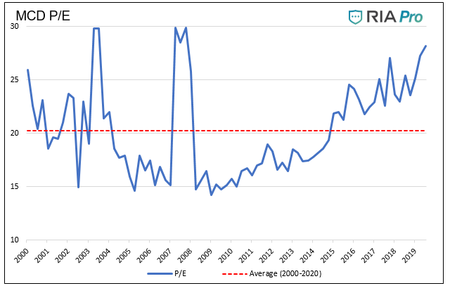
Using a simple price to earnings (P/E) valuation, as shown below, MCD’s current P/E for the trailing twelve months is 28, which is about 40% greater than its average over the last two decades.
The
following graphs, tables, and data use the same models and methods we used to evaluate
KO. For a further description, please read Gimme Shelter.
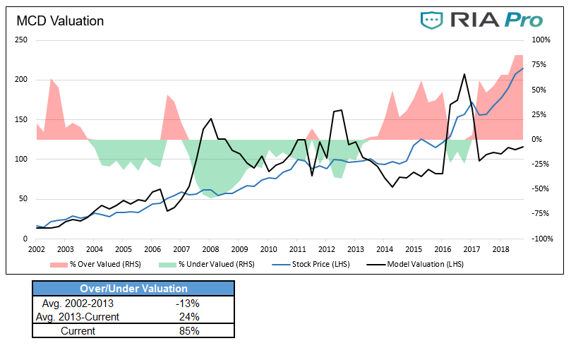
Currently, as shown below, MCD is trading 85% above its fair value using our earnings growth model. It is worth noting that MCD, as shown with green shading, was typically valued as cheap using this model. The table below the graph shows that, on average, from 2002-2013, the stock traded 13% below fair value.
We support the
graph and table above with a cash flow analysis. We assumed McDonald’s 5.6%
long-run income growth rate to forecast earnings for the next 30 years. When
these forecasted earnings are then discounted at the appropriate discounting
rate of 7%, representing longer-term equity returns, MCD is currently overvalued by 72%.
Lastly, as we did in Gimme Shelter, we asked our friend David Robertson from Arete Asset Management to evaluate MCD’s intrinsic value. His cash flow-based model assigns an intrinsic share price value of 97.27. Based on his work, MCD is currently overvalued by 124%.
Summary
Like KO, we
are not making a recommendation on MCD as a short or a sell candidate, but by
our analysis, MCD stock appears to be trading at a very high valuation. Much
of what we see in large-cap stocks today, MCD included, is being driven by
indiscriminate buying by passive investment funds. Such buying can certainly continue,
but at some point, the gross overvaluations will correct as all extremes do.
Even if MCD
were to “only” decline back to a normal valuation, the losses could be
significant and might even exceed those of the benchmark index, the S&P
500. Now consider that MCD may correct beyond the average and could once again
trade below fair value. Even assuming
MCD earnings are not hurt during a recession, the correction in its stock price
to more reasonable levels could be painful for shareholders.
Quick Take: The Great “Tesla” Hysteria Of 2020
“Let us see how high we can fly
before the sun melts the wax in our wings.” – E. O. Wilson
Since January 1, 2020, Tesla’s (TSLA) stock price has risen by $462 or 110%. TSLA’s market cap now exceeds every automaker except for Toyota. In fact, it exceeds not only the combined value of the “big three” automakers GM, Ford, and Chrysler/Fiat, but also companies like Charles Schwab, Target, Deere, Eli Lily, and Marriot to name a few large companies.
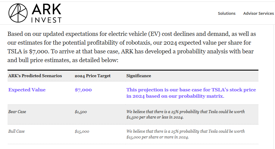
Seem crazy? Not as crazy as what comes next. Crazy are the expectations of Catherine Wood of ARK Invest. This well-known “disruptive innovation” based investor put out the following chart showing an expected price of $7,000 in 2024 with a $15,000 upside target.
Siren songs
such as the one shown above encourage investors to chase the stock higher with
reckless abandon, and maybe that is ARK’s intent. Given their large holding of
TSLA, it certainly makes more sense than their price targets. Instead of taking
her recommendations with blind faith, here are some statistics to illustrate
what is required for TSLA to reach such lofty goals.
To start, let’s compare TSLA to their peer group, the auto industry. The chart below shows that TSLA has the second largest market cap in the auto industry, only behind Toyota. Despite the market cap, its sales are the lowest in the industry and by a lot. According to figures published on their website, TSLA sold 367,500 cars in 2019. General Motors sold 2.9 million and Ford sold 2.4 million.
Clearly investors
are betting on the future, so let’s put ARK’s forecast into context.
If the TSLA share price were to rise to their baseline forecast of 7,000, the market cap would increase to $1.26 trillion. Currently, the auto industry, as shown above, and including TSLA, aggregates to $772 billion. At the upside scenario of 15,000, the market cap of TSLA ($2.7 trillion) would be almost four times the current market cap of the entire auto industry. More stunning, it would be greater than the combined value of Apple and Microsoft.
Even if we make
the ridiculous assumption that TSLA will be the world’s only automaker, a price
of 15,000 still implies a valuation that is three to four times the current industry
average based on price to sales and price to earnings. At 7,000, its valuation
would be 1.6 times the industry average. Again,
and we stress, that is if TSLA is the world’s only automaker.
Summary
Tesla is one
of a few poster children for the latest surge in the current bull market. That
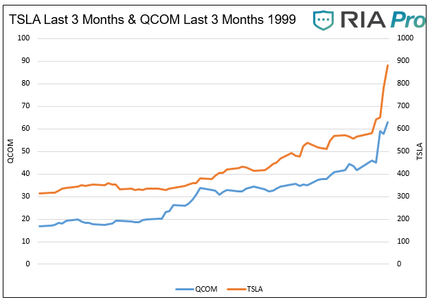
said, it’s worth remembering some examples from the past. For instance, Qualcomm
(QCOM) was a poster child for the tech boom in the late 1990s. Below is a chart
comparing the final surge in QCOM (Q4 1999) to the last three months of trading
for TSLA.
In the last quarter of 1999, QCOM’s price rose by 277%. TSLA is only up 181% in the last three months and may catch up to QCOM’s meteoric rise. However, if history is any guide, QCOM likely offers what a textbook example of a blow-off top is. By 2003 QCOM lost 90% of its value and would not recapture the 1999 highs for 15 years.
Tesla may be
the next great automaker and, in doing so, own a sizeable portion of market
share. However, to have estimates as high as those proposed by ARK, they must
be the only automaker and assume fantastic growth in the number of cars bought worldwide. Given their
technology is replicable and given the enormous incentives for competitors, we
not only find ARK’s wild forecast exceedingly optimistic, but we believe it is
already trading near a best-case scenario level.
One final
factor that ARK Invest also seems to have neglected is the risk of an economic
downturn. Although they do highlight a “Bear Case” price target of $1,500, that
too seems incoherent. Given that TSLA is still losing money and is also heavily
indebted, an economic slowdown would raise the risk of their demise. In such an
instance, TSLA would probably become the property of one of the major car
companies for less than $50 per share.
TSLA’s stock may run higher. Its price is now a function of all the key speculative ingredients – momentum, greed, FOMO, and of course, short covering. The sky always seems to be the limit in the short run, but as Icarus found out, be careful aiming for the sun.
**As we published the article Tesla was up 20% on the day. The one day jump raised their market cap by an amount greater than the respective market caps of KIA, Hyundai, Nissan, and Fiat/Chrysler!!
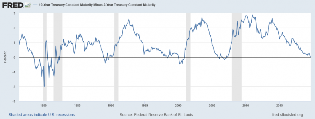
Comparing Yield Curves
Since August
of 1978, there have been seven instances where the yields on ten-year Treasury
Notes were lower than those on two-year Treasury Notes, commonly referred to as
“yield curve inversion.” That count includes the current episode which only
just occurred. In all six prior instances a recession followed, although in
some cases with a lag of up to two years.
Given the yield
curve’s impeccable 30+ year track record of signaling recessions, we think it
is appropriate to compare the current inversion to those of the past. In doing
so, we can further refine our economic and market expectations.
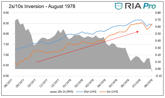
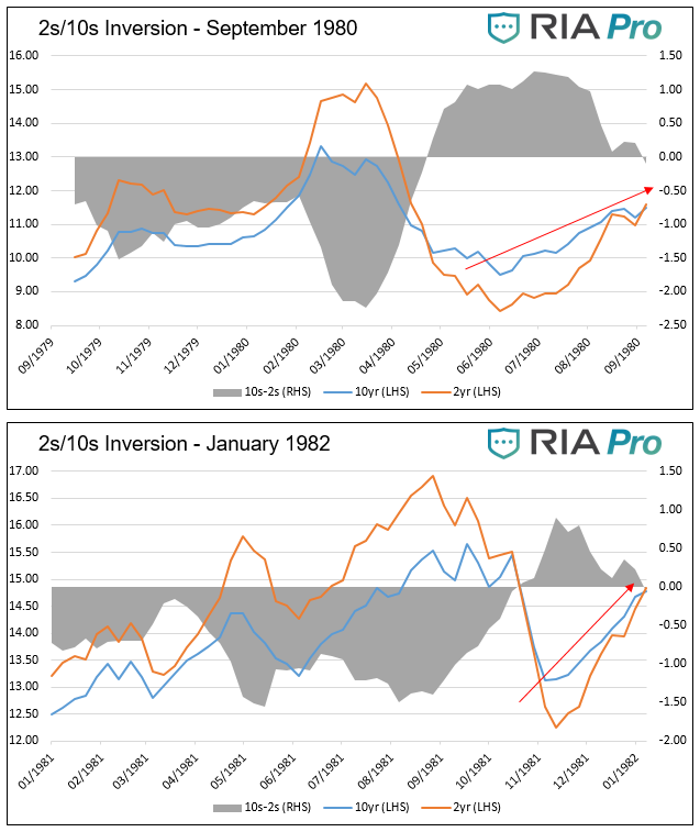
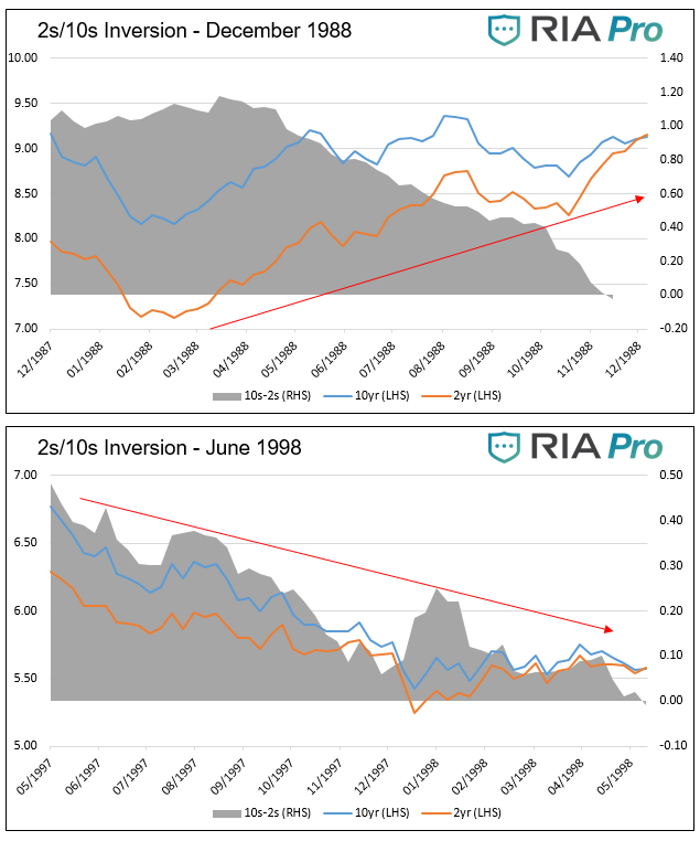
Bull or Bear Flattening
In this
section, we graph the seven yield curve inversions since 1978, showing how ten-year
U.S. Treasuries (UST), two-year UST and the 10-year/2 year curve performed in
the year before the inversion.
Before
progressing, it is worth defining some bond trading lingo:
Steepener-
Describes a situation in which the difference between the yield on the 10-year UST and the yield on the 2y-year UST is
increasing. Steepeners can occur when both securities are trending up or down
in yield or when the 2-year yield declines while the 10-year yield increases.
Flattener-
A flattener is the opposite of a steepener, and the difference between yields
is declining. As shown in the graph
above, the slope of the curve has been in a flattening trend for the last five
years.
Bullish/Bearish-
The terms steepener and flattener are typically preceded with the descriptor
bullish or bearish. Bullish means yields are declining (bond prices are rising)
while bearish means yields are rising (bond prices are falling). For instance,
a bullish flattener means that both 2s and 10s are declining in yield but 10s
are declining at a quicker pace. A bearish flattener implies that yields for 2s
and 10s are rising with 2s increasing at a faster pace. Currently, we are witnessing a bullish
flattener. All inversions, by definition, are preceded by a flattening trend.
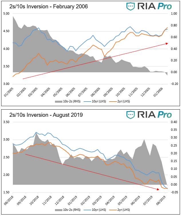
As shown in
the seven graphs below, there are two distinct patterns, bullish flatteners and
bearish flatteners, which emerged before each of the last seven inversions. The
red arrows highlight the general trend of yields during the year leading up to
the curve inversion.
Data for all graphs courtesy St.
Louis Federal Reserve
Five of the
seven instances exhibited a bearish flattening before inversion. In other
words, yields rose for both two and ten year Treasuries and two year yields
were rising more than tens. The exceptions are 1998 and the current period.
These two instances were/are bullish flatteners.
Bearish Flattener
As the
amount of debt outstanding outpaces growth in the economy, the reliance on debt
and the level of interest rates becomes a larger factor driving economic
activity and monetary and fiscal policy decisions. In five of the seven
instances graphed, interest rates rose as economic growth accelerated and consumer
prices perked up. While the seven periods are different in many ways, higher interest
rates were a key factor leading to recession. Higher interest rates reduce the
incentive to borrow, ultimately slowing growth and in these cases resulted in a
recession.
Bullish Insurance Flattener
As noted,
the current period and 1998 are different from the other periods shown. Today, as
in 1998, yields are falling as the 10-year
Treasury yield drops faster than the 2-year Treasury yield. The curve thus flattens
and ultimately inverts.
Seven years
into the economic expansion, during the fall of 1998, the Fed cut rates in
three 25 basis point increments. Deemed “insurance cuts,” the purpose was to
counteract concerns about sluggish growth overseas and financial market concerns
stemming from the Asian crisis, Russian default, and the failure of hedge fund giant
Long Term Capital. The yield curve inversion was another factor driving the
Fed. The domestic economy during the period was strong, with real GDP staying
above 4%, well above the natural growth rate.
The current
period is somewhat similar. The U.S. economy, while not nearly as strong as the
’98 experience, has registered above-trend economic growth for the last two
years. Also similar to 1998, there are exogenous factors that are concerning for
the Fed. At the top of the list are the trade war and sharply slowing economic
activity in Europe and China. Like in 1998, we can add the newly inverted yield
curve to the list.
The Fed
reduced rates by 25 basis points on July 31, 2019. Chairman Powell characterized
the cut as a “mid-cycle adjustment” designed to ensure solid economic growth
and support the record-long expansion. Some Fed members are describing the cuts
as an insurance measure, similar to the language employed in 1998.
If 1998-like
“insurance” measures are the Fed’s game plan to counteract recessionary
pressures, we must ask if the periods are similar enough to ascertain what may
happen this time.
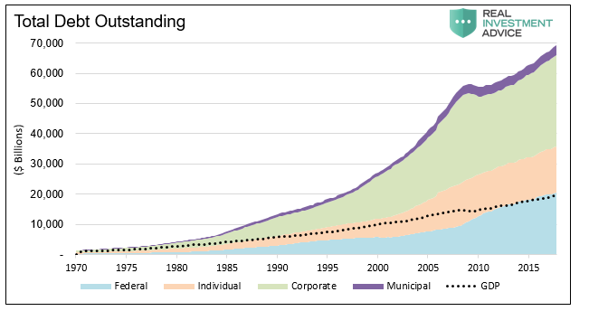
A key
differentiating factor between today and the late 1990s is not only the amount
of debt but the dependence on it. Over
the last 20 years, the amount of total debt as a ratio to GDP increased from
2.5x to over 3.5x.
Data Courtesy St. Louis Federal
Reserve
In 1998, believe
it or not, the U.S. government ran a fiscal surplus and Treasury debt issuance was
declining. Today, the reliance on debt for new economic activity and the burden
of servicing old debt has never been greater in the United States. Because
rates are already at or near 300-year lows, unlike 1998, the marginal benefits
from borrowing and spending as a result of lower rates are much less
economically significant currently.
In 1998, the
internet was in its infancy and its productive benefits were just being
discovered. Productivity, an essential element for economic growth, was
booming. By comparison, current productivity growth has been lifeless for well
over the last decade.
Demographics,
the other key factor driving economic activity, was also a significant
component of economic growth. Twenty years ago, the baby boomers were in their
spending and investing prime. Today they are retiring at a rate of 10,000 per
day, reducing their consumption and drawing down their investment accounts.
The key
point is that lower rates are far less likely to spur economic activity today than
in 1998. Additionally, the natural rate of economic growth is lower today, so the
economy is more susceptible to recession given a smaller decline in economic
activity than it was in 1998.
The 1998
rate cuts led to an explosion of speculative behavior primarily in the tech
sectors. From October of 1998 when the Fed first cut rates, to the market peak
in March of 2000, the NASDAQ index rose over 300%. Many equity valuation ratios
from the period set records.
We have
witnessed a similar but broader-based speculative fervor over the last five
years. Valuations in some cases have exceeded those of the late 1990s and in
other cases stand right below them. While the economic, productivity, and
demographic backdrops are not the same, we cannot rule out that Fed cuts might
fuel another explosive rally. If this were to occur, it will further reduce
expected returns and could lead to a crushing decline in the years following as
occurred in the early 2000s.
Summary
A yield
curve inversion is the bond market’s way of telegraphing concern that economic
growth will slow in the coming months. Markets do not offer guarantees, but the
2s-10s yield curve has been right every time in the last 30 years it voiced
this concern. As the book of Ecclesiastes reminds us, “the race does not always
go to the swift nor the battle to the strong…”, but that’s the way to bet.
Insurance rate
cuts may buy the record-long economic expansion another year or two as they did
20 years ago, but the marginal benefit of lower rates is not nearly as powerful
today as it was in 1998.
Whether the
Fed combats a recession in the months ahead as the bond market warns or in a
couple of years, they are very limited in their abilities. In 2000 and 2001,
the Fed cut rates by a total of 575 basis points, leaving the Fed Funds rate at
1.00%. This time around, the Fed can only cut rates by 225 basis points until
it reaches zero percent. When we reach that point, and historical precedence
argues it will be quicker than many assume, we must then ask how negative
rates, QE, or both will affect the economy and markets. For this there is no
prescriptive answer.
We respect your privacy and will only send you email that is related to what you subscribed to and why you subscribed. You can unsubscribe whenever you want with just a click of your mouse. For more information please see... Disclosure & Privacy Policy.