Michael Markowski: Embrace The Bear – Next Leg Down Is Coming
Michael Markowski has been involved in the Capital Markets since 1977. He spent the first 15 years of his career in the Financial Services Industry as a Stockbroker, Portfolio Manager, Venture Capitalist, Investment Banker and Analyst. Since 1996 Markowski has been involved in the Financial Information Industry and has produced research, information and products that have been used by investors to increase their performance and reduce their risk. Read more at BullsNBears.com
Investors must embrace the bear. A savvy investor or advisor can generate significantly more profits from a secular bear, than a secular bull. It’s also much easier to predict the behavior of a wild and vicious bear than a domesticated bull.
The new 2020 secular bear is the first for which an investor can utilize an inverse ETF (Exchange Traded Fund) to invest in a bear market from start to finish. The share price of an inverse ETF increases when a market goes down. The first inverse ETFs were invented in 2007. The new ETFs enabled investors to make significant profits at the end of the 2000 to 2009 secular bear market. The chart below depicts the gains for the Dow’s inverse ETF before and after Lehman went bankrupt in 2008.
The increased volatility caused by the secular bear can be leveraged by algorithms which had not been utilized in prior bear markets. Two of my algorithms have the potential to produce substantial gains:
Bull & Bear Tracker (BBT)
From April 9, 2018, and through February 29, 2020, the Bull & Bear Tracker (BBT) trend trading algorithm which trades both long and inverse ETFs produced a gain of 77.3% vs. the S&P 500’s 14.9%. March of 2020 will be the BBT’s 9th consecutive profitable month.
The Bull & Bear Tracker thrives on market volatility. The algorithm’s best performance days since the inception of the signals have been when the markets are most volatile.
SCPA (Statistical Crash Probability Analysis)
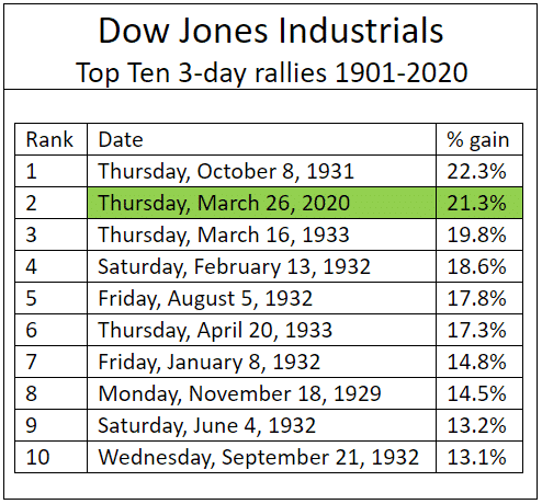
The SCPA is a crash event forecasting algorithm. The algorithm has been very accurate at forecasting the crash of 2020’s events. The SCPA’s forecast that the market had reached a bottom on March 23rd was precisely accurate. From 03/23/20 to 0/3/26/20, the Dow had its biggest one-day gain (11.4%) and three-day percentage gain (21.3%) since 1929 and 1931, respectively. Those investors who purchased the Dow’s long ETF (symbol: DIA) by close of the market on March 23, 2020, after reading “Probability is 87% that market is at interim bottom” which was published during market hours, had a one day gain of 11% at the close of the market on March 24, 2020.
The SCPA’s future event forecasts throughout the life of the crash of 2020 are being utilized to trade long and inverse ETFs until the US markets reach their final bottoms in the fourth quarter of 2022. Had the SCPA and inverse ETFs been available to trade the SCPA’s forecasts in 1929, savvy investors would have made more than 572% from December of 1929 through July of 1932. There were 14 Bear market rallies with average gains of 17%. The rallies were followed by 14 declines which averaged 23%. could have produced average gains of 23% for inverse ETF investors.
Both the Bull & Bear Tracker (BBT) and SCPA complement each other. The BBT predicts market volatility before it increases. The SCPA forecasts the percentage increases for the bear market rallies and the percentage declines from the bear rally highs. My prediction is that the utilization of both of the algorithms will reduce the failed signals ratio for the Bull & Bear Tracker.
Based on the findings from my recently completed empirical research of the Dow’s best rallies from 1901 to 2020, the markets will remain extremely volatile for the foreseeable future.
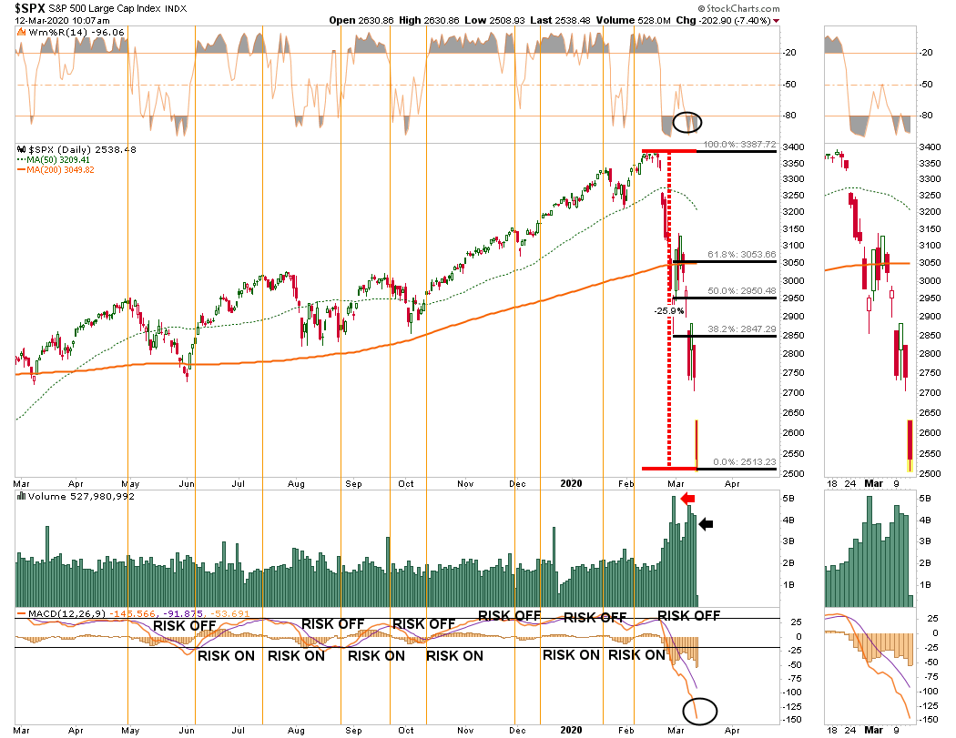
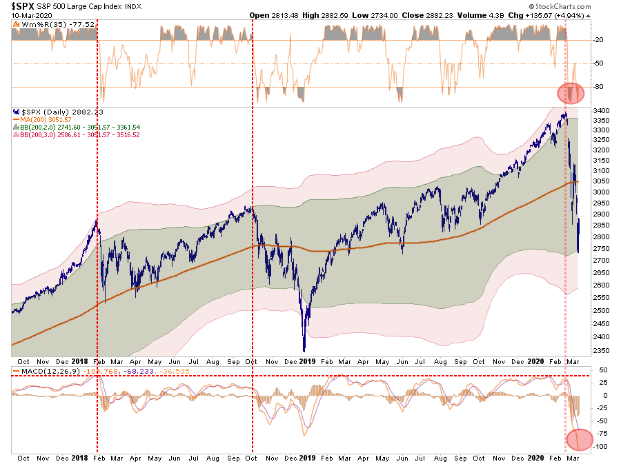
The Truth About The Biggest One Day Jump Since 1933
The Wall Street Journal’s “Dow Soars More Than 11% in Biggest One-Day Jump Since 1933” was inaccurate. It should have read since “1929”. The article should have been about the Dow Jones industrials composite index having its best one day and three-day percentage gains since 1929 and 1931 respectively.
The gain of 21.3% for the Dow’s three-day rally that ended on March 26th was the index’s second best since 1901. The one-day gain of 11.4% on March 24th ranks as the Dow’s fourth best day since 1901. To understand the significance of the error read on.
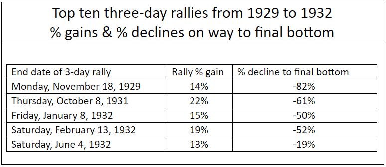
Nine of the top ten three-day percentage gainers occurred during the first four years of the 1929 to 1949 secular bear market. The Five rallies which occurred before the 1929 crash reached its final bottom on July 8, 1932 all failed. Their post rally declines ranged from 19% to 82%.
Six of the 10 biggest daily percentage increases in the table below for the Dow over the last 120 years occurred from 1929 to 1933. There were two 2008 secular bear market rallies, October 13 and 28, 2008 among the top ten one day wonders. The losses for both of the one-day 2008 rallies at the March 2009 were 31.1% and 28.7% respectively.
Of the 100 best percentage gain days for the Dow since 1901, 29 of them occurred between the post 1929 crash and the final July 1932 bottom. From the 1932 bottom to the end of 1933 accounted for an additional 23 of the 100 best days. All of those rallies were profitable. From the low to the end of 1933, the Dow increased by more than 100%. The only other period or year which had concentrated representation in the top 100 was 2008 which had seven.
The Wall Street Journal’s error is significant since 100% of the top 100 best one day rallies from:
October 1929 to July 1932 resulted in significant losses
July 1932 bottom to end of 1933 resulted in significant gains
The error has created a false sense of security for investors and especially for investment professionals, who are aware that after the 1929 crash, the Dow bottomed in 1932. Had the performance for the Dow’s performance cited in the headline been compared to 1929, the context of the article would have been very bearish instead of somewhat bullish.
From my preliminary empirical research findings there were only seven bull market rallies within the top 100 one day percentage gainers. Three of seven in the table below were represented by 1987 and two by 2009.
The three post 1987 “Black Monday’ crash rallies enabled the secular bull which began in 2002 to resume. To understand why it’s not possible for the secular bull which began in 2009 to resume read my two March 2020 articles below. The 1987 crash does not share the genealogy of the Dow 1929, NASDAQ 2000 and the 2020 crashes for the markets of the US, Japan, Germany, Canada, France and South Korea which are now underway.
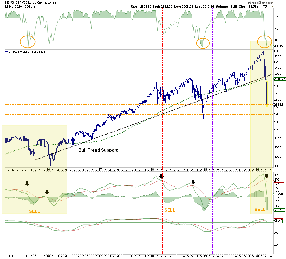
Based on the findings from my empirical research the probability is 94.4% (17/18) that the Dow 2020’s one day and three-day top ten percentage gainers last week were bear market rallies.
Many are hopeful that the crash which has been underway since February 20, 2020, is just a correction for the continuation of the secular bull market which began in 2009. Based on my just concluded empirical research of the Dow’s best daily and three-day gains and my previous findings from my prior statistical crash probability analysis, the rationale is in place for the markets to continue to crash. My deep fear is that the world is on the verge of a 1930’s style economic depression.
Everyone should take advantage of the Bear market rally that is currently underway to exit the market as soon as possible.
According to the Statistical Crash Probability Analysis (SCPA) forecast the probability is 100% that the relief rally high has either already occurred or will occur by April 8, 2020.
The probability is the same for the markets of the six countries to make new lows by April 30, 2020.
For more about the SCPA click here for access to all of my 2020 crash related articles. To view the SCPA’s very accurate track record for March 2020 click here.
All mutual funds and stocks over $5.00 per share should be liquidated by April 8th. My suggestion is to utilize a methodical approach by liquidating 20% of all holdings per day from April 1st to April 8th.
The SCPA is also forecasting the probability is 100% for the coming attractions from the crash of 2020:
Interim bottom by or before May 4, 2020
At interim bottom market will be 41% to 44% below 2020 highs
Post-crash high before the journey begins to final Q 4 2022 bottom will occur from June 24, 2020 to September 18, 2020.
Post-crash highs to get market to within 17% of 2020 highs.
My only argument against the SCPA’s statistical probability analyses is can the markets get back to above, or even to their March/April 2020 post-crash relief rally highs? The simultaneous crashes in multiple markets for more than one country, let alone six countries, is historically unprecedented.
My hunch is that the damage to the markets and economies of the world’s leading developed countries will be much more severe than the damage caused by the 1929 crash. The relief rally highs could prove to be the post-crash highs.
If that proves to be the case, according to the SCPA the probability is 100% that it will take the markets a minimum of 15 years to get back above the highs already made by the relief rally and longer to get back to their post-crash highs. Additionally, the findings from my extensive research on all of the secular bear markets since 1929 further support the SCPA’s forecast.
There are only three reasons why anyone who is reading my articles would not to sell:
Waiting to get back to break even. It’s against human nature to take losses.
Not wanting to pay capital gains. Securities with gains can be “sold short against the box” to delay a taxable capital gain,
Financial advisor advising otherwise. Beware of the following:
a) An advisor’s largest percentage fee that can be charged is for the amount that an investor has in stocks. If the investor is in cash the advisor can-not charge the fee.
b) The majority of financial advisors are affiliated with big brand name firms including Merrill Lynch, Morgan Stanley, Goldman Sachs and UBS, etc. These advisors have to follow the party line. They do not have the independence to get their clients out of the market even if they wanted to.
c) The financial advisor industry utilizes propaganda to get clients to remain invested during volatile periods. Read “No One Saw It Coming’ – Should You Worry About The 10-Best Days” by Lance Roberts. He is among a few of the independent advisors who I know which had his clients’ 90% out of the market.
TPA Analytics: Death Cross On Russell 3000 Signals More Pain To Come
Jeffrey Marcus is the President of Turning Point Analytics. Turning Point Analytics utilizes a time-tested, real world strategy that optimizes client’s entry and exit points and adds alpha. TPA defines each stock as Trend or Range to identify actionable inflection points. For more information on TPA check out: http://www.TurningPointAnalyticsllc.com
Michael Markowski: Dip Buyers, Beware Of Sensational Headlines
Michael Markowski has been involved in the Capital Markets since 1977. He spent the first 15 years of his career in the Financial Services Industry as a Stockbroker, Portfolio Manager, Venture Capitalist, Investment Banker and Analyst. Since 1996 Markowski has been involved in the Financial Information Industry and has produced research, information and products that have been used by investors to increase their performance and reduce their risk.Read more at BullsNBears.com
Many investors are salivating to trade the dips in a stock market which is becoming increasingly more volatile. It’s because Wall Street for the week ended March 13th according to the headlines had its worst week since 2008. Its human nature to want to buy at fire sale prices.
Investors became conditioned to buy the dips after the record setting 2008 crash. The S&P 500 made a quick recovery after crashing down by 40% within six months to its lowest level since 1996 after Lehman declared bankruptcy in September 2008.
Those who jumped in the last time the markets had their worst week since 2008, the week ended February 28, 2020, lost 8.2% in 10 days based on the S&P 500’s March 13th close. Secular bear markets are famous for producing one sensational headline after another as a market continues to reach new lows.
From September 12, 2008, the last market close prior to Lehman’s bankruptcy to the bottom of the 2000 to 2009 secular bear market which began in 2000 and ended on March 9, 2009:
Passive buy and hold investors lost 39%
bullish traders who precisely got in at all bottoms and sold at tops made 136.5%
bearish traders who precisely sold short at all tops and bought the shares back at all bottoms made 162.3%
What likely happened due to the extreme volatility as depicted in the chart below most non-professional traders lost money. Buy and hold bargain hunters who bought during the first five months after the 2008 crash began lost a minimum of 20%. From February 9, 2009, which was five months after the decline began, to the March 9th final bottom the market declined by an additional 22%.
The table below reinforces the difficulties that anyone but a professional investor had to make money from the 2008 crash. $100 traded from September 12th to March 2009, would have declined to $74.20 at the 2000 secular bear’s final bottom.
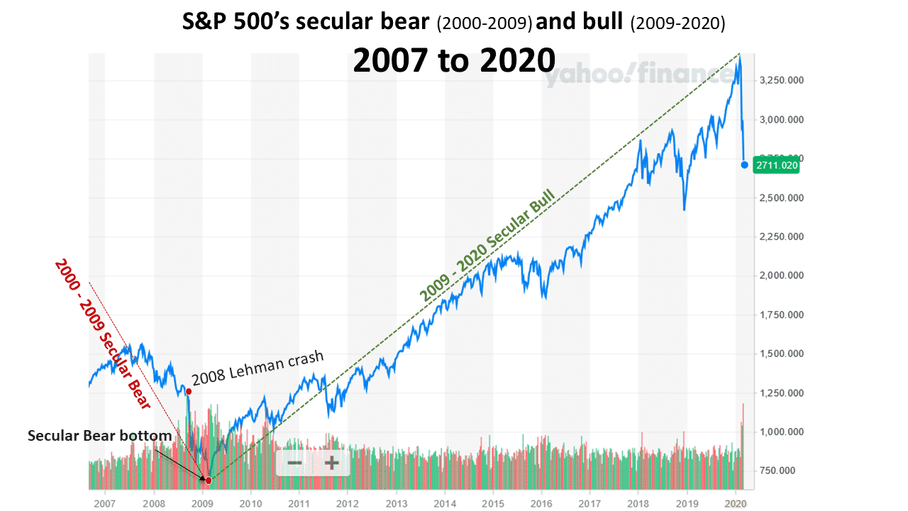
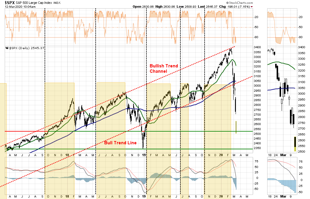
The current market is much riskier than the 2008 market for dip buying. Instead of being at the bottom of secular bear, the chart below depicts that the S&P 500 has been in a secular bull market since 2009. In my March 5th article when the S&P 500 was 10% higher included my prediction that the secular bull likely reached its all-time high on February 19, 2020 and the secular bear began the very next day on February 20, 2020.
Based on my recent empirical research findings from analyzing prior crashes which have similar traits as the crash of 2020, the probability is high that the decline from the top to the bottom will be from 79% to 89%. The final bottom will be reached between October and December of 2022.
BullsNBears.com which covers all of the emerging and declining economic and market trends is an excellent resource site. Click here to view one-minute video about the site.
Profits & Earnings Suggest The Bear Market Isn’t Over.
Is the bear market over yet?
This is the question that everyone wants to know. Why? So they can “buy the bottom.”
For that reason alone, I would suggest the current “bear market” is not over yet. Historically speaking, at the bottom of bear market cycles, as we saw in 1932, 1974, 2002, and 2008, there are few individuals willing to put capital at risk.
Given the large number of people on social media clamoring to jump back in the market given the rally this past Friday, it suggests that “optimism,” and “recency bias,” are still far too prevalent in the market.
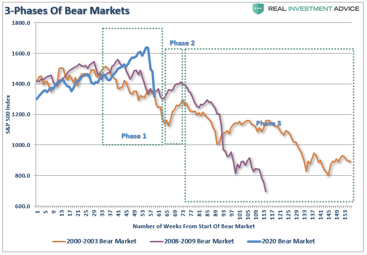
Bear markets have three stages – sharp down, reflexive rebound and a drawn-out fundamental downtrend.”
Bear markets often START with a sharp and swift decline.
After this decline, there is an oversold bounce that retraces a portion of that decline.
The longer-term decline then continues, at a slower and more grinding pace, as the fundamentals deteriorate.
Dow Theory also suggests that bear markets consist of three down legs with reflexive rebounds in between.
While the correction has been sharp in recent weeks, it hasn’t inflicted enough “emotional pain” to deter individuals from jumping back in. As I stated:
“That selloff sets up a ‘reflexive bounce.’ For many individuals, they will ‘feel like’ they are ‘safe.’ This is how ‘bear market rallies’ lure investors back just before they are mauled again in ‘Phase 3.’”
Just like in 2000, and 2008, the media/Wall Street will be telling you to just “hold on.” Unfortunately, by the time “Phase 3” was finished, there was no one wanting to “buy” anything.
That’s how you know a “bear market” is over.
Price To Profits & Earnings
From an investment view, I prefer more data-driven analysis to determine if the current bear market is over.
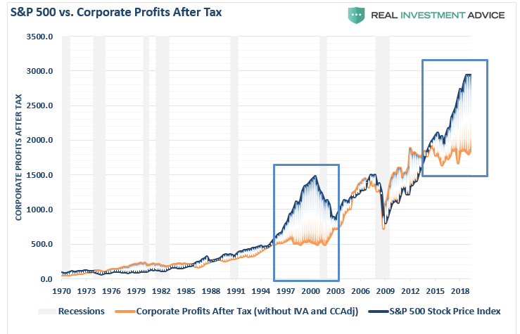
“If the economy is slowing down, revenue and corporate profit growth will decline also. However, it is this point which the ‘bulls’ should be paying attention to. Many are dismissing currently high valuations under the guise of ‘low interest rates,’ however, the one thing you should not dismiss, and cannot make an excuse for, is the massive deviation between the market and corporate profits after tax. The only other time in history the difference was this great was in 1999.”
It isn’t just the deviation of asset prices from corporate profitability which is skewed, but also reported earnings per share.
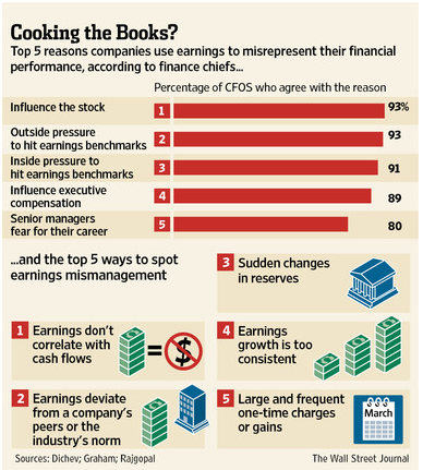
“It should come as no surprise that companies manipulate bottom-line earnings to win the quarterly ‘beat the estimate’ game. By utilizing ‘cookie-jar’ reserves, heavy use of accruals, and other accounting instruments they can mold earnings to expectations.
‘The tricks are well-known: A difficult quarter can be made easier by releasing reserves set aside for a rainy day or recognizing revenues before sales are made, while a good quarter is often the time to hide a big ‘restructuring charge’ that would otherwise stand out like a sore thumb.
What is more surprising though is CFOs’ belief that these practices leave a significant mark on companies’ reported profits and losses. When asked about the magnitude of the earnings misrepresentation, the study’s respondents said it was around 10% of earnings per share.’“
“As shown in the table, it is not surprising to see that 93% of the respondents pointed to ‘influence on stock price’ and ‘outside pressure’ as the reason for manipulating earnings figures. For fundamental investors, this manipulation of earnings skews valuation analysis particularly with respect to P/E’s, EV/EBITDA, PEG, etc.”
“I think that every time you see the word EBITDA, you should substitute the word ‘bullshit’ earnings.”
Corporate Profits Weaker Than Advertised
Before the recent market rout, the deviation between reported earnings and corporate profits is one of the largest on record. This is an anomaly that should, in reality, not exist.
However, it is worse than it appears.
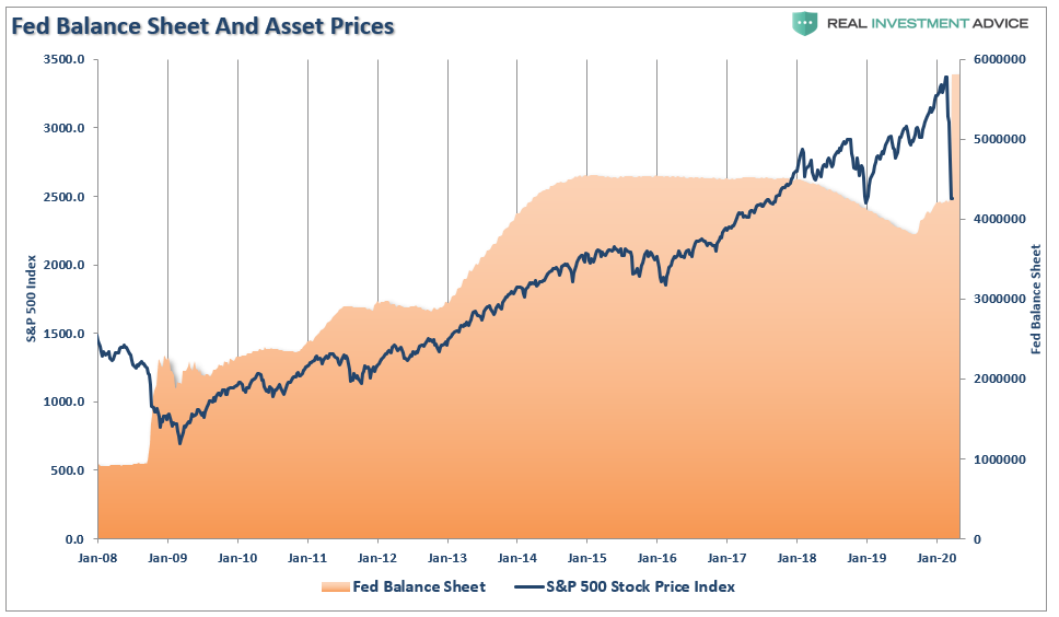
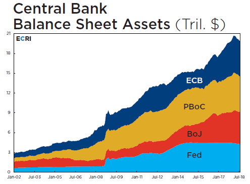
There is an interesting company included in the calculation of corporate profits, which is not widely recognized in most analysis. If you are an astute follower of our blog, you may recognize this particular company by the size of their balance sheet as shown below.
Yes, you guessed it (and it’s in the title). It’s the Federal Reserve.
When the Treasury Department pays interest one the debt, an expense to the U.S. Government, the Federal Reserve takes that in as “profits” which is reported on their balance sheet. Then, at the end of the year, the Fed remits a portion of the “revenue” back to the Government (who also count it as revenue).
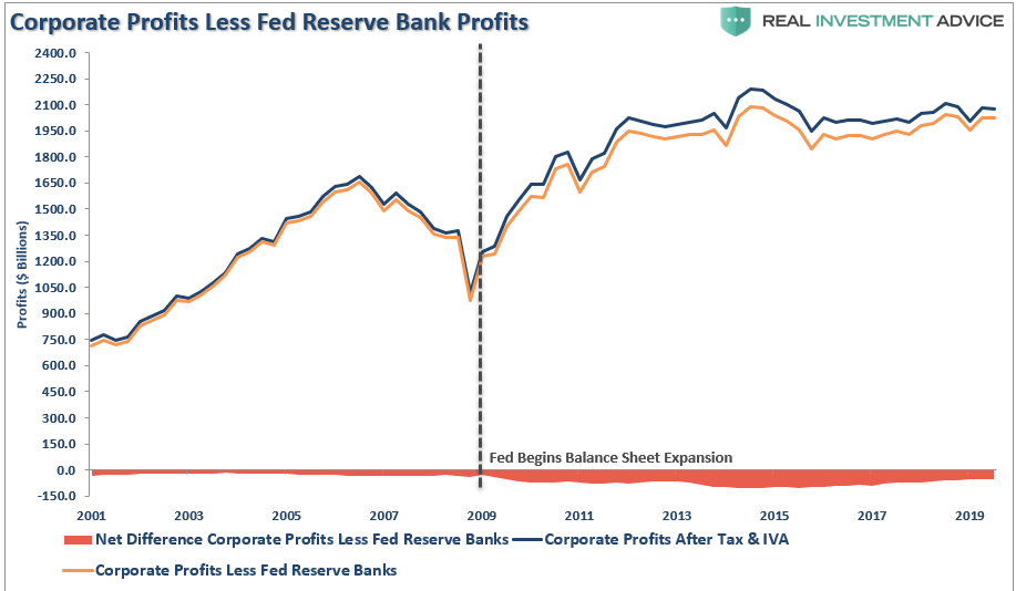
These“profits,” which are generated by the Federal Reserve’s balance sheet, are included in the corporate profits discussed here. As shown below, actual corporate profitability is weaker if you extract the Fed’s profits from the analysis.
It’s quite amazing, and with the Fed massively increasing their balance sheet, their profitability will expand further.
Nonetheless, since the Fed’s balance sheet is part of the corporate profit calculation, we must include them in our analysis. While the media is focused on record operating profits, reported corporate profits are roughly at the same level as they were in 2011. Yet, the market has been making consistent new highs during that same period.
Estimating The Risk
The detachment of the stock market from underlying profitability guarantees poor future outcomes for investors. But, as has always been the case, the markets can certainly seem to “remain irrational longer than logic would predict,” but it never lasts indefinitely.
“Profit margins are probably the most mean-reverting series in finance, and if profit margins do not mean-revert, then something has gone badly wrong with capitalism. If high profits do not attract competition, there is something wrong with the system, and it is not functioning properly.” – Jeremy Grantham
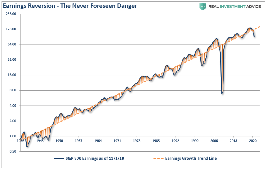
The impending recession, and consumption freeze, is going to start the mean-reversion process in both corporate profits and earnings. In the following series of charts, I have projected the potential reversion.
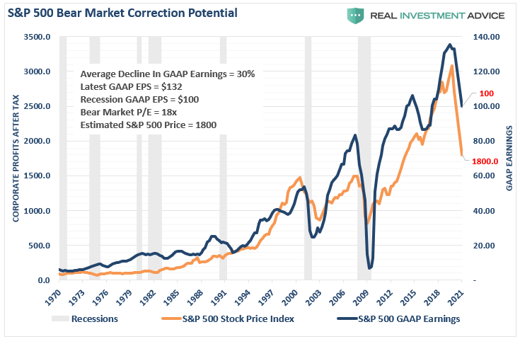
The reversion in GAAP earnings is pretty calculable as swings from peaks to troughs have run on a fairly consistent trend. (The last drop off is the estimate to for a recession)
Using that historical context, we can project a recession will reduce earnings to roughly $100/share. The resulting decline asset prices to revert valuations to a level of 18x (still high) trailing earnings would suggest a level of $1800 for the S&P 500 index.
Let me suggest that I am not being “overly dramatic” or “super bearish.” There is a good bit of data to support the thesis. As I noted on Twitter, you can pick your valuation range, and do the math.
S&P Estimates still WAY too high. Using historical drawdowns in earnings, and peak to trough ranges, earnings will drop to $100/share during the #recession2020 – Pick your valuation target for #SPY bottom. 20x = 2000 18x = 1800 15x = 1500 (Long-Term Avg) 13x = 1300 Undervalued pic.twitter.com/v4inJMdAlj
We can support that thesis with corporate profits.
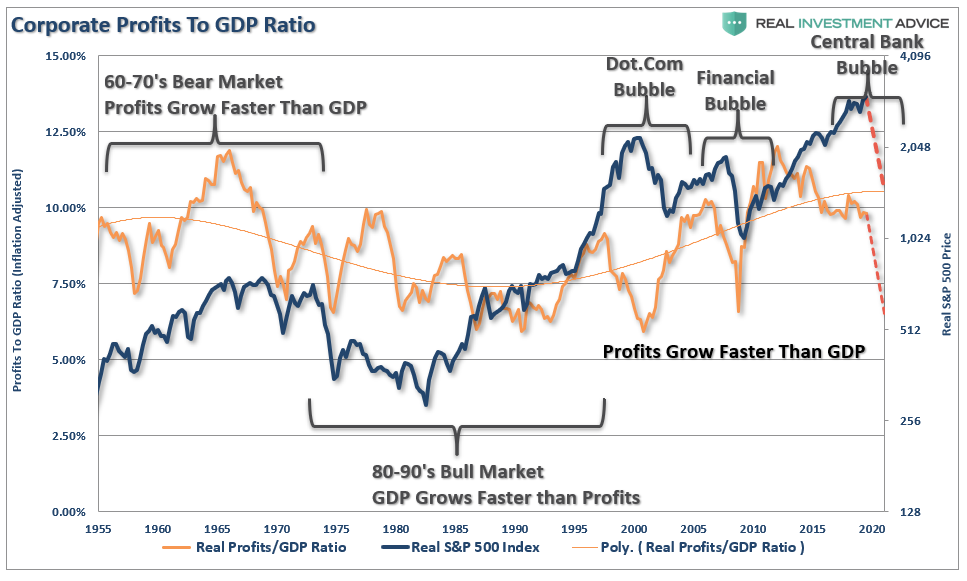
If we look at inflation-adjusted profit margins as a percentage of inflation-adjusted GDP, we see the same process of mean-reverting activity over time. Of course, these mean reverting events are always coupled with recessions, crisis, or bear markets.
More importantly, corporate profit margins have physical constraints. Out of each dollar of revenue created, there are costs such as infrastructure, R&D, wages, etc. Currently, one of the biggest beneficiaries to expanding profit margins has been the suppression of employment, wage growth, and artificially suppressed interest rates, which have significantly lowered borrowing costs. The oncoming recession will cause a rather marked collapse in corporate profitability as consumption declines.
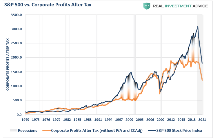
The chart below shows corporate profits overlaid against the S&P 500 index. As with GAAP Earnings in the chart above, I have projected the potential reversion in corporate profitability as well.
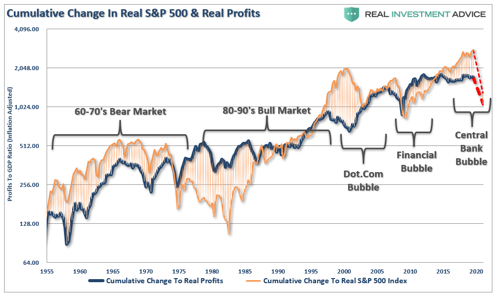
When we measure the cumulative change in the S&P 500 index as compared to the level of profits, we find again that when investors pay more than $1 for a $1 worth of profits, there is an reversal of those excesses
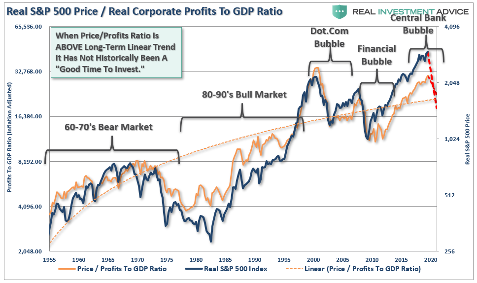
The correlation is clearer when looking at the market versus the ratio of corporate profits to GDP. Again,since corporate profits are ultimately a function of economic growth, the correlation is not unexpected. Hence, neither should the impending reversion in both series.
To this point, it has seemed to be a simple formula that as long as the Fed remains active in supporting asset prices, the deviation between fundamentals and fantasy doesn’t matter. It has been a hard point to argue.
However, what has started, and has yet to complete, is the historical “mean reversion” process which has always followed bull markets. This should not be a surprise to anyone, as asset prices eventually reflect the underlying reality of corporate profitability.
Recessions reverse excesses.
Are we at the bottom yet? Probably not, if history is any guide.
Special Report: Fed Launches A Bazooka As Markets Hit Our Line In The Sand
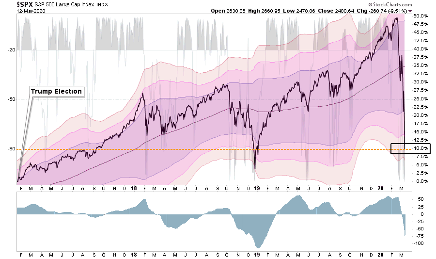
The severity of the recent market rout has been quite astonishing. As shown below, in just three very short weeks, the market has reversed almost the entirety of the “Trump Stock Market” gains.
The decline has been unrelenting, and despite the Fed cutting rates last week, and President Trump discussing fiscal stimulus, the markets haven’t responded. In mid-February we were discussing the markets being 3-standard deviations above their 200-dma which is a rarity. Three short weeks later, the markets are now 4-standard deviations below which is even a rarer event.
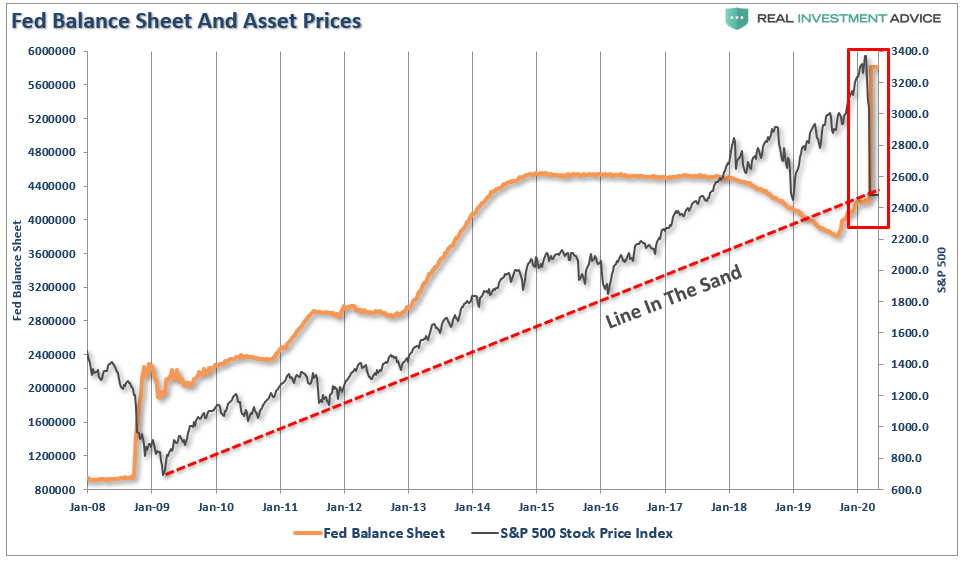
On Wednesday, the Federal Reserve increased “Repo operations” to $175 Billion.
Still no response from the market.
Then on Thursday, the Fed brought out their “big gun.”
The Fed Bazooka
Yesterday, the Federal Reserve stepped into financial markets for the second day in a row, this time dramatically ramping up asset purchases amid the turmoil created by the combination of the spreading coronavirus and the collapse in oil prices.
In a statement from the New York Fed:
The Federal Reserve said it would inject more than $1.5 trillion of temporary liquidity into Wall Street on Thursday and Friday to prevent ominous trading conditions from creating a sharper economic contraction.
‘These changes are being made to address highly unusual disruptions in Treasury financing markets associated with the coronavirus outbreak.’
The New York Fed said it would conduct three additional repo offerings worth an additional $1.5 trillion this week, with two separate $500 billion offerings that will last for three months and a third that will mature in one month.
If the transactions are fully subscribed, they would swell the central bank’s $4.2 trillion asset portfolio by more than 35%.” – WSJ
“The Fed can label this however they want, but it’s another round of QE.”
As you can see in the chart below, this is a massive surge of liquidity hitting the market at a time the market is hitting important long-term trend support.
Of course, this is what the market has been hoping for:
Rate cuts? Check
Liquidity? Check
It is now, or never, for the markets.
With our portfolios already at very reduced equity levels, the break of this trendline will take our portfolios to our lowest levels of exposure. However, given the extreme oversold condition, noted above, it is likely we are going to see a bounce, which we will use to reduce risk into.
What happened today was an event we have been worried about, but didn’t expect to see until after a break of the trendline – “margin calls.”
This is why we saw outsized selling in “safe assets” such as REITs, utilities, bonds, and gold.
Cash was the only safe place to hide.
This also explains why the market “failed to rally” when the Fed announced $500 billion today. There is another $500 billion coming tomorrow. We will see what happens.
We aren’t anxious to “fight the Fed,” but the markets may have a different view this time.
Use rallies to raise cash, and rebalance portfolio risk accordingly.
We are looking to be heavy buyers of equities when the market forms a bottom, we just aren’t there as of yet.
Special Report: Panic Sets In As “Everything Must Go”
Note: All charts now updated for this mornings open.
It has, been a heck of a couple of weeks for the market with daily point swings running 1000, or more, points in either direction.
However, given Tuesday’s huge rally, it seemed as if the market’s recent rout might be over with the bulls set to take charge? Unfortunately, as with the two-previous 1000+ point rallies, the bulls couldn’t maintain their stand.
But with the markets having now triggered a 20% decline, ending the “bull market,” according to the media, is all “hope” now lost? Is the market now like an “Oriental Rug Factory” where “Everything Must Go?”
It certainly feels that way at the moment.
“Virus fears” have run amok with major sporting events playing to empty crowds, the Houston Live Stock Show & Rodeo was canceled, along with Coachella, and numerous conferences and conventions from Las Vegas to New York. If that wasn’t bad enough, Saudi Arabia thought they would start an “oil price” war just to make things interesting.
What is happening now, and what we have warned about for some time, is that markets needed to reprice valuations for a reduction in economic growth and earnings.
It has just been a much quicker, and brutal, event than even we anticipated.
The questions to answer now are:
Are we going to get a bounce to sell into?
Is the bear market officially started – from a change in trend basis; and,
Just how bad could this get?
A Bounce Is Likely
In January, when we discussed taking profits out of our portfolios, we noted the markets were trading at 3-standard deviations above their 200-dma, which suggested a pullback, or correction, was likely.
Now, it is the same comment in reverse. The correction over the last couple of weeks has completely reversed the previous bullish exuberance into extreme pessimism. On a daily basis, the market is back to oversold. Historically, this condition has been sufficient for a bounce. Given that the oversold condition (top panel) is combined with a very deep “sell signal” in the bottom panel, it suggests a fairly vicious reflexive rally is likely. The question, of course, is how far could this rally go.
Looking at the chart above, it is possible we could see a rally back to the 38.2%, or the 50% retracement level is the most probable. However, with the severity of the break below the 200-dma, that level will be very formidable resistance going forward. A rally to that level will likely reverse much of the current oversold condition, and set the market up for a retest of the lows.
The deep deviation from the 200-dma also supports this idea of a stronger reflexive rally. If we rework the analysis a bit, the 3-standard deviation discussed previously has now reverted to 4-standard deviation move below the 200-dma. The market may find support there, and with the deeply oversold condition, it again suggests a rally is likely.
Given that rally could be sharp, it will be a good opportunity to reduce risk as the impact from the collapse in oil prices, and the shutdown of the global supply chain, has not been fully factored in as of yet.
The following chart is a longer-term analysis of the market and is the format we use for “onboarding” our clients into their allocation models. (Vertical black lines are buy periods)
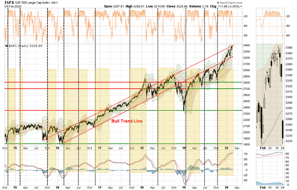
The triggering of the “sell signals” suggests we are likely in a larger correction process. With the “bull trend” line now broken, a rally toward the 200-dma, which is coincident with the bull trend line, will likely be an area to take additional profits, and reduce risk accordingly.
The analysis becomes more concerning as we view other time frames.
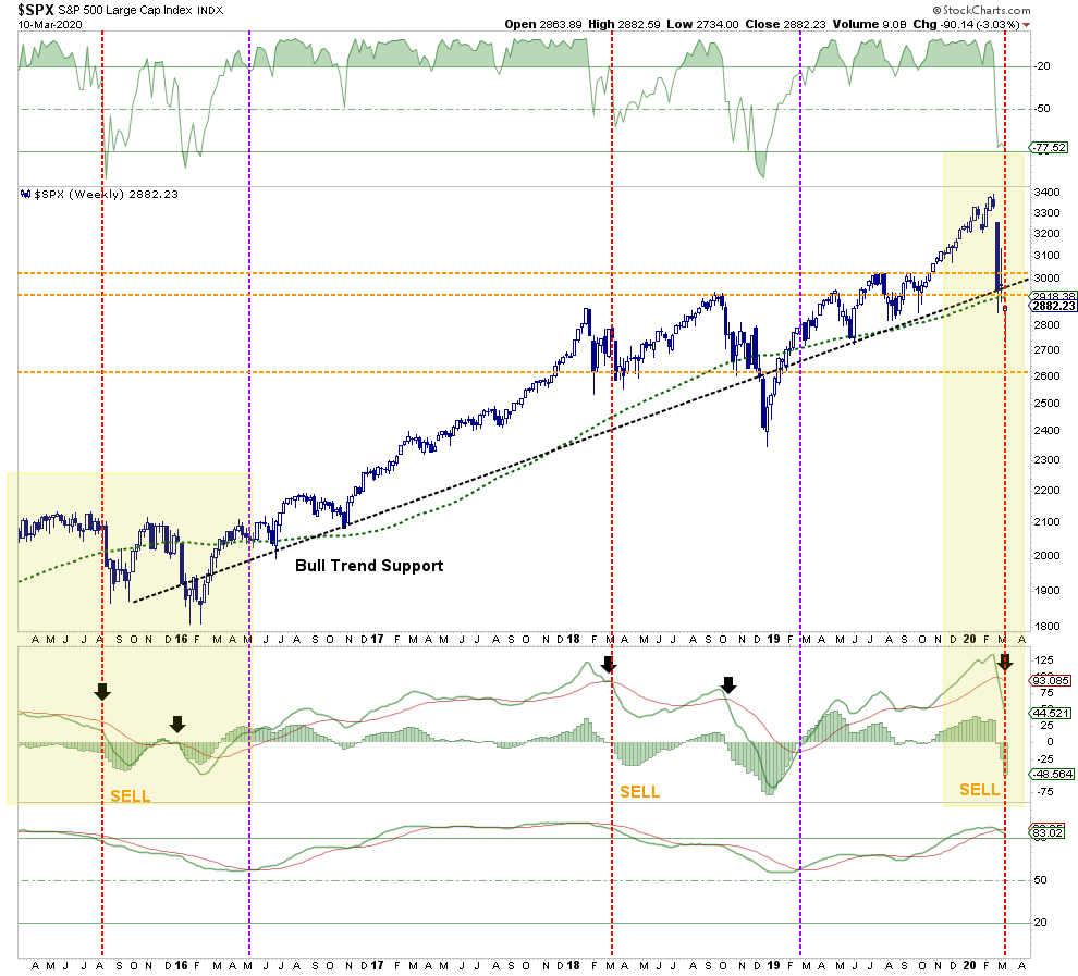
Has A Bear Market Started?
On a weekly basis, the rising trend from the 2016 lows is clear. The market has NOW VIOLATED that trend, which suggests a “bear market” has indeed started. This means investors should consider maintaining increased cash allocations in portfolios currently. With the two longer-term sell signals, bottom panels, now triggered, it suggests that whatever rally may ensue short-term will likely most likely fail. (Also a classic sign of a bear market.)
With the market oversold on a weekly basis, a counter-trend, or “bear market” rally is likely. However, as stated, short-term rallies should be sold into, and portfolios hedged, until the correction process is complete.
With all of our longer-term weekly “sell signals” now triggered from fairly high levels, it suggests the current selloff is much like what we saw in 2015-2016. (Noted in the chart above as well.) In other words, we will see a rally, followed by a secondary failure to lower lows, before the ultimate bottom is put in. If the market fails to hold current levels, the 2018 lows are the next most likely target.
Just How Bad Can It Get?
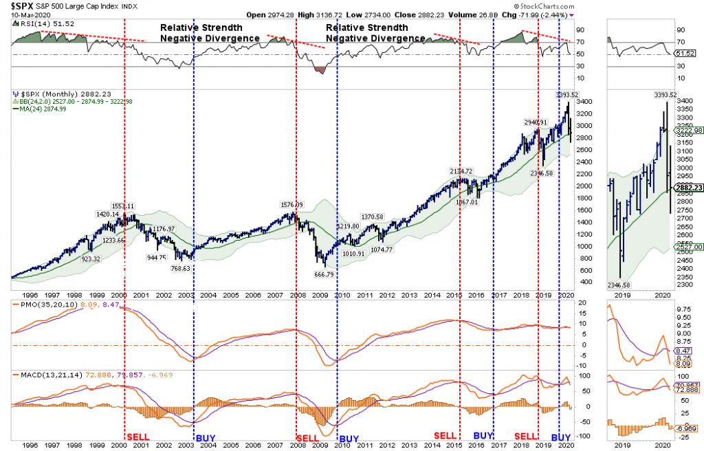
The idea of a lower bottom is also supported by the monthly data.
NOTE: Monthly Signals Are ONLY Valid At The End Of The Month.
On a monthly basis, sell signals have also been triggered, but we will have to wait until the end of the month for confirmation. However, given the depth of the decline, it would likely take a rally back to all-time highs to reverse those signals. This is a very high improbability.
Assuming the signals remain, there is an important message being sent, as noted in the top panel. The “negative divergence” of relative strength has only been seen prior to the start of the previous two bear markets, and the 2015-2016 slog. While the current sell-off resembles what we saw in late 2015, there is a risk of this developing into a recessionary bear market later this summer. The market is very close to violating the 4-year moving average, which is a “make or break” for the bull market trend from the 2009 lows.
How bad can the “bear market” get? If the 4-year moving average is violated, the 2018 lows become an initial target, which is roughly a 30% decline from the peak. However, the 2016 lows also become a reasonable probability if a “credit event” develops in the energy market which spreads across the financial complex. Such a decline would push markets down by almost 50% from the recent peak, and not unlike what we saw during the previous two recessions.
Caution is advised.
What We Are Thinking
Since January, we have been regularly discussing taking profits in positions, rebalancing portfolio risks, and, most recently, moving out of areas subject to slower economic growth, supply-chain shutdowns, and the collapse in energy prices. This led us to eliminate all holdings in international, emerging markets, small-cap, mid-cap, financials, transportation, industrials, materials, and energy markets.(RIAPRO Subscribers were notified real-time of changes to our portfolios.)
While there is “some truth” to the statement “that no one” could have seen the fallout of the “coronavirus” being escalated by an “oil price” war, there has been mounting risks for quite some time from valuations, to price deviations, and a complete disregard of risk by investors. While we have been discussing these issues with you, and making you aware of the risks, it was often deemed as “just being bearish” in the midst of a “bullish rally.”However, it is managing these types of risks, which is ultimately what clients pay advisors for.
It isn’t a perfect science. In times like these, it gets downright messy. But this is where working to preserve capital and limit drawdowns becomes most important. Not just from reducing the recovery time back to breakeven, but in also reducing the “psychological stress” which leads individuals to make poor investment decisions over time.
Given the extreme oversold and deviated measures of current market prices, we are looking for a reflexive rally that we can further reduce risk into, add hedges, and stabilize portfolios for the duration of the correction. When it is clear, the correction, or worse a bear market, is complete, we will reallocate capital back to equities at better risk/reward measures.
We highly suspect that we have seen the highs for the year. Most likely,,we are moving into an environment where portfolio management will be more tactical in nature, versus buying and holding. In other words, it is quite probable that “passive investing” will give way to “active management.”
Given we are longer-term investors, we like the companies we own from a fundamental perspective and will continue to take profits and resize positions as we adjust market exposure accordingly. The biggest challenge coming is what to do with our bond exposures now that rates have gotten so low OUTSIDE of a recession.
But that is an article for another day.
As we have often stated, “risk happens fast.”
Special Report: S&P 500 – Bounce Or Bull Market
Headlines from the past two days:
Dow sinks 2,000 points in worst day since 2008, S&P 500 drops more than 7%
Dow rallies more than 1,100 points in a wild session, halves losses from Monday’s sell-off
Actually its been a heck of a couple of weeks for the market with daily point swings running 1000, or more, points in either direction.
However, given Tuesday’s huge rally, is the market’s recent rout over with the bulls set to take charge? Or is this just a reflexive rally, with a retest of lows set to come?
Let’s take a look at charts to see what we can determine.
Daily
On a daily basis, the market is back to oversold. Historically, this condition has been sufficient for a bounce. Given that the oversold condition (top panel) is combined with a very deep “sell signal” in the bottom panel, it suggested a fairly vicious reflexive rally was likely. The question, of course is how far could this rally go.
Looking at the chart above, it is quite possible we could well see a rally back to the 32.8%, or even the 50% retracement level which is where the 200-dma currently resides. A rally to that level will likely reverse much of the current oversold condition and set the market up for a retest of the lows.
This idea of a stronger reflexive rally is also supported by the deep deviation from the 200-dma. If we rework the analysis a bit, the 3-standard deviation discussed previously has now reverted to 2-standard deviations below the 200-dma. The market found support there, and with the deep oversold condition it again suggests a rally to the 200-dma is likely.
Given that rally could be sharp, it will likely be a good opportunity to reduce risk as the impact from the collapse in oil prices and the shutdown of the global supply chain has not been fully factored in as of yet.
The following chart is a longer-term analysis of the market and is the format we use for “onboarding” our clients into their allocation models. (Vertical black lines are buy periods)
The triggering of the “sell signals” suggests we are likely in a larger correction process. With the “bull trend” line now broken, a rally back to toward the 200-dma, which is coincident with the bull trend line, will likely be an area to take profits and reduce risk accordingly.
The analysis becomes more concerning as we view other time frames.
Weekly
On a weekly basis, the rising trend from the 2016 lows is clear. The market has NOW VIOLATED that trend, which suggests maintaining some allocation to cash in portfolios currently. With the two longer-term sell signals, bottom panels, now triggered, it suggests that whatever rally may ensue short-term will likely fail.
The market is getting oversold on a weekly basis which does suggest a counter-trend rally is likely. However, as stated, short-term rallies should likely be sold into, and portfolios hedged, until the correction process is complete.
With all of our longer-term weekly “sell signals” now triggered from fairly high levels, it suggests the current selloff is much like what we saw in 2015-2016. (Noted in chart above as well.) In other words, we will see a rally, a failure to lower lows, before the ultimate bottom is put in.
Monthly
The idea of a lower bottom is also supported by the monthly data.
On a monthly basis, sell signals have also been triggered. HOWEVER, these signals must remain through the end of the month to be valid. These monthly signals are “important,” and one of the biggest concerns, as noted in the top panel, is the “negative divergence” of relative strength which was only seen prior to the start of the previous two bear markets, and the 2015-2016 slog. Again, the current sell-off resembles what we saw in late 2015, but there is a risk of this developing into a recessionary bear market later this summer. Caution is advised.
What We Are Thinking
Since January we have been taking profits in positions, rebalancing portfolio risks, and recently moving out of areas subject to slower economic growth, a supply-chain shut down, and the collapse in energy prices. (We have no holdings in international, emerging markets, small-cap, mid-cap, financial or energy currently.)
We are looking for a rally that can hold for more than one day to add some trading exposure for a move back to initial resistance levels where we will once again remove those trades and add short-hedges to the portfolio.
We highly suspect that we have seen the highs for the year, so we will likely move more into a trading environment in portfolios to add some returns while we maintain our longer-term holdings and hedges.
Given we are longer-term investors, we like the companies we own from a fundamental perspective and will continue to take profits and resize positions as we adjust market exposure accordingly. The biggest challenge coming is what to do with our bond exposures now that rates have gotten so low OUTSIDE of a recession.
We will keep you updated accordingly.
Quick Take: Recession Risks Tick Up
Over the last couple of months, there was a slight uptick in the economic data, which lifted hopes that a “global reflation” event was underway.
As we have been warning for the last couple of months in our weekly newsletter, the ongoing collapse in commodity prices suggested a problem was emerging that trailing “sentiment” data was clearly overlooking. To wit:
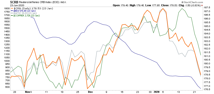
“There are a few indicators which, by their very nature, should be signaling a surge in economic activity if there was indeed going to be one. Copper, energy prices, commodities in general, and the Baltic Dry index, should all be rising if economic activity is indeed beginning to recover.
Not surprisingly, as the “trade deal” was agreed to, we DID see a pickup in commodity prices, which was reflected in the stronger economic reports as of late. However, while the media is crowing that “reflation is on the horizon,” the commodity complex is suggesting that whatever bump there was from the “trade deal,” is now over.”
Importantly, that decline happened BEFORE the “Coronavirus,” which suggests the virus will only worsen the potential impact.
I want to reiterate an important point.
The risk to the market, and the economy, is not “sick people.” It is the shutdown of the global supply chain.
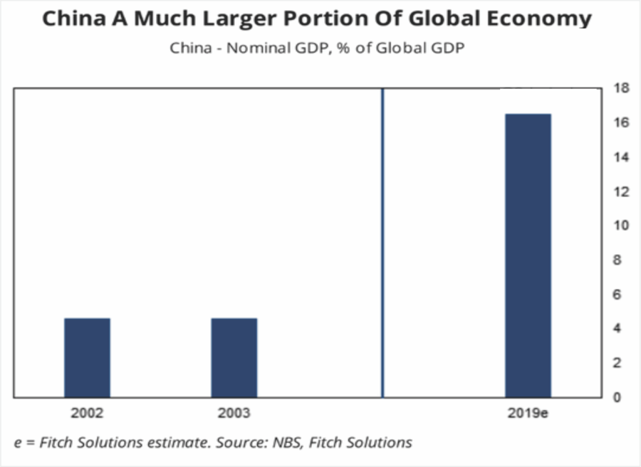
China is a substantially larger portion, and economically more important, than it was in 2003 when SARS hit. As noted by Johnson & Palmer of Foreign Policy:
“China itself is a much more crucial player in the global economy than it was at the time of SARS, or severe acute respiratory syndrome, in 2003. It occupies a central place in many supply chains used by other manufacturing countries—including pharmaceuticals, with China home to 13 percent of facilities that make ingredients for U.S. drugs—and is a voracious buyer of raw materials and other commodities, including oil, natural gas, and soybeans. That means that any economic hiccups for China this year—coming on the heels of its worst economic performance in 30 years—will have a bigger impact on the rest of the world than during past crises.
That is particularly true given the epicenter of the outbreak: Wuhan, which is now under effective quarantine, is a riverine and rail transportation hub that is a key node in shipping bulky commodities between China’s coast and its interior.
But it isn’t just China. It is also hitting two other economically important countries: Japan and South Korea, which will further stall exports and imports to the U.S.
Given that U.S. exporters have already been under pressure from the impact of the “trade war,” the current outbreak could lead to further deterioration of exports to and from China, South Korea, and Japan. This is not inconsequential as exports make up about 40% of corporate profits in the U.S. With economic growth already struggling to maintain 2% growth currently, the virus could shave between 1-1.5% off that number.
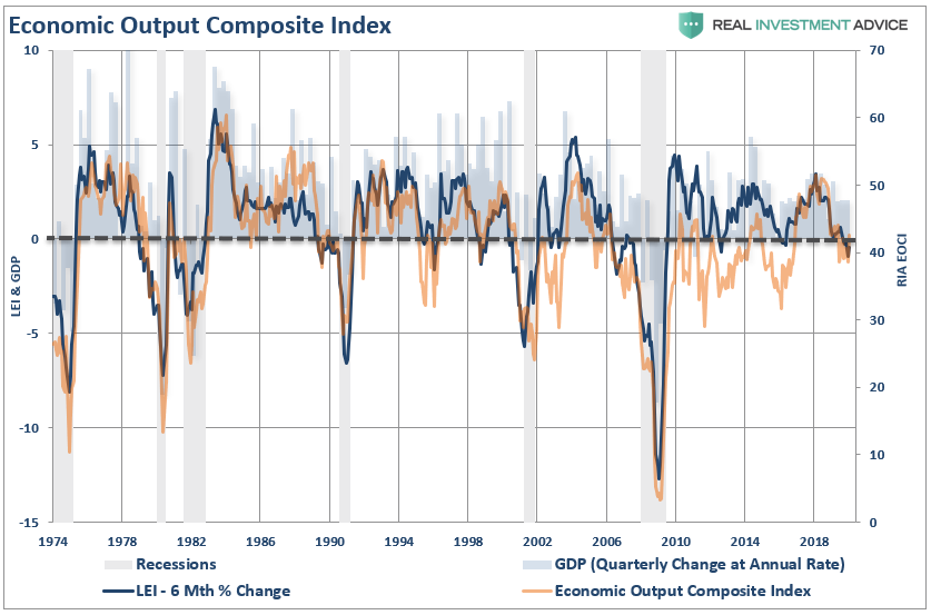
With our Economic Output Composite Indicator (EOCI) already at levels which has previously denoted recessions, the “timing” of the virus could have more serious consequences than currently expected by overzealous market investors.
(The EOCI is comprised of the Fed Regional Surveys, CFNAI, Chicago PMI, NFIB, LEI, and ISM Composites. The indicator is a broad measure of hard and soft data of the U.S. economy)
Given the current level of the index as compared to the 6-Month rate of change of the Leading Economic Index, there is a rising risk of a recessionary drag within the next 6-months.
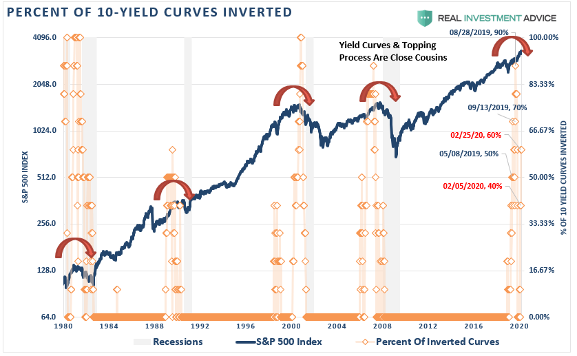
This is what the collapsing yield curve is already confirming as the 10-year plunged to the lowest levels on record. Currently, 60% of the yields we track have now inverted.
Outside of the indicators we track, Eric Hickman previously made similar observations:
“The long history (49+ years) of these indicators can be used to get a sense of timing for when a recession may begin. I have measured historically how long these indicators signaled before (or after) the start of their accompanying recession. Comparing this time-frame to when these indicators triggered recently, suggests a range for when this recession may come. The chart below shows the time ranges (minimum amount of time historically to maximum amount of time historically) in which each indicator would suggest a recession start.”
“There are a few conclusions to this. First, five recession indicators have signaled. Second, there is nothing unusual in the timing that the recession hasn’t started yet. Third, no matter which of the five indicators you use, a recession will likely begin in 2020 and the average center-point of the indicators is in March, just a little over two months away. Don’t confuse the Fed’s ‘on-hold’ stance to have any more meaning than the hope that the consumer and labor market’s strength will continue. History suggests that this is not a good bet to make.”
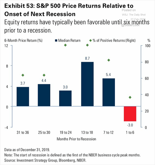
The problem with most of the current analysis, which suggests a “no recession” scenario, is based heavily on lagging economic data which is highly subject to negative revisions. The stock market, however, is a strong leading indicator of investor expectations of growth over the next 12-months. Historically, stock market returns are typically favorable until about 6-months prior to the start of a recession.
The compilation of the data all suggests the risk of recession is markedly higher than what the media currently suggests. Yields and commodities are suggesting something quite different.
Special Report: S&P 500 Plunges On Coronavirus Impact
Dow plunges 1,000 points on coronavirus fears, 3.5% drop is worst in two years
“Stocks fell sharply on Monday as the number of coronavirus cases outside China surged, stoking fears of a prolonged global economic slowdown from the virus spreading.“ – CNBC
According to CNBC’s logic, the economy was perfectly fine on Friday, even though the market sold off then as well. However, over the weekend, stocks are plunging because the virus is now important?
No, this has been a correction in the making for the past several weeks that we have been discussing in our weekly market updates. Here was whatwe posted yesterday morning:
As noted last week: “With the market now trading 12% above its 200-dma, and well into 3-standard deviations of the mean, a correction is coming.” That correction started last Friday.
Currently, there is a strong bias to “buy the dip” of every corrective action. We recognize this and given the S&P 500 hit initial support on Friday we did add 1/2 position of VOOG to the Dynamic Model. The model is underallocated to equities and has a short hedge so we are taking this opportunity to add slowly. However, we suspect there is more to this corrective action to come this week.
As noted previously, extensions to this degree rarely last long without a correction. There is more work to be done before the overbought and extended condition is corrected. We will look to add to our holdings during that process.
While the correction occurred all in one day, which wasn’t our preference, it nonetheless set the markets up for a short-term bounce. We highly suggest using that bounce to rebalance portfolio risks accordingly.
Daily
On a daily basis, the market is back to oversold. Historically, this condition has been sufficient for a bounce. The difference, however, is the current oversold condition (top panel) is combined with a “sell signal” in the bottom panel. This suggests that any rally in the markets over the next few days should be used to reduce equity risk, raise cash, and add hedges.
If we rework the analysis a bit, the 3-standard deviation discussed previously is in the correction process. However, with the break of the 50-dma, uptrend channel, and triggering a short-term sell signal, the 200-dma comes into focus as important support.
As with the chart above, the market is oversold on a short-term basis, and a rally from current support back to the 50-dma is quite likely.
Again, that rally should be used to reduce risk.
The following chart is a longer-term analysis of the market and is the format we use for “onboarding” our clients into their allocation models. (Vertical black lines are buy periods)
Notice that while the market has been rising since early 2016, the momentum indicators are extremely stretched. Historically, such divergences result in markedly lower asset prices. In the short-term, as noted above, the market remains confined to a rising trend which is denoted by the trend channel. At this juncture, the market has not violated any major support points and does not currently warrant a drastically lower exposure to risk. However, if the “sell signals” are triggered, it will suggest a larger “reduction” of risk.
The analysis becomes more concerning as view other time frames.
Weekly
On a weekly basis, the rising trend from the 2016 lows is clear. The market has not violated that trend currently, which suggests maintaining some allocation to equity risk in portfolios currently. However, the two longer-term sell signals, bottom panels, are closing. If they both confirm, it will suggest a more significant correction process is forming.
The market is still very overbought on a weekly basis which confirms the analysis above that short-term rallies should likely be sold into, and portfolios hedged, until the correction process is complete.
Monthly
On a monthly basis, the bulls remain in control currently, which keeps our portfolios primarily allocated to equity risk. As we have noted previously, the market had triggered a “buy” signal in October of last year as the Fed “repo” operations went into overdrive. These monthly signals are “important,” but it won’t take a tremendous decline to reverse those signals. It’s okay to remain optimistic short-term, just don’t be complacent.
Don’t Panic Sell
The purpose of the analysis above is to provide you with the information to make educated guesses about the “probabilities” versus the “possibilities” of what could occur in the markets over the months ahead.
It is absolutely “possible” the markets could find a reason to rally back to all-time highs and continue the bullish trend. (For us, such would be the easiest and best outcome.)
However, the analysis currently suggests the risks currently outweigh potential reward and a deeper correction is the most “probable” at this juncture.
Don’t take that statement lightly.
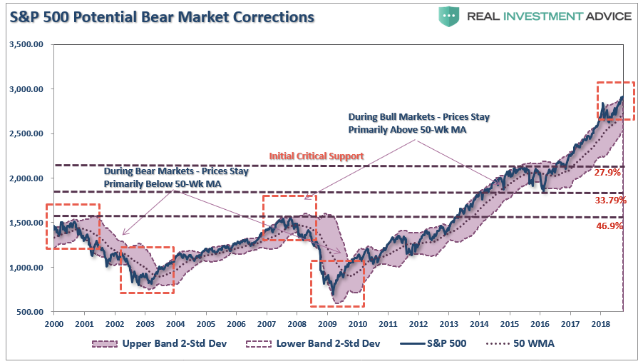
I am suggesting reducing risk opportunistically, and being pragmatic about your portfolio, and your money. Another 50% correction is absolutely possible, as shown in the chart below.
(The chart shows ever previous major correction from similar overbought conditions on a quarterly basis. A similar correction would currently entail a 58.2% decline.)
So, what should you be doing now. Here are our rules that we will be following on the next rally.
Move slowly. There is no rush in adding equity exposure to your portfolio. Use pullbacks to previous support levels to make adjustments.
If you are heavily UNDER-weight equities, DO NOT try and fully adjust your portfolio to your target allocation in one move. This could be disastrous if the market reverses sharply in the short term. Again, move slowly.
Begin by selling laggards and losers. These positions are dragging on performance as the market rises and tends to lead when markets fall. Like “weeds choking a garden,” pull them.
Add to sectors, or positions, that are performing with, or outperforming the broader market.
Move “stop-loss” levels up to current breakout levels for each position. Managing a portfolio without “stop-loss” levels is like driving with your eyes closed.
While the technical trends are intact, risk considerably outweighs the reward. If you are not comfortable with potentially having to sell at a LOSS what you just bought, then wait for a larger correction to add exposure more safely. There is no harm in waiting for the “fat pitch” as the current market setup is not one.
If none of this makes any sense to you – please consider hiring someone to manage your portfolio for you. It will be worth the additional expense over the long term.
While we remain optimistic about the markets currently, we are also taking precautionary steps of tightening up stops, adding non-correlated assets, raising some cash, and looking to hedge risk opportunistically.
Everyone approaches money management differently. This is just our approach to the process of controlling risk.
We hope you find something useful in it.
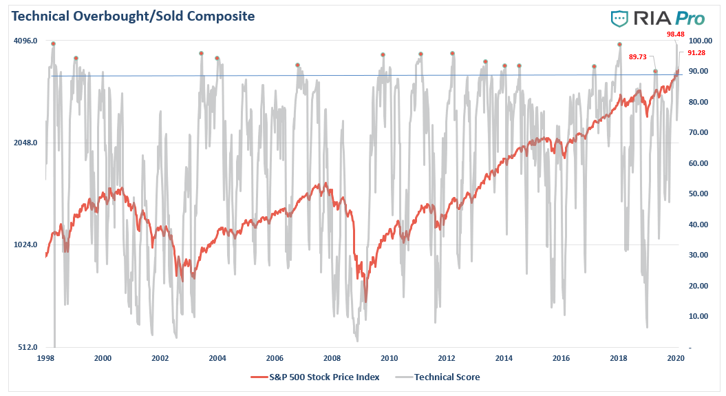
Technically Speaking: COT Positioning – Risk Of Correction Still High (Q1-2020)
As discussed in thispast weekend’s newsletter,the market remains overly extended as the recent correction sharply reversed on expectations for more Fed liquidity. However, with the market extremely deviated from the long-term moving average, a correction is once again a high probability event.
“Previously, we discussed that we had taken profits out of portfolios as we were expecting between a 3-5% correction to allow for a better entry point to add equity exposure. While the “virus correction” did encompass a correction of 3%, it was too shallow to reverse the rather extreme extension of the market. The rally this past week has reversed the corrective process, and returned the markets to 3-standard deviations above the 200-dma. Furthermore, all daily, weekly, and monthly conditions have returned to more extreme overbought levels as well.”
But it isn’t just the more extreme advance of the market over the past 5-weeks which has us a bit concerned in the short-term, but a series of other indications which typically suggest short- to intermediate-terms corrections in the market.
Furthermore, the markets are completely entirely the impact the “coronavirus” will have on the supply-chain globally. As David Rosenberg noted Monday:
“The impact of this virus is lasting longer and the effects, relative to SARS, are larger at a time when the Chinese economy is far softer. The follow-on effects on other markets has yet to be fully appreciated.”
Had the markets completed a correction that reduced the extreme overbought and extended conditions of the market, such would have offset the risk of the “viral impact” to the economy. However, without that correction, the eventual slowdown will likely have a great impact than is currently anticipated.
However, even if we set aside investor sentiment and positioning for a moment, the rapid reversion is price has sent our technical composite overbought/oversold gauge back towards more extreme levels of overbought conditions.(Get this chart every week at RIAPRO.NET)
What we know is that markets move based on sentiment and positioning. This makes sense considering that prices are affected by the actions of both buyers and sellers at any given time. Most importantly, when prices, or positioning, becomes too “one-sided,” a reversion always occurs. As Bob Farrell’s Rule #9 states:
“When all experts agree, something else is bound to happen.”
So, how are traders positioning themselves currently?
Positioning Review
The COT (Commitment Of Traders) data, which is exceptionally important, is the sole source of the actual holdings of the three key commodity-trading groups, namely:
Commercial Traders: this group consists of traders that use futures contracts for hedging purposes and whose positions exceed the reporting levels of the CFTC. These traders are usually involved with the production and/or processing of the underlying commodity.
Non-Commercial Traders: this group consists of traders that don’t use futures contracts for hedging and whose positions exceed the CFTC reporting levels. They are typically large traders such as clearinghouses, futures commission merchants, foreign brokers, etc.
Small Traders: the positions of these traders do not exceed the CFTC reporting levels, and as the name implies, these are usually small traders.
The data we are interested in is the second group of Non-Commercial Traders.
This is the group that speculates on where they believe the market is headed. While you would expect these individuals to be “smarter” than retail investors, we find they are just as subject to “human fallacy” and “herd mentality” as everyone else.
Therefore, as shown in the series of charts below, we can take a look at their current net positioning (long contracts minus short contracts) to gauge excessive bullishness or bearishness.
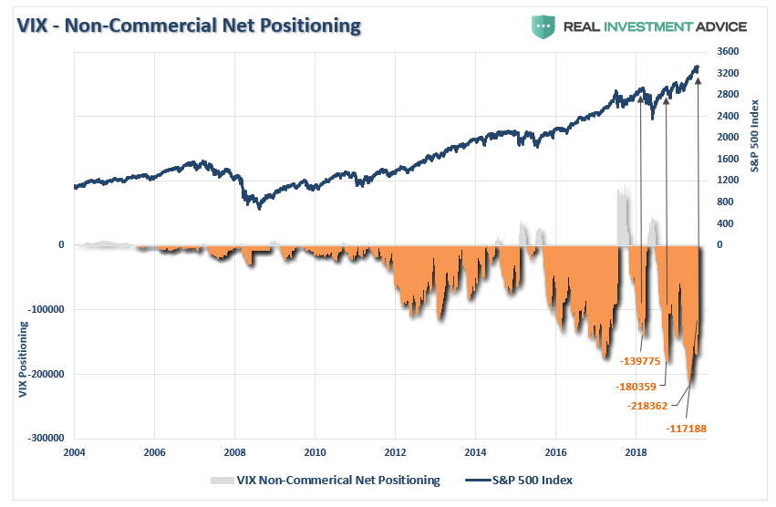
Volatility
The extreme net-short positioning on the volatility before to the correction last week, had suggested the correction was coming. However, while the correction reduced the net-short positioning somewhat, it remains at historical extremes. What the more extreme positioning tells us is there is plenty of “fuel” to drive a correction when one occurs.
Investors have gotten used to extremely low levels of volatility, which is unique to this market cycle. This complacency, due to low volatility, has encouraged investors to take on greater levels of risk than they currently realize. When volatility eventually makes it return, the consequences to investors will not be kind.
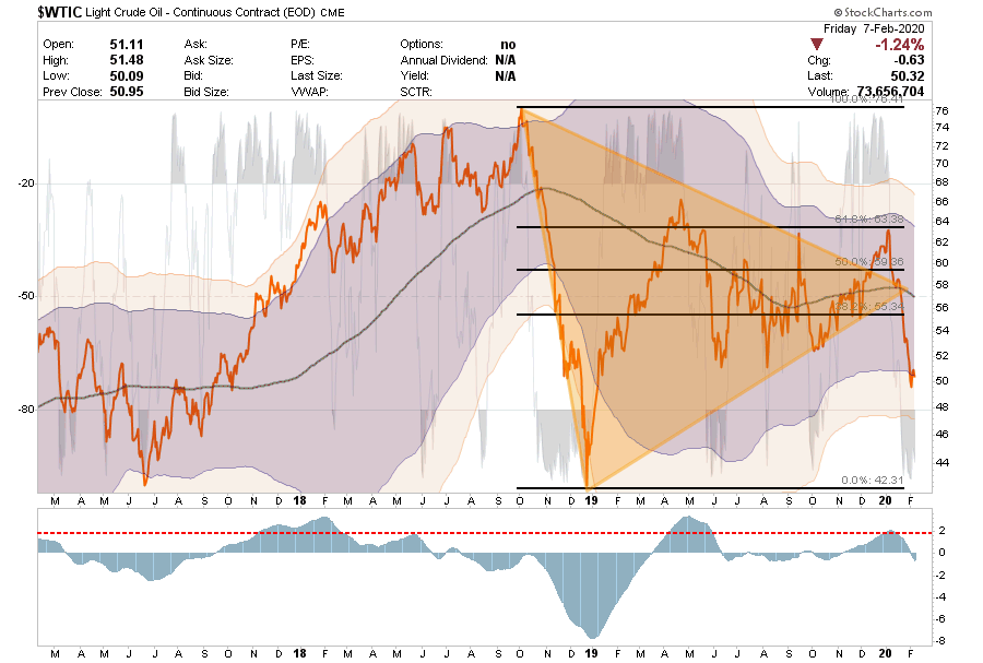
Crude Oil Extreme
The recent attempt by crude oil to get back above the 200-dma coincided with the Fed’s initiation of QE-4. Historically, these liquidity programs tend to benefit highly speculative positions like commodities, as liquidity seeks the highest rate of return.
However, beginning in December, that support for oil prices gave way, and prices have collapsed along with expectations for global economic recovery. We have been warning our RIAPro Subcribers (30-Day Risk Free Trial)for the last couple of months about the potential for this decline.
As noted previously, “Oil completely broke down last week, and collapsed below all of the important levels. Oil is now testing critical support at $51. A failure there and a break into the low $40’s is probable.”
The support is barely holding and oil looks extremely weak. However, oil is extremely oversold so a counter-trend rally is highly likely and can be used to “sell” into.
Stops Triggered for any direct crude oil positions.
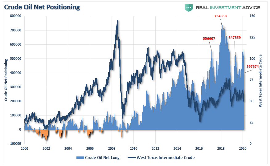
Long-Term Positioning: Bearish
Despite the decline in oil prices over the last year, it is worth noting that crude oil positioning is still on the bullish side with 397,000 net long contracts.
The inherent problem with this is that if crude oil breaks below $48/bbl, those long contracts will start to get liquidated which will likely push oil back into the low 40’s very quickly. The decline in oil is both deflationary and increases the risk of an economic recession.
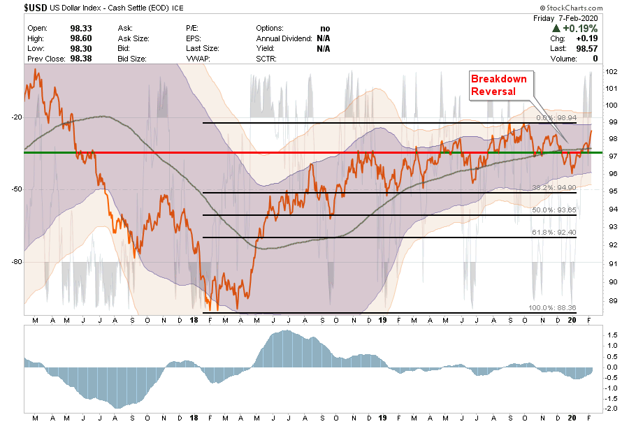
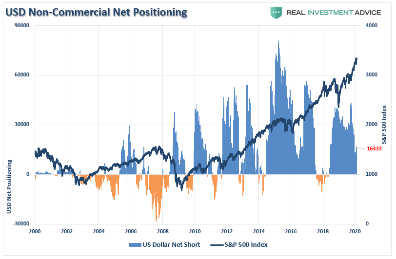
U.S. Dollar Extreme
Another index we track each week at RIAPRO.NETis the U.S. Dollar.
As noted previously: “The dollar has rallied back to that all-important previous support line. IF the dollar can break back above that level, and hold, then commodities, and oil, will likely struggle.
That is exactly what happened over the last two weeks. The dollar has strengthened that rally as concerns over the “coronavirus” persist. With the dollar close to testing previous highs, a break above that resistance could result in a sharp move higher for the dollar.
The rising dollar is not bullish for Oil, commodities or international exposures.
The “sell” signal has began to reverse. Pay attention.
Much of the bulls rallying cry has been based on the dollar weakening with the onset of QE, but as shown above, that has yet to be the case. However, it is worth noting that positioning in the US Dollar has been weakening. Historically, these reversals are markets of more important peaks in the market and subsequent corrections.
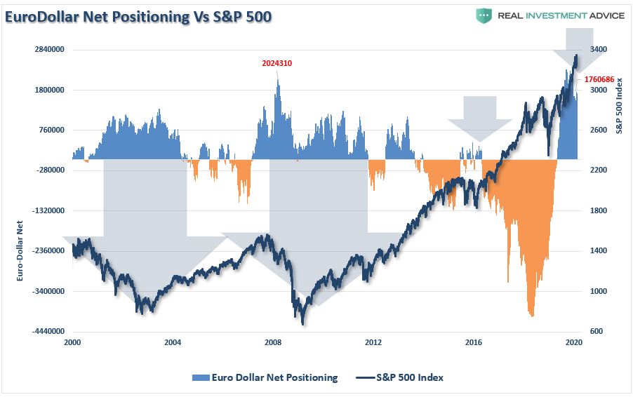
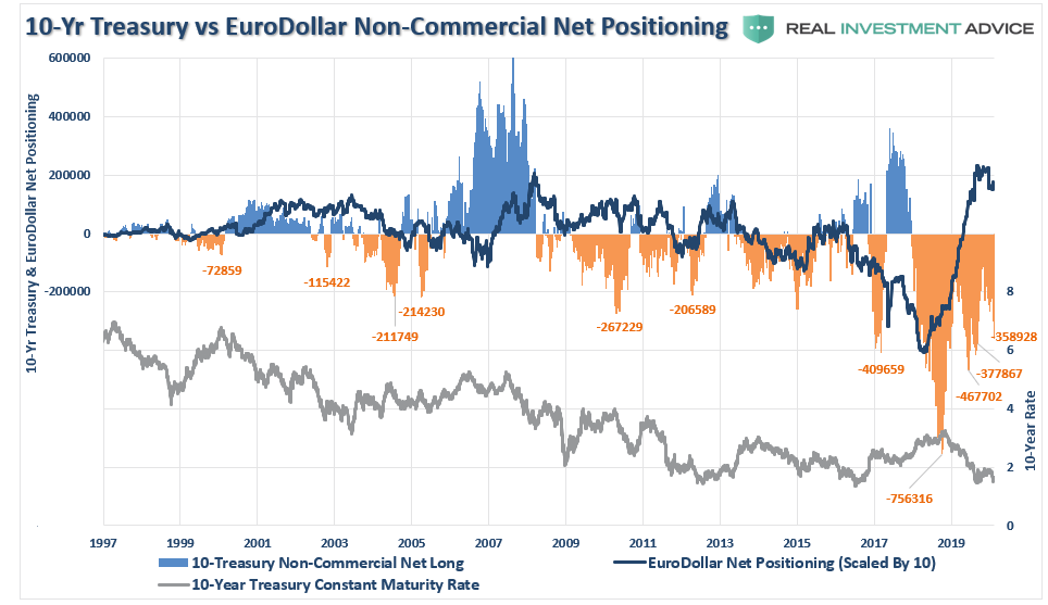
It is also worth watching the net-short positioning the Euro-dollar as well. Historically, when positioning in the Eurodollar becomes NET-LONG, as it is currently, such has been associated with short- to intermediate corrections in the markets, including outright bear markets.
Net-long Eurodollar positioning has recently started to reverse from an all-time record. While the market hasn’t corrected as of yet, if foreign banks begin to extract dollar-denominated assets to a large degree, the risk to the market rises sharply.
Interest Rate Extreme
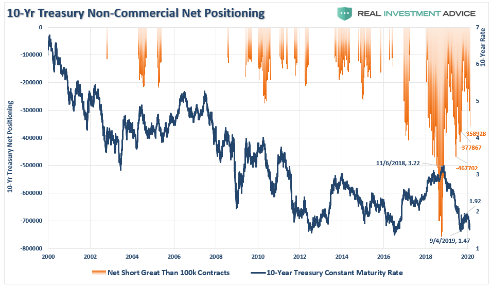
One of the biggest conundrums for the financial market “experts” is why interest rates fail to rise. In March of last year, I wrote“The Bond Bull Market” which was a follow up to our earlier call for a sharp drop in rates as the economy slowed. That call was based on the extreme “net-short positioning” in bonds which suggested a counter-trend rally was likely.
Since then, rates fell back to some of the lowest levels in 10-years as economic growth continues to slow, both domestically and globally. Importantly, while the Federal Reserve turned back on the “liquidity pumps” last October, juicing markets to all-time highs, bonds have continued to attract money for “safety” over “risk.”
Not surprisingly, despite much commentary to the contrary, the number of contracts “net-short” the 10-year Treasury remains at some of the highest historical readings.
Importantly, even while the “net-short” positioning on bonds has been reversed, rates have failed to rise correspondingly. The reason for this is due to the near-record levels of Eurodollar positioning, as noted above.
This suggests a high probability rates will fall further in the months ahead. This will most likely occur in concert with further deterioration in economic growth as the impact of the “coronavirus” is realized.
Amazingly, investors seem to be residing in a world without any perceived risks and a strong belief that financial markets can only rise further. The arguments supporting those beliefs are based on comparisons to previous peak market cycles. Unfortunately, investors tend to be wrong at market peaks and bottoms.
The inherent problem with much of the mainstream analysis is that it assumes everything remains status quo. However, such never tends to be the case for long.
“Oil prices down 20% is not a good thing, even if it means lower gasoline prices. This is swamped by the negative implications for capital spending and employment in the key oil-producing regions of the U.S. Copper prices have dropped 11% in just the past two weeks and just above a three-year low, and this is a global macro barometer. Money flowing into bond funds, the lagging performance in the high-yield market, the slump in commodity markets and the weakness, both relative and absolute, in the Russell 2000 small-cap index, surely cannot be making the economic growth bulls feeling too comfortable right now..” – David Rosenberg
We agree.
With retail positioning very long-biased, the implementation of QE4 has once again removed all “fears” of a correction, a recession, and a bear market, which existed just this past summer. Historically, such sentiment excesses form around short-term market peaks.
This is a excellent time to remind you of the other famous “Bob Farrell Rule” to remember:
“#5 – The public buys the most at the top and the least at the bottom.”
What investors miss is that while a warning doesn’t immediately translate into a negative consequence, such doesn’t mean you should not pay attention to it.
It is akin to constantly running red lights and never getting into an accident. We begin to think we are skilled at running red lights, rather than just being lucky.
Eventually, your luck will run out.
Pay attention, have a plan, and act accordingly.
Economic Theories & Debt Driven Realities
One of the most highly debated topics over the past few months has been the rise of Modern Monetary Theory (MMT). The economic theory has been around for quite some time but was shoved into prominence recently by Congressional Representative Alexandria Ocasio-Cortez’s “New Green Deal” which is heavily dependent on massive levels of Government funding.
There is much debate on both sides of the argument but, as is the case with all economic theories, supporters tend to latch onto the ideas they like, ignore the parts they don’t, and aggressively attack those who disagree with them. However, what we should all want is a robust set of fiscal and monetary policies which drive long-term economic prosperity for all.
Here is the problem with all economic theories – they sound great in theory, but in practice, it has been a vastly different outcome. For example, when it comes to deficits, John Maynard Keynes contended that:
“A general glut would occur when aggregate demand for goods was insufficient, leading to an economic downturn resulting in losses of potential output due to unnecessarily high unemployment, which results from the defensive (or reactive) decisions of the producers.”
In other words, when there is a lack of demand from consumers due to high unemployment, then the contraction in demand would force producers to take defensive actions to reduce output. Such a confluence of actions would lead to a recession.
In such a situation, Keynesian economics states that government policies could be used to increase aggregate demand, thus increasing economic activity and reducing unemployment and deflation. Investment by government injects income, which results in more spending in the general economy, which in turn stimulates more production and investment involving still more income and spending and so forth. The initial stimulation starts a cascade of events, whose total increase in economic activity is a multiple of the original investment.
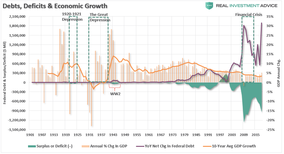
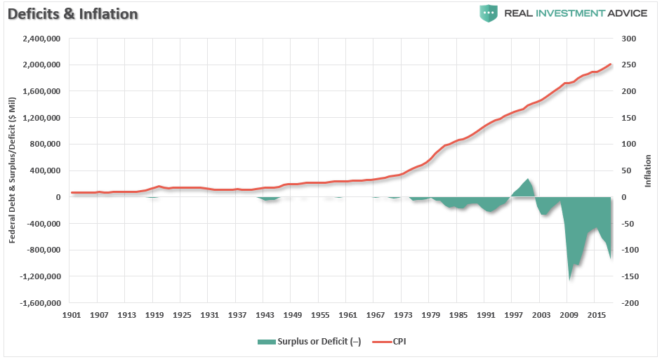
Unfortunately, as shown below, economists, politicians, and the Federal Reserve have simply ignored the other part of the theory which states that when economic activity returns to normal, the Government should return to a surplus. Instead, the general thesis has been:
“If a little deficit is good, a bigger one should be better.”
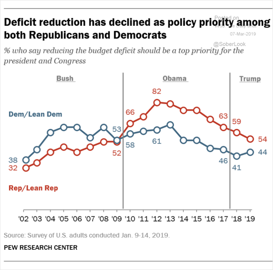
As shown, politicians have given up be concerned with deficit reduction in exchange for the ability to spend without constraint.
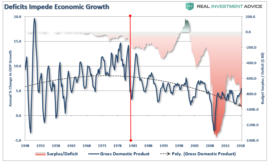
However, as shown below, the theory of continued deficit spending has failed to produce a rising trend of economic growth.
When it comes to MMT, once again we see supporters grasping onto the aspects of the theory they like and ignoring the rest. The part they “like” sounds a whole lot like a “Turbotax” commercial:
The part they don’t like is:
“The only constraint on MMT is inflation.”
That constraint would come as, the theory purports, full employment causes inflationary pressures to rise. Obviously, at that point, the government could/would reduce its support as the economy would theoretically be self-sustaining.
However, as we questioned previously, the biggest issue is HOW EXACTLY do we measure inflation?
This is important because IF inflation is the ONLY constraint on debt issuance and deficits, then an accurate measure of inflation, by extension, is THE MOST critical requirement of the theory.
In other words:
“Where is the point where the policy must be reversed BEFORE you cause serious, and potentially irreversible, negative economic consequences?”
This is the part supporters dislike as it imposes a “limit” on spending whereas the idea of unconstrained debt issuance is far more attractive.
Again, there is no evidence that increasing debts or deficits, inflation or not, leads to stronger economic growth.
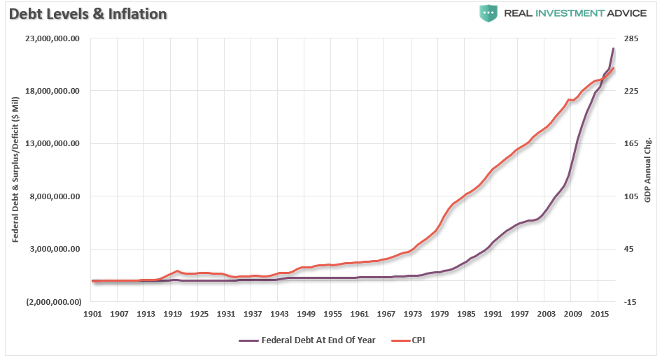
However, there is plenty of evidence which shows that rising debts and deficits lead to price inflation. (The chart below uses the consumer price index (CPI) which has been repeatedly manipulated and adjusted since the late 90’s to suppress the real rate of inflationary pressures in the economy. The actual rate of inflation adjusted for a basket of goods on an annual basis is significantly higher.)
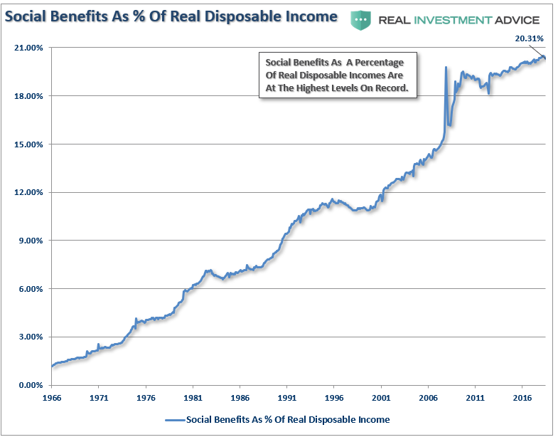
Of course, given the Government has already been running a “quasi-MMT” program for the last 30-years, the real impact has been a continued shift of dependency on the Government anyway. Currently, one-in-four households in the U.S. have some dependency on government subsidies with social benefits as a percentage of real disposable income at record highs.
If $22 trillion in debt, and a deficit approaching $1 trillion, can cause a 20% dependency on government support, just imagine the dependency that could be created at $40 trillion?
If the goal of economic policy is to create stronger rates of economic growth, then any policy which uses debt to solve a debt problem is most likely NOT the right answer.
This is why proponents of Austrian economics suggest trying something different – less debt. Austrian economics suggests that a sustained period of low interest rates and excessive credit creation results in a volatile and unstable imbalance between saving and investment. In other words, low interest rates tend to stimulate borrowing from the banking system which in turn leads, as one would expect, to the expansion of credit. This expansion of credit then creates an expansion of the supply of money.
Therefore, as one would ultimately expect, the credit-sourced boom becomes unsustainable as artificially stimulated borrowing seeks out diminishing investment opportunities. Finally, the credit-sourced boom results in widespread malinvestments. When the exponential credit creation can no longer be sustained a “credit contraction” occurs which ultimately shrinks the money supply and the markets finally “clear” which causes resources to be reallocated back towards more efficient uses.
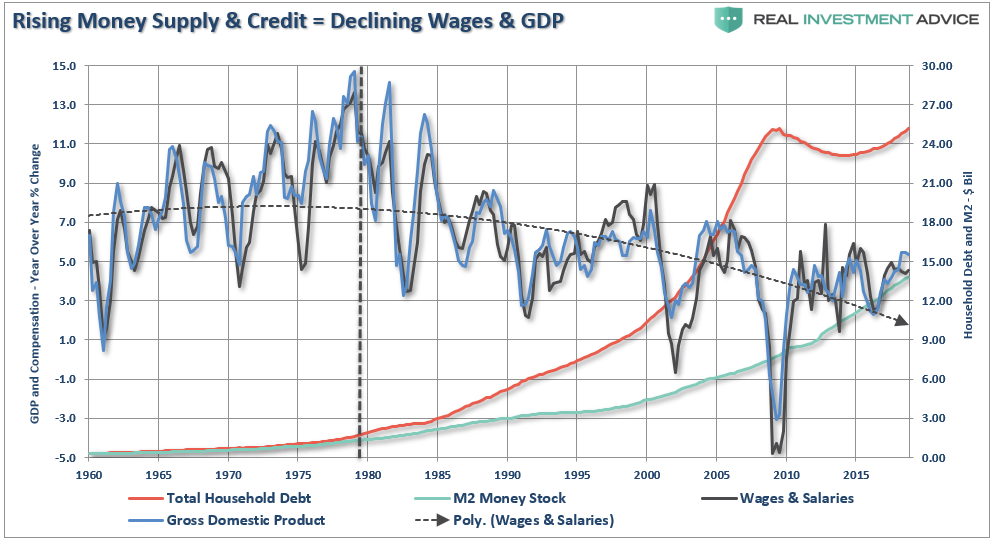
Time To Wake Up
For the last 30 years, each Administration, along with the Federal Reserve, have continued to operate under Keynesian monetary and fiscal policies believing the model worked. The reality, however, has been most of the aggregate growth in the economy has been financed by deficit spending, credit expansion and a reduction in savings. In turn, the reduction of productive investment into the economy has led to slowing output. As the economy slowed and wages fell the consumer was forced to take on more leverage which also decreased savings. As a result of the increased leverage, more of their income was needed to service the debt.
Secondly, most of the government spending programs redistribute income from workers to the unemployed. This, Keynesians argue, increases the welfare of many hurt by the recession. What their models ignore, however, is the reduced productivity that follows a shift of resources toward redistribution and away from productive investment.
In its essential framework, MMT suggests correctly that debts and deficits don’t matter as long as the money being borrowed and spent is used for productive purposes. Such means that the investments being made create a return greater than the carrying cost of the debt used to finance the projects.
Again, this is where MMT supporters go astray. Free healthcare, education, childcare, living wages, etc., are NOT a productive investments which have a return greater than the carrying cost of the debt. In actuality, history suggests these welfare supports have a negative multiplier effect in the economy.
What is most telling is the inability for the current economists, who maintain our monetary and fiscal policies, to realize the problem of trying to “cure a debt problem with more debt.”
This is why the policies that have been enacted previously have all failed, be it “cash for clunkers” to “Quantitative Easing”, because each intervention either dragged future consumption forward or stimulated asset markets. Dragging future consumption forward leaves a “void” in the future which must be continually filled, This is why creating an artificial wealth effect decreases savings which could, and should have been, used for productive investment.
The Keynesian view that “more money in people’s pockets” will drive up consumer spending, with a boost to GDP being the end result, has been clearly wrong. It hasn’t happened in 30 years.
MMT supporters have the same view that if the government hands out money it will create stronger economic growth. There is not evidence which supports such is actually the case.
It’s time for those driving both monetary and fiscal policy to wake up. The current path we are is unsustainable. The remedies being applied today is akin to using aspirin to treat cancer. Sure, it may make you feel better for the moment, but it isn’t curing the problem.
Unfortunately, the actions being taken today have been repeated throughout history as those elected into office are more concerned about “satiating the mob with bread and games” rather than suffering the short-term pain for the long-term survivability of the empire. In the end, every empire throughout history fell to its knees under the weight of debt and the debasement of their currency.
It’s time we wake up and realize that we too are on the same path.
Technically Speaking: Irrational Exuberance?
On December 5th, 1996, during a televised speech then Fed Chairman Alan Greenspan stated:
“Clearly, sustained low inflation implies less uncertainty about the future, and lower risk premiums imply higher prices of stocks and other earning assets. We can see that in the inverse relationship exhibited by price/earnings ratios and the rate of inflation in the past. But how do we know when irrational exuberancehas unduly escalated asset values, which then become subject to unexpected and prolonged contractions as they have in Japan over the past decade?”
It is an interesting point given that the U.S. has sustained very low rates of inflation combined with both monetary and fiscal stimulus which have lowered risk premiums leading to an inflation of asset prices.
The advance has had two main storylines to support the bullish narrative.
It’s an earnings recovery story, and;
It’s all about tax cuts.
There is much to debate about the earnings recovery story. However, despite many who are suggesting this has been a ‘rational rise’ due to strong earnings growth, that is simply been the case of tax rate reductions and share-buybacks. (I only use ‘reported earnings’ which includes all the ‘bad stuff.’ Any analysis using “operating earnings” is misleading.)”
Since 2014, the stock market has risen (capital appreciation only) by 55% while reported earnings growth has risen by a total of 29% all of which is attributable to a change in the corporate tax rate. Such hardly justifies an 89.6% premium over earnings.
Of course, even reported earnings is somewhat misleading due to the heavy use of share repurchases to artificially inflate reported earnings on a per share basis. However, corporate profits BEFORE tax give us a better idea of what profits actually were since that is the amount earned before tax cuts were applied.
Here, a much different picture emerges as a 6.7% cumulative gain in profits makes it increasingly difficult to justify such a large gain in asset prices.
We can also use the data above to construct a valuation measure of the inflation-adjusted price divided by inflation-adjusted corporate profits. As with all the valuation measures we have discussed, with the P/CP (pretax) ratio at the second highest level in history, forward-return expectations should be lowered.
The reality, of course, is that investors are simply chasing asset prices higher as exuberance overtakes logic.
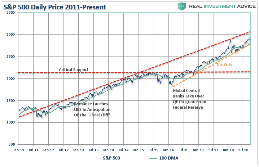
The second meme of “it’s all about tax cuts” is also not entirely accurate. The current rally, following the nearly 20% decline in early 2016 is actually an extension from the transition of “quantitative easing” from the Federal Reserve to the global Central Banks. What is clearly seen in the chart below is that as the Fed signaled the end of their QE program, and begin hiking interest rates, Global Central banks took the lead.
As I noted on Friday, that support from the major Central Banks is now reversing at a time where global economic growth has peaked and the fiscal support in the U.S. is fading.
A correction back to critical support, the 2015 peak, would entail a nearly 28% decline from current levels. More importantly, a decline of such magnitude will threaten to trigger “margin calls” which, as discussed previously, is the “time bomb” waiting to happen.
Here is the point. The “excuses” driving the rally are just that. Tax cuts and massive deficit spending by the government are fleeting supports. Given that tax reform didn’t lead to strong increases in real wage growth to support higher levels of consumption, the short-term boosts will begin to fade in the months ahead.
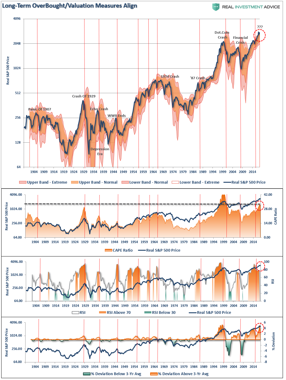
Importantly, on a quarterly basis, the market has pushed into the highest level of overbought conditions on record since 1999. The vertical red lines marked on the chart below show each previous peak which has correlated to a subsequent decline in the not terribly distant future.
The problem for investors is not being able to tell whether the next correction will be just a “correction” within an ongoing bull market advance, or something materially worse. Unfortunately, by the time most investors figure it out – it is generally far too late to do anything meaningful about it.
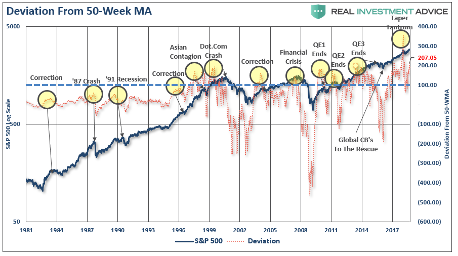
As shown below, price deviations from the 50-week moving average has been important markers for the sustainability of an advance historically. Prices can only deviate so far from their underlying moving average before a reversion will eventually occur.(You can’t have an “average” unless price trades above and below the average during a given time frame.) Historically, “events” tend to occur when the deviation exceeds 100% from the long-term mean. Currently, that deviation is at 207%.
It is more than obvious that a correction will eventually come. The only question is just how big will it likely be?
Just how big could the next correction be?
As stated above, just a correction back to the initial “critical support” set at the 2015 highs would equate to roughly a 28% decline.
However, the risk, as noted above, is that a correction of that magnitude would begin to trigger margin calls, junk bond defaults, blow up the “VIX” short-carry, and trigger a wave of automated selling as the algorithms begin to sell in tandem. Such a combination of events could conceivably push markets to support at either the 2016 correction lows, or the 2007 market peak.
Such a correction would entail either a 34% or a 47% decline. Both would be detrimental to long-term financial planning goals.
That can’t happen you say?
It’s happened numerous times throughout history on far less buildups of leverage, debt, and investor “irrational exuberance.”
7-Impossible Trading Rules
As investors, we should always be mindful of the possibilities, but manage for the probabilities.
No one knows with certainty what the future holds which is why we must manage portfolio risk accordingly and be prepared to react when conditions change.
I am neither bullish or bearish. I follow a very simple set of rules which are the core of my portfolio management philosophy which focus on capital preservation and long-term “risk-adjusted” returns. As such, let me remind you of the 7-most difficult trading rules to follow:
1) Sell Losers Short: Let Winners Run:
It seems like a simple thing to do but when it comes down to it the average investor sells their winners and keeps their losers hoping they will come back to even.
2) Buy Cheap And Sell Expensive:
You haggle, negotiate and shop extensively for the best deals on cars and flat-screen televisions. However, you will pay any price for a stock because someone on television told you too. Insist on making investments when you are getting a “good deal” on it. If it isn’t – it isn’t. Don’t try and come up with an excuse to justify overpaying for an investment. In the long run – overpaying always reduces returns.
3) This Time Is Never Different:
As much as our emotions and psychological makeup want to always hope and pray for the best – this time is never different than the past. History may not repeat exactly but it surely rhymes awfully well.
4) Be Patient:
As with item number 2; there is never a rush to make an investment and there is NOTHING WRONG with sitting on cash until a good deal, a real bargain, comes along. Being patient is not only a virtue – it is a good way to keep yourself out of trouble.
5) Turn Off The Television:
Any good investment is NEVER dictated by day to day movements of the market which is merely nothing more than noise. If you have done your homework, made a good investment at a good price and have confirmed your analysis to correct – then the day to day market actions will have little, if any, bearing on the longer-term success of your investment. The only thing you achieve by watching the television from one minute to the next is increasing your blood pressure.
6) Risk Is Not Equal To Your Return:
Taking RISK in an investment or strategy is not equivalent to how much money you will make. It only relates to the permanent loss of capital that will be incurred when you are wrong. Invest conservatively and grow your money over time with the LEAST amount of risk possible.
7) Go Against The Herd:
The populous is generally right in the middle of a move up in the markets but they are seldom right at major turning points. When everyone agrees on the direction of the market due to any given set of reasons – generally something else happens. However, this also cedes to points 2) and 4); in order to buy something cheap or sell something at the best price – you are generally buying when everyone is selling and selling when everyone else is buying.
These are the rules. They are simple and impossible to follow for most. However, if you can incorporate them you will succeed in your investment goals in the long run. You most likely WILL NOT outperform the markets on the way up, but you will not lose as much on the way down. This is important because it is easy to replace a lost opportunity in investing – it is impossible to replace lost capital.
As an investor, it is simply your job to step away from your “emotions” for a moment and look objectively at the market around you. Is it currently dominated by “greed” or “fear?” Your long-term returns will depend greatly not only on how you answer that question, but how you manage the inherent risk.
Everyone approaches money management differently. This is just the way I do it.
All I am suggesting is that you do “something” rather than the alternative which has historically been much less beneficial to long-term financial goals. Because, eventually, the decline will come and investors will once again do exactly the opposite of what they should do.
They always do.
“The investor’s chief problem – and even his worst enemy – is likely to be himself.”– Benjamin Graham
We respect your privacy and will only send you email that is related to what you subscribed to and why you subscribed. You can unsubscribe whenever you want with just a click of your mouse. For more information please see... Disclosure & Privacy Policy.