Tag Archives: market

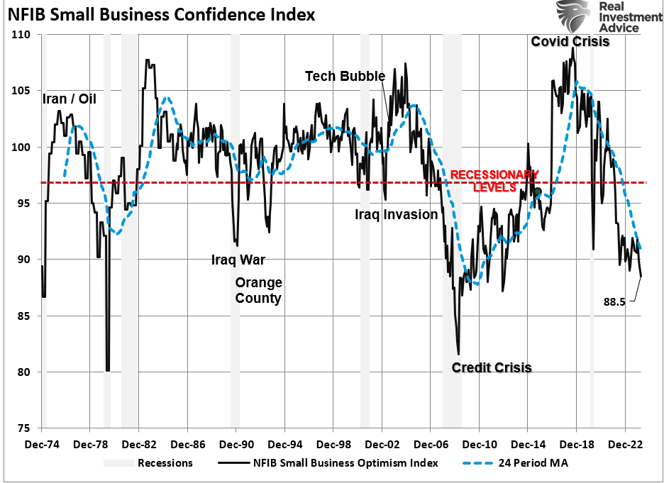
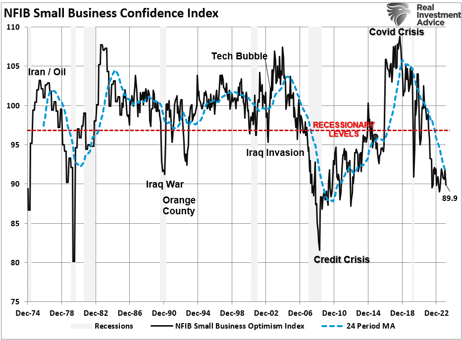
Economic Warning From The NFIB

The latest National Federation of Independent Business (NFIB) survey was an economic warning that departed widely from more robust governmental reports. In a recent analysis of small businesses, we discussed the importance those business owners play in the economy.

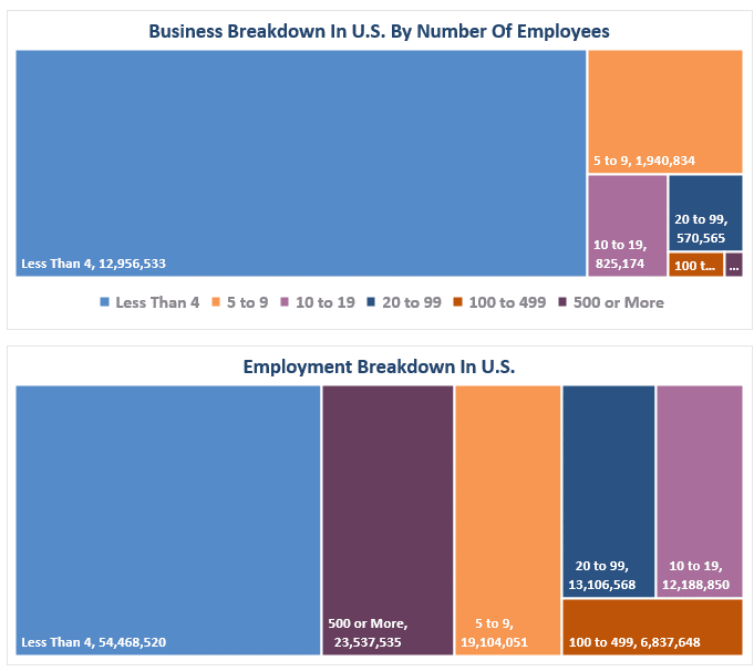
“It is crucial to understand that small and mid-sized businesses comprise a substantial percentage of the U.S. economy. Roughly 60% of all companies in the U.S. have less than ten employees.

Small businesses drive the economy, employment, and wages. Therefore, the NFIB’s statements are highly relevant to the economy’s current state compared to the headline economic data from Government sources.”

While recent government data on economic growth and employment remain robust, the NFIB small business confidence survey declined in its latest reading. Not only did it fall to the lowest level in 11 years, but, as far as an economic warning goes, it remained at levels historically associated with a recessionary economy.

NFIB Small Business Survey

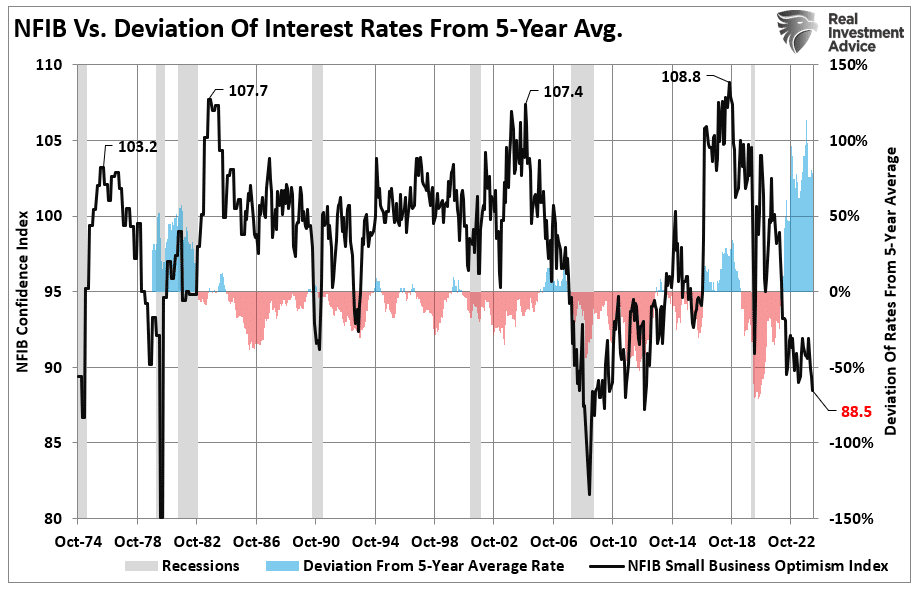
The decline in confidence should be unsurprising given the largest deviation of interest rates from their 5-year average since 1975. Higher borrowing costs impede business growth for small businesses, as they don’t have access to the bond market like major companies.

NFIB Deviation from 5-year average rates

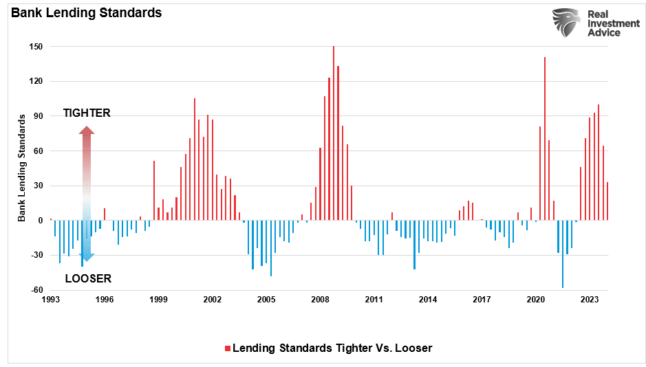
Therefore, as the economy slows and interest rates rise, small business owners turn to their local banks for operating loans. However, higher rates and tighter lending standards make access to capital more difficult.

Bank lending standards

Of course, given that capital is the lifeblood of any business, decisions on hiring, capital expenditures, and expansion hang in the balance.

Economic WarningCapital Expenditures

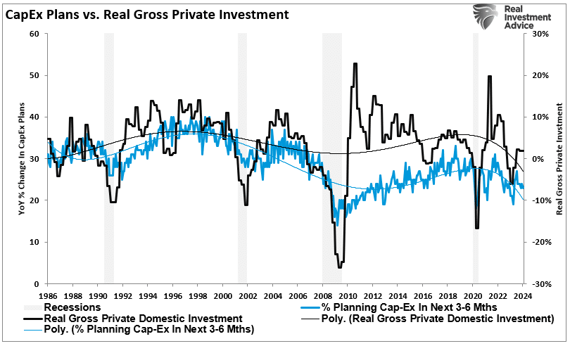
It should be unsurprising that if the economy were expanding as quickly as headline data suggests, business owners would be expending capital to increase capacity to meet rising demand. However, in the most recent NFIB report, the percentage of business owners planning capital expenditures over the 3-6 months dropped to the lowest level since the pandemic-driven shutdown.

Capital expenditure plans

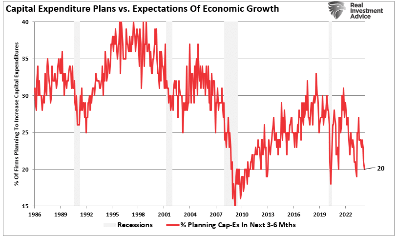
Again, given that small businesses comprise about 50% of the economy, there is more than just a casual relationship between their capital expenditure plans (CapEx) and real gross private investment, which is part of the GDP equation.

CapEx plans vs real private investment

In other words, if small businesses cut back on CapEx, this will eventually translate into slower rates of private investment and, ultimately, economic growth in coming quarters.

Real gross private investment vs real GDP

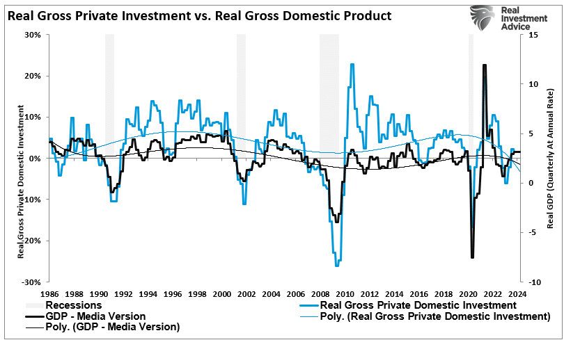
As shown, the correlation between small business CapEx plans and economic growth should not be dismissed. While mainstream economists are becoming increasingly optimistic about an “economic reflation,” the economic warning between real GDP and CapEx suggests caution.

CapEx plans vs Real GDP

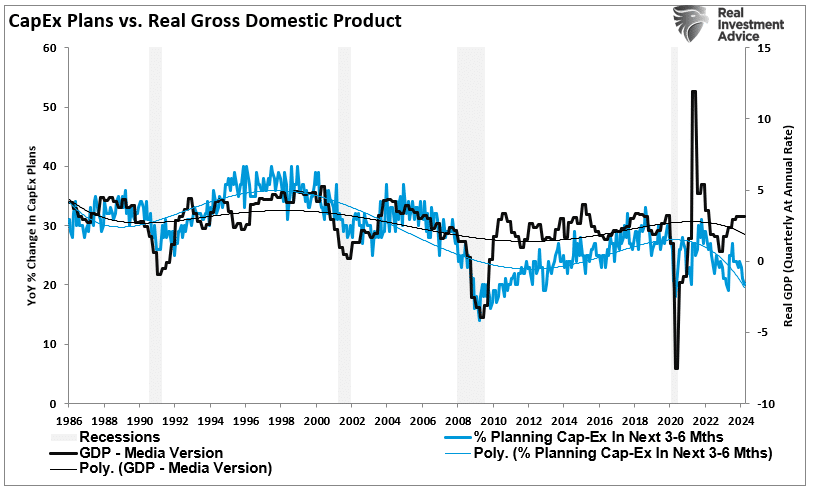
Of course, if small businesses are unwilling to increase CapEx, it is because there is a lack of demand to justify those expenditures. Therefore, if CapEx is falling, we should expect economic warnings from employment and sales.

Ad for SimpleVisor, the do-it-yourself investing tool by RIA Advisors. Get the latest trades, analysis, and insights from the RIA SimpleVisor team. Click to sign up now.

Something Amiss With Sales

Many reasons feed into a small business owner’s decision NOT to invest in their business. As noted above, tighter bank lending standards and increased borrowing costs certainly weigh on that decision. However, if “business is booming,” business owners will find the capital needed to meet increased demand. However, looking deeper into the NFIB data, we find rising concerns about the “demand” side of the equation.

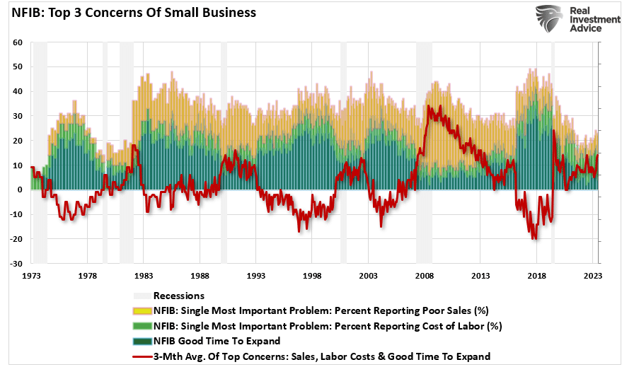
The NFIB publishes several data points from the survey concerning the “concerns” small business owners have. These cover many concerns, from government regulations to taxes, labor costs, sales, and other concerns confronting business owners. When it comes to the “demand” side of the equation, there are three crucial categories:

  1. Poor sales (demand),
  2. Cost of labor (the most significant expense to any business), and
  3. Is it a “Good time to expand?” (Capex)

In the chart below, I have inverted “Good time to expand,” so it correlates with rising concerns about the cost of labor and poor sales. What should be obvious is that the average of these concerns escalates as economic growth weakens (recessionary periods) and falls during economic recoveries. Currently, these rising concerns should provide an economic warning to economists.

Top 3 concerns of NFIB survey

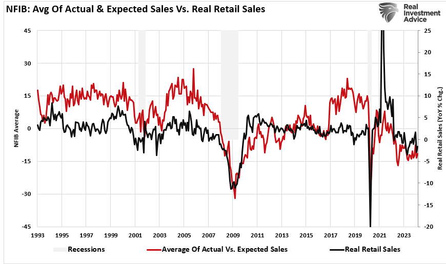
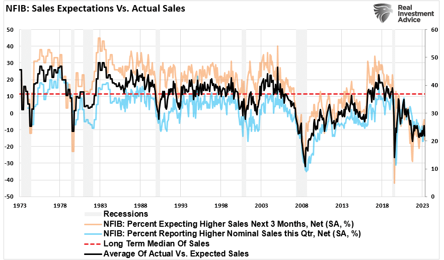
Examining sales and employment figures can help us understand why business owners remain pessimistic about the overall economy. The chart below shows the NFIB members’ sales expectations over the next quarter compared to the previous quarter. The black line is the average of both with a long-term median.

Unsurprisingly, business owners are always optimistic that sales will improve in the next quarter. However, actual sales tend to fall short of those expectations. The two have a very high correlation, which is why the average of both provides valuable information. Sales expectations and actual sales are well below levels typically witnessed during recessions. With sales (demand) weak, there is little need to increase production (supply) substantially.

NFIB sales expectations vs actual sales

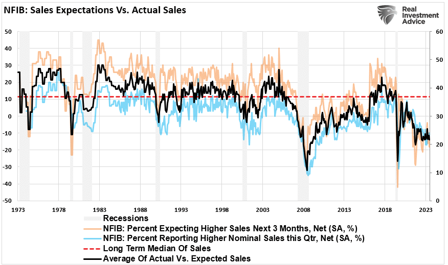
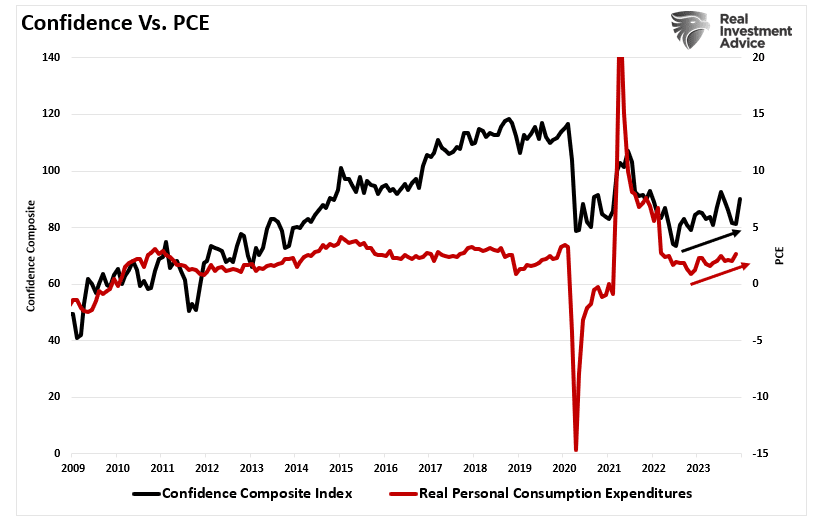
Here is the economic warning to pay attention to. Real retail sales comprise about 40% of personal consumption expenditures (PCE), roughly 70% of the economic growth rate. The decline in the average of actual and expected sales of small businesses suggests weaker retail sales and, by extension, a slower economic growth rate.
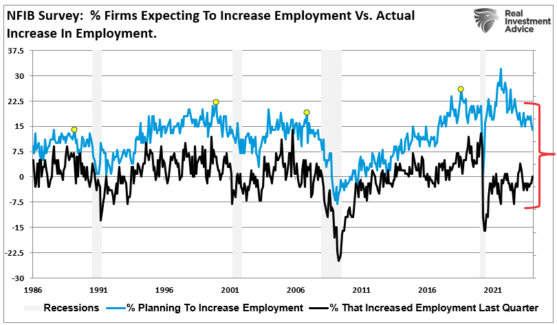
NFIB average of sales vs real retail sales
advertisement for our bull/bear report newsletter. click to subscribe today

Employment Warning

The demand side of the economic equation is crucially important. If the demand for a business owner’s products or services declines, there is little need to increase employment. Therefore, if economic growth was as robust as headlines suggest, why are small businesses’ plans to increase employment declining sharply?

NFIB increases in employment

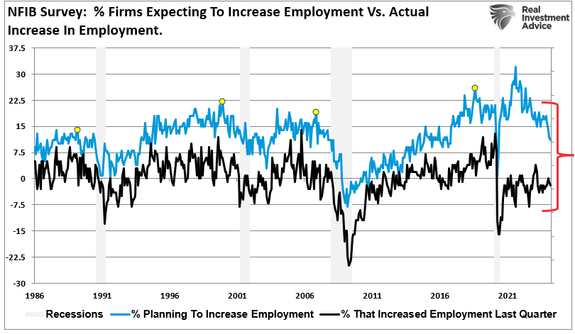
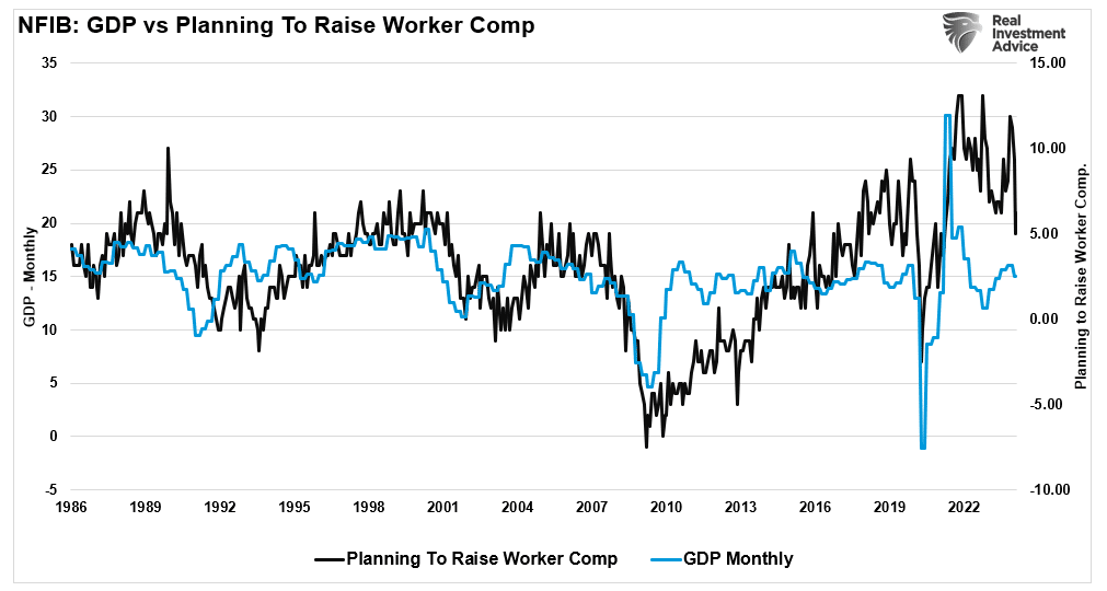
Furthermore, when demand falls, business owners look to cut operating costs to protect profitability. While cutting future employment is part of that equation, so are plans to raise worker compensation.

NFIB plans to increase employment

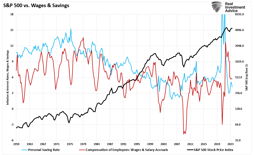
The last chart is crucial. The U.S. is a consumption-based economy. However, consumers can not consume without producing something first. Production must come first to generate the income needed for that consumption. The cycle is displayed below.

Economic Cycle.

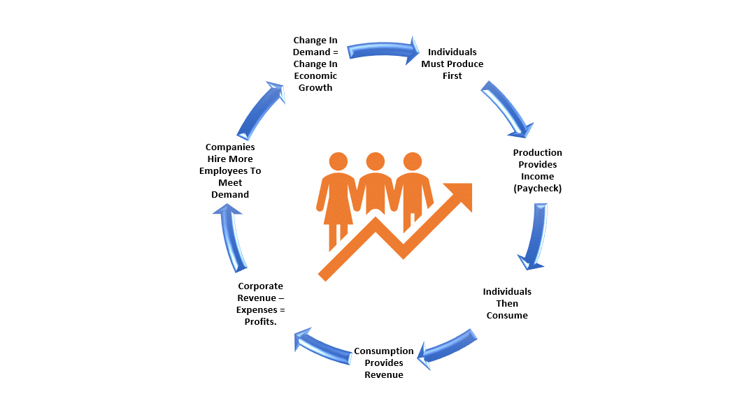
As employees receive fewer compensation increases (raises, bonuses, etc.) amid rising living costs, they cut consumption, which translates into slower economic growth rates. In turn, business owners cut employment and compensation further. It is a virtual spiral that historically ends in recession.

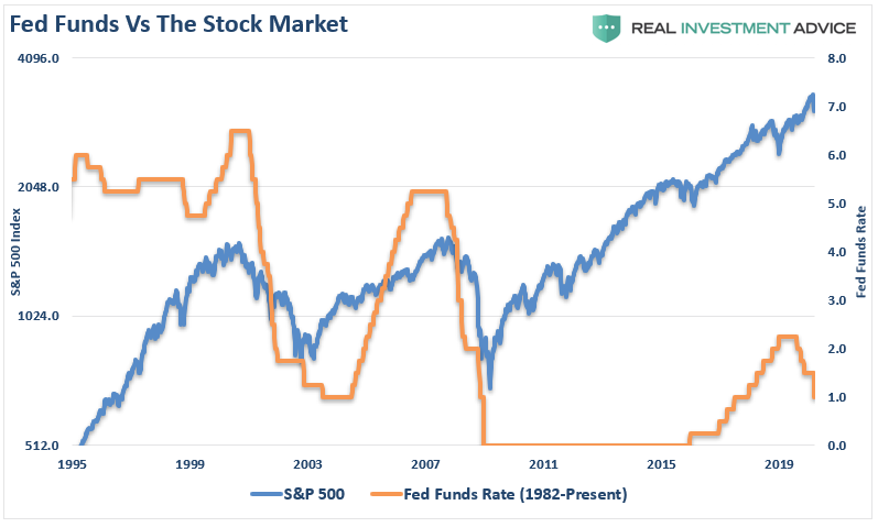
While this time could certainly be different, the economic warnings from the NFIB survey should not be dismissed. The data could explain why the Fed is adamant about cutting rates.

Immigration And Its Impact On Employment

Is immigration why employment reports from the Bureau of Labor Statistics (BLS) continue defying mainstream economists’ estimates? Many are asking this question as the U.S. experiences a flood of immigrants across the southern border. Concurrently, many young college graduates continue to complain about the inability to receive a job offer. As noted recently by CNBC:

The job market looks solid on paper. According to government data, U.S. employers added 2.7 million people to their payrolls in 2023. Unemployment hit a 54-year low of 3.4% in January 2023 and ticked up just slightly to 3.7% by December.

But active job seekers say the labor market feels more difficult than ever. A 2023 survey from staffing agency Insight Global found that recently unemployed full-time workers had applied to an average of 30 jobs only to receive an average of four callbacks or responses.”

These stories are not unique. If you Google “Can’t find a job,” you will get many article links. Yet employment reports have been exceedingly strong for the past several months. In March, the U.S. economy added 303,000 jobs, exceeding every economist’s estimate by four standard deviations. In terms of statistics, a single four-standard deviation event should be rare. Three months in a row is a near statistical impossibility.

Nonfarm payrolls monthly estimate history

Despite weakness in manufacturing and services, with many companies recently announcing layoffs, we have near-record-low jobless claims and employment. According to official government data, the economy has rarely been more robust.

Unemployment and jobless claims.

Such a situation begs an obvious question: How are college graduates struggling to find employment while the labor market remains so strong?

We may find the answer in immigration.

Immigrations Impact By The Numbers

A recent study by Wendy Edelberg and Tara Watson at the Brookings Institution found that illegal immigrants in the country helped boost the labor market, steering the economy from a downturn. Data from the Congressional Budget Office shows a massive uptick of 2.4 million “other immigrants” who don’t fall into the category of lawful immigrants or those on temporary visas. The chart below shows how this figure has spiked from a level of less than 500,000 at the beginning of the 2020s.

CBO Estimates Of Net Immigration

The most significant change relative to the past stems from CBO’s other non-immigrant category, which includes immigrants with a nonlegal or pending status.

“We indicate our estimates of ‘likely stayers’ by diamonds in Figure 2. In FY 2023, almost a million people encountered at the border were given a ‘notice to appear,’ meaning they have permission to petition a court for asylum or other immigration relief. Most of these individuals are waiting in the U.S. for the asylum court queue, which has over a million case backlog. In addition, over 800,000 have been granted humanitarian parole (mostly immigrants from Ukraine, Haiti, Cuba, Nicaragua, and Venezuela). These 1.8 million ‘likely stayers’ in FY 2023 may or may not remain in the U.S. permanently, but most are currently living in the U.S. and participating in the economy. CBO estimates that there were 2 million such entries over the calendar year 2023, which is consistent with higher encounters at the end of the calendar year.”

Border Encounters By Fiscal Year

According to the CBO’s estimates for 2023, the categories of lawful permanent resident migration, INA non-immigrant, and other non-immigrant equated to 3.3 million net entries. However, the number is likely much higher than estimates, subject to uncertainty about unencountered border crossings, visa overstays, and “got-aways.”

As such, this influx of immigrants has significantly added to payroll growth and has accounted for the uptick in economic growth starting in 2022. While the uptick in border encounters began in earnest in 2021, as the current Administration repealed previous border security actions, there is a “lag effect” of immigration on economic growth.

GDP Growth Vs Employment

However, not all jobs are created equal.

advertisement for our bull/bear report newsletter. click to subscribe today

Immigration’s Impact On Job Availability

Since 1980, the U.S. economy has shifted from a manufacturing-based economy to a service-oriented one. The reason is that the “cost of labor” in the U.S. to manufacture goods is too high. Domestic workers want high wages, benefits, paid vacations, personal time off, etc. On top of that are the numerous regulations on businesses from OSHA to Sarbanes-Oxley, FDA, EPA, and many others. All those additional costs are a factor in producing goods or services. Therefore, corporations must offshore production to countries with lower labor costs and higher production rates to manufacture goods competitively.

In other words, for U.S. consumers to “afford” the latest flat-screen television, iPhone, or computer, manufacturers must “export” inflation (the cost of labor and production) to import “deflation” (cheaper goods.) There is no better example of this than a previous interview with Greg Hays of Carrier Industries. Following the 2016 election, President Trump pushed for reshoring U.S. manufacturing. Carrier Industries was one of the first to respond. Mr. Hays discussed the reasoning for moving a plant from Mexico to Indiana.

So what’s good about Mexico? We have a very talented workforce in Mexico. Wages are obviously significantly lower. About 80% lower on average. But absenteeism runs about 1%. Turnover runs about 2%. Very, very dedicated workforce. Which is much higher versus America. And I think that’s just part of these — the jobs, again, are not jobs on an assembly line that [Americans] really find all that attractive over the long term.

The need to lower costs by finding cheaper and plentiful sources of labor continues. While employment continues to increase, the bulk of the jobs created are in areas with lower wages and skill requirements.

Where the jobs are

As noted by CNBC:

“The continued rebound of these jobs, along with strong months for sectors like construction, could be a sign that immigration is helping the labor market grow without putting too much upward pressure on wages.”

This is a crucial point. If there is strong employment growth, wages should increase commensurately as the demand for labor increases. However, that isn’t happening, as the cost of labor is suppressed by hiring workers willing to work for less compensation. In other words, the increase in illegal immigrants is lowering the “average” wage for Americans.

Wage growth of the bottom 80% of workers

Nonetheless, in the last year, 50% of the labor force growth came from net immigration. The U.S. added 5.2 million jobs last year, which boosted economic growth without sparking inflationary pressures.

While immigration has positively impacted economic growth and disinflation, this story has a dark side.

Ad for SimpleVisor, the do-it-yourself investing tool by RIA Advisors. Get the latest trades, analysis, and insights from the RIA SimpleVisor team. Click to sign up now.

The Profit Motive

In a previous article, I discussed an interview by Fed Chair Jerome Powell discussing immigration during a 60-Minutes Interview. To wit:

“SCOTT PELLEY: Why was immigration important?

FED CHAIR POWELL: Because, you know, immigrants come in, and they tend to work at a rate that is at or above that for non-immigrants. Immigrants who come to the country tend to be in the workforce at a slightly higher level than native Americans. But that’s primarily because of the age difference. They tend to skew younger.

You should read that comment again carefully. As noted by Greg Hayes, immigrants tend to work harder and for less compensation than non-immigrants. That suppression of wages and increased productivity, which reduces the amount of required labor, boosts corporate profitability.

Porfits to wages ratio

The move to hire cheaper labor should be unsurprising. Following the pandemic-related shutdown, corporations faced multiple threats to profitability from supply constraints, a shift to increased services, and a lack of labor. At the same time, mass immigration (both legal and illegal) provided a workforce willing to fill lower-wage paying jobs and work regardless of the shutdown. Since 2019, the cumulative employment change has favored foreign-born workers, who have gained almost 2.5 million jobs, while native-born workers have lost 1.3 million. Unsurprisingly, foreign-born workers also lost far fewer jobs during the pandemic shutdown.

Native vs Foreign Born Workers

Given that the bulk of employment continues to be in lower-wage paying service jobs (i.e., restaurants, retail, leisure, and hospitality) such is why part-time jobs have dominated full-time in recent reports. Since last year, part-time jobs have risen by 1.8 million while full-time employment has declined by 1.35 million.

Full time vs Part Time employment

Not dismissing the implications of the shift to part-time employment is crucial.

Personal consumption, what you and I spend daily, drives nearly 70% of economic growth in the U.S. Therefore, Americans require full-time employment to consume at an economically sustainable rate. Full-time jobs provide higher wages, benefits, and health insurance to support a family, whereas part-time jobs do not.

Notably, given the surge in immigration into the U.S. over the last few years, the all-important ratio of full-time employees relative to the population has dropped sharply. As noted, given that full-time employment provides the resources for excess consumption, that ratio should increase for the economy to continue growing strongly. 

Full Time Employees to Working age population

However, the reality is that the full-time employment rate is falling sharply. Historically, when the annual rate of change in full-time employment dropped below zero, the economy entered a recession.

Annual Change in Full-Time Employment

While there is much debate over immigration, most of the arguments do not differentiate between legal and illegal immigration. There are certainly arguments that can be made on both sides. However, what is less debatable is the impact that immigration is having on employment and wages. Of course, as native-born workers continue to demand higher wages, benefits, and other tax-funded support, those costs must be passed on by the companies creating those products and services. At the same time, consumers are demanding lower prices.

That imbalance between input costs and selling price drives companies to aggressively seek options to reduce the highest cost to any business – labor. 

Such is why full-time employment has declined since 2000 despite the surge in the Internet economy, robotics, and artificial intelligence. It is also why wage growth fails to grow fast enough to sustain the cost of living for the average American. These technological developments increased employee productivity, reducing the need for additional labor.

Unfortunately, college graduates expecting high-paying jobs will likely continue to find it increasingly frustrating. Such is particularly the case as “Artificial Intelligence” gains traction and displaces “white collar” work, further squeezing the demand for “native-born” workers.

Market Corrections Matter More Than You Think

During running bull markets, much commentary is written on why this time is different and why investors should not worry about market corrections. One such piece was written recently by Fisher Investments. To wit:

“After the S&P 500’s 26% return last year and this year’s strong start, many investors are worried – understandably – that this bull run is getting ahead of itself. 

They shouldn’t. The strange-but-true fact is that, statistically speaking, average returns — which have amounted to about 10% a year over nearly a century of trading — aren’t normal in the stock market for any given year. A second, surprisingly pleasant fact is that so-called “extreme” returns are far closer to what we’d call normal — and they’re mostly on the positive side.”

There are a lot of problems with that statement, which we will get into. However, there are some essential facts about markets that should be understood. First, indeed, stocks rise more often than they fall. Historically speaking, the stock market increases about 73% of the time. The other 27% of the time, market corrections are reversing the excesses of the previous advance. The table below shows the dispersion of returns over time.

Average Returns Annual

However, fairly substantial corrections have not been uncommon in those positive return years. As shown in the table below, intra-year corrections, which average roughly 10%, are common.

There is little to be concerned about as 38% of the time, the market is cranking out greater than 20% returns versus just 6% of 20% or more market corrections. As Mr. Fisher notes:

“The upshot? Big returns simply aren’t the rarity that “too far, too fast” bears claim. In bull markets, they are more normal than not. Why? The roughly 10% long-term annual average includes bear markets. Strip out the bears and you’ll find that during the 14 S&P 500 bull markets before this one, stocks annualized 23%.

The problem with Mr. Fisher’s statement is that he doesn’t understand the math behind market corrections. As we will explain, a significant difference exists between a 20% advance and a 20% market correction. Such is particularly the case if you are in or approaching retirement.

Market Corrections And The Function Of Math

Notice that the table above uses percentage returns. As noted, that is a deceptive take if you don’t examine the issue beyond a cursory glance.

For example, assume an arbitrary stock market index that trades at 1000 points. Over the next 12 months, the index will increase by 20%. The index value is now 1200 points.

During the next 12 months, the index declines by one of those rare outliers of 20%. The index doesn’t just give up its gain of 200 points.

  • 1200 x (-20%) = 240 points = 960 points

The investor now has an unrealized capital loss.

Let’s take this example further and assume the index goes from 1000 to 8000.

  • 1000 to 2000 = 100% return
  • From 1000 to 3000 = 200% return
  • The next 1000 to 4000 = 300% return
  • The final 1000 to 8000 = 700% return

No one would argue that a 700% return on their money wasn’t fantastic. However, let’s do some math:

  • 10% loss equals an 800-point decline, nearly wiping out the last 1000-point advance.
  • 20% market correction is 1600 points
  • 30% decline erases 2400 points.
  • 40% loss equals 3200 points or nearly 50% of all the gains.
  • 50% decline is 4000 points.

The problem with using percentages to measure an advance is that there is an unlimited upside. However, you can only lose 100%. 

A Graphic Example

That is the problem of percentages. We can also show this graphically.

One of the charts often used by the “perma bulls” like Ken Fisher to coax individuals into not worrying about portfolio risk is measuring the cumulative advances and declines of the market in percentages. When presented this way, the bear market corrections are hardly noticeable. This chart is often used to convince individuals that bear markets don’t matter much over the long term.

Cumulative Percentage Returns

However, as noted above, this presentation is very deceptive due to how math works. If we change from percentages to actual point changes, the devastation of market corrections becomes more evident. Historically, the subsequent declines wiped out huge chunks of the previous advances. Of course, at the bottom of these market corrections, investors generally sell due to the mounting losses’ psychological pressures.

Cumulative Point Returns

This is why, after two of the most significant bull markets in history, most individuals have very little money invested in the financial markets.

Ad for SimpleVisor, the do-it-yourself investing tool by RIA Advisors. Get the latest trades, analysis, and insights from the RIA SimpleVisor team. Click to sign up now.

Average And Actual Returns Are Not The Same

There is a massive difference between AVERAGE and ACTUAL returns on invested capital. Thus, in any given year, the impact of losses destroys the annualized “compounding” effect of money.

The chart below shows the difference between “actual” investment returns and “average” returns over time. See the problem? The purple-shaded area and the market price graph show “average” returns of 7% annually. However, the return gap in “actual returns,” due to periods of capital destruction, is quite significant.

Average versus actual retunrs

In the chart box below, I have taken a $1000 investment for each period and assumed the total return holding period until death. There are no withdrawals made. (Note: the periods from 1983 forward are still running as the investable life expectancy span is 40-plus years.)

The orange sloping line is the “promise” of 6% annualized compound returns. The black line represents what happened with invested capital from 35 years of age until death. At the bottom of each holding period, the bar chart shows the surplus, or shortfall, of the 6% annualized return goal.

Real Total Return vs Life Span

At the point of death, the invested capital is short of the promised goal in every case except the current cycle starting in 2009. However, that cycle is yet to be complete, and the next significant downturn will likely reverse most, if not all, of those gains. Such is why using “compounded” or “average” rates of return in financial planning often leads to disappointment.

Three Key Considerations

Over the next few months, the markets can extend the current deviations from the long-term mean even further. But that is the nature of every bull market peak and bubble throughout history as the seeming impervious advance lures the last stock market “holdouts” back into the markets.

As such, three key considerations exist for individuals currently invested in the stock market.

  1. Time horizon (retirement age less starting age)
  2. Valuations at the beginning of the investment period.
  3. Rate of return required to achieve investment goals.

Suppose valuations are high at the beginning of the investment journey. In that case, if the time horizon is too short or the required rate of return is too high, the outcome of a “buy and hold” strategy will most likely disappoint expectations.

Mean reverting events expose the fallacies of “buy-and-hold” investment strategies. The “stock market” is NOT the same as a “high yield savings account,” and losses devastate retirement plans. (Ask any “boomer” who went through the dot.com crash or the financial crisis.”)

Therefore, during excessively high valuations, investors should consider opting for more “active” strategies with a goal of capital preservation.

As Vitaliy Katsenelson once wrote:

Our goal is to win a war, and to do that we may need to lose a few battles in the interim. Yes, we want to make money, but it is even more important not to lose it.”

I agree with that statement, so we remain invested but hedged within our portfolios.

Unfortunately, most investors do not understand market dynamics and how prices are “ultimately bound by the laws of physics.” While prices can certainly seem to defy the law of gravity in the short term, the subsequent reversion from extremes has repeatedly led to catastrophic losses for investors who disregard the risk.

Just remember, in the market, there is no such thing as “bulls” or “bears.” 

There are only those who “succeed” in reaching their investing goals and those who “fail.” 

Technical Measures And Valuations. Does Any Of It Matter?

Technical measures and valuations all suggest the market is expensive, overbought, and exuberant. However, none of it seems to matter as investors pile into equities to chase risk assets higher. A recent BofA report shows that the increase in risk appetite has been the largest since March 2021.

Risk Appetite Index

Of course, as prices increase faster than underlying earnings growth, valuations also increase. However, as discussed in “Valuations Suggest Caution,” valuations are a better measure of psychology in the short term. To wit:

“Valuation metrics are just that – a measure of current valuation. More importantly, when valuation metrics are excessive, it is a better measure of ‘investor psychology’ and the manifestation of the ‘greater fool theory.’ As shown, there is a high correlation between our composite consumer confidence index and trailing 1-year S&P 500 valuations.”

Consumer confidence vs valuations

When investors are exuberant and willing to overpay for future earnings growth, valuations increase. The increase in valuations, also known as “multiple expansion,” is a crucial support for bull markets. As shown, the increase in multiples coincides with rising markets. Of course, the opposite, known as “multiple contractions,” is also true. With a current Shiller CAPE valuation multiple of 34x earnings, such suggests that investor confidence is elevated.

Valuation Model

As noted, valuations are terrible market timing indicators and should not be used for such. While valuations provide the basis for calculating future returns, technical measures are more critical for managing near-term portfolio risk.

Technical Measures Are Getting Extreme

As noted, investors are again becoming exuberant over stock ownership. Such is vital to creating multiple expansions and fueling bull market advances. High valuations, bullish sentiment, and leverage are meaningless if the underlying equities are not owned. As discussed in Household Equity Allocations,” the current levels of household equity ownership have reverted to near-record levels. Historically, such exuberance has been the mark of more important market cycle peaks.

Household equity ownership vs SP500

While household equity ownership is critical to expanding the bull market, the technical measures provide an understanding of when excesses are reached. One measure we focus on is the deviation of price from long-term means. The reason is that markets are bound to long-term means over time. For a “mean” or “average” to exist, prices must trade above and below that price over time. Therefore, we can determine when deviations are approaching more extreme levels by viewing past deviations. Currently, the deviation of the market from its underlying 2-year average is one of the largest in history. Notably, there have certainly been more significant deviations in the past, suggesting the current deviation from the mean can grow further. However, such deviations have crucially been a precursor to an eventual mean-reverting event.

Technical Model

The following analysis uses quarter data and evaluates the market using valuation and technical measures. From a long-term perspective, the market is trading at more extreme levels. The quarterly Relative Strength (RSI) measure is above 70, the deviation is close to a historical record, and the market trades nearly 3 standard deviations above its quarterly mean. As noted, while these valuation and technical measures can undoubtedly become more extreme, the ingredients for an eventual mean reverting event are present.

Quarterly risk based market model

Of course, the inherent problem with long-term analysis is that while valuations and long-term technical measures are more extreme, they can remain that way for much longer than logic suggests. However, we can construct a valuation and technical measures model using the data above. As shown, the model triggered a “risk off” warning in early 2022 when high valuations collided with an extreme deviation of the market above the 24-month moving average. That signal was reversed in January 2023, as the market began to recover. While a new signal has not yet been triggered, the ingredients of valuations and deviations are present.

Fundamental and Technical Model
Ad for SimpleVisor, the do-it-yourself investing tool by RIA Advisors. Get the latest trades, analysis, and insights from the RIA SimpleVisor team. Click to sign up now.

The Ingredients Are Missing A Catalyst

The problem with long-term technical measures and valuations is that they move slowly. Therefore, the general assumption is that if high valuations do not lead to an immediate market correction, the measure is flawed.

In the short term, “valuations” have little relevance to what positions you should buy or sell. It is only momentum, the direction of the price, that matters. Managing money, either “professionally” or “individually,” is a complicated process over the long term. It seems exceedingly easy in the short term, particularly amid a speculative mania. However, as with every bull market, a strongly advancing market forgives investors’ many investing mistakes. The ensuing bear market reveals them in the most brutal and unforgiving of outcomes. 

There is a clear advantage to providing risk management to portfolios over time. The problem is that most individuals cannot manage their own money because of “short-termism.” As shown by shrinking holding periods.

Holding periods for investors

While “short-termism” currently dominates the investor mindset, the ingredients for a reversion exist. However, that does not mean one will happen tomorrow, next month, or even this year.

Think about it this way. If I gave you a bunch of ingredients such as nitrogen, glycerol, sand, and shell, you would probably stick them in the garbage and think nothing of it. They are innocuous ingredients and pose little real danger by themselves. However, you make dynamite using a process to combine and bind them. However, even dynamite is safe as long as it is stored properly. Only when dynamite comes into contact with the appropriate catalyst does it become a problem. 

“Mean reverting events,” bear markets, and financial crises result from a combined set of ingredients to which a catalyst ignites. Looking back through history, we find similar elements every time.

Like dynamite, the individual ingredients are relatively harmless but dangerous when combined.

Leverage + Valuations + Psychology + Ownership + Momentum = “Mean Reverting Event”

Importantly, this particular formula remains supportive of higher asset prices in the short term. Of course, the more prices rise, the more optimistic investors become.

While the combination of ingredients is dangerous, they remain “inert” until exposed to the right catalyst.

What causes the next “liquidation cycle” is currently unknown. It is always an unexpected, exogenous event that triggers a “rush for the exits.”

Many believe that “bear markets” are now a relic of the past, given the massive support provided by Central Banks. Maybe that is the case. However, remembering that such beliefs were always present before more severe mean-reverting events is worth remembering.

To quote Irving Fisher in 1929, “Stocks are at a permanently high plateau.” 

Retirement Crisis Faces Government And Corporate Pensions

It is long past the time that we face the fact that Social Security” is facing a retirement crisis. In June 2022, we touched on this issue, discussing the stark realities confronting Social Security.

“The program’s payouts have exceeded revenue since 2010, but the recent past is nowhere near as grim as the future. According to the latest annual report by Social Security’s trustees, the gap between promised benefits and future payroll tax revenue has reached a staggering $59.8 trillion. That gap is $6.8 trillion larger than it was just one year earlier. The biggest driver of that move wasn’t Covid-19, but rather a lowering of expected fertility over the coming decades.” – Stark Realities

Note the last sentence.

When President Roosevelt first enacted social security in 1935, the intention was to serve as a safety net for older adults. However, at that time, life expectancy was roughly 60 years. Therefore, the expectation was that participants would not be drawing on social security for very long on an actuarial basis. Furthermore, according to the Social Security Administration, roughly 42 workers contributed to the funding pool for each welfare recipient in 1940.

Of course, given that politicians like to use government coffers to buy votes, additional amendments were added to Social Security to expand participation in the program. This included adding domestic labor in 1950 and widows and orphans in 1956. They lowered the retirement age to 62 in 1961 and increased benefits in 1972. Then politicians added more beneficiaries, from disabled people to immigrants, farmers, railroad workers, firefighters, ministers, federal, state, and local government employees, etc.

While politicians and voters continued adding more beneficiaries to the welfare program, workers steadily declined. Today, there are barely 2-workers for each beneficiary. As noted by the Peter G. Peterson Foundation:

Social Security has been a cornerstone of economic security for almost 90 years, but the program is on unsound footing. Social Security’s combined trust funds are projected to be depleted by 2035 — just 13 years from now. A major contributor to the unsustainability of the current Social Security program is that the number of workers contributing to the program is growing more slowly than the number of beneficiaries receiving monthly payments. In 1960, there were 5.1 workers per beneficiary; that ratio has dropped to 2.8 today.”

Ratio of workers to SSI Beneficiaries

As we will discuss, the collision of demographics and math is coming to the welfare system.

A Massive Shortfall

The new Financial Report of the United States Government (February 2024) estimates that the financial position of Social Security and Medicare are underfunded by roughly $175 Trillion. Treasury Secretary Janet Yellin signed the report, but the chart below details the problem.

Four layers of massive debt and liabilities

The obvious problem is that the welfare system’s liabilities massively outweigh taxpayers’ ability to fund it. To put this into context, as of Q4-2023, the GDP of the United States was just $22.6 trillion. In that same period, total federal revenues were roughly $4.8 trillion. In other words, if we applied 100% of all federal revenues to Social Security and Medicare, it would take 36.5 years to fill the gap. Of course, that is assuming that nothing changes.

However, therein lies the actuarial problem.

All pension plans, whether corporate or governmental, rely on certain assumptions to plan for future obligations. Corporate pensions, for example, rely on certain portfolio return assumptions to fund planned employee retirements. Most pension plans assume that portfolios will return 7% a year. However, a vast difference exists between “average returns” and “compound returns” as shown.

Difference between compound and actual returns

Social Security, Medicare, and corporate pension plans face a retirement crisis. A shortfall arises if contributions and returns don’t meet expectations or demand increases on the plans.

For example, given real-world return assumptions, pension funds SHOULD lower their return estimates to roughly 3-4% to potentially meet future obligations and maintain some solvency. However, they can’t make such reforms because “plan participants” won’t let them. Why? Because:

  1. It would require a 30-40% increase in contributions by plan participants they can not afford.
  2. Given many plan participants will retire LONG before 2060, there isn’t enough time to solve the issues and;
  3. Any bear market will further impede the pension plan’s ability to meet future obligations without cutting future benefits.

Social Security and Medicare face the same intractable problem. While there is ample warning from the Trustees that there are funding shortfalls to the plans, politicians refuse to make the needed changes and instead keep adding more participants to the rolls.

However, all current actuarial forecasts depend on a steady and predictable pace of age and retirement. But that is not what is currently happening.

Ad for SimpleVisor, the do-it-yourself investing tool by RIA Advisors. Get the latest trades, analysis, and insights from the RIA SimpleVisor team. Click to sign up now.

A Retirement Crisis In The Making

The single biggest threat that faces all pension plans is demographics. That single issue can not be fixed as it takes roughly 25 years to grow a taxpayer. So, even if we passed laws today that required all women of birthing age to have a minimum of 4 children over the next 5 years, we would not see any impact for nearly 30 years. However, the problem is running in reverse as fertility rates continue to decline.

Interestingly, researchers from the Center For Sexual Health at Indiana University put forth some hypotheses behind the decline in sexual activity:

  • Less alcohol consumption (not spending time in bars/restaurants)
  • More time on social media and playing video games
  • Lower wages lead to lower rates of romantic relationships
  • Non-heterosexual identities

The apparent problem with less sex and non-heterosexual identities is fewer births.

Fertility rate of women

No matter how you calculate the numbers, the problem remains the same. Too many obligations and a demographic crisis. As noted by official OECD estimates, the aging of the population relative to the working-age population has already crossed the “point of no return.”

Working age vs Elderly Population

To compound that situation, there has been a surge in retirees significantly higher than estimates. As noted above, actuarial tables depend on an expected rate of retirees drawing from the system. If that number exceeds those estimates, a funding shortfall increases to provide the required benefits.

Sharp uptick in retirements

The decline in economic prosperity discussed previously is caused by excessive debt and declining income growth due to productivity increases. Furthermore, the shift from manufacturing to a service-based society will continue to lead to reduced taxable incomes.

This employment problem is critical.

By 2025, each married couple will pay Social Security retirement benefits for one retiree and their own family’s expenses. Therefore, taxes must rise, and other government services must be cut.

Back in 1966, each employee shouldered $555 of social benefits. Today, each employee has to support more than $18,000 in benefits. The trend is unsustainable unless wages or employment increases dramatically, and based on current trends, such seems unlikely.

The entire social support framework faces an inevitable conclusion where wishful thinking will not change that outcome. The question is whether elected leaders will make needed changes now or later when they are forced upon us.

For now, we continue to “Whistle past the graveyard” of a retirement crisis.

Blackout Of Buybacks Threatens Bullish Run

With the last half of March upon us, the blackout of stock buybacks threatens to reduce one of the liquidity sources supporting the bullish run this year. If you don’t understand the importance of corporate share buybacks and the blackout periods, here is a snippet of a 2023 article I previously wrote.

“The chart below via Pavilion Global Markets shows the impact stock buybacks have had on the market over the last decade. The decomposition of returns for the S&P 500 breaks down as follows:

  • 6.1% from multiple expansions (21% at Peak),
  • 57.3% from earnings (31.4% at Peak),
  • 9.1% from dividends (7.1% at Peak), and
  • 27% from share buybacks (40.5% at Peak)
Buyback contribution

Yes, buybacks are that important.

As John Authers pointed out:

“For much of the last decade, companies buying their own shares have accounted for all net purchases. The total amount of stock bought back by companies since the 2008 crisis even exceeds the Federal Reserve’s spending on buying bonds over the same period as part of quantitative easing. Both pushed up asset prices.”

In other words, between the Federal Reserve injecting massive liquidity into the financial markets and corporations buying back their shares, there have been no other real buyers in the market. 

Given the increasing amount of corporate share buybacks, with 2024 expected to set a record, the importance of that activity has been a critical support for asset prices. As we noted in October 2023, near the bottom of the summer correction:

“Three primary drivers will likely drive markets from the middle of October through year-end. The first is earnings season, which kicks off in two weeks, negative short-term sentiment, and the corporate share buyback window reopens from blackout in November.”

Notably, since 2009, and accelerating starting in 2012, the percentage change in buybacks has far outstripped the increase in asset prices.

Share buybacks vs SP500

As we will discuss, it is more than just a casual correlation, and the upcoming blackout window may be more critical to the rally than many think.

A High Correlation

Unsurprisingly, the market rally that began in November correlated with a strong surge in corporate share repurchases. Interestingly, while the media touts the strong earnings growth shown in the recent reporting period, such would not have been the case without the surge in buybacks.

Share buybacks vs earnings

The result is not surprising given that the majority of earnings growth for the quarter came from the companies that are the most aggressive with share repurchases. However, given current valuation levels, it should make one question precisely what you are paying for.

Nonetheless, the buyback surge has supported the market surge since the October 2023 lows. We saw the same at the bottom of the market in October 2022. The chart shows the 4-week percentage change in share buybacks versus the S&P 500.

Share buybacks 4-week percent change versus the market.

The end of October tends to be the inflection point for the market, particularly over the last few years, because that is when the blackout period for share buybacks fully ends. While many argue that buybacks have little to do with market movements, a high correlation exists between the 4-week percentage change in buybacks versus the stock market. More importantly, since the act of share repurchases provides a buyer for those shares, the .85 correlation between the two suggests this is more than just a casual relationship.

Correlation of share repurchases 4-week percentage change to the S&P 500.

Investors Are Really Bullish

Currently, investors are very exuberant about the current investing environment. As discussed in “Market Top or Bubble?”, little seems to deter investor enthusiasm.

“The ongoing ‘can’t stop, won’t stop’ bullish trend remains firmly intact.

Investor sentiment is once again very bullish. Historically, when retail investor sentiment is exceedingly bullish combined with low volatility, such has generally corresponded to short-term market peaks.

Sentiment vs the market.

At the same time, professional managers are also very bullish and are leveraging portfolios to chase returns. When professional investor allocations exceed 97%, such has historically been close to short-term market peaks.

Professional managers buy tops.

The risk to these more optimistic investors is that with the blackout period beginning, corporate demand, the largest buyers of equities, will drop by 35%. Therefore, given the correlation between buybacks and the market, a reversal of that corporate demand could lead to a market decline. Any decline will likely lead to a reversal of positioning by investors, further exacerbating that correction process.

While there is no guarantee of anything in the markets, it is likely a short-term risk worth paying attention to.

Ad for SimpleVisor, the do-it-yourself investing tool by RIA Advisors. Get the latest trades, analysis, and insights from the RIA SimpleVisor team. Click to sign up now.

The Fed Will Support Buybacks

While the blackout of share buybacks may lead to a short-term market correction, the Federal Reserve may provide additional support over the long term.

The Federal Reserve has been transparent and likely done with hiking interest rates for this cycle. Given the massive surge in the Fed funds rate, the economy has withstood that impact quite well. Of course, the reason was the enormous surge in fiscal support through deficit spending and a massive increase in the M2 money supply as a percentage of GDP.

m2 and the deficit as a percentage of the economy.

However, if the Federal Reserve lowers interest rates, it will reduce corporate borrowing costs, which has historically been a boon for share buybacks. Such is particularly the case for large corporations like Apple (AAPL), which can borrow several billion dollars at low rates and buy back outstanding shares. As shown, share buybacks rose sharply following the “Financial Crisis” but slowed during periods of higher rates. Corporations are now “front-running” the Federal Reserve in anticipation of increased monetary accommodation.

Buybacks vs the Fed funds rate

With corporate buybacks on track to set a new record this year, exceeding $1 Trillion, corporations will need lower rates to finance the purchases.

Goldman Sachs estimates of share repurchases.

Conclusion

As we have discussed for the last month, the market is exceptionally bullish, extended, and deviated from long-term means. With the beginning of the “buyback blackout,” removing an essential buyer of equities is a risk worth watching.

Even if you are incredibly bullish on the markets, healthy bull markets must occasionally be corrected. Without such corrections, excesses are built, leading to more destructive outcomes.

What causes such a correction is always unknown. While the removal of buybacks temporarily may lead to a price reversal, those buybacks will return soon enough. And with $1 trillion in anticipated purchases, that is a lot of support for asset prices this year.

Does this mean the market will never face another “bear market?”

Of course not. There is a consequence for buying back shares at a premium. As Warren Buffet recently wrote:

“The math isn’t complicated: When the share count goes down, your interest in our many businesses increases. Every small bit helps if repurchases are made at value-accretive prices.

Just as surely, when a company overpays for repurchases, the continuing shareholders lose. At such times, gains flow only to the selling shareholders and to the friendly, but expensive, investment banker who recommended the foolish purchases.

Eventually, the detachment of the financial markets from underlying economic realities will be reverted.

However, that is not likely a problem we will face between now and year-end.

Household Equity Allocations Suggests Caution

Household equity allocations are again sharply rising, as the “Fear Of Missing Out” or “F.O.M.O.” fuels a near panic mentality to chase markets higher. As Michael Hartnett from Bank of America recently noted:

“Stocks are up a ferocious +25% in 5 months, which has happened just 10 times since the 1930s. Normally, such surges occur from recession lows (1938, 1975, 1982, 2009, 2020), but, of course, we did not have a recession in 2023, according to the Biden administration. These surges also occur at the start of bubbles (Jan’99).”

25% increase in 10-months.

As discussed in the recent Bull Bear Report, we can only identify bubbles in hindsight. Such is the problem with trying to “time” a market top, as they can last much longer than logic would predict. George Soros explained this well in his theory of reflexivity.

Financial markets, far from accurately reflecting all the available knowledge, always provide a distorted view of reality. The degree of distortion may vary from time to time. Sometimes it’s quite insignificant, at other times it is quite pronounced. When there is a significant divergence between market prices and the underlying reality, the markets are far from equilibrium conditions.

Every bubble has two components:

  1. An underlying trend that prevails in reality and; 
  2. A misconception relating to that trend.

When positive feedback develops between the trend and the misconception, a boom-bust process gets set into motion. The process is liable to be tested by negative feedback along the way, and if it is strong enough to survive these tests, both the trend and the misconception get reinforced. Eventually, market expectations become so far removed from reality that people get forced to recognize that a misconception is involved. A twilight period ensues during which doubts grow, and more people lose faith, but the prevailing trend gets sustained by inertia.” – George Soros

In simplistic terms, Soros says that once the bubble inflates, it will remain inflated until some unexpected, exogenous event causes a reversal in the underlying psychology. That reversal then reverses psychology from “exuberance” to “fear.”

What will cause that reversion in psychology? No one knows.

However, the important lesson is that market tops and bubbles are a function of “psychology.” The manifestation of that “psychology” manifests itself in asset prices and valuations that exceed economic growth rates.

Once again, investors are piling into equities and “writing checks that the economy can’t cash.”

An Economic Underpinning

To understand the problem, we must first realize from which capital gains are derived.

Capital gains from markets are primarily a function of market capitalization, nominal economic growth, plus dividend yield. Using John Hussman’s formula, we can mathematically calculate returns over the next 10-year period as follows:

(1+nominal GDP growth)*(normal market cap to GDP ratio / actual market cap to GDP ratio)^(1/10)-1

Therefore, IF we assume that GDP could maintain 2% annualized growth in the future, with no recessions ever, AND IF current market cap/GDP stays flat at 2.0, AND IF the dividend yield remains at roughly 2%, we get forward returns of:

But there are a “whole lotta ifs” in that assumption. Most importantly, we must also assume the Fed can get inflation to its 2% target, reduce current interest rates, and, as stated, avoid a recession over the next decade.

Yet, despite these essential fundamental factors, retail investors again throw caution to the wind. As shown, the current levels of household equity ownership have reverted to near-record levels. Historically, such exuberance has been the mark of more important market cycle peaks.

Household equity ownership vs SP500

If economic growth is reversed, the valuation reduction will be quite detrimental. Again, such has been the case at previous peaks where expectations exceed economic realities.

Household equity vs valuations

Bob Farrell once quipped investors tend to buy the most at the top and the least at the bottom. Such is simply the embodiment of investor behavior over time. Our colleague, Jim Colquitt, previously made an important observation.

The graph below compares the average investor allocation to equities to S&P 500 future 10-year returns. As we see, the data is very well correlated, lending credence to Bob Farrell’s Rule #5. Note the correlation statistics at the top left of the graph.”

The 10-year forward returns are inverted on the right scale. This suggests that future returns will revert toward zero over the next decade from current levels of household equity allocations by investors.

Household equity allocations vs 10-year forward returns

The reason is that when investor sentiment is extremely bullish or bearish, such is the point where reversals have occurred. As Sam Stovall, the investment strategist for Standard & Poor’s, once stated:

“If everybody’s optimistic, who is left to buy? If everybody’s pessimistic, who’s left to sell?”

Everyone is very optimistic about the market. Bank of America, one of the world’s largest asset custodians, monitors risk positioning across equities. Currently, “risk love” is in the 83rd percentile and at levels that have generally preceded short-term corrective actions.

Global Equity risk

The only question is what eventually reverses that psychology.

Ad for SimpleVisor, the do-it-yourself investing tool by RIA Advisors. Get the latest trades, analysis, and insights from the RIA SimpleVisor team. Click to sign up now.

A Disappointment Of Hopes

In January 2022, Jeremy Grantham made headlines with his market outlook titled “Let The Wild Rumpus Begin.” The crux of the article is summed up in the following paragraph.

“All 2-sigma equity bubbles in developed countries have broken back to trend. But before they did, a handful went on to become superbubbles of 3-sigma or greater: in the U.S. in 1929 and 2000 and in Japan in 1989. There were also superbubbles in housing in the U.S. in 2006 and Japan in 1989. All five of these superbubbles corrected all the way back to trend with much greater and longer pain than average.

Today in the U.S. we are in the fourth superbubble of the last hundred years.”

While the market corrected in 2022, the reversion needed to reverse the excess deviation from the long-term growth trends was not achieved. Therefore, unless the Federal Reverse is committed to a never-ending program of zero interest rates and quantitative easing, the eventual reversion of returns to their long-term means remains inevitable.

Such will result in profit margins and earnings returning to levels that align with actual economic activity. As Jeremy Grantham once noted:

Profit margins are probably the most mean-reverting series in finance. And if profit margins do not mean-revert, then something has gone badly wrong with capitalism. If high profits do not attract competition, there is something wrong with the system, and it is not functioning properly.” – Jeremy Grantham

Historically, real profits have always eventually reverted to underlying economic realities.

Cumulative change in profits vs the market

Many things can go wrong in the months and quarters ahead. Such is particularly the case at a time when deficit spending is running amok, and economic growth is slowing.

While investors cling to the “hope” that the Fed has everything under control, there is a reasonable chance they don’t.

The reality is that the next decade could be a disappointment to overly optimistic expectations.

Digital Currency And Gold As Speculative Warnings

Over the last few years, digital currencies and gold have become decent barometers of speculative investor appetite. Such isn’t surprising given the evolution of the market into a “casino” following the pandemic, where retail traders have increased their speculative appetites.

“Such is unsurprising, given that retail investors often fall victim to the psychological behavior of the “fear of missing out.” The chart below shows the “dumb money index” versus the S&P 500. Once again, retail investors are very long equities relative to the institutional players ascribed to being the “smart money.””

Dumb money index vs market

“The difference between “smart” and “dumb money” investors shows that, more often than not, the “dumb money” invests near market tops and sells near market bottoms.”

Net Smart Dumb Money vs Market

That enthusiasm has increased sharply since last November as stocks surged in hopes that the Federal Reserve would cut interest rates. As noted by Sentiment Trader:

“Over the past 18 weeks, the straight-up rally has moved us to an interesting juncture in the Sentiment Cycle. For the past few weeks, the S&P 500 has demonstrated a high positive correlation to the ‘Enthusiasm’ part of the cycle and a highly negative correlation to the ‘Panic’ phase.”

Investor Enthusiasm

That frenzy to chase the markets, driven by the psychological bias of the “fear of missing out,” has permeated the entirety of the market. As noted in This Is Nuts:”

“Since then, the entire market has surged higher following last week’s earnings report from Nvidia (NVDA). The reason I say “this is nuts” is the assumption that all companies were going to grow earnings and revenue at Nvidia’s rate. There is little doubt about Nvidia’s earnings and revenue growth rates. However, to maintain that growth pace indefinitely, particularly at 32x price-to-sales, means others like AMD and Intel must lose market share.”

Nvidia Price To Sales

Of course, it is not just a speculative frenzy in the markets for stocks, specifically anything related to “artificial intelligence,” but that exuberance has spilled over into gold and cryptocurrencies.

Birds Of A Feather

There are a couple of ways to measure exuberance in the assets. While sentiment measures examine the broad market, technical indicators can reflect exuberance on individual asset levels. However, before we get to our charts, we need a brief explanation of statistics, specifically, standard deviation.

As I discussed in “Revisiting Bob Farrell’s 10 Investing Rules”:

“Like a rubber band that has been stretched too far – it must be relaxed in order to be stretched again. This is exactly the same for stock prices that are anchored to their moving averages. Trends that get overextended in one direction, or another, always return to their long-term average. Even during a strong uptrend or strong downtrend, prices often move back (revert) to a long-term moving average.”

The idea of “stretching the rubber band” can be measured in several ways, but I will limit our discussion this week to Standard Deviation and measuring deviation with “Bollinger Bands.”

“Standard Deviation” is defined as:

“A measure of the dispersion of a set of data from its mean. The more spread apart the data, the higher the deviation. Standard deviation is calculated as the square root of the variance.”

In plain English, this means that the further away from the average that an event occurs, the more unlikely it becomes. As shown below, out of 1000 occurrences, only three will fall outside the area of 3 standard deviations. 95.4% of the time, events will occur within two standard deviations.

Standard Deviation Chart

A second measure of “exuberance” is “relative strength.”

“In technical analysis, the relative strength index (RSI) is a momentum indicator that measures the magnitude of recent price changes to evaluate overbought or oversold conditions in the price of a stock or other asset. The RSI is displayed as an oscillator (a line graph that moves between two extremes) and can read from 0 to 100.

Traditional interpretation and usage of the RSI are that values of 70 or above indicate that a security is becoming overbought or overvalued and may be primed for a trend reversal or corrective pullback in price. An RSI reading of 30 or below indicates an oversold or undervalued condition.” – Investopedia

With those two measures, let’s look at Nvidia (NVDA), the poster child of speculative momentum trading in the markets. Nvidia trades more than 3 standard deviations above its moving average, and its RSI is 81. The last time this occurred was in July of 2023 when Nvidia consolidated and corrected prices through November.

NVDA chart vs Bollinger Bands

Interestingly, gold also trades well into 3 standard deviation territory with an RSI reading of 75. Given that gold is supposed to be a “safe haven” or “risk off” asset, it is instead getting swept up in the current market exuberance.

Gold vs Bollinger Bands

The same is seen with digital currencies. Given the recent approval of spot, Bitcoin exchange-traded funds (ETFs), the panic bid to buy Bitcoin has pushed the price well into 3 standard deviation territory with an RSI of 73.

Bitcoin vs Bollinger Bands

In other words, the stock market frenzy to “buy anything that is going up” has spread from just a handful of stocks related to artificial intelligence to gold and digital currencies.

Ad for SimpleVisor, the do-it-yourself investing tool by RIA Advisors. Get the latest trades, analysis, and insights from the RIA SimpleVisor team. Click to sign up now.

It’s All Relative

We can see the correlation between stock market exuberance and gold and digital currency, which has risen since 2015 but accelerated following the post-pandemic, stimulus-fueled market frenzy. Since the market, gold and cryptocurrencies, or Bitcoin for our purposes, have disparate prices, we have rebased the performance to 100 in 2015.

Gold was supposed to be an inflation hedge. Yet, in 2022, gold prices fell as the market declined and inflation surged to 9%. However, as inflation has fallen and the stock market surged, so has gold. Notably, since 2015, gold and the market have moved in a more correlated pattern, which has reduced the hedging effect of gold in portfolios. In other words, during the subsequent market decline, gold will likely track stocks lower, failing to provide its “wealth preservation” status for investors.

SP500 vs Gold

The same goes for cryptocurrencies. Bitcoin is substantially more volatile than gold and tends to ebb and flow with the overall market. As sentiment surges in the S&P 500, Bitcoin and other cryptocurrencies follow suit as speculative appetites increase. Unfortunately, for individuals once again piling into Bitcoin to chase rising prices, if, or when, the market corrects, the decline in cryptocurrencies will likely substantially outpace the decline in market-based equities. This is particularly the case as Wall Street can now short the spot-Bitcoin ETFs, creating additional selling pressure on Bitcoin.

SP500 vs Bitcoin

Just for added measure, here is Bitcoin versus gold.

Gold vs Bitcoin

Not A Recommendation

There are many narratives surrounding the markets, digital currency, and gold. However, in today’s market, more than in previous years, all assets are getting swept up into the investor-feeding frenzy.

Sure, this time could be different. I am only making an observation and not an investment recommendation.

However, from a portfolio management perspective, it will likely pay to remain attentive to the correlated risk between asset classes. If some event causes a reversal in bullish exuberance, cash and bonds may be the only place to hide.

Presidential Elections And Market Corrections

Presidential elections and market corrections have a long history of companionship. Given the rampant rhetoric between the right and left, such is not surprising. Such is particularly the case over the last two Presidential elections, where polarizing candidates trumped policies.

From a portfolio management perspective, we must understand what happens during election years concerning the stock market and investor returns.

Since 1833, the S&P 500 index has gained an average of 10.03% in the year of a presidential election. By contrast, the first and second years following a Presidential election see average gains of 6.15% and 6.94%, respectively. There are notable exceptions to positive election-year returns, such as in 2008, when the S&P 500 sank nearly 37%. (Returns are based on price only and exclude dividends.) However, overall, the win rate of Presidential election years is a very high 76.6%

Since President Roosevelt’s victory in 1944, there have only been two losses during presidential election years: 2000 and 2008. Those two years corresponded with the “Dot.com Crash” and the “Financial Crisis.” On average, the second-best performance years for the S&P 500 are in Presidential election years.

Presidential Election Stock Market Cycle

For investors, with a “win ratio” of 76%, the odds are high that markets will most likely finish the 2024 Presidential election year higher. However, given the current economic underpinnings, I would caution completely dismissing the not-so-insignificant 24% chance that a more meaningful correction could reassert itself. Given the recent 15-year duration of the ongoing bull market, the more extreme deviations from long-term means, and ongoing valuation issues, a “Vegas handicapper” might increase those odds a bit.

Deviation of SP500 from 200-DMA

That deviation is more significant when looking at the 1-year moving average. Current deviation levels from the 52-week moving average have generally preceded short-term market corrections or worse.

Deviation of market from 52-Week M/A

However, as stated, while the market will likely end the year higher than where it started, Presidential election years have a correctional bias to them during the summer months.

Will Policies Matter

The short answer is “Yes.” However, not in the short term.

Presidential platforms are primarily “advertising” to get your vote. As such, a politician will promise many things that, in hindsight, rarely get accomplished. Therefore, while there is much debate about whose policies will be better, it doesn’t matter much as both parties have an appetite for “providing bread and games to the masses” through continuing increases in debt.

GDP growth vs debt issuance

However, regarding the financial markets, Wall Street tends to abhor change. With the incumbent President, Wall Street understands the “horse the riding.” The risk to elections is a policy change that may undermine current trends. Those policy changes could be an increase in taxes, restrictive trade policies, cuts to spending, etc., which would potentially be unfriendly to financial markets in the short term.

This is why markets tend to correct things before the November elections. A look at all election years since 1960 shows that markets did rise during election years. However, notice that the market tends to correct during September and October.

Average election year market performance.

Notably, that data is heavily skewed by the decline during the 2008 “Financial Crisis,” also a Presidential election year. If we extract that one year, returns jump to 7.7% annually in election years. However, in both cases, returns still slump during September and October. The chart below shows that 2024 is running well ahead of historical norms.

Election year performance ex-2008 compared with YTD.

Lastly, while policies matter over a longer-term period, as changes to spending and regulation impact economic outcomes, market performance during SECULAR market periods varies greatly. During secular (long-term) bull markets, as we have now since 2009, Presidential election years tend to average almost 14% annually. That is opposed to secular bear markets, which tend to decline by 7% on average.

Election Year Performance bull and bear periods

However, one risk that has taken shape since the “Financial Crisis” could have an outside effect on the markets in 2024.

Ad for SimpleVisor, the do-it-yourself investing tool by RIA Advisors. Get the latest trades, analysis, and insights from the RIA SimpleVisor team. Click to sign up now.

The Great Divide

While you may feel strongly about one party or the other regarding politics, it doesn’t matter much regarding your money.

Such is particularly the case today. As we head into November, for the third election in a row, voters will cast ballots for the candidate they dislike less, not whose policies they like more. More importantly, most voters are going to the polls with large amounts of misinformation from social media commentators pushing political agendas.

Notably, the market already understands that with the parties more deeply divided than at any other point in history, the likelihood of any policies getting passed is slim. (2017 was the latest data from a 2019 report. Currently, that gap is even more significant as Social Media continues to fuel the divide.)

Political Division in the US

The one thing markets do seem to prefer – “political gridlock.”

“A split Congress historically has been better for stocks, which tend to like that one party doesn’t have too much sway. Stocks gained close to 30% in 1985, 2013 and 2019, all under a split Congress, according to LPL Financial. The average S&P 500 gain with a divided Congress was 17.2% while GDP growth averaged 2.8%.” – USA Today

Gridlock stock market performance

What we can derive from the data is the odds suggest the market will end this year on a positive note. However, such says little about next year. If you go back to our data table above, the 1st year of a new Presidential cycle is roughly a 50/50 outcome. It is also the lowest average return year, going back to 1833.

Furthermore, from the election to 2025, outcomes have been overly dependent on many things continuing to go “right.”

  1. Avoidance of a “double-dip” recession. (Without more Fiscal stimulus, this is a plausible risk.)
  2. The Fed drastically expands monetary policy. (Such won’t come without a recession.)
  3. The consumer will need to expand their current debt-driven consumption. (This is a risk without more fiscal stimulus or sustainable economic growth.)
  4. There is a marked improvement in both corporate earnings and profitability. (This will likely be the case as mass layoffs benefit bottom-line profitability. However, top-line sales remain at risk due to items #1 and #3.)
  5. Multiple expansions continue. (The problem is that a lack of earnings growth in the bottom 490 stocks eventually disappoints)

These risks are all undoubtedly possible.

However, when combined with the longest-running bull market in history, high valuations, and excessive speculation, the risks of something going wrong have risen.

So, how do you position your portfolio for the election?

advertisement for our bull/bear report newsletter. click to subscribe today

Portfolio Positioning For An Unknown Election Outcome

Over the last few weeks, we have repeatedly discussed reducing risk, hedging, and rebalancing portfolios. Part of this was undoubtedly due to the exaggerated rise from the November lows and the potential for an unexpected election outcome. As we noted in “Tending The Garden:” 

“Taking these actions has TWO specific benefits depending on what happens in the market next.

  1. If the market corrects, these actions clear out the ‘weeds’ and allow for protection of capital against a subsequent decline.
  2. If the market continues to rally, then the portfolio has been cleaned up, and new positions can be added to participate in the next leg of the advance.

No one knows for sure where markets are headed in the next week, much less the next month, quarter, year, or five years. What we do know is not managing ‘risk’ to hedge against a decline is more detrimental to the achievement of long-term investment goals.”

That advice continues to play well in setting up your portfolio for the election. As outlined, the historical odds suggest that markets will rise regardless of the electoral outcome. However, those are averages. In 2000 and 2008, investors didn’t get the “average.”

Such is why it is always important to prepare for the unexpected. While you certainly wouldn’t speed down a freeway “blindfolded,” it makes little sense not to be prepared for an unexpected outcome.

Holding a little extra cash, increasing positioning in Treasury bonds, and adding some “value” to your portfolio will help reduce the risk of a sharp decline in the months ahead. Once the market signals an “all clear,” you can take “your foot off the brake” and speed to your destination.

Of course, it never hurts to always “wear your seatbelt.” 

Valuation Metrics And Volatility Suggest Investor Caution

Valuation metrics have little to do with what the market will do over the next few days or months. However, they are essential to future outcomes and shouldn’t be dismissed during the surge in bullish sentiment. Just recently, Bank of America noted that the market is expensive based on 20 of the 25 valuation metrics they track. As BofA’s Chief Equity Strategist stated:

“The S&P 500 is egregiously expensive vs. history. It’s hard to be bullish based on valuation

BofA Valuation Measures

Since 2009, repeated monetary interventions and zero interest rate policies have led many investors to dismiss any measure of “valuation.” Therefore, investors reason the indicator is wrong since there was no immediate correlation.

The problem is that valuation models are not, and were never meant to be, market timing indicators.” The vast majority of analysts assume that if a measure of valuation (P/E, P/S, P/B, etc.) reaches some specific level, it means that:

  1. The market is about to crash, and;
  2. Investors should be in 100% cash.

Such is incorrect. Valuation metrics are just that – a measure of current valuation. More importantly, when valuation metrics are excessive, it is a better measure of “investor psychology” and the manifestation of the “greater fool theory.” As shown, there is a high correlation between our composite consumer confidence index and trailing 1-year S&P 500 valuations.

Consumer confidence vs valuations

What valuations do provide is a reasonable estimate of long-term investment returns. It is logical that if you overpay for a stream of future cash flows today, your future return will be low.

 I previously quoted Cliff Asness on this issue in particular:

“Ten-year forward average returns fall nearly monotonically as starting Shiller P/E’s increase. Also, as starting Shiller P/E’s go up, worst cases get worse and best cases get weaker.

If today’s Shiller P/E is 22.2, and your long-term plan calls for a 10% nominal (or with today’s inflation about 7-8% real) return on the stock market, you are basically rooting for the absolute best case in history to play out again, and rooting for something drastically above the average case from these valuations.”

We can prove that by looking at forward 10-year total returns versus various levels of PE ratios historically.

Valuations and forward returns

Asness continues:

“It [Shiller’s CAPE] has very limited use for market timing (certainly on its own) and there is still great variability around its predictions over even decades. But, if you don’t lower your expectations when Shiller P/E’s are high without a good reason — and in my view, the critics have not provided a good reason this time around — I think you are making a mistake.”

Which brings me to Warren Buffett.

Market Cap To GDP

In our most recent newsletter, I discussed Warren Buffet’s dilemma with his $160 billion cash pile.

The problem with capital investments is that they take time to generate a profitable return that accretes to the business’s bottom line. The same goes for acquisitions. More importantly, concerning acquisitions, they must both be accretive to the company and reasonably priced. Such is Berkshire’s current dilemma.

“There remain only a handful of companies in this country capable of truly moving the needle at Berkshire, and they have been endlessly picked over by us and by others. Some we can value; some we can’t. And, if we can, they have to be attractively priced.”

This was an essential statement. Here is one of the most intelligent investors in history, suggesting that he cannot deploy Berkshire’s massive cash hoard in meaningful size due to an inability to find acquisition targets that are reasonably priced. With a $160 war chest, there are plenty of companies that Berkshire could either acquire outright, use a stock/cash offering, or acquire a controlling stake in. However, given the rampant increase in stock prices and valuations over the last decade, they are not reasonably priced.

One of Warren Buffett’s favorite valuation measures is the market capitalization to GDP ratio. I have modified it slightly to use inflation-adjusted numbers. The simplicity of this measure is that stocks should not trade above the value of the economy. This is because economic activity provides revenues and earnings to businesses.

Market Cap to GDP Ratio

The “Buffett Indicator” confirms Mr. Asness’ point. The chart below uses the S&P 500 market capitalization versus GDP and is calculated on quarterly data.

Market Cap to GDP ratio to S&P 500 market correlation

Not surprisingly, like every other valuation measure, forward return expectations are substantially lower over the next ten years than in the past.

Market Cap To GDP Ratio vs forward 10-year Returns

None of this should be surprising. Logics suggests that overpaying for any asset in the present inherently will generate lower future expected returns versus buying assets at a discount. Or, as Warren Buffett stated:

“Price is what you pay. Value is what you get.”

Ad for SimpleVisor, the do-it-yourself investing tool by RIA Advisors. Get the latest trades, analysis, and insights from the RIA SimpleVisor team. Click to sign up now.

F.O.M.O. Trumps Fundamentals

In the “heat of the moment,” fundamentals don’t matter. In a market where momentum drives participants due to the “Fear Of Missing Out (F.O.M.O.),” fundamentals are displaced by emotional biases. Such is the nature of market cycles and one of the primary ingredients necessary to create the proper environment for an eventual reversion.

Notice, I said eventually.

As David Einhorn once stated:

“The bulls explain that traditional valuation metrics no longer apply to certain stocks. The longs are confident that everyone else who holds these stocks understands the dynamic and won’t sell either. With holders reluctant to sell, the stocks can only go up – seemingly to infinity and beyond. We have seen this before.

There was no catalyst that we know of that burst the dot-com bubble in March 2000, and we don’t have a particular catalyst in mind here. That said, the top will be the top, and it’s hard to predict when it will happen.”

Furthermore, as James Montier previously stated:

Current arguments as to why this time is different are cloaked in the economics of secular stagnation and standard finance workhorses like the equity risk premium model. Whilst these may lend a veneer of respectability to those dangerous words, taking arguments at face value without considering the evidence seems to me, at least, to be a common link with previous bubbles.

As BofA noted in its analysis, stocks are far from cheap. Based on Buffett’s preferred valuation model and historical data, return expectations for the next ten years are as likely to be close to zero or negative. Such was the case for ten years following the late ’90s.

Investors would do well to remember the words of the then-chairman of the SEC, Arthur Levitt. In a 1998 speech entitled “The Numbers Game,” he stated:

“While the temptations are great, and the pressures strong, illusions in numbers are only that—ephemeral, and ultimately self-destructive.”

Regardless, there is a straightforward truth.

“The stock market is NOT the economy. But the economy is a reflection of the very thing that supports higher asset prices: earnings.”

The economy is slowing down following the pandemic-related spending spree. It is also doubtful the Government can continue spending at the same clip over the next decade as it did in the last.

While current valuations are expensive, it does NOT mean the markets will crash tomorrow, next quarter, or even next year.

However, there is a more than reasonable expectation of disappointment in future market returns.

That is probably something investors need to come to grips with sooner rather than later.

Dumb Money Almost Back To Even, Making The Same Mistakes

After over two years, retail investors, also known as the “dumb money,” are almost back to breakeven. A recent chart by Vanda Research shows that the average retail “dumb money” investor portfolio still sports a drawdown despite the markets making new all-time highs.

Retail investors gain loss in portfolios.

Such is unsurprising, given that retail investors often fall victim to the psychological behavior of the “fear of missing out.” The chart below shows the “dumb money index” versus the S&P 500. Once again, retail investors are very long equities relative to the institutional players ascribed to being the “smart money.”

Dumb money index vs market

The difference between “smart” and “dumb money” investors shows that, more often than not, the “dumb money” invests near market tops and sells near market bottoms.

Net Smart Dumb Money vs Market

We can confirm the “smart/dumb money” analysis by looking at the allocations of retail investors in stocks, bonds, and cash. With markets overvalued and hitting all-time highs, it is unsurprising that retail investor equity allocations are at very high historical levels with low holdings of cash and bonds.

AAII Investor Allocations

Of course, it isn’t that retail investors are chasing the markets higher; it is what the “dumb money” is chasing that is most interesting.

Chasing The Russell 2000

Last week, I discussed the relationship between the NFIB data and the Russell 2000 index. As I noted:

“The recent exuberance for small-cap equities is also unsurprising, given the long period of underperformance relative to the S&P 500 market-capitalization-weighted index. The hope of a “catch-up” trade as a “rising tide lifts all boats” is a perennial bet by investors, and as shown, small and mid-cap stocks have indeed rallied with a lag to their large capitalization brethren.”

Small and Midcap Stocks relative to the SP500 market

We see that exuberance in capital inflows into small-capitalization companies following the 2020 stimulus checks, which fueled an entire generation of “meme stock” traders on Reddit and the Robinhood app. The hopes for quick riches from a small-cap stock “going to the moon,” along with a lot of hype on social media apps, has increased the speculative craze.

Retail inflows into markets

At the same time, to leverage their bets, these retail traders have piled into call options. The risk with speculative call options is they are either a “win” or a complete “bust.” Therefore, the speculative risk in trading options is dramatically higher than buying the underlying companies.

Call options

However, retail investors are directly piling money into small-cap stocks, as shown by increasing weekly inflows.

Small cap inflows

Particularly into small-cap growth stocks versus value, with a substantial acceleration starting in November 2023 and increasing in 2024.

Cumulative flows for small cap growth

As noted above, this degree of speculative risk-taking by retail investors has always ended badly. This is why the financial market considers retail investors as “dumb money.”

Of course, this brings us to whether investors are again making the same mistakes.

Ad for SimpleVisor, the do-it-yourself investing tool by RIA Advisors. Get the latest trades, analysis, and insights from the RIA SimpleVisor team. Click to sign up now.

A Small Problem May Turn Out To Be Big

Over the past decade, the Fed’s ongoing interventions have led to a massive increase in the leveraging of U.S. corporations. Of course, with repeated financial interventions combined with a zero-interest policy, why would corporations increase the use of cheap debt?

Corporate debt vs GDP

The increased debt load doesn’t provide an inherent risk for large capitalization companies with massive revenues. However, for small-cap companies, it is a very different story. Weaker economic growth continues to increase in the number of “zombie firms.” What is a “zombie” in the financial world? To wit:

“‘Zombies’ are firms whose debt servicing costs are higher than their profits but are kept alive by relentless borrowing. 

Such is a macroeconomic problem because zombie firms are less productive. Their existence lowers investment in and employment at more productive firms. In short, one side effect of central banks keeping rates low for a long time is that it keeps more unproductive firms alive, which ultimately lowers the long-run growth rate of the economy.” – Axios

The chart below from our friends at Kailash Concepts shows the problem facing the “dumb money” crowding in small caps.

Russell 2000 companies with negative earnings.

With nearly 40% of the Russell 2000 index sporting negative earnings, many have issued debt to sustain operations. Unlike many companies in the S&P 500 that refinanced debt at substantially lower rates, many of the Russell 2000 were unable. The risk is that if higher interest rates remain when that “debt wall” matures, such could further impair survivability.

Debt wall for companies

Interestingly, since the beginning of the year, we are seeing borrowers return to the market for refinancing. As shown, there has been a surge in B-minus (junk) rated borrowers, who are already taking on debt at higher rates to refinance old debt. While we are very early in the cycle, the risk to underlying balance sheets is rising.

B-minus debt loan volumes

As we concluded previously:

“There are risks to assuming a solid economic and employment recovery over the next couple of quarters. With consumers running out of savings, the risk of further disappointment in sales expectations will likely continue to weigh on small business owners. This is why we keep a close eye on the NFIB reports.”

At the moment, the “dumb money” is chasing momentum amid a bullish frenzy. Unfortunately, such will likely again prove disappointing when expectations eventually collide with fundamental realities.

This Is Nuts – An Entire Market Chasing One Stock

“When you sit down with your portfolio management team, and the first comment made is ‘this is nuts,’ it’s probably time to think about your overall portfolio risk. On Friday, that was how the investment committee both started and ended – ‘this is nuts.’” – January 11th, 2020.

I revisited that original post a couple of weeks ago as the market approached its 5000 psychological milestone. Since then, the entire market has surged higher following last week’s earnings report from Nvidia (NVDA). The reason I say “this is nuts” is the assumption that all companies were going to grow earnings and revenue at Nvidia’s rate.

Even one of the “always bullish” media outlets took notice, which is notable.

“In a normal functioning market, Nvidia doing amazingly is bad news for competitors such as AMD and Intel. Nvidia is selling more of its chips, meaning fewer sales opportunities for rivals. Shouldn’t their stocks drop? Just because Meta owns and uses some new Nvidia chips, how is that going to positively impact its earnings and cash flow over the next four quarters? Will it at all?

‌The point is that investors are acting irrationally as Nvidia serves up eye-popping financial figures and the hype machine descends on social media. It makes sense until it doesn’t, and that is classic bubble action.” – Yahoo Finance

As Brian Sozzi notes in his article, we may be at the “this is nuts” stage of market exuberance. Such usually coincides with Wall Street analysts stretching to “justify” why paying premiums for companies is “worth it.”

Earnings Growth Justification

We Can’t All Be Winners

Of course, that is the quintessential underpinning for a market that has reached the “this is nuts” stage. There is little doubt about Nvidia’s earnings and revenue growth rates. However, to maintain that growth pace indefinitely, particularly at 32x price-to-sales, means others like AMD and Intel must lose market share.

Nvidia Price To Sales

However, as shown, numerous companies in the S&P 1500 alone are trading well above 10x price-to-sales. (If you don’t understand why 10x price-to-sales is essential, read this.) Many companies having nothing to do with Nvidia or artificial intelligence, like Wingstop, trade at almost 22x price-to-sales.

Stocks trading above 10x to sales

Again, if you don’t understand why “this is nuts,” read the linked article above.

However, in the short term, this doesn’t mean the market can’t keep increasing those premiums even further. As Brian concluded in his article:

“Nothing says ‘investing bubble’ like unbridled confidence. It’s that feeling that whatever stock you buy — at whatever price and at whatever time — will only go up forever. This makes you feel like an investing genius and inclined to take on more risk.”

Looking at some current internals tells us that Brian may be correct.

This Is Nuts” Type Of Exuberance

In momentum-driven markets, exuberance and greed can take speculative actions to increasingly further extremes. As markets continue to ratchet new all-time highs, the media drives additional hype by producing commentary like the following.

“Going back to 1954, markets are always higher one year later – the only exception was 2007.”

That is a correct statement. When markets hit all-time highs, they are usually higher 12 months later due to the underlying momentum of the market. But therein lies the rub: what happened next? The table below from Warren Pies tells the tale.

New Highs and bear Markets

As shown, markets were higher 12 months after new highs were made. However, a lot of money was lost during the next bear market or correction. Except for only four periods, those bear markets occurred within the next 24 to 48 months. Most gains from the previous highs were lost in the subsequent downturn.

Unsurprisingly, investing in the market is not a “risk-free” adventure. While there are many opportunities to make money, there is also a history of wealth devastation. Therefore, understanding the environment you are investing in can help avoid potential capital destruction.

From a technical perspective, markets are exceedingly overbought as investors have rushed back into equities following the correction in 2022. The composite index below comprises nine indicators measured using weekly data. That index is now at levels that have denoted short-term market peaks.

Technical Gauge

Unsurprisingly, speculative money is chasing the Mega-cap growth and technology stocks. The volume of call options on those stocks is at levels that have previously preceded more significant corrections.

Stocks net call volume on Mega Cap Growth and Technology stocks.

Another way to view the current momentum-driven advance in the market is by measuring the divergence between short and long-term moving averages. Given that moving averages smooth price changes over given periods, the divergences should not deviate significantly from each other over more extended periods. However, as shown below, that changed dramatically following the stimulus-fueled surge in the markets post-pandemic. Currently, the deviation between the weekly moving averages is at levels only previously seen when the Government sent checks to households, overnight lending rates were zero, and the Fed bought $120 billion monthly in bonds. Yet, none of that is happening currently.

Weekly composite index measures.

Unsurprisingly, with the surge in market prices, investor confidence has surged along with their allocation to equities. The most recent Schwab Survey of bullish sentiment suggests the same.

More than half of traders have a bullish outlook for the first quarter – the highest level of bullishness since 2021

Yes, quite simply, “This is nuts.”

Ad for SimpleVisor, the do-it-yourself investing tool by RIA Advisors. Get the latest trades, analysis, and insights from the RIA SimpleVisor team. Click to sign up now.

Market Measures Advise Caution

In the short term, over the next 12 months, the market will indeed likely finish the year higher than where it started. That is what the majority of analysis tells us. However, that doesn’t mean that stocks can’t, and won’t, suffer a rather significant correction along the way. The chart below shows retail and professional traders’ 13-week average of net bullish sentiment. You will notice that high sentiment readings often precede market corrections while eventually rising to higher levels.

For example, the last time bullish sentiment was this extreme was in late 2021. Even though the market eventually rallied to all-time highs, it was 2-years before investors got back to even.

13-week net bullish sentiment vs the market

Furthermore, the compression of volatility remains a critical near-term concern. While low levels of volatility have become increasingly common since the financial crisis due to the suppression of interest rates and a flood of liquidity, the lack of volatility provides the “fuel” for a market correction.

VIX versus the market

Combining excessive bullish sentiment and low volatility into a single indicator shows that previous levels were warnings to more bullish investors. Interestingly, Fed rate cuts cause excess sentiment to unwind. This is because rate cuts have historically coincided with financial events and recessions.

Net bullish sentiment and vix composite versus the Fed.

While none of this should be surprising, given the current market momentum and bullish psychology, the over-confidence of investors in their decision-making has always had less than desirable outcomes.

No. The markets likely will not crash tomorrow or in the next few months. However, sentiment has reached the “this is nuts” stage. For us, as portfolio managers, such has always been an excellent time to start laying the groundwork to protect our gains.

Lean on your investing experience and all its wrinkles.” – Brian Sozzi

Small Cap Stocks May Be At Risk According To NFIB Data

Recently, retail investors have started chasing small-cap stocks in hopes of both a rate-cutting cycle by the Federal Reserve and avoiding a recession. Such would seem logical given that, historically, small capitalization companies tend to perform best during the early stages of an economic recovery.

Market and Economic Cycles

The recent exuberance for small-cap equities is also unsurprising, given the long period of underperformance relative to the S&P 500 market-capitalization-weighted index. The hope of a “catch-up” trade as a “rising tide lifts all boats” is a perennial bet by investors, and as shown, small and mid-cap stocks have indeed rallied with a lag to their large capitalization brethren.

Small and Midcap Stocks relative to the SP500 market

However, some issues also plague smaller capitalization companies that remain. The first, as noted by Goldman Sachs, remains a fundamental one.

“I’m surprised how easy it is to find someone who wants to call the top in tech and slide those chips into small cap. Aside from the prosect of short-term pain trades, I don’t get the fundamental argument for sustained outperformance of an index where 1-in-3 companies will be unprofitable this year.”

As shown in the chart by Apollo below, in the 1990s, 15% of companies in the Russell 2000 had negative 12-month trailing EPS. Today, that share is 40%.

Companies with negative earnings.

Besides the obvious that retail investors are chasing a rising slate of unprofitable companies that are also heavily leveraged and dependent on debt issuance to stay afloat (a.k.a. Zombies), these companies are susceptible to actual changes in the underlying economy.

Rising shared of companies with debt servicing costs higher than profits.

So, is there a case to be made for small and mid-capitalization companies in the current environment? We can turn to the National Federation of Independent Business (NFIB) for that analysis.

The NFIB Report Tells A Very Different Story

The primary economic data points continue to be very robust. Low unemployment, strong economic growth, and declining rates of inflation. As I have heard recently by more mainstream analysts, “What’s not to love?”

Understanding that small and mid-sized businesses comprise a substantial percentage of the U.S. economy is crucial. Roughly 60% of all companies in the U.S. have less than ten employees.

Small Business Breakdown

Simply, small businesses drive the economy, employment, and wages. Therefore, what the NFIB says is highly relevant to what is happening in the actual economy versus the headline economic data from Government sources.

For example, despite Government data that suggests that the economy is strong and unlikely to enter a recession this year, the NFIB small business confidence survey declined in its latest reading. It remained at levels that have historically been associated with recessionary economies.

NFIB Small Business Confidence

Unsurprisingly, selling a product, good, or service drives business optimism and confidence. If consumer demand is high, the business owners are more confident about the future. However, despite headlines of a strong consumer, both actual and expected sales by small businesses remain weak.

NFIB Sales Expectations vs Actual retail sales.

Furthermore, if the economy and the underlying demand were as strong as recent headlines suggest, the business would be ramping up capital expenditures to meet that demand. However, such is not the case regarding capital expenditures and actual versus planned employment.

NFIB Capex Plans vs Real Private Investment
NFIB Employment plans vs actual

There is an essential disconnect between reported economic data and what is happening within the economy. Of course, this brings us to whether investors are making a mistake by betting on small capitalization stocks.

Ad for SimpleVisor, the do-it-yourself investing tool by RIA Advisors. Get the latest trades, analysis, and insights from the RIA SimpleVisor team. Click to sign up now.

The Potential Risk In Small Caps

In the short term, some momentum behind small-cap stocks bolsters the arguments for bets on those companies. However, over a longer time frame, earnings and fundamentals will matter.

As noted above, many companies in the Russell 2000 have little profitability and large debt loads. Unlike many companies in the S&P 500 that refinanced debt at substantially lower rates, many of the Russell 2000 were unable. If interest rates are still elevated when that “debt wall” matures, refinancing debt at higher rates could further impair profitability.

Debt wall for companies

Furthermore, the deep decline in sales expectations may undermine earnings growth estimates for these companies later in the year.

Sales Expectations vs Earnings

Of course, there are arguments for investing in small-cap stocks currently.

  • The economy could return to much more robust rates of growth.
  • Consumer demand could increase, leading to stronger sales and employment outlooks for companies.
  • The Federal Reserve could cut interest rates sharply ahead of the debt-refinancing in 2024.
  • Inflation could drop sharply, boosting profitability for smaller capitalization companies.
advertisement for our bull/bear report newsletter. click to subscribe today

Confidence Matters

Yes, any of those things are possible. If they emerge, such should quickly reflect in the confidence of businesses surveyed by the NFIB. As shown, there is a high correlation between the annual rate of change of NFIB small business confidence and the Russell 2000 index.

NFIB Confidence vs Small Caps

The apparent problem with the wish list for small-cap investors is that more substantial economic growth and consumer demand will push inflationary pressures higher. Such would either keep the Federal Reserve on hold from cutting rates or lead to further increases, neither of which are beneficial for small-cap companies. Lastly, the surge in economic growth over the last two years resulted from a massive increase in Government spending. It is unlikely that the pace of the expenditures can continue, and as monetary supply reverses, economic growth will continue to slow.

M2 as percent of GDP growth

Given this backdrop, assuming current accelerated earnings growth estimates for stocks in the future is a bit unreasonable. On a 2-year forward-looking basis, current valuations for the Russell 2000 are higher than the S&P 500 index, where the top 10 largest companies dominate earnings growth.

Current PE based on 2-year forward estimates

Conclusion

Since debt-driven government spending programs have a dismal history of providing the promised economic growth, disappointment over the next year is almost guaranteed.

However, suppose additional amounts of short-term stimulus deliver higher rates of inflation and higher interest rates. In that case, the Federal Reserve may become contained in its ability to continue to provide an “insurance policy” to investors.

There are risks to assuming a solid economic and employment recovery over the next couple of quarters. With consumers running out of savings, the risk of further disappointment in sales expectations will likely continue to weigh on small business owners. This is why we keep a close eye on the NFIB reports.

However, in the short term, there is nothing wrong with being optimistic, and small-cap stocks benefit from the ongoing speculative frenzy in the market. The optimism can last longer with the Federal Reserve set to cut rates and further ease monetary accommodation.

However, regarding your investment portfolio, keeping a realistic perspective on the data will be essential to navigating the risks to come. For small-cap investors, the time to take profits and move to “safer pastures” is likely closer than you think.

Don’t Fear All-Time Highs, Understand Them

Don’t fear all-time highs in the market. Such is a natural response for investors who are concerned about market risk. However, rather than fearing market exuberance, we must understand what drives it.

There is an essential concept investors should understand about markets when they are hitting “new records.”

“Record levels” of anything are “records for a reason.”

It should be remembered that when records are broken, that is the point where previous limits were reached. Just as in horse racing, sprinting, or car races, the difference between an old record and a new one is often measured in fractions of a second. Yes, while the market is currently hitting all-time highs, it is a function that, in this case, took two years to occur.

Stock market hitting all-time highs

So, while the media is giddy about markets hitting all-time highs, we must remember that “record levels are NOT THE BEGINNING but rather an indication of a well-underway process. While the media has focused on record-low unemployment, record stock market levels, and surging confidence as signs of an ongoing economic recovery, history suggests caution. For investors, everything is always at its best at the end of a cycle rather than the beginning.

Let’s take a look at a long-term chart of the market. Since 1871, there have been FIVE very distinct bull market cycles. During those roughly 15 to 20-year periods, stock prices rose, hitting new highs. Notably, long periods of flat to declining prices follow bullish periods. In other words, 100% of the total market gains came from five distinct historical periods.

Stock market real index price versus CAPE valuations

At the end of those five bullish trends, markets were at all-time highs. For those invested at those all-time highs, it took an average of 20 years before they saw all-time highs again. Note the level of valuations when those peak bull market periods occurred.

With valuations currently elevated and prices surging to all-time highs, does this mean we are in for 20 years of no returns?

What Valuations Do And Don’t Tell Us

The mistake investors repeatedly make is dismissing the data in the short term because there is no immediate impact on price returns. Valuations, by their very nature, are HORRIBLE predictors of 12-month returns. As such, investors should avoid any investment strategy with such a focus. However, valuations are strong predictors of expected returns in the longer term.

Forward 10-year returns based on valuations.

While valuations suggest that returns over the next 10 years will likely be lower than the last decade, psychology drives short-term markets. Unsurprisingly, there is a high correlation between investor sentiment and asset prices. The chart below shows the 13-week moving average of net bullish sentiment (betail and institutional) versus the market. During periods of rising prices, sentiment increases, creating a buying panic for stocks.

13-week bullish sentiment vs the market

Eventually, something changes investors’ sentiment from bullish to bearish, and that creates the eventual reversion in asset prices. So, while valuations are vital in setting expectations for future rates of return, they are of little value in the short term. As such, this is why using some basic technical analysis can help investors navigate short-term market time frames to avoid excessive risk buildup in portfolios. The chart below is a composite of weekly technical indicators (price close as of the end of the week.) In October 2023, with a reading below 20, the deep oversold condition marked the bottom of the market. Such formed our call for a year-end rally. With the current reading above 90, which is exceptionally bullish, risk-taking by investors has swung wildly into bullish territory.

Technical gauge vs the market.

Of course, given the hype of “artificial intelligence” and the ongoing hopes of a reversal in monetary tightening, it is unsurprising that markets have hit all-time highs.

Ad for SimpleVisor, the do-it-yourself investing tool by RIA Advisors. Get the latest trades, analysis, and insights from the RIA SimpleVisor team. Click to sign up now.

Don’t Fear All-Time Highs, Understand Them

In the short term, investors should not fear all-time highs as a harbinger of impending doom. When driven by momentum and psychology, bull markets can last longer and go farther than logic would predict. But even during these momentum-driven rallies, 5-10% intrayear corrections are the norm.

Annual and Intra-year returns

History is pretty clear that when markets hit all-time highs, more will follow as investors become more “fearful of missing out.” But such exuberance will eventually give way to fundamental realities.

Real S&P 500 index bull markets.

What will cause such a reversal is unknown. However, given the current deviation of the market from its long-term exponential growth trend, it will become more challenging for stocks to continue to grow faster than the economy. Notably, such deviations have historically led to extended periods of very low to zero rates of return.

Real S&P 500 deviations from exponential growth trend.

Of course, that is what current valuations already tell us. While Wall Street analysts are very bullish on the future, some factors must be considered. The economic cycle is tied closely to demographics, debt, and deficit. If you agree with this premise and the data, then the media’s optimistic views are unlikely. 

We believe rationalizing high valuations today will likely lead to disappointing future outcomes. However, bullish sentiment is becoming contagious in the short term, making continued “new all-time highs” more likely.

Don’t fear all-time highs. Just understand they are the byproduct of exuberance.

Fed Chair Powell Just Said The Quiet Part Out Loud

Regarding the surprisingly strong employment data, Fed Chair Powell said the quiet part out loud. The media hopes you didn’t hear it as we head into a contentious election in November.

Over the last several months, we have seen repeated employment reports from the Bureau of Labor Statistics (BLS) that crushed economists’ estimates and seemed to defy logic. Such is particularly the case when you read commentary about the state of the average American as follows.

“New Yorker Lohanny Santos publicly vented her frustration after her attempts to go door-to-door with her CV in hand in the hope of finally landing a job were unsuccessful.

It would appear that other young jobseekers could relate to Lohanny’s struggles. The USA and Canada rank fifth out of seven when it comes to youth unemployment and third when it comes to total unemployment, according to World Bank data based on an International Labor Organization model for 2020, as per Statista.”Business Insider

Even M.B.A.s are finding it difficult.

“Jenna Starr stuck a blue Post-it Note to her monitor a few months after getting her M.B.A. from Yale University last May. “Get yourself the job,” it read. It wasn’t until last week—when she received a long-awaited offer—that she could finally take it down.

For months, Starr has been one of a large number of 2023 M.B.A. graduates whose job searches have collided with a slowdown in hiring for well-paid, white-collar positions. Her search for a job in sustainability began before graduation, and she applied for more than 100 openings since, including in the field she used to work in—nonprofit fundraising.” – WSJ

These stories are not unique. If you Google “Can’t find a job,” you will get many article links. The question, of course, is why individuals with college degrees, no less, are having such a tough time finding employment. After all, aside from record-smashing employment reports, we also continue to see near-record low jobless claims and high numbers of job openings, as shown below.

Unemployment and jobless claims.

The Washington Post touched on part of the problem and why the unemployment rate for college graduates is higher than for all workers.

“Part of the problem is that the industries with the biggest worker shortages — including restaurants, hotels, daycares, and nursing homes — aren’t necessarily where recent graduates want to work. Meanwhile, the industries where they do want to work — tech, consulting, finance, media — are announcing layoffs and rethinking hiring plans.”

Recent grads are unemployed more than others.

As the Washington Post summed up:

“The result is yet another disruption for a generation of college graduates who have already had crucial years of schooling upended by the pandemic. In interviews, many said they’d struggled to adjust to remote-learning in early 2020 and felt like they had missed out on opportunities to forge connections with professors, employers and other students that could have been crucial in lining up for postgraduate work. Now, as they enter the workforce, they say they’re feeling increasingly disillusioned about the economy, which is fueling political discontent and causing them to rethink the financial independence they thought they’d achieve after college.”

Of course, it isn’t just the shuttering of the economy and the shift to working from home causing the problem. It is also the shift in demand from consumers to more service-oriented conveniences, combined with the need by employers to maintain profitability.

Fed Chair Powell Says The Quiet Part

Since the turn of the century, the U.S. economy has shifted from a manufacturing-based economy to a service-oriented one. There are two primary reasons for this.

The first is that the “cost of labor” in the U.S. to manufacture goods is too high. Domestic workers want high wages, benefits, paid vacations, personal time off, etc. On top of that are the numerous regulations on businesses from OSHA to Sarbanes-Oxley, FDA, EPA, and many others. All those additional costs are a factor in producing goods or services. Therefore, corporations needed to offshore production to countries with lower labor costs and higher production rates to manufacture goods competitively.

During an interview with Greg Hays of Carrier Industries, the reasoning for moving a plant from Mexico to Indiana during the Trump Administration was most interesting.

So what’s good about Mexico? We have a very talented workforce in Mexico. Wages are obviously significantly lower. About 80% lower on average. But absenteeism runs about 1%. Turnover runs about 2%. Very, very dedicated workforce.

Which is much higher versus America. And I think that’s just part of these — the jobs, again, are not jobs on an assembly line that [Amerians] really find all that attractive over the long term.

Fed Chair Powell emphasized this point in a recent 60-Minutes Interview. To wit:

“SCOTT PELLEY: Why was immigration important?

FED CHAIR POWELL: Because, you know, immigrants come in, and they tend to work at a rate that is at or above that for non-immigrants. Immigrants who come to the country tend to be in the workforce at a slightly higher level than native Americans. But that’s primarily because of the age difference. They tend to skew younger.

The suppression of wages, increased productivity to reduce the amount of required labor, and offshoring has been a multi-decade process to increase corporate profitability.

Porfits to wages ratio

A Native Problem

Following the pandemic-related shutdown, corporations faced multiple threats to profitability from supply constraints, a shift to increased services, and a lack of labor. At the same time, mass immigration (both legal and illegal) provided a workforce willing to fill lower-wage paying jobs and work regardless of the shutdown. Since 2019, the cumulative employment change has favored foreign-born workers, who have gained almost 2.5 million jobs, while native-born workers have lost 1.3 million. Unsurprisingly, foreign-born workers also lost far fewer jobs during the pandemic shutdown.

Native vs Foreign Born Workers

Given that the bulk of employment continues to be in lower-wage paying service jobs (i.e., restaurants, retail, leisure, and hospitality) such is why part-time jobs have dominated full-time in recent reports. Relative to the working-age population, full-time employment has dropped sharply after failing to recover pre-pandemic levels.

Full Time Employment to Populations

However, as noted, full-time employment has declined since 2000 as services dominate labor-intensive processes such as manufacturing. This is because we “export” our “inflation” and import “deflation.” We do this to buy flat-screen televisions for $299 versus $3,999. Such is also why the economy continues to grow slower, requiring ever-increasing debt levels.

Debt ot GDP growth

For recent college graduates, this all leads to a more dire outlook.

Ad for SimpleVisor, the do-it-yourself investing tool by RIA Advisors. Get the latest trades, analysis, and insights from the RIA SimpleVisor team. Click to sign up now.

Immigration Is Needed, But It Has Consequences

To keep an economy growing, you must have population growth. In other words, “demographics are destiny.” As such, there are two ways to obtain more robust population growth rates – natural births and immigration. As shown below, the fertility rate in the United States is problematic in that we aren’t producing enough children to replace an aging workforce.

Fertility Rate

Such is particularly problematic given the rapid aging of older adults versus a declining working-age population. Such means the underfunding of entitlements will continue to grow, requiring more debt issuance to fill the gap.

Working age to elderly population

However, there is a vast difference between immigration policies that import highly skilled workers, capital, and education versus those that don’t. Merit-based immigration policies bring workers who earn higher salaries, create businesses, employ labor, and create tax revenues and other economic contributions. However, current policies are creating a rush of lower-skilled, uneducated labor that will work for cheaper wages, produce less revenue, and are subsidized by tax-payers through welfare programs. As noted above, these workers tend to fill the jobs in the service areas of the economy, thereby displacing native-born workers. Such was a point made by the WSJ:

“Before the pandemic, foreign-born adults were almost as likely as the overall population to hold at least a bachelor’s degree. This was mainly because of higher educational attainment among immigrants from Asia, Africa, and Europe, which offset lower levels of schooling among people from Mexico and Central America.”

Post-pandemic, this has not been the case, which is impacting native-born employment. This is not a new issue, but one addressed by Bill Clinton in the 1995 State of the Union Address:

“The jobs they hold might otherwise be held by citizens or legal immigrants; the public services they use impose burdens on our taxpayers.”

Such is the natural consequence of a change in the economy’s demands and the need for corporations to maintain profitability in an ultimately deflationary environment.

Conclusion

While there is much debate over immigration, most of the arguments do not differentiate between legal and illegal immigration. There are certainly arguments that can be made on both sides. However, what is less debatable is the impact that immigration is having on employment. Of course, as native-born workers continue to demand higher wages, benefits, and other tax-funded support, those costs must be passed on by the companies creating those products and services. At the same time, consumers are demanding lower prices.

That imbalance between input costs and selling price drives companies to aggressively seek options to reduce the highest cost to any business – labor. Such was discussed in our article on the cost and consequences of the demand for increased minimum wages.

  • Reductions in employment would initially be concentrated at firms where higher prices quickly reduce sales. 
  • Over a longer period, however, more firms would replace low-wage workers with higher-wage workers, machines, and other substitutes.
  • As employers pass some of those costs on to consumers, consumers purchase fewer goods and services.
  • Consequently, the employers produce fewer goods and services.
  • When the cost of employing low-wage workers rises, the cost of investing in machines and technology goes down.” – Congressional Budget Office.

Such is why full-time employment has declined since 2000 despite the surge in the Internet economy, robotics, and artificial intelligence. It is also why wage growth fails to grow fast enough to sustain the cost of living for the average American. These technological developments increased employee productivity, reducing the need for additional labor.

Unfortunately, these tales of college graduates expecting high-paying jobs will likely continue to find it increasingly complicated. Particularly as “Artificial Intelligence” becomes cheap enough to displace higher-paid employees.

Divergences And Other Technical Warnings

While the bulls remain entirely in control of the market narrative, divergences and other technical warnings suggest becoming more cautious may be prudent.

In January 2020, we discussed why we were taking profits and reducing risk in our portfolios. At the time, the market was surging, and there was no reason for concern. However, just over a month later, the markets fell sharply as the “pandemic” set in. While there was no evidence at the time that such an event would occur, the markets were so exuberant that only a trigger was needed to spark a correction.

“When you sit down with your portfolio management team, and the first comment made is ‘this is nuts,’ it’s probably time to think about your overall portfolio risk. On Friday, that was how the investment committee both started and ended – ‘this is nuts.'”January 11th, 2020.

As the S&P 500 index approaches another psychological milestone of 5000, we again see numerous warning signs emerging that suggest the risk of a correction is elevated. Does that mean a correction will ensue tomorrow? Of course not. As the old saying goes, “Markets can remain irrational longer than you can remain solvent.” However, just as in 2020, it took more than a month before the warnings became reality.

While discussing the risk of a correction, it was just last October that we discussed why a rally was likely. The reasons at that time were almost precisely the opposite of what we see today. There was extremely bearish investor sentiment combined with negative divergences of technical indicators, and analysts could not cut year-end price targets fast enough.

What happened next was the longest win streak in 52 years that pushed the market to new all-time highs.

Market vs number of weeks of consecutive positive returns

The last time we saw such a rally was between November 1971 and February 1972. Of course, the “Nifty Fifty” rally preceded the 1973-74 bear market. Then, like today, a handful of stocks were driving the markets higher as interest rates were elevated along with inflation.

That 70s show

While there are many differences today versus then, there are reasons for concern.

The “New Nifty 50”

My colleague Albert Edwards at Societe Generale recently discussed the rising capitalization of the technology market.

I never thought we would get back to the point where the value of the US tech sector once again comprised an incredible one third of the US equity market. This just pips the previous all-time peak seen on 17 July 2000 at the height of the Nasdaq tech bubble.

What’s more, this high has been reached with only three of the ‘Magnificant-7’ internet stocks actually being in the tech sector (Apple, Microsoft, and Nvidia)! If you add in the market cap of Amazon, Meta, Alphabet (Google) and Tesla, then the IT and ‘internet’ stocks dominate like never before.”

US Technology Market Cap

Of course, there are undoubtedly important differences between today and the “Dot.com” era. The most obvious is that, unlike then, technology companies generate enormous revenues and profits. However, this was the same with the “Nifty-50” in the early 70s. The problem is always two-fold: 1) the sustainability of those earnings and growth rates and 2) the valuations paid for them. If something occurs that slows earnings growth, the valuation multiples will get revised lower.

While the economic backdrop has seemingly not caught up with technology companies yet, the divergence of corporate profits between the Technology sector and the rest of the market is likely unsustainable.

Technology EPS vs rest of the market

That inability to match the pace of expectations is already occurring. That divergence poses a substantial risk to investors.

US Trailing Technology EPS not keeping pace with estimates

Again, while the risk is somewhat evident, the “bullishness” of the market can last much longer than logic would predict. Valuations, as always, are a terrible market timing device; however, they tell you a lot about long-term returns from markets. Currently, the valuations paid for technology stocks are alarming and hard to justify.

However, despite valuations, those stocks can keep ramping higher in the short term (6-18 months) as the speculative flows continue.

Tech sector absorbing all market inflows.

However, over the next few months, some divergences and indicators suggest caution is advisable.

Ad for SimpleVisor, the do-it-yourself investing tool by RIA Advisors. Get the latest trades, analysis, and insights from the RIA SimpleVisor team. Click to sign up now.

Technical Divergences Add To The Risk

Each weekend in the BullBearReport, investor sentiment is something that we track closely. The reason is that when investor sentiment is extremely bullish or bearish, such is the point where reversals have occurred. As Sam Stovall, the investment strategist for Standard & Poor’s, once stated:

“If everybody’s optimistic, who is left to buy? If everybody’s pessimistic, who’s left to sell?”

Currently, everyone is very optimistic about the market. Bank of America, one of the world’s largest asset custodians, monitors risk positioning across equities. Currently, “risk love” is in the 83rd percentile and at levels that have generally preceded short-term corrective actions.

Global Equity risk

At the same time, retail and professional investors are also exuberant, as noted on Tuesday.

“Another measure of bullish sentiment is comparing investor sentiment to the volatility index. Low levels of volatility exist when there is little concern about a market correction. Low volatility and bullish sentiment are often cozy roommates. The chart below compares the VIX/Sentiment ratio to the S&P Index. Once again, this measure suggests that markets are at risk of a short-term price correction.”

Sentiment / Vix ratio versus the market.

However, while everyone is exceedingly bullish on the market, the internal divergence of stocks sends warning signals. Andrei Sota recently showed that market breadth is weakening despite record highs. Note that prior market peaks were accompanied by peaks in the percentage of stocks above their 20, 50, and 200-day moving averages. To further hammer home this point, consider the following Tweet from Jason Goepfert of Sentimentrader:

Man, this is weird. The S&P 500 is within .35% of a 3-year high. Fewer than 40% of its stocks are above their 10-day avg, fewer than 60% above their 50-day, and fewer than 70% above their 200-day. Since 1928, that’s only happened once before: August 8, 1929.

market breadth

That negative divergence between stocks making new highs and the underlying breadth is a good reason to be more cautious with allocations currently.

As I started this commentary, “This is nuts.”

advertisement for our bull/bear report newsletter. click to subscribe today

So Why Not Go To Cash

This analysis raises an obvious question.

“Well, if this is nuts, why not go to cash and wait out the correction and then buy back in.”

The best answer to that question came from Albert Edwards this week.

“I cast my mind back to 2000 where the narrative around the then IT bubble was incredibly persuasive, just as it is now. But the problem that skeptical investors have now, as they did in 1999, is that selling, or underweighting US IT, can destroy performance if one exits too early.”

Regarding speculative bull markets, as noted above, the “this is nuts” part can remain “nuts” for much longer than you think. Therefore, given that we have to generate returns for our clients or suffer career risk, we must be careful not to exit the markets too early…or too late.

Therefore, regardless of your personal views, the bull market that started in October remains intact. The speculative frenzy is still present. As such, we are reducing equity exposure modestly and rebalancing risk by following our basic procedures.

  1. Trim Winning Positions back to their original portfolio weightings. (ie. Take profits)
  2. Sell Those Positions That Aren’t Working. If they don’t rally with the market during a bounce, they will decline when it sells off again.
  3. Move Trailing Stop Losses Up to new levels.
  4. Review Your Portfolio Allocation Relative To Your Risk Tolerance. If you have an aggressive allocation to equities at this point of the market cycle, you may want to try to recall how you felt during 2008. Raise cash levels and increase fixed income accordingly to reduce relative market exposure.

Could I be wrong? Absolutely.

But a host of indicators are sending us an early warning.

What’s worse:

  1. Missing out temporarily on some additional short-term gains or
  2. Spending time getting back to even which is not the same as making money.

Opportunities are made up far easier than lost capital.” – Todd Harrison

Housing Is Unaffordable. Dems Want To Make It Worse.

The cost of housing remains a hot-button topic with both Millennials and Gen-Z. Plenty of articles and commentaries address the concern of supply and affordability, with the younger generations getting hit the hardest. Such was the subject of this recent CNET article:

“The housing affordability crisis means it’s taking longer for people to become homeowners — and that’s especially impacting millennials and Gen Zers, economically disadvantaged families, and minority groups. There’s not one single driver of the crisis, but several colliding elements that put homeownership out of reach: rising home prices, high mortgage interest rates and limited housing supply. That’s on top of myriad financial challenges, including sluggish wage growth and increasing student loan and credit card debt among middle-income and low-income Americans.”

The chart below of the housing affordability index certainly supports those claims.

NAR Housing Affordability Index

As noted by CNET, there are many apparent reasons causing housing to be unaffordable, from a lack of supply to increased mortgage rates and rising prices. Over the last couple of years, as the Fed aggressively hiked interest rates, the supply of homes on the market has grown. Such is because higher interest rates lead to higher mortgage rates and higher monthly payments for homes. It is also worth noting that previously, when the supply of homes exceeded eight months, the economy was in a recession.

Fed rates and housing supply

At the same time, higher interest rates and increased supply should equate to lower home prices and, therefore, create more affordability.” As shown, such was the case in prior periods, but post-pandemic housing prices skyrocketed as “stimulus checks” fueled a rash of buyers.

Home prices vs Fed funds.

As is always the case with everything in economics, price is ALWAYS a function of supply versus demand.

A Host Of Bad Decisions Created This Problem

The following economic illustration is taught in every “Econ 101” class. Unsurprisingly, inflation is the consequence if supply is restricted and demand increases.

Supply vs Demand chart

While such was the case following the economic shutdown in 2020, the current housing affordability problem is a function of bad decisions made at the turn of the century. Before 2000, the average home buyer needed good credit and a 20% down payment. Those constraints kept demand and supply in balance to some degree. While housing increased with inflation, median household incomes could keep pace.

However, in the late 90s, banks and realtors lobbied Congress heavily to change the laws to allow more people to buy homes. Alan Greenspan, then Fed Chairman, pushed adjustable-rate mortgages, mortgage companies began using split mortgages to bypass the need for mortgage insurance, and credit requirements were eased for borrowers. By 2007, mortgages were being given to subprime borrowers with no credit and no verifiable sources of income. These actions inevitably led to increased demand that outpaced available supply, pushing home prices well above what incomes could afford.

Median and average home prices vs wage growth

This episode in the housing market resulted from zero-interest policies by the Federal Reserve. That policy and massive liquidity injections into the financial markets brought hoards of speculators, from individuals to institutions. Institutional players like Blackstone, Blackrock, and many others purchased 44% of all single-family homes in 2023 to turn them into rentals. As prices rose, advances like AirBnB brought more demand from individuals for rentals, further reducing the available housing pool. Those influences lead to even higher prices for available inventory.

Notably, it isn’t a lack of housing construction. The Total Housing Activity Index is not far from its all-time highs following the 2020 pandemic “housing rush.” The issue is the removal of too many homes by “non-home buyers” from the available inventory.

Total housing activity index

Furthermore, existing home sales are absent. Current homeowners are unwilling to sell homes with a 4% mortgage rate to buy a home with a 7% mortgage. As shown, existing home sales remain remarkably absent.

Existing home sales

All of these actions have exacerbated the problem. At the root of it all is the Federal Reserve, keeping interest rates too low for too long. Oversupplying liquidity and creating repeated surges in home prices. It is not a far stretch to realize the bulk of the housing problem directly results from Governmental forces.

Housing process and the Fed.

So, what does this have to do with the Democrats?

Ad for SimpleVisor, the do-it-yourself investing tool by RIA Advisors. Get the latest trades, analysis, and insights from the RIA SimpleVisor team. Click to sign up now.

Dems Want To Make The Housing Problem Worse

Sen. Elizabeth Warren, D-Mass., and three other Democratic lawmakers are pushing Jerome Powell to lower interest rates at the upcoming Fed meeting to make housing more affordable.

“As the Fed weighs its next steps in the new year, we urge you to consider the effects of your interest rate decisions on the housing market. The direct effect of these astronomical rates has been a significant increase in the overall home purchasing cost to the average consumer.” – Letter To Jerome Powell

As discussed above, lowering interest rates is not the solution to lowering housing prices. Lower interest rates would bring more buyers into a market already short inventory, thereby increasing home prices. We can already see the impact of lower mortgage rates on home prices just since October. Prices rose as yields fell on hopes the Federal Reserve would cut rates in 2024. If mortgage rates revert to 4%, where they were during most of the last decade, home prices will significantly increase.

Housing prices vs 30-year  mortgage

The Terrible Terrible Solution

There is only one solution to return home prices to affordability for most of the population. That is to reduce the existing demand. If Elizabeth Warren is serious about doing that, passing laws today would go a long way to solving that problem.

  1. Restrict corporate and institutional interests from buying individual homes.
  2. Increase the lending standards to require a minimum 15% down payment and a good credit score. (such would also increase the stability of banks against another housing crisis.)
  3. Increase the debt-to-income ratios for home buyers.
  4. Return the mortgage market to straight fixed-rate mortgages. (No adjustable rate, split, etc.)
  5. Require all banks that extend mortgages to hold 25% of the mortgage on their books.

Yes, those are very tough standards to meet and initially would exclude many from home ownership. But, home ownership should be a demanding standard to meet, as the cost of home ownership is high. For the individual, such standards would ensure that home ownership is feasible and that such ownership, along with the subsequent fees, taxes, maintenance costs, etc., would still allow for financial stability. For the lenders, it would reduce the liability of another financial crisis to almost zero, as the housing market’s stability would be inevitable.

But most importantly, such strict standards would immediately cause an evaporation of housing demand. With a complete lack of demand, housing prices would fall and reverse the vast appreciation caused by a decade of fiscal and monetary largesse. Yes, it would be a very tough market until those excesses reverse, but such is the consequence of allowing banks and institutions to run amok in the housing market.

Naturally, none of this will ever happen or considered, as there is too much money in the housing market for corporations, institutions, and banks to feed on. But one thing is for sure: if the Democrats get their wish and the Fed cuts rates again, housing prices will become even more unaffordable.

S&P Index Set To Hit 5000 As Bull Run Continues

In September 2021, I discussed how the markets had set its sights on the S&P 500 index hitting 5000. To wit.

“Yes, the rally off the COVID-19 bottom in March 2020 has been extraordinary, but we think there are further gains ahead. Solid economic and corporate profit growth, in conjunction with a still-accommodative Fed, means that the environment for stocks remains favorable. As a result of our higher EPS estimates, we raise our targets for the S&P 500 for December 2021 by 100 points to 4,600 and June 2022 by 150 points to 4,800. We initiate our December 2022 target of 5,000, representing about 13% price appreciation from current levels.’” – David Lefkowitz, UBS.

Of course, the market peaked in January 2022, just four months later, at 4796.56. Fast forward 2-full years of returning investors to breakeven, and the market is again approaching that magical round number of 5000.

The quest to 5000 for the S&P Index

Nonetheless, with the market surging higher since the beginning of the year, bullish investors are drooling over the next significant milestone for the market – S&P Index 5000. These milestones have a gravitational pull as investors become fixated on them. Interestingly, the time to reach these milestones continues to shrink, particularly after the Federal Reserve became hyperactive with monetary policy changes.

S&P Index 1000 Point Milestones

These milestones have very little meaning other than being psychological markers or having the ability to put on an “S&P 5000” hat if you’re in the media. Nonetheless, the bullish backdrop suggests the market will likely hit that psychological level soon, if not already.

But the question we should be asking ourselves is what most likely will happen next.

Things Are Always The Same

Just a few months ago, in October, with the market down 10% from its peak, investors were very negative about the S&P Index.

More than once, I received emails asking me if “the selling is ever going to stop.”

Then I wrote an article explaining why “October Weakness Would Lead To A Year-End Run.” To wit:

“A reasonable backdrop between the summer selloff, sentiment, positioning, and buybacks suggests a push higher by year-end. Add to that the performance chase by portfolio managers as they buy stocks for year-end reporting purposes.”

Since then, there has been a stunning reversal of bearish sentiment. Investors once again believe that “nothing can stop this bull rally.”

Funny enough, that was the same sentiment discussed in the July 2022 report “Trading An Unstoppable Bull Market.”

“The S&P Index is set to close out its fifth straight month of gains. In addition to being up six out of the seven months this year, returns are unusually high, with the S&P advancing 18% year-to-date. There is little doubting the incredibly bullish tailwind for the US equities despite the Fed hiking interest rates and reducing its balance sheet.”

That was just before the 10% decline into October.

The history lesson is that investors again believe we are in an unstoppable bull market. With the S&P index set to set a historical record by hitting 5000, it seems nothing can derail the bulls. But such is always the sentiment just before it changes. The only question is, what causes the change in sentiment? Unfortunately, we will never know with certainty until after the fact.

We do know that the market currently has all the ingredients needed for a period of price correction. For example, retail and professional investor sentiment is at levels usually associated with short- to intermediate-term market peaks. The chart below marks when the investor sentiment ratio is above 2.5. Those levels have previously marked short-term market peaks. Ratios below 0.75 have correlated with market bottoms.

Composite investor sentiment vs the market.

Another measure of bullish sentiment is comparing investor sentiment to the volatility index. Low levels of volatility exist when there is little concern about a market correction. Low volatility and bullish sentiment are often cozy roommates. The chart below compares the VIX/Sentiment ratio to the S&P Index. Once again, this measure suggests that markets are at risk of a short-term price correction.

Sentiment / Vix ratio versus the market.

Furthermore, our composite gauge of weekly technical indicators has already reached more extreme levels. Historically, we are close to a peak when this gauge exceeds 90 (scale is 0 to 100).

Technical Gauge vs the market

As is always the case, the resolution of more extreme bullish sentiment and technical price extensions is through a short-term reversal. However, such does not mean that the market won’t hit 5000 first, as we suspect it will.

Ad for SimpleVisor, the do-it-yourself investing tool by RIA Advisors. Get the latest trades, analysis, and insights from the RIA SimpleVisor team. Click to sign up now.

S&P Index At 5000, Most Stocks Aren’t

Another interesting facet about the current market is that as the S&P Index approaches a psychological 5000 level, that advance continues to be a function of a relatively small number of stocks doing most of the lifting. As we discussed previously, given the weight of the top-10 “Market-Capitalization” companies in the S&P index, which currently comprises 35% of the index, as shown.

Weighting of top 10 stocks

Those stocks disproportionately impact the performance of the index. That impact is represented by the comparison to the S&P 500 “Equal-Weight” index, which removes that effect.

Market cap vs equal weight returns

This narrowness of winners and losers is better represented by comparing the major market’s relative performance since 2014. Other than the Nasdaq, which is heavily weighted in Technology, all other major markets have lagged the S&P Index.

Major market performance

Even within the S&P index itself, except for Technology, all other sectors have underperformed the index since 2020.

market vs sector performance

Critically, while the S&P index is hitting “all-time” highs and hitting the psychological level of 5000, it remains a story of the “haves” and the “have nots.” While Mega-capitalization companies have earnings, and investors are bidding up the market in anticipation of future earnings growth, earnings are declining for everyone else.

S&P 500 EPS with and with Mag 7 stocks.

Here is the data numerically to better visualize the problem.

Maginficent 7 stocks earnings versus the rest of the market.

With markets technically stretched, sentiment bullish, and still weak fundamental underpinnings, the index hitting 5000 as a measure of market health is a bit of a mirage.

At some point, earnings for the broad market will need to accelerate, requiring more substantial economic growth rates, or a more meaningful correction will occur to realign valuations. Historically, it has been the latter.

Notably, such reversions in price have often occurred just after the market hits a psychological milestone.

Retirement Savers Are Piling Into Stocks. Is That A Good Idea?

As the financial markets grind higher, retirement savers have consciously decided to add more to equity risk. Such was the result of a recent Bloomberg survey.

“Retirement savers want more stocks in their portfolios as a hedge against inflation, potentially offering a long-term tailwind for equities as societies age, according to the latest Bloomberg Markets Live Pulse survey.

Almost half of the 252 respondents said they were putting more funds into stocks as a response to rising prices – far eclipsing the 6% who said they’d be adding the traditional inflation hedge, gold.” – Simon White

Stock are popular with future retirees.

While the respondents said they were buying stocks as a hedge against inflation, which may be part of the answer, the reality is that a surging bull market over the last 14 years is more likely the real reason. The same psychology permeated into the next question, which asked which asset classes would do the best as society ages. Given the real-world experience of most individuals of skyrocketing home prices and stocks, it was not surprising to see both ranking as top answers.

Stocks and House prices expected to go up.

Given the recency bias of most individuals, the responses were unsurprising given the outsized proportion of market gains relative to the long-term averages. Such was the recent topic of “Portfolio Return Expectations Are Too High.” To wit:

The chart shows the average annual inflation-adjusted total returns (dividends included) since 1928. I used the total return data from Aswath Damodaran, a Stern School of Business professor at New York University. The chart shows that from 1928 to 2023, the market returned 8.45% after inflation. However, after the financial crisis in 2008, returns jumped by nearly four percentage points for the various periods. After over a decade, many investors have become complacent in expecting elevated portfolio returns from the financial markets. However, can those expectations continue to be met in the future?”

Bar Chart of "Arithmetic Average S&P 500 Annual Total Real Return Over Different Periods" with data from 1928 to 2023.

That last sentence is critical.

A Staggering Shortfall

There are a couple of apparent reasons individuals are willing to take on increased risk in portfolios, the most obvious being the rather significant savings shortfall. For example, a previous survey by CNBC found that most Americans will need $1.3 million to retire comfortably.

“When it comes to how much they will need to retire comfortably, Americans have a “magic number” in mind — $1.27 million, according to new research from Northwestern Mutual.

The survey found that respondents in their 50s expected to need the most when they retire — more than $1.5 million. For those in their 60s and 70s, who are close to or in retirement, those expectations dropped to less than $1 million.”

How much do US adults have saved for retirement.

The problem with that data is that most individuals are nowhere close to those levels of savings.

“A recent survey conducted by Clever Real Estate polled 1,000 Gen Xers born between 1965 and 1980 to find out how they fare regarding personal finances and the road to retirement. A staggering 56% of Gen Xers said they have less than $100,000 saved for retirement, and 22% said they have yet to save a single cent.

While the desire to retire may be there, the money just isn’t. A whopping 64% of respondents said they stopped saving for retirement not because they don’t want to but because they simply can’t afford to.

Approximately, how much do income brackets have saved for retirement.

Furthermore, a LendingClub survey shows that 61% of U.S. consumers live paycheck to paycheck.

It’s a dire situation for most Americans, particularly those retirement savers. As such, it is unsurprising that more individuals are looking to the stock market as a solution to make up the shortfall.

However, therein lies the risk.

Ad for SimpleVisor, the do-it-yourself investing tool by RIA Advisors. Get the latest trades, analysis, and insights from the RIA SimpleVisor team. Click to sign up now.

The Risk Of Risk

One of the incredible genetic traits of humans is the ability to forget pain. The trait is essential to the survival of the species. If cavemen clearly remembered the agonizing pain of being attacked by a predator, they would have likely never left their caves to hunt. If women vividly remembered the excruciating pain of childbirth, they would probably never have more than one. In the financial markets, investors all too soon forget the painful memories of bear markets, particularly when the bull is stampeding.

Currently, the bull market that began in 2009 remains firmly intact. Despite a mild stumble in 2022, the long-term trend remains higher, and investors feel confident that the trend will remain indefinitely. However, a risk has been overlooked amid above-average returns over the last decade. That risk is liquidity, which we discussed in more depth in “The Markets Are Frontrunning The Fed.” 

“The psychological change is a function of more than a decade of fiscal and monetary interventions that have separated the financial markets from economic fundamentals. Since 2007, the Federal Reserve and the Government have continuously injected roughly $43 Trillion in liquidity into the financial system and the economy to support growth. That support entered the financial system, lifting asset prices and boosting consumer confidence to support economic growth.”

Government interventions and the stock market.

The risk of reduced monetary liquidity may become problematic for stocks to sustain current returns. As shown below, nearly 100% of the index returns from 1900 to the present came during the 4-periods of multiple expansion. With valuations currently very elevated, the reduction of monetary liquidity may lead to the next secular period of “multiple contraction,” which would yield much lower rates of returns.

Bull and Bear Market Cycles

In other words, retirement savers currently allocating more savings to equity risk could well be setting themselves up for an extended period of higher volatility and lower expected rates of return.

Real returns and valuations.

Conclusion

As Jeremy Grantham previously noted:

“All 2-sigma equity bubbles in developed countries have broken back to trend. But before they did, a handful went on to become superbubbles of 3-sigma or greater: in the U.S. in 1929 and 2000 and in Japan in 1989. There were also superbubbles in housing in the U.S. in 2006 and Japan in 1989. All five of these superbubbles corrected all the way back to trend with much greater and longer pain than average.

Today in the U.S. we are in the fourth superbubble of the last hundred years.”

Therefore, unless the Federal Reverse is committed to a never-ending program of zero interest rates and quantitative easing, the eventual reversion of returns to their long-term means is inevitable.

It is hard to fathom how forward return rates will not be disappointing compared to the last decade. However, those excess returns were the result of a monetary illusion. The consequence of dispelling that illusion will be challenging for retirement savers.

However, throughout history, investors have repeatedly invested the most into equity risk and the worst possible times. For retirement savers, this time will likely be no different.

“Theory Of Reflexivity” And Does It Matter?

I received an email this past week concerning George Soros’ “Theory Of Reflexivity.”

“I am not a fan of Soros, but this market has the look and feel of the dot com bust of 2000. In a few short words, the AI investment phenomenon is feeding on itself just as the internet and fiber did in 1999.”

It’s an interesting question, and I have previously written about the “Theory of Reflexivity.” Notably, this theory begins to resurface whenever markets become exuberant. However, concerning the email, there seems to be a similarity between the current “A.I.” driven speculation and what was seen in the late 90s.

Nasdaq Dot.com vs Today

There is, of course, a significant difference between the companies surging higher today versus those in the late 90s. That difference is that those companies involved in the “A.I.” race have revenues and earnings versus many Dot.com darlings that didn’t. Nonetheless, the valuations paid for many companies today, in terms of price-to-sales, are certainly not justifiable. The table below shows all the companies in the S&P 500 index with a price-to-sales ratio above 10x. Do you recognize any you own?

Stocks trading above 10x sales

I picked 10x price-to-sales because of what Scott McNeely, then CEO of Sun Microsystems, said in a circa 1999 interview.

“At 10 times revenues, to give you a 10-year payback, I have to pay you 100% of revenues for 10 straight years in dividends. That assumes I can get that by my shareholders. Iassumes I have zero cost of goods sold, which is very hard for a computer company. That assumes zero expenses, which is really hard with 39,000 employees. That assumes I pay no taxes, which is very hard. And that assumes you pay no taxes on your dividends, which is kind of illegal. And that assumes with zero R&D for the next 10 years, I can maintain the current revenue run rate. Now, having done that, would any of you like to buy my stock at $64? Do you realize how ridiculous those basic assumptions are?”

This is an important point. At a Price-to-Sales ratio of TWO (2), a company needs to grow sales by roughly 20% annually. That growth rate will only maintain a normalized price appreciation required to maintain that ratio. At 10x sales, the sales growth rate needed to maintain that valuation is astronomical.

While 41 companies in the S&P 500 are trading above 10x price-to-sales, 131 companies (26% of the S&P) trade above 5x sales and must grow sales by more than 100% yearly to maintain that valuation. The problem is that some companies, like Apple (AAPL), have declining revenue growth rates.

Apple annual revenue growth

While it is believed that “A.I.” is a game changer, this is not the first time we have seen such a “revolution” in the markets.

Stock market vs valuations

As shown, there is an end to these cycles, as valuations ultimately matter.

So, what does this have to do with the “Theory of Reflexivity.”

Connect Now To Schedule An Appointment Banner

The “Theory Of Reflexivity” – A Rudimentary Theory Of Bubbles

For investors, in the “heat of the moment,” silly notions like “valuations,” “equity risk premiums,” and “revenue growth” matter very little. Such is because, in the very short term, all that matters is momentum. However, over extended periods, valuations are a direct determinant of returns.

Despite one selloff after another leading to increased volatility, the markets are currently hitting all-time highs as the speculative chase for return heats up. However, the current market mentality reminds me much of what Alan Greenspan said about this behavior.

Thus, this vast increase in the market value of asset claims is, in part, the indirect result of investors accepting lower compensation for risk. Market participants too often view such an increase in market value as structural and permanent. To some extent, those higher values may be reflecting the increased flexibility and resilience of our economy. But what they perceive as newly abundant liquidity can readily disappear. Any onset of increased investor caution elevates risk premiums and, as a consequence, lowers asset values and promotes the liquidation of the debt that supported higher asset prices. This is the reason that history has not dealt kindly with the aftermath of protracted periods of low-risk premiums.

Alan Greenspan, August 25th, 2005.

A decline in perceived risk is often self-reinforcing in that it encourages presumptions of prolonged stability and thus a willingness to reach over an ever-more extended time period. But, because people are inherently risk averse, risk premiums cannot decline indefinitely. Whatever the reason ‎ for narrowing credit spreads, and they differ from episode to episode, history caution’s that extended periods of low concern about credit risk have invariably been followed by reversal, with an attendant fall in the prices of risky assets. Such developments apparently reflect not only market dynamics but also the all-too-evident alternating and infectious bouts of human euphoria and distress and the instability they engender.

Alan Greenspan, September 27th, 2005.

Once again, investors accept a low equity risk premium for market exposure. (Data courtesy of Aswath Damodaran, Stern University)

Equity Risk Premium

Such brings us to George Soros’ “Theory Of Reflexivity.”

“First, financial markets, far from accurately reflecting all the available knowledge, always provide a distorted view of reality. The degree of distortion may vary from time to time. Sometimes it’s quite insignificant, at other times, it is quite pronounced. When there is a significant divergence between market prices and the underlying reality, there is a lack of equilibrium conditions.

I have developed a rudimentary theory of bubbles along these lines. Every bubble has two components: an underlying trend that prevails in reality and a misconception relating to that trend. When a positive feedback develops between the trend and the misconception, a boom-bust process is set in motion. The process is liable to be tested by negative feedback along the way, and if it is strong enough to survive these tests, both the trend and the misconception will be reinforced. Eventually, market expectations become so far removed from reality that people are forced to recognize that a misconception is involved. A twilight period ensues during which doubts grow and more and more people lose faith, but the prevailing trend is sustained by inertia. As Chuck Prince, former head of Citigroup, said, ‘As long as the music is playing, you’ve got to get up and dance. We are still dancing.’ Eventually, a tipping point is reached when the trend is reversed; it then becomes self-reinforcing in the opposite direction.

Typically bubbles have an asymmetric shape. The boom is long and slow to start. It accelerates gradually until it flattens out again during the twilight period. The bust is short and steep because it involves the forced liquidation of unsound positions.”

The chart below is an example of asymmetric bubbles.

Asymmetric-bubbles

Soros’ view on the pattern of bubbles is interesting because it changes the argument from a fundamental to a technical view. Let me explain.

Ad for SimpleVisor, the do-it-yourself investing tool by RIA Advisors. Get the latest trades, analysis, and insights from the RIA SimpleVisor team. Click to sign up now.

Bubbles And Exuberance

Prices reflect the psychology of the market, which can create a feedback loop between the markets and fundamentals. As Soros stated:

“Financial markets do not play a purely passive role; they can also affect the so-called fundamentals they are supposed to reflect. These two functions, that financial markets perform, work in opposite directions. In the passive or cognitive function, the fundamentals are supposed to determine market prices. In the active or manipulative function market, prices find ways of influencing the fundamentals. When both functions operate at the same time, they interfere with each other. The supposedly independent variable of one function is the dependent variable of the other, so that neither function has a truly independent variable. As a result, neither market prices nor the underlying reality is fully determined. Both suffer from an element of uncertainty that cannot be quantified.”

The chart below utilizes Dr. Robert Shiller’s stock market data going back to 1900 on an inflation-adjusted basis. I then looked at the markets before each significant market correction and overlaid the asymmetrical bubble shape, as discussed by George Soros.

Previous market periods of asymmetric market bubbles.

Of course, what each of those previous periods had in common were three things:

  1. High valuation levels (chart 1)
  2. Large deviations from the long-term exponential growth trend of the market. (chart 2)
  3. High levels of investor exuberance which drive chart 1 and 2.

The S&P 500 trades in the upper 90% of its historical valuation levels.

CAPE valuations deviations from growth trend.

However, since stock market “bubbles” reflect speculation, greed, and emotional biases, valuations only reflect those emotions. As such, price becomes more reflective of psychology. From a “price perspective,” the level of “greed” is on full display as the S&P 500 trades at one of the most significant deviations on record from its long-term exponential trend. (Such is hard to reconcile, given a 35% correction in March 2020 and a 20% decline in 2022.)

S&P 500 deviation from growth trend

Historically, all market crashes have resulted from things unrelated to valuation levels. Issues such as liquidity, government actions, monetary policy mistakes, recessions, or inflationary spikes are the culprits that trigger the “reversion in sentiment.”

Notably, the “bubbles” and “busts” are never the same.

Comparing the current market to any previous period is rather pointless. Is the current market like 1995, 1999, or 2007? No. Valuations, economics, drivers, etc., all differ from one cycle to the next.

Critically, the financial markets adapt to the cause of the previous “fatal crashes.” However, that adaptation won’t prevent the next one.

Conclusion

There is currently much debate about the health of financial markets. Can prices remain detached from the fundamentals long enough for the economic/earnings recession to catch up with prices?

Maybe. It has just never happened.

The speculative appetite for “yield,” fostered by the Fed’s ongoing interventions and suppressed interest rates, remains a powerful force in the short term. Furthermore, investors have now been successfully “trained” by the markets to “stay invested” for “fear of missing out.”

The speculative risks and excess leverage increase leave the markets vulnerable to a sizable correction. The only missing ingredient for such a correction is the catalyst that starts the “panic for the exit.” 

It is all reminiscent of the 1929 market peak when Dr. Irving Fisher uttered his famous words: “Stocks have now reached a permanently high plateau.” The clamoring of voices proclaiming the bull market still has plenty of room to run tells the same story. History is replete with market crashes that occurred just as the mainstream belief made heretics out of anyone who dared to contradict the bullish bias.

When will Soros’ “Theory of Reflexivity” affect the market? No one knows with any certainty. But what we do know with certainty is that markets are affected by gravity. Eventually, for whatever reason, what goes up will come down.

Make sure to manage your portfolio risk accordingly.

Money Market “Cash On The Sidelines” – A Myth That Won’t Die

As money market account balances soar, the mainstream media again proclaims, “There is $6 trillion of cash on the sidelines just waiting to come into the market.”

No? Well, here it is directly from YahooFinance:

“The growing pile of cash in money market funds should serve as a strong backstop for the stock market in 2024, according to a recent note from Fundstrat’s technical strategist Mark Newton. The allure of 5% interest rates has led to a surge in money market fund assets this year, with total cash on the sidelines recently reaching a record $5.88 trillion. That’s up 24% from last year, when money market funds held $4.73 trillion in cash.

‘While several prominent sentiment polls have turned more optimistic in the last few weeks, this gauge should be a source of comfort to market bulls, meaning that minor pullbacks in the weeks/months to come likely should be buyable given the global liquidity backdrop coupled with ample cash on the sidelines,” Newton said.

The surge in money markets since the “pandemic” has revived the age-old narrative that “money on the sidelines” is set to come into the markets. However, they don’t tell you those funds have accumulated since 1974. Correctly, in the aftermath of crisis events, some of these assets rotate from “safety” to “risk,” but not the degree commentators suggest.

Money market funds vs the market

Here is the problem with the “cash on the sidelines” reasoning: it is a complete myth.

The Myth Of Cash On The Sidelines

We have repeatedly discussed this myth, but it is worth repeating, particularly when the financial media begins to push the narrative to garner headlines.

There is a superficial, glib appeal to the idea. After all, lots of people hold money on deposit at the bank, and they could use that money to buy stocks, right? After all, the latest financial data from the Office of Financial Research shows more than $6.3 Trillion sitting in money market accounts.

Money market fund balances

So what’s to prevent some of that money “coming into the market?”

Simple. The fallacy of composition. This was the point we made previously:

Every transaction in the market requires both a buyer and a seller, with the only differentiating factor being the transaction’s price. Since this is required for there to be equilibrium in the markets, there can be no “sidelines.” 

Think of this dynamic like a football game. Each team must field 11 players despite having over 50 players. If a player comes off the sidelines to replace a player on the field, the player being replaced will join the ranks of the 40 or so other players on the sidelines. At all times, there will only be 11 players per team on the field. This is true if teams expand to 100 or even 1000 players.”

advertisement for our bull/bear report newsletter. click to subscribe today

Less Cash Than You Think

Furthermore, despite this very salient point, looking at the stock-to-cash ratios (cash as a percentage of investment portfolios) also suggests very little buying power for investors. As shown in the chart from Sentimentrader.com, as asset prices have escalated, so have individuals’ appetite to chase risk. The current equity to money market asset ratio, although down from its record, is still above all pre-financial crisis peaks.

Equity to Money Market funds balances vs the market

If we look specifically at retail investors, their cash levels have been at the lowest level since 2014 and are not far from record lows. At the same time, equity allocations are not far from the levels in 2007.

AAII cash, equity and bond allocations

The same is valid with money market levels relative to the market capitalization of the S&P 500 index. The ratio is currently near its lowest since 1980, which suggests that even if the cash did come into the market, it would not move the needle much.

money market vs market capitalization ratios vs the market

With net exposure to equity risk by individuals at very high levels it suggests two things:

  1. There is little buying left from individuals to push markets marginally higher, and
  2. The stock/cash ratio, shown below, is near levels that generally coincide with market peaks.

But it isn’t just individual investors that are “all in,” but professionals as well.

Mutual fund cash levels vs the market

So, if retail and professional investors are already primarily allocated to equity exposure, with very little “cash on the sidelines,” who has all this cash?

Ad for SimpleVisor, the do-it-yourself investing tool by RIA Advisors. Get the latest trades, analysis, and insights from the RIA SimpleVisor team. Click to sign up now.

So, Where Is All This Cash, Then?

To understand who is holding all the cash currently in money market funds, we can break the Office Of Financial Research data down by category.

Money market funds breakdown

There are a few things we need to consider about money market funds.

  1. Just because I have money in a money market account doesn’t mean I am saving it for investing purposes. It could be an emergency savings account, a down payment for a house, or a vacation fund on which I want to earn a higher interest rate. 
  2. Also, corporations use money markets to store cash for payroll, capital expenditures, operations, and other uses unrelated to investing in the stock market. 
  3. Foreign entities also store cash in the U.S. for transactions processed in the United States, which they may not want to repatriate back into their country of origin immediately.

The list goes on, but you get the idea.

Furthermore, you will notice the bulk of the money is in Government Money Market funds. These particular types of money market funds often have much higher account minimums (from $100,000 to $1 million), suggesting these funds are not retail investors. (Those would be the smaller balances of prime retail funds.)

Of course, since the “Great Financial Crisis,” one of the primary uses of corporate “cash on the sidelines” has been for share repurchases to boost earnings. As noted previously, as much as 40% of the bull market since 2012 can be attributed to share buybacks alone.

Share buybacks vs SP500

What Changes The Game

As noted above, the stock market is always a function of buyers and sellers, each negotiating to make a transaction. While there is a buyer for every seller, the question is always at “what price?” 

In the current bull market, few people are willing to sell, so buyers must keep bidding up prices to attract a seller to make a transaction. As long as this remains the case and exuberance exceeds logic, buyers will continue to pay higher prices to get into the positions they want to own.

Such is the very definition of the “greater fool” theory.

However, at some point, for whatever reason, this dynamic will change. Buyers will become more scarce as they refuse to pay a higher price. When sellers realize the change, there will be a rush to sell to a diminishing pool of buyers. Eventually, sellers begin to “panic sell” as buyers evaporate and prices plunge.

Sellers live higher. Buyers live lower.

What causes that change? No one knows.

But for now, we need to put the myth of “cash on the sidelines” to rest.

All-Time Highs For Stocks As Bitter Economic Headlines Persist

As the stock market hit all-time highs this past week, there remains an interesting disconnect from the more dour economic concerns of the average American. A recent survey by Axios, a left-leaning website that supports the current Administration, addressed this issue.

Poll after poll shows that the country is bummed out by the economy. Voters blame Biden. Nearly four in 10 Americans rate their financial situation as poor, according to a new Axios Vibes survey by The Harris Poll. In the language of our new Vibes series — which taps into the depth of Americans’ feelings — those surveyed feel sad about jobs and the economy.”

We compile a consumer sentiment composite index using the University of Michigan and Conference Board measures to confirm that assessment. Interestingly, while the stock market is hitting all-time highs, the gap between economic expectations and current conditions remains profoundly negative.

Consumer Confidence Composite vs S&P 500

That gap should be unsurprising given the increases in borrowing costs directly impacting the average American. As shown, both the headline composite sentiment index and expectations are far off their highs as the Federal Reserve aggressively hiked borrowing costs.

Consumer confidence vs Fed rates

However, the upside is that if the market can continue to register further all-time highs, which we will discuss why in a moment, such should translate into increased consumer confidence. Such is because even though the average household has very little money invested in the financial markets, the drumbeat of all-time highs from the media reduces economic concerns. Improvements in consumer confidence lead to increases in consumer spending, which translates into economic growth.

Confidence vs PCE

However, given that higher rates remain and consumers have drained most of their savings, there is likely only a limited impact on further improvements in confidence. While stocks are currently registering all-time highs, much of that gain is based on the assumption that the Federal Reserve will cut rates and reintroduce monetary liquidity.

Front-Running The Fed

The last paragraph is critical. We previously discussed how the Federal Reserve used “Pavlov’s experiment” to train investors over the last decade. To wit:

Classical conditioning (also known as Pavlovian or respondent conditioning) refers to a learning procedure in which a potent stimulus (e.g., food) is paired with a previously neutral stimulus (e.g., a bell). Pavlov discovered that when the neutral stimulus was introduced, the dogs would begin to salivate in anticipation of the potent stimulus, even though it was not currently present. This learning process results from the psychological “pairing” of the stimuli.”

In 2010, then Fed Chairman Ben Bernanke introduced the “neutral stimulus” to the financial markets by adding a “third mandate” to the Fed’s responsibilities – the creation of the “wealth effect.”

“This approach eased financial conditions in the past and, so far, looks to be effective again. Stock prices rose, and long-term interest rates fell when investors began to anticipate this additional action. Easier financial conditions will promote economic growth. For example, lower mortgage rates will make housing more affordable and allow more homeowners to refinance. Lower corporate bond rates will encourage investment. And higher stock prices will boost consumer wealth and help increase confidence, which can also spur spending. Increased spending will lead to higher incomes and profits that, in a virtuous circle, will further support economic expansion.” – Ben Bernanke, Washington Post Op-Ed, November, 2010.

Importantly, for conditioning to work, the “neutral stimulus,” when introduced, must be followed by the “potent stimulus” for the “pairing” to be completed. For investors, as each round of “Quantitative Easing” was introduced, the “neutral stimulus,” the stock market rose, the “potent stimulus.” 

That analysis also corresponds to the Fed cutting rates as well. The chart below compares the Fed rate hiking cycle and its balance sheet contraction and expansion to the S&P 500 index. Since 2008, the Federal Reserve, through its messaging, has trained investors to respond to increased liquidity actions. Previously, markets tended to correct during periods of monetary tightening, as should be expected. However, this time, investors are front-running the Fed to get ahead of the reversal in monetary tightening.

Fed funds vs balance sheet vs the stock market

While there has been previous debate on the impact of the Fed’s balance sheet changes on the markets, there is a very high correlation between the two, suggesting it is more than a coincidence. The correlation explains the Federal Reserve’s control over the financial markets.

Cumulative growth of balance sheet vs the stock market correlation

The influence of the Federal Reserve on the markets is evident in a recent BofA survey of professional managers on the “biggest driver of equity prices in 2024.” While fundamentals and corporate earnings should have been the top answer, 52 percent said “The Fed.” However, since “Liquidity” is controlled by the Fed, it was 59%.

BofA Survey of Investment Professionals on the driver of equity prices in 2024.

Such makes it clear how the markets can obtain all-time highs despite the underlying view of the average American who has very little or no participation in it.

Ad for SimpleVisor, the do-it-yourself investing tool by RIA Advisors. Get the latest trades, analysis, and insights from the RIA SimpleVisor team. Click to sign up now.

It’s A Narrow Market

Another issue worth delving into with the market breaking out to all-time highs is the narrow participation in that rally. The chart below shows each market sector of the S&P 500 rebased to 100 as of January 2021. I have compared each to the S&P 500 itself. While the overall market is indeed reaching new all-time highs, it is the function of just one sector – Technology.

Sector performance of the market.

While the Technology sector can grow earnings in a slower economic environment, market liquidity has chased just a handful of stocks over the last year. Through the end of 2023, the S&P 500 market-capitalization weighted index doubled the return of the equal-weighted index. The reason is that the top-10 stocks in the index absorb more than 30% of all flows into passive indexes.

SP500 Market Cap vs Equal Weighted Returns.

In 2024, that deviation continues as the chase for “artificial intelligence” dominates media headlines.

Market Capitalization vs Equal Weight index performance

Given that Mega-capitalization stocks are a place of safety where major asset managers can place large amounts of capital, and the bulk of expected earnings growth will come from those companies, it is not surprising we are seeing the divergence again. However, while such a deviation is unsustainable long-term, the recent breakout to all-time highs may continue as “F.O.M.O” outpaces fundamentals and valuations. Given that the 24% advance in 2023 was primarily a function of valuation expansion, current valuation multiples are at risk of disappointment if earnings fail to achieve rather lofty expectations.

advertisement for our bull/bear report newsletter. click to subscribe today

Earnings Are Key

Economic activity generates the revenues, and ultimately earnings, for corporations. Therefore, the consumer’s return of confidence in the economy is the key to sustaining the all-time highs in the market. The overriding problem for the average American is the decline in savings and wages and increases in the cost of debt.

S&P 500 market vs wages vs savings

What most economists and mainstream analysts miss is that while the economy remains robust, it remains a function of massive increases in deficit spending. The problem, and why Americans are so sour on the economy, is that while deficit spending keeps the economy from recession, it is temporary and does not increase the wealth or prosperity of the average American.

Federal Receipts & Expenditures

The problem for the market is that as the monetary impulse from the 2020 stimulus campaign to the Inflation Reduction and CHIPs Act continues to support economic activity, the rest of the economy is slowing. Ultimately, such will show up in the reduction of rather lofty earnings expectations, which are already declining.

2024 earnings estimates

Lastly, given that most sectors are experiencing stagnating earnings growth because of slower economic activity, any risk arising that impacts the earnings of the handful of stocks driving the market could be significant. With valuations elevated, any disappointment, or worse, a potential recession, could lead to a considerable market repricing.

Valuations deviation from long-term trend

For now, the market’s breakout to all-time highs is bullish and will likely lead to further gains. However, the critical message is not to forget there is still substantial risk underlying the current economy and the market.

Narrow markets are fine until they aren’t.

The problem with that statement is that it is difficult to realize when something has changed. As is always the case with investing, market risks always occur “slowly, then all at once.”

S&P 500 Monthly Valuation & Analysis Review – 4-01-2020

J. Brett Freeze, CFA, founder of Global Technical Analysis. Each month Brett will provide you their valuable S&P 500 Valuation Chart Book. This unique analysis provides an invaluable long term perspective of equity valuations. If you are interested in learning more about their services, please connect with them.


Fed Trying To Inflate A 4th Bubble To Fix The Third

Over the last couple of years, we have often discussed the impact of the Federal Reserve’s ongoing liquidity injections, which was causing distortions in financial markets, mal-investment, and the expansion of the “wealth gap.” 

Our concerns were readily dismissed as bearish as asset prices were rising. The excuse:

“Don’t fight the Fed”

However, after years of zero interest rates, never-ending support of accommodative monetary policy, and a lack of regulatory oversight, the consequences of excess have come home to roost. 

This is not an “I Told You So,” but rather the realization of the inevitable outcome to which investors turned a blind-eye too in the quest for “easy money” in the stock market. 

It’s a reminder of the consequences of “greed.” 

The Liquidity Trap

We previously discussed the “liquidity trap” the Fed has gotten themselves into, along with Japan, which will plague economic growth in the future. To wit:

“The signature characteristics of a liquidity trap are short-term interest rates that are near zero and fluctuations in the monetary base that fail to translate into fluctuations in general price levels.

Our “economic composite” indicator is comprised of 10-year rates, inflation (CPI), wages, and the dollar index. Importantly, downturns in the composite index leads GDP. (I have estimated the impact to GDP for the first quarter at -2% growth, but my numbers may be optimistic)

The Fed’s problem is not only are they caught in an “economic liquidity trap,” where monetary policy has become ineffective in stimulating economic growth, but are also captive to a “market liquidity trap.”

Whenever the Fed, or other Global Central Banks, have engaged in “accommodative monetary policy,” such as QE and rate cuts, asset prices have risen. However, general economic activity has not, which has led to a widening of the “wealth gap” between the top 10% and the bottom 90%. At the same time, corporations levered up their balance sheets, and used cheap debt to aggressively buy back shares providing the illusion of increased profitability while revenue growth remained weak. 

As I have shown previously, while earnings have risen sharply since 2009, it was from the constant reduction in shares outstanding rather than a marked increase in revenue from a strongly growing economy. 

Now, the Fed is engaged in the fight of its life trying to counteract a “credit-event” which is larger, and more insidious, than what was seen during the 2008 “financial crisis.”  

Over the course of the next several months, the Federal Reserve will increase its balance sheet towards $10 Trillion in an attempt to stop the implosion of the credit markets. The liquidity being provided may, or may not be enough, to offset the risk of a global economy which is levered roughly 3-to-1 according to CFO.com:

“The global debt-to-GDP ratio hit a new all-time high in the third quarter of 2019, raising concerns about the financing of infrastructure projects.

The Institute of International Finance reported Monday that debt-to-GDP rose to 322%, with total debt reaching close to $253 trillion and total debt across the household, government, financial and non-financial corporate sectors surging by some $9 trillion in the first three quarters of 2019.”

Read that last part again.

In 2019, debt surged by some $9 Trillion while the Fed is injecting roughly $6 Trillion to offset the collapse. In other words, it is likely going to require all of the Fed’s liquidity just to stabilize the debt and credit markets. 

Bubbles, Bubbles, Bubbles

Jerome Powell clearly understands that after a decade of monetary infusions and low interest rates, he has created an asset bubble larger than any other in history. However, they were trapped by their own policies, and any reversal led to almost immediate catastrophe as seen in 2018.

As I wrote previously:

“In the U.S., the Federal Reserve has been the catalyst behind every preceding financial event since they became ‘active,’ monetarily policy-wise, in the late 70’s.”

For quite some time now, we have warned investors against the belief that no matter what happens, the Fed can bail out the markets, and keep the bull market. Nevertheless, it was widely believed by the financial media that, to quote Dr. Irving Fisher:

“Stocks have reached a permanently high plateau.”

What is important to understand is that it was imperative for the Fed that market participants, and consumers, believed in this idea. With the entirety of the financial ecosystem more heavily levered than ever, due to the Fed’s profligate measures of suppressing interest rates and flooding the system with excessive levels of liquidity, the “instability of stability” was the most significant risk. 

“The ‘stability/instability paradox’ assumes that all players are rational, and such rationality implies avoidance of complete destruction. In other words, all players will act rationally, and no one will push ‘the big red button.’”

The Fed had hoped they would have time, and the “room” needed, after more than 10-years of the most unprecedented monetary policy program in U.S. history, to try and navigate the risks that had built up in the system. 

Unfortunately, they ran out of time, and the markets stopped “acting rationally.”

This is the predicament the Federal Reserve currently finds itself in. 

Following each market crisis, the Fed has lowered interest rates, and instituted policies to “support markets.” However, these actions led to unintended consequences which have led to repeated “booms and busts” in the financial markets.  

While the market has currently corrected nearly 25% year-to-date, it is hard to suggest that such a small correction will reset markets from the liquidity-fueled advance over the last decade.

To understand why the Fed is trapped, we have to go back to what Ben Bernanke said in 2010 as he launched the second round of QE:

“This approach eased financial conditions in the past and, so far, looks to be effective again. Stock prices rose and long-term interest rates fell when investors began to anticipate the most recent action. Easier financial conditions will promote economic growth. For example, lower mortgage rates will make housing more affordable and allow more homeowners to refinance. Lower corporate bond rates will encourage investment. And higher stock prices will boost consumer wealth and help increase confidence, which can also spur spending.”

I highlight the last sentence because it is the most important. Consumer spending makes up roughly 70% of GDP; therefore increased consumer confidence is critical to keeping consumers in action. The problem is the economy is no longer a “productive” economy, but rather a “financial” one. A point made by Ellen Brown previously:

“The financialized economy – including stocks, corporate bonds and real estate – is now booming. Meanwhile, the bulk of the population struggles to meet daily expenses. The world’s 500 richest people got $12 trillion richer in 2019, while 45% of Americans have no savings, and nearly 70% could not come up with $1,000 in an emergency without borrowing.

Central bank policies intended to boost the real economy have had the effect only of boosting the financial economy. The policies’ stated purpose is to increase spending by increasing lending by banks, which are supposed to be the vehicles for liquidity to flow from the financial to the real economy. But this transmission mechanism isn’t working, because consumers are tapped out.”

This was shown in a recent set of studies:

The “Stock Market” Is NOT The “Economy.”

Roughly 90% of the population gets little, or no, direct benefit from the rise in stock market prices.

Another way to view this issue is by looking at household net worth growth between the top 10% to everyone else.

Since 2007, the ONLY group that has seen an increase in net worth is the top 10% of the population.

“This is not economic prosperity. This is a distortion of economics.”

As I stated previously:

“If consumption retrenches, so does the economy.

When this happens debt defaults rise, the financial system reverts, and bad things happen economically.”

That is where we are today. 

The Federal Reserve is desperate to “bail out” the financial and credit markets, which it may  be successful in doing, however, the real economy may not recover for a very long-time. 

With 70% of employment driven by small to mid-size businesses, the shutdown of the economy for an extended period of time may eliminate a substantial number of businesses entirely. Corporations are going to retrench on employment, cut back on capital expenditures, and close ranks. 

While the Government is working on a fiscal relief package, it will fall well short of what is needed by the overall economy and a couple of months of “helicopter money,” will do little to revive an already over leveraged, undersaved, consumer. 

The 4th-Bubble

As I stated previously:

“The current belief is that QE will be implemented at the first hint of a more protracted downturn in the market. However, as suggested by the Fed, QE will likely only be employed when rate reductions aren’t enough.”

The implosion of the credit markets made rate reductions completely ineffective and has pushed the Fed into the most extreme monetary policy bailout in the history of the world. 

The Fed is hopeful they can inflate another asset bubble to restore consumer confidence and stabilize the functioning of the credit markets. The problem is that since the Fed never unwound their previous policies, current policies are having a much more muted effect. 

However, even if the Fed is able to inflate another bubble to offset the damage from the deflation of the last bubble, there is little evidence it is doing much to support economic growth, a broader increase in consumer wealth, or create a more stable financial environment. 

It has taken a massive amount of interventions by Central Banks to keep economies afloat globally over the last decade, and there is little evidence that growth will recover following this crisis to the degree many anticipate.

There are numerous problems which the Fed’s current policies can not fix:

  • A decline in savings rates
  • An aging demographic
  • A heavily indebted economy
  • A decline in exports
  • Slowing domestic economic growth rates.
  • An underemployed younger demographic.
  • An inelastic supply-demand curve
  • Weak industrial production
  • Dependence on productivity increases

The lynchpin in the U.S., remains demographics, and interest rates. As the aging population grows, they are becoming a net drag on “savings,” the dependency on the “social welfare net” will explode as employment and economic stability plummets, and the “pension problem” has yet to be realized.

While the current surge in QE may indeed be successful in inflating another bubble, there is a limit to the ability to continue pulling forward future consumption to stimulate economic activity. In other words, there are only so many autos, houses, etc., which can be purchased within a given cycle. 

There is evidence the cycle peak has already been reached.

One thing is for certain, the Federal Reserve will never be able to raise rates, or reduce monetary policy ever again. 

Welcome to United States of Japan.

#MacroView: Fed Launches A Bazooka To Kill A Virus

Last week, we discussed in Fed’s ‘Emergency Rate Cut’ Reveals Recession Risks” that while current economic data may not suggest a possibility of a recession was imminent, other “off the run” data didn’t agree.

We are likely experiencing more than just a ‘soft patch’ currently despite the mainstream analysts’ rhetoric to the contrary. There is clearly something amiss within the economic landscape, even before the impact of COVID-19, and the ongoing decline of inflationary pressures longer term was already telling us just that.”

The plunge in both 5- and 10-year “breakeven inflation rates,” are currently suggesting that economic growth over the next couple of quarters will drop markedly. The last time there was such a sharp drop in inflation expectations at the beginning of the “financial crisis.”

In the meantime, the markets have been rocked as concerns over the spread of the“COVID-19” virus in the U.S. have shut down sporting events, travel, consumer activities, and a host of other economically sensitive inputs. As we discussed previously:

“Given that U.S. exporters have already been under pressure from the impact of the ‘trade war,’ the current outbreak could lead to further deterioration of exports to and from China, South Korea, and Japan. This is not inconsequential as exports make up about 40% of corporate profits in the U.S. With economic growth already struggling to maintain 2% growth currently, the virus could shave between 1-1.5% off that number.”

As noted, with the U.S. now shutting down and entrenching itself in response to the virus, the economic impact will be worsened. However, given that economic data is lagging, and we only have numbers that were mostly pre-virus, the reports over the next couple of months will ultimately reveal the extent of the damage.

We suspect that it will be more significant than most analysts currently expect.

With our Economic Output Composite Indicator (EOCI) at levels which have previously warned of recessions, the “timing” of the virus, and the shutdown of activity in response, will push the indications lower.

“Given the current level of the index as compared to the 6-Month rate of change of the Leading Economic Index, there is a risk of a recessionary drag within the next 6-months.”

(The EOCI is comprised of the Fed Regional Surveys, CFNAI, Chicago PMI, NFIB, LEI, and ISM Composites. The indicator is a broad measure of hard and soft data of the U.S. economy)”

One reason we are confident the economic data will worsen near term is the correlation between the index and the annual rate of change of the S&P 500 index.

The financial markets lead the economy by about 6-months as markets begin to “price in” changes to earnings due to the outlook for economic strength. The recent plunge in the S&P 500 has deviated from the current EOCI index reading suggesting the index will decline towards recessionary levels over the next few months.

What the chart above obfuscates is the severity of the recent market rout. As shown below, in just three very short weeks, the market has reversed almost the entirety of the “Trump Stock Market” gains since he took office on January 20th.

The estimation of substantially weaker economic growth is not just a random assumption. In a post next week, I am going through the math of our analysis. Here is a snippet.

“Over the last sixty years, the yield on the 10-year has approximated real GDP plus inflation (shown in the chart below). Given this historical fact, we can do some basic math to determine what yields are currently predicting for the U.S. economy currently.”

Doug Kass recently did the math:

“Given ZIRP and QE policies around the globe which has pulled an extraordinary amount of sovereign debt into negative territory coupled with secular headwinds to energy prices, I have assumed that the 10 year yield will fall from 1.0x nominal GDP and average about 0.8x nominal GDP. 

According to my pal Peter Boockvar, the 10-year inflation breakeven (in the tips market) stands at 1.41% this morning:

So, let’s solve for what the market expects Real GDP to be (over the next 1-2 years) with this formula:

10-Year Yield (0.744% Actual) = 0.8x (Real GDP + 1.41% Actual (inflation))

The implied U.S. Real GDP of this equation is now negative — at -0.48%. (This compares to the consensus 2020 Real GDP growth forecast of between +1.75% to +2.00%) It also implies that nominal GDP (Real GDP plus Inflation) will be only about +0.93% – substantially below consensus expectations of slightly above 3%.”

Doug’s estimates were before to the recent collapse in oil prices, and breakeven inflation rates. With oil prices now at $30/bbl and 10-year breakeven rates to 0.9%, the math is significantly worse, and that is what the severity of the recent selloff is telling us. Over the next two quarters, we could see as much as a 3% clip off of current GDP.

This data is not lost on the Federal Reserve and is why they have been taking action over the last two weeks.

The Fed Bazooka

It’s quite amazing that in mid-February, which now seems like a lifetime ago, we were discussing the markets being 3-standard deviations above their 200-dma, which is a rarity. Three short weeks later, the markets are now 4-standard deviations below, which is even a rarer event. 

That swing in asset prices has cut the “wealth effect” from the market, and will severely impact consumer confidence over the next few months. The decline in confidence, combined with the impact of the loss of activity from the virus, will sharply reduce consumption, which is 70% of the economy.

This is why the Fed cut rates in an “emergency action” by 0.50% previously. Then on Wednesday, increased “Repo operations” to $175 Billion.

However, like hitting a patient with a defibrillator, the was no response from the market.

Then yesterday, the Fed brought out their “big gun.”  In a statement from the New York Fed:

The Federal Reserve said it would inject more than $1.5 trillion of temporary liquidity into Wall Street on Thursday and Friday to prevent ominous trading conditions from creating a sharper economic contraction.

‘These changes are being made to address highly unusual disruptions in Treasury financing markets associated with the coronavirus outbreak.’

The New York Fed said it would conduct three additional repo offerings worth an additional $1.5 trillion this week, with two separate $500 billion offerings that will last for three months and a third that will mature in one month.

If the transactions are fully subscribed, they would swell the central bank’s $4.2 trillion asset portfolio by more than 35%.” – WSJ

As Mish Shedlock noted,

“The Fed can label this however they want, but it’s another round of QE.”

As you can see in the chart below, this is a massive surge of liquidity hitting the market at a time the market is sitting on critical long-term trend support.

Of course, this is what the market has been hoping for:

  • Rate cuts? Check
  • Liquidity? Check

For about 15-minutes yesterday, stocks responded by surging higher and reversing half of the day’s losses. Unfortunately, the enthusiasm was short-lived as sellers quickly returned to continue their “panic selling.” 

This has been frustrating for investors and portfolio managers, as the ingrained belief over the last decade has been “Don’t worry, the Fed’s got this.”

All of a sudden, it looks like they don’t.

Will It Work This Time?

There is a singular risk that we have worried about for quite some time.

Margin debt.

Here is a snip from an article I wrote in December 2018.

Margin debt is the ‘gasoline,’ which drives markets higher as the leverage provides for the additional purchasing power of assets. However, that ‘leverage’ also works in reverse as it provides the accelerant for larger declines as lenders ‘force’ the sale of assets to cover credit lines without regard to the borrower’s position.

That last sentence is the most important. The issue with margin debt, in particular, is that the unwinding of leverage is NOT at the investor’s discretion. It is at the discretion of the broker-dealers that extended that leverage in the first place. (In other words, if you don’t sell to cover, the broker-dealer will do it for you.) When lenders fear they may not be able to recoup their credit-lines, they force the borrower to either put in more cash or sell assets to cover the debt. The problem is that “margin calls” generally happen all at once as falling asset prices impact all lenders simultaneously.

Margin debt is NOT an issue – until it is.”

Given the magnitude of the declines in recent days, and the lack of response to the Federal Reserve’s inputs, it certainly has the feel of a margin debt liquidation process. This was also an observation made by David Rosenberg:

“The fact that Treasuries, munis, and gold are getting hit tells me that everything is for sale right now. One giant margin call where even the safe-havens aren’t safe anymore. Except for cash.”

Unfortunately, FINRA only updates margin debt in arrears, so as of this writing, the latest margin debt stats are for January. What we do know is that due to the market decline, negative free cash balances have likely declined markedly. That’s the good news.

Back to my previous discussion for a moment:

“When an event eventually occurs, it creates a rush to liquidate holdings. The subsequent decline in prices eventually reaches a point which triggers an initial round of margin calls. Since margin debt is a function of the value of the underlying ‘collateral,’ the forced sale of assets will reduce the value of the collateral, further triggering further margin calls. Those margin calls will trigger more selling forcing, more margin calls, so forth and so on.

Given the lack of ‘fear’ shown by investors during the recent decline, it is unlikely that the recent drop in margin debt is a function of ‘forced liquidations.’ As I noted above, it will likely take a correction of more than 20%, or a ‘credit related’ event, which sparks broker-dealer concerns about repayment of their credit lines.

The risk to the market is ‘when’ those ‘margin calls’ are made.

It is not the rising level of debt that is the problem; it is the decline which marks peaks in both market and economic expansions.”

That is precisely what we have seen over the last three weeks.

While the Federal Reserve’s influx of liquidity may stem the tide temporarily, it is likely not a “cure” for what ails the market.

However, with that said, the Federal Reserve, and Central Banks globally, are not going to quietly into the night. Expect more stimulus, more liquidity, and more rate cuts. If that doesn’t work, expect more until it does.

We have already reduced a lot of equity risk in portfolios so far, but are going to continue lifting exposures and reducing risk until a bottom is formed in the market. The biggest concern is trying to figure out exactly where that is.

One thing is now certain.

We are in a bear market and a recession. It just hasn’t been announced as of yet.

That is something the Fed can’t fix right away with monetary policy alone, and, unfortunately, there won’t be any help coming from the Government until after the election.

#MacroView: Fed’s “Emergency Rate Cut” Reveals Recession Risks

Last week, I discussed in “Recession Risks Tick Up” that while current data may not suggest a possibility of a recession was imminent, other “off the run” data didn’t agree.

“The problem with most of the current analysis, which suggests a “no recession” scenario, is based heavily on lagging economic data, which is highly subject to negative revisions. The stock market, however, is a strong leading indicator of investor expectations of growth over the next 12-months. Historically, stock market returns are typically favorable until about 6-months prior to the start of a recession.”

“The compilation of the data all suggests the risk of recession is markedly higher than what the media currently suggests. Yields and commodities are suggesting something quite different.”

In this particular case, while the market is suggesting there is an economic problem coming, we also discussed the impact of the “coronavirus,” or “COVID-19,” on the economy. Specifically, I stated:

But it isn’t just China. It is also hitting two other economically important countries: Japan and South Korea, which will further stall exports and imports to the U.S. 

Given that U.S. exporters have already been under pressure from the impact of the “trade war,” the current outbreak could lead to further deterioration of exports to and from China, South Korea, and Japan. This is not inconsequential as exports make up about 40% of corporate profits in the U.S. With economic growth already struggling to maintain 2% growth currently, the virus could shave between 1-1.5% off that number. 

With our Economic Output Composite Indicator (EOCI) already at levels which has previously denoted recessions, the “timing” of the virus could have more serious consequences than currently expected by overzealous market investors. 

(The EOCI is comprised of the Fed Regional Surveys, CFNAI, Chicago PMI, NFIB, LEI, and ISM Composites. The indicator is a broad measure of hard and soft data of the U.S. economy)”

“Given the current level of the index as compared to the 6-Month rate of change of the Leading Economic Index, there is a rising risk of a recessionary drag within the next 6-months.”

That analysis seemed to largely bypass the mainstream economists, and the Fed, who were focused on the “number of people getting sick,” rather than the economic disruption from the shutdown of the supply chain.

On Tuesday, the Federal Reserve shocked the markets with an “emergency rate cut” of 50-basis points. While the futures market had been predicting the Fed to cut rates at their next meeting on March 18th, the half-percent cut shocked equity markets as the Fed now seems more concerned about the economy than they previously acknowledged.

It is one thing for the Fed to cut rates to support economic growth. It is quite another for the Fed to slash rates by 50 basis points between meetings.

It smacks of “fear.” 

Previously, such emergency rate cuts have not been done lightly, but in response to a bigger crisis which was simultaneously unfolding.

While we have spilled a good bit of digital ink as of late warning about the ramifications of COVID-19:

“Clearly, the ‘flu’ is a much bigger problem than COVID-19 in terms of the number of people getting sick. The difference, however, is that during ‘flu season,’ we don’t shut down airports, shipping, manufacturing, schools, etc. The negative impact on exports and imports, business investment, and potential consumer spending are all direct inputs into the GDP calculation and will be reflected in corporate earnings and profits.”

This is not a trivial matter.

“Nearly half of U.S. companies in China said they expect revenue to decrease this year if business can’t return to normal by the end of April, according to a survey conducted Feb. 17 to 20 by the American Chamber of Commerce in China, or AmCham, to which 169 member companies responded. One-fifth of respondents said 2020 revenue from China would decline more than 50% if the epidemic continues through Aug. 30..”WSJ

That drop in revenue, and ultimately earnings, has not yet been factored into earnings estimates. This is a point I made on Tuesday:

“More importantly, the earnings estimates have not been ratcheted down yet to account for the impact of the “shutdown” to the global supply chain. Once we adjust (dotted blue line) for a negative earnings environment in 2020, with a recovery in 2021, you can see just how far estimates will slide over the coming months. This will put downward pressure on stocks over the course of this year.”

It is quite possible even my estimates may still be too high.

While the markets have been largely dismissing the impact of the virus, the Fed’s “panic” move on Tuesday was confirming evidence that we are on the right track.

The market’s wild correction over the past two weeks, also begins to align with the Fed’s previous rate-cutting cycles. While it initially appeared “this time was different,” as the market continued to rise due to the Fed’s flood of liquidity, the markets seem to be playing catch up to previous rate-cutting cycles. If the economic data begins to weaken markedly, we may will see an alignment with the previous starts of bear markets and recessions.

Of course, we need to add some context to the chart above. Historically, the reason the Fed cuts rates, and interest rates fall, is because the Fed has acted in response to a crisis, recession, or both. The chart below shows when there is an inversion between the Fed Funds rate, and the 10-year Treasury, it has been associated with recessionary onset. (This curve will invert when the Fed cuts rates further at their next meeting.)

Not surprisingly, as suggested by the historical data above, the stock market has yielded a negative return a year after an emergency rate cut was initiated.

There is another risk the Fed may not be prepared for, an inflationary spike in prices. What could potentially impact the economy, and inflationary pressures, is the shutdown of the global supply chain which creates a lack of supply to meet immediate demand. Basic economics suggests this could lead to inflationary pressures as inventories become extremely lean, and products become unavailable. Even a short-term inflationary spike would put the Federal Reserve on the “wrong-side” of the trade, rendering the Fed’s monetary policies ineffective.

The rising recession risk is also being signaled by the collapse in the 10-year Treasury yield, a point which I have made repeatedly over the last several years in discussing why interest rates were headed toward zero.

“Outside of other events such as the S&L Crisis, Asian Contagion, Long-Term Capital Management, etc. which all drove money out of stocks and into bonds pushing rates lower, recessionary environments are especially prone at suppressing rates further. But, given the inflation of multiple asset bubbles, a credit-driven event that impacts the corporate bond market will drive rates to zero.

Furthermore, given rates are already negative in many parts of the world, which will likely be even more negative during a global recessionary environment, zero yields will still remain more attractive to foreign investors. This will be from both a potential capital appreciation perspective (expectations of negative rates in the U.S.) and the perceived safety and liquidity of the U.S. Treasury market. 

Rates are ultimately directly impacted by the strength of economic growth and the demand for credit. While short-term dynamics may move rates, ultimately the fundamentals combined with the demand for safety and liquidity will be the ultimate arbiter.”

A chart of monetary velocity tells you there is a problem in the economy as lower interest rates fails to spark an uptick in the flow of money.

My friend Caroline Baum summed up the Fed’s primary problem given the issue of plunging rates:

“All of a sudden, the reality of revisiting the zero lower bound, which the Fed now refers to as the effective lower bound (ELB), is no longer off in the distance. It could be right around the corner.

And this at a time when Fed officials are still saying that the economy and monetary policy are ‘in a good place’ and the fundamentals are sound. So what do policymakers do when the good place deteriorates into something mediocre, and the fundamentals turn sour?

Forward guidance, which I like to call talk therapy? Large-scale asset purchases? Unfortunately, the Fed goes to war with the tools it has, not the tools it might want or wish to have.”

Unfortunately, the Fed is still misdiagnosing what ails the economy, and monetary policy is unlikely to change the outcome in the U.S.

The reasons are simple. You can’t cure a debt problem with more debt. Therefore, monetary interventions, and government spending, don’t create organic, sustainable, economic growth. Simply pulling forward future consumption through monetary policy continues to leave an ever-growing void in the future that must be filled.

There is already evidence that lower rates are not leading to expanding consumption, business investment, or economic activity. Furthermore, while QE may temporarily lift asset prices, the lack of economic growth, resulting in lower earnings growth, will eventually lead to a repricing of assets.

Furthermore, there is likely no help coming from fiscal policy, either. As Caroline noted:

“Fiscal-policy measures, which entail tax cuts and government spending, will be difficult to enact in this highly charged political environment. There is little evidence that the Republicans and Democrats can put partisan differences aside to work together.”

Or, as Chuck Schumer said to Ben Bernanke just prior to the “financial crisis:”

“You’re the only game in town.” 

The real concern for investors, and individuals, is the real economy.

We are likely experiencing more than just a “soft patch” currently despite the mainstream analysts’ rhetoric to the contrary. There is clearly something amiss within the economic landscape, even before the impact of COVID-19, and the ongoing decline of inflationary pressures longer term was already telling us just that.

The Fed already realizes they have a problem, as noted by Fed Chair Powell on Tuesday:

“A rate cut will not reduce the rate of infection. It won’t fix a broken supply chain. We get that.”

More importantly, this is no longer a domestic question, but rather a global one. Since every major central bank is now engaged in a coordinated infusion of liquidity, fighting slowing economic growth, a rising level of negative yields, and a spreading virus shutting down economic activity, it is “all hands on deck.”

The Federal Reserve is currently betting on a “one trick pony” which is that by increasing the “wealth effect,” it will ultimately lead to a return of consumer confidence, and mitigate the effect of a global contagion.

Unfortunately, there mounting evidence it may not work.

S&P 500 Monthly Valuation & Analysis Review – 3-2-2020

J. Brett Freeze, CFA, founder of Global Technical Analysis. Each month Brett will provide you their valuable S&P 500 Valuation Chart Book. This unique analysis provides an invaluable long term perspective of equity valuations. If you are interested in learning more about their services, please connect with them.


MacroView: The Ghosts Of 2018?

On Jan 3rd, I wrote an article entitled: “Will The Market Repeat The Start Of 2018?” At that time, the Federal Reserve was dumping a tremendous amount of money into the financial markets through their “Repo” operations. To wit:

“Don’t fight the Fed. That is the current mantra of the market as we begin 2020, and it certainly seems to be the right call. Over the last few months, the Federal Reserve has continued its “QE-Not QE” operations, which has dramatically expanded its balance sheet. Many argue, rightly, the current monetary interventions by the Fed are technically “Not QE” because they are purchasing Treasury Bills rather than longer-term Treasury Notes.

However, ‘Mr. Market’ doesn’t see it that way. As the old saying goes, ‘if it looks, walks, and quacks like a duck…it’s a duck.'” 

As I noted then, despite commentary to the contrary, there were only two conclusions to draw from the data:

  1. There is something functionally “broken” in the financial system which is requiring massive injections of liquidity to try and rectify, and;
  2. The surge in liquidity, whether you want to call it a “duck,” or not, is finding its way into the equity markets.

Let me remind you this was all BEFORE the outbreak of the Coronavirus.

The Ghosts Of 2018

“Well, this past week, the market tripped ‘over its own feet’ after prices had created a massive extension above the 50-dma as shown below. As I have previously warned, since that extension was so large, a correction just back to the moving average at this point will require nearly a -6% decline.”

“I have also repeatedly written over the last year:

‘The problem is that it has been so long since investors have even seen a 2-3% correction, a correction of 5%, or more, will ‘feel’ much worse than it actually is, which will lead to ’emotionally driven’ mistakes.’

The question now, of course, is do you “buy the dip” or ‘run for the hills?’”

Yesterday morning, the markets began the day deeply in the red, but by mid-morning were flirting with a push into positive territory. By the end of the day, the Dow had posted its largest one-day point loss in history.”

That was from February 6th, 2018 (Technically Speaking: Tis But A Flesh Wound)

Here is a chart of October 2019 to Present.

Besides the reality that the only thing that has occurred has been a reversal of the Fed’s “Repo” rally, there is a striking similarity to 2018. That got me to thinking about the corollary between the two periods, and how this might play out over the rest of 2020.

Let’s go back.

Heading in 2018, the markets were ebullient over President Trump’s recently passed tax reform and rate cut package. Expectations were that 2018 would see a massive surge in earnings growth, due to the lower tax rates, and there would be a sharp pickup in economic growth.

However, at the end of January, President Trump shocked the markets with his “Trade War” on China and the imposition of tariffs on a wide variety of products, which potentially impacted American companies. As we said at the time, there was likely to be unintended consequences and would kill the effect of tax reform.)

“While many have believed a ‘trade war’ will be resolved without consequence, there are two very important points that most of the mainstream analysis is overlooking. For investors, a trade war would likely negatively impact earnings and profitability while slowing economic growth through higher costs.”

Over the next few months, the market dealt, and came to terms with, the trade war and the Fed’s tightening of the balance sheet. As we discussed in May 2018, the trade war did wind up clipping earnings estimates to a large degree, but massive share repurchases helped buoy asset prices.

Then in September, the Fed did the unthinkable.

After having hiked rates previously, thereby tightening the monetary supply, they stated that monetary policy was not “close to the neutral rate,” suggesting more rate hikes were coming. The realization the Fed was intent on continuing to tighten policy, and further extracting liquidity by reducing their balance sheet, sent asset prices plunging 20% from the peak, to the lows on Christmas Eve.

It was then the Fed acquiesced to pressure from the White House and began to quickly reverse their stance and starting pumping liquidity back into the markets.

And the bull market was back.

Fast forward to 2020.

“The exuberance that surrounded the markets going into the end of last year, as fund managers ramped up allocations for end of the year reporting, spilled over into the start of the new with S&P hitting new record highs.

Of course, this is just a continuation of the advance that has been ongoing since the Trump election. The difference this time is the extreme push into 3-standard deviation territory above the moving average, which is concerning.” – Real Investment Report Jan, 5th 2018

As noted in the chart below, in both instances, the market reached 3-standard deviations above the 200-dma before mean-reverting.

Of course, while everyone was exuberant over the Fed’s injections of monetary support, we were discussing the continuing decline in earnings growth estimates, along with the lack of corporate profit growth To wit:

With equities now more than 30% higher than they were then, the Fed mostly on hold in terms of rate cuts, and ‘repo’ operations starting to slow, it certainly seems that expectations for substantially higher market values may be a bit optimistic.

Furthermore, as noted above, earnings expectations declined for the entirety of 2019, as shown in the chart below. However, the impact of the ‘coronavirus’ has not been adopted into these reduced estimates as of yet. These estimates WILL fall, and likely markedly so, which, as stated above, is going to make justifying record asset prices more problematic.”

Just as the “Trade War” shocked the markets and caused a repricing of assets in 2018, the “coronavirus” has finally infected the markets enough to cause investors to adjust their expectations for earnings growth. Importantly, as in 2018, earnings estimates have not been revised lower nearly enough to compensate for the global supply chain impact coming from the virus.

While the beginning of 2020 is playing out much like 2018, what about the rest of the year?

There are issues occurring which we believe will have a very similar “feel” to 2018, as the impact of the virus continues to ebb and flow through the economy. The chart below shows the S&P 500 re-scaled to 1000 for comparative purposes.

Currently, the expectation has risen to more than a 70% probability the Fed will cut rates 3x in 2020. Historically, the market tends to underestimate just how far the Fed will go as noted by Michael Lebowitz previously:

“The graph below tracks the comparative differentials (Fed Funds vs. Fed Fund futures) using the methodology outlined above. The gray rectangular areas represent periods where the Fed was systematically raising or lowering the Fed funds rate (blue line). The difference between Fed Funds and the futures contracts, colored green or red, calculates how much the market over (green) or under (red) estimated what the Fed Funds rate would ultimately be. In this analysis, the term overestimate means Fed Funds futures thought Fed Funds would be higher than it ultimately was. The term underestimate, means the market expectations were lower than what actually transpired.”

Our guess is that in the next few weeks, the Fed will start using “forward guidance” to try and stabilize the market. Rate cuts, and more “quantitative easing,” will likely follow.

Such actions should stabilize the market in the near-term as investors, who have been pre-conditioned to “buy” Fed liquidity, will once again run back into markets. This could very well lift the markets into second quarter of this year.

But it will likely be a “trap.”

While monetary policy will likely embolden the bulls short-term, it does little to offset an economic shock. As we move further into the year, the impact to the global supply chain will begin to work its way through the system resulting in slower economic growth, reduced corporate profitability, and potentially a recession. (See yesterday’s commentary)

This is a guess. There is a huge array of potential outcomes, and trying to predict the future tends to be a pointless exercise. However, it is the thought process that helps align expectations with potential outcomes to adjust for risk accordingly.

A Sellable Rally

Just as in February 2018, following the sharp decline, the market rallied back to a lower high before failing once again. For several reasons, we suspect we will see the same over the next week or two, as the push into extreme pessimism and oversold conditions will need to be reversed before the correction can continue.

While 2019 ended in an entirely dissimilar manner as compared to 2018, the current negative sentiment, as shown by CNN’s Fear & Greed Index is back to the extreme fear levels seen at the lows of the market in 2018.

On a short-term technical basis, the market is now extremely oversold, which is suggestive of a counter-trend rally over the next few days to a week or so.

It is highly advisable to use ANY reflexive rally to reduce portfolio risk, and rebalance portfolios. Most likely, another wave of selling will likely ensue before a stronger bottom is finally put into place. 

Lastly, our composite technical overbought/oversold gauge is also pushing more extreme oversold conditions, which are typical of a short-term oversold condition.

In other words, in 2019 “everyone was in the pool,” in 2020 we just found out “everyone was swimming naked.” 

Rules To Follow

One last chart.

I just want you to pay attention to the top panel and the shaded areas. (standard deviations from the 50-dma)

We were not this oversold even during the 2015-2016 decline, much less the two declines in 2018.

Currently, not only is the market extremely oversold on a short-term basis, but is currently 5-standard deviations below the 50-dma.

Let me put that into perspective for you.

  • 1-standard deviation = 68.26% of all possible price movement.
  • 2-standard deviations = 95.45% 
  • 3-standard deviations = 99.73%
  • 4-standard deviations = 99.993%
  • 5-standard deviations = 99.9999%

Mathematically speaking, the bulk of the decline is already priced into the market.

“I get it. We are gonna get a bounce. So, what do I do?”

I am glad you asked.

Step 1) Clean Up Your Portfolio

  1. Tighten up stop-loss levels to current support levels for each position.
  2. Take profits in positions that have outperformed during the rally.
  3. Sell laggards and losers (those that lagged the rally, probably led the decline)
  4. Raise cash, and rebalance portfolios to reduced risk levels for now.

Step 2) Compare Your Portfolio Allocation To Your Model Allocation.

  1. Determine areas where exposure needs to be increased, or decreased (bonds, cash, equities)
  2. Determine how many shares need to be bought or sold to rebalance allocation requirements.
  3. Determine cash requirements for hedging purposes
  4. Re-examine the portfolio to ensure allocations are adjusted for FORWARD market risk.
  5. Determine target price levels for each position.
  6. Determine “stop loss” levels for each position being maintained.

Step 3) Be Ready To Execute

  • Whatever bounce we get will likely be short-lived. So have your game plan together before-hand as the opportunity to rebalance risk will likely not be available for very long. 

This is just how we do it.

However, there are many ways to manage risk, and portfolios, which are all fine. What separates success and failure is 1) having a strategy to begin with, and; 2) the discipline to adhere to it.

The recent market spasm certainly reminds of 2018. And, if we are right, it will get better, before it gets worse.

MacroView: The Next “Minsky Moment” Is Inevitable

In 2007, I was at a conference where Paul McCulley, who was with PIMCO at the time, was discussing the idea of a “Minsky Moment.”  At that time, this idea fell on “deaf ears” as the markets, and economy, were in full swing.

However, it wasn’t too long before the 2008 “Financial Crisis” brought the “Minsky Moment” thesis to the forefront. What was revealed, of course, was the dangers of profligacy which resulted in the triggering of a wave of margin calls, a massive selloff in assets to cover debts, and higher default rates.

So, what exactly is a “Minskey Moment?”

Economist Hyman Minsky argued that the economic cycle is driven more by surges in the banking system, and in the supply of credit than by the relationship which is traditionally thought more important, between companies and workers in the labor market.

In other words, during periods of bullish speculation, if they last long enough, the excesses generated by reckless, speculative, activity will eventually lead to a crisis. Of course, the longer the speculation occurs, the more severe the crisis will be.

Hyman Minsky argued there is an inherent instability in financial markets. He postulated that an abnormally long bullish economic growth cycle would spur an asymmetric rise in market speculation which would eventually result in market instability and collapse. A “Minsky Moment” crisis follows a prolonged period of bullish speculation which is also associated with high amounts of debt taken on by both retail and institutional investors.

One way to look at “leverage,” as it relates to the financial markets, is through “margin debt,” and in particular, the level of “free cash” investors have to deploy. In periods of “high speculation,” investors are likely to be levered (borrow money) to invest, which leaves them with “negative” cash balances.

While margin balances did decline in 2018, as the markets fell due to the Federal Reserve hiking rates and reducing their balance sheet, it is notable that current levels of “leverage” are still excessively higher than they were either in 1999, or 2007.

This is also seen by looking at the S&P 500 versus the growth rate of margin debt.

The mainstream analysis dismisses margin debt under the assumption that it is the reflection of “bullish attitudes” in the market. Leverage fuels the market rise. In the early stages of an advance, this is correct. However, in the later stages of an advance, when bullish optimism and speculative behaviors are at the peaks, leverage has a “dark side” to it. As I discussed previously:

“At some point, a reversion process will take hold. It is when investor ‘psychology collides with ‘leverage and the problems associated with market liquidity. It will be the equivalent of striking a match, lighting a stick of dynamite, and throwing it into a tanker full of gasoline.”

That moment is the “Minsky Moment.”

As noted, these reversion of “bullish excess” are not a new thing. In the book, The Cost of Capitalism, Robert Barbera’s discussed previous periods in history:

The last five major global cyclical events were the early 1990s recession — largely occasioned by the U.S. Savings & Loan crisis, the collapse of Japan Inc. after the stock market crash of 1990, the Asian crisis of the mid-1990s, the fabulous technology boom/bust cycle at the turn of the millennium and the unprecedented rise and then collapse for U.S. residential real estate in 2007-2008.

All five episodes delivered recessions, either global or regional. In no case was there as significant prior acceleration of wages and general prices. In each case, an investment boom and an associated asset market ran to improbably heights and then collapsed. From 1945 to 1985 there was no recession caused by the instability of investment prompted by financial speculation — and since 1985 there has been no recession that has not been caused by these factors. 

Read that last sentence again.

Interestingly, it was post-1970 the Federal Reserve became active in trying to control interest rates and inflation through monetary policy.

As noted in “The Fed & The Stability Instability Paradox:”

“In the U.S., the Federal Reserve has been the catalyst behind every preceding financial event since they became ‘active,’ monetarily policy-wise, in the late 70’s. As shown in the chart below, when the Fed has lifted the short-term lending rates to a level higher than the 2-year rate, bad ‘stuff’ has historically followed.”

The Fed Is Doing It Again

As noted above, “Minsky Moment” crises occur because investors, engaging in excessively aggressive speculation, take on additional credit risk during prosperous times, or bull markets. The longer a bull market lasts, the more investors borrow to try and capitalize on market moves.

However, it hasn’t just been investors tapping into debt to capitalize on the bull market advance, but corporations have gorged on debt for unproductive spending, dividend issuance, and share buybacks. As I noted in last week’s MacroView:

“Since the economy is driven by consumption, and theoretically, companies should be taking on debt for productive purposes to meet rising demand, analyzing corporate debt relative to underlying economic growth gives us a view on leverage levels.”

“The problem with debt, of course, is it is leverage that has to be serviced by underlying cash flows of the business. While asset prices have surged to historic highs, corporate profits for the entirety of U.S. business have remained flat since 2014. Such doesn’t suggest the addition of leverage is being done to ‘grow’ profits, but rather to ‘sustain’ them.”

Over the last decade, the Federal Reserve’s ongoing liquidity interventions, zero interest-rates, and maintaining extremely “accommodative” policies, has led to substantial increases in speculative investment. Such was driven by the belief that if “something breaks,” the Fed will be there to fix to it.

Despite a decade long economic expansion, record stock market prices, and record low unemployment, the Fed continues to support financial speculation through ongoing interventions.

John Authers recently penned an excellent piece on this issue for Bloomberg:

“Why does liquidity look quite so bullish? As ever, we can thank central banks and particularly the Federal Reserve. Twelve months ago, the U.S. central bank intended to restrict liquidity steadily by shrinking the assets on its balance sheet on “auto-pilot.” That changed, though. It reversed course and then cut rates three times. And most importantly, it started to build its balance sheet again in an attempt to shore up the repo market — which banks use to access short-term finance — when it suddenly froze up  in September. In terms of the increase in U.S. liquidity over 12 months, by CrossBorder’s measures, this was the biggest liquidity boost ever:”

While John believes we are early in the global liquidity cycle, I personally am not so sure given the magnitude of the increase Central Bank balance sheets over the last decade.

Currently, global Central Bank balance sheets have grown from roughly $5 Trillion in 2007, to $21 Trillion currently. In other words, Central Bank balance sheets are equivalent to the size of the entire U.S. economy.

In 2007, the global stock market capitalization was $65 Trillion. In 2019, the global stock market capitalization hit $85 Trillion, which was an increase of $20 Trillion, or roughly equivalent to the expansion of the Central Bank balance sheets.

In the U.S., there has been a clear correlation between the Fed’s balance sheet expansions, and speculative risk-taking in the financial markets.

Is Another Minsky Moment Looming?

The International Monetary Fund (IMF) has been issuing global warnings of high debt levels and slowing global economic growth, which has the potential to result in Minsky Moment crises around the globe.

While this has not come to fruition yet, the warning signs are there. Globally, there is roughly $15 Trillion in negative-yielding debt with asset prices fundamentally detached for corporate profitability, and excessive valuations on multiple levels.

As Desmond Lachman wrote:

“How else can one explain that the risky U.S. leveraged loan market has increased to more than $1.3 trillion and that the size of today’s global leveraged loan market is some two and a half times the size of the U.S. subprime market in 2008? Or how else can one explain that in 2017 Argentina was able to place a 100-year bond? Or that European high yield borrowers can place their debt at negative interest rates? Or that as dysfunctional and heavily indebted government as that of Italy can borrow at a lower interest rate than that of the United States? Or that the government of Greece can borrow at negative interest rates?

These are all clear indications that speculative excess is present in the markets currently.

However, there is one other prime ingredient needed to complete the environment for a “Minsky Moment” to occur.

That ingredient is complacency.

Yet despite the clearest signs that global credit has been grossly misallocated and that global credit risk has been seriously mispriced, both markets and policymakers seem to be remarkably sanguine. It would seem that the furthest thing from their minds is that once again we could experience a Minsky moment involving a violent repricing of risky assets that could cause real strains in the financial markets.”

Desmond is correct. Currently, despite record asset prices, leverage, debt, combined with slowing economic growth, the level of complacency is extraordinarily high. Given that no one currently believes another “credit-related crisis” can occur is what is needed to allow one to happen.

Professor Minsky taught that markets have short memories, and that they repeatedly delude themselves into believing that this time will be different. Sadly, judging by today’s market exuberance in the face of mounting economic and political risks, once again, Minsky is likely to be proved correct.

At this point in the cycle, the next “Minsky Moment” is inevitable.

All that is missing is the catalyst to start the ball rolling.

An unexpected recession would more than likely due to trick.

S&P 500 Monthly Valuation & Analysis Review – 2-1-2020

J. Brett Freeze, CFA, founder of Global Technical Analysis. Each month Brett will provide you their valuable S&P 500 Valuation Chart Book. This unique analysis provides an invaluable long term perspective of equity valuations. If you are interested in learning more about their services, please connect with them.