Tag Archives: lebowitz

The COVID19 Tripwire

“You better tuck that in. You’re gonna’ get that caught on a tripwire.Lieutenant Dan, Forrest Gump

There is a popular game called Jenga in which a tower of rectangular blocks is arranged to form a sturdy tower. The objective of the game is to take turns removing blocks without causing the tower to fall. At first, the task is as easy as the structure is stable. However, as more blocks are removed, the structure weakens. At some point, a key block is pulled, and the tower collapses. Yes, the collapse is a direct cause of the last block being removed, but piece by piece the structure became increasingly unstable. The last block was the catalyst, but the turns played leading up to that point had just as much to do with the collapse. It was bound to happen; the only question was, which block would cause the tower to give way?

A Coronavirus

Pneumonia of unknown cause first detected in Wuhan, China, was reported to the World Health Organization (WHO) on December 31, 2019. The risks of it becoming a global pandemic (formally labeled COVID-19) was apparent by late January. Unfortunately, it went mostly unnoticed in the United States as China was slow to disclose the matter and many Americans were distracted by impeachment proceedings, bullish equity markets, and other geopolitical disruptions.

The S&P 500 peaked on February 19, 2020, at 3393, up over 5% in the first two months of the year. Over the following four weeks, the stock market dropped 30% in one of the most vicious corrections of broad asset prices ever seen. The collapse erased all of the gains achieved during the prior 3+ years of the Trump administration. The economy likely entered a recession in March.

There will be much discussion and debate in the coming months and years about the dynamics of this stunning period. There is one point that must be made clear so that history can properly record it; the COVID-19 virus did not cause the stock and bond market carnage we have seen so far and are likely to see in the coming months. The virus was the passive triggering mechanism, the tripwire, for an economy full of a decade of monetary policy-induced misallocations and excesses leaving assets priced well beyond perfection.
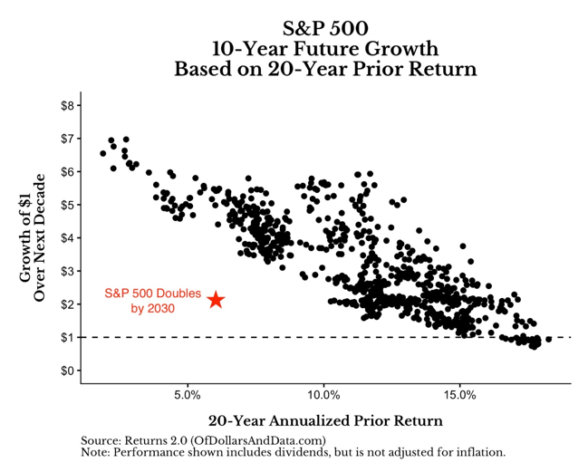
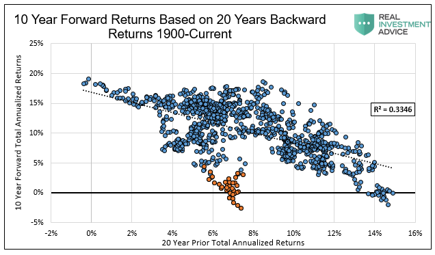
Never-Ending Gains

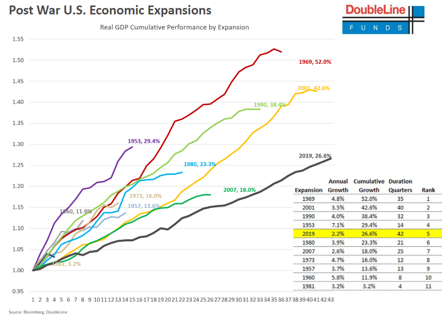
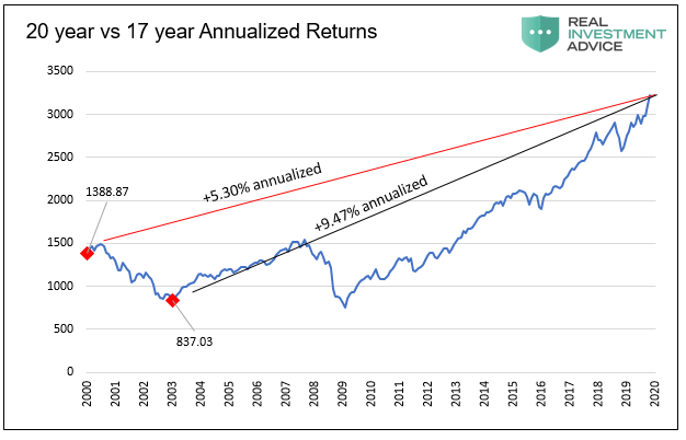
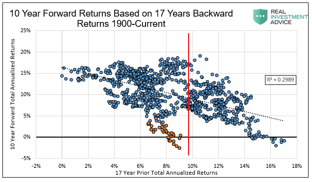
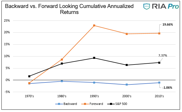
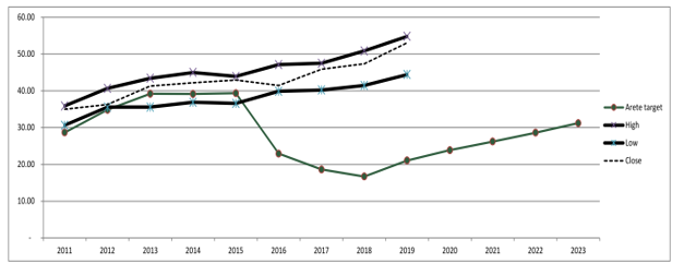
It is safe to say that the record-long economic expansion, to which no one saw an end, ended in February 2020 at 128 months. To suggest otherwise is preposterous given what we know about national economic shutdowns and the early look at record Initial Jobless Claims that surpassed three million. Between the trough in the S&P 500 from the financial crisis in March 2009 and the recent February peak, 3,999 days passed. The 10-year rally scored a total holding-period return of 528% and annualized returns of 18.3%. Although the longest expansion on record, those may be the most remarkable risk-adjusted performance numbers considering it was also the weakest U.S. economic expansion on record, as shown below.

They say “being early is wrong,” but the 30-day destruction of valuations erasing over three years of gains, argues that you could have been conservative for the past three years, kept a large allocation in cash, and are now sitting on small losses and a pile of opportunity with the market down 30%.

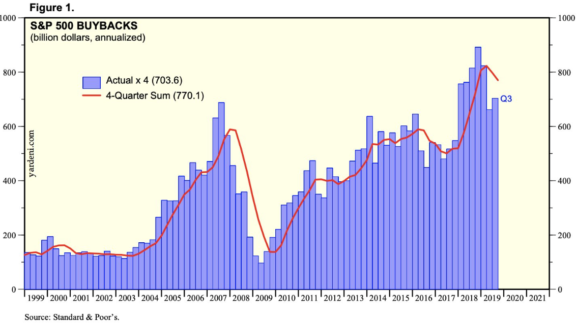
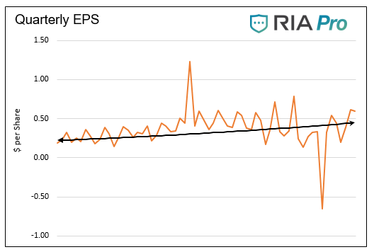
As we have documented time and again, the market for financial assets was a walking dead man, especially heading into 2020. Total corporate profits were stagnant for the last six years, and the optics of magnified earnings-per-share growth, thanks to trillions in share buybacks, provided the lipstick on the pig.

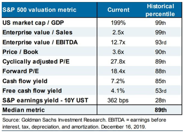
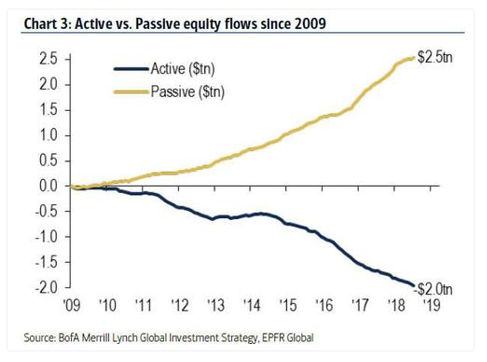
Passive investors indiscriminately and in most cases, unknowingly, bought $1.5 trillion in over-valued stocks and bonds, helping further push the market to irrational levels. Even Goldman Sachs’ assessment of equity market valuations at the end of 2019, showed all of their valuation measures resting in the 90-99th percentile of historical levels.
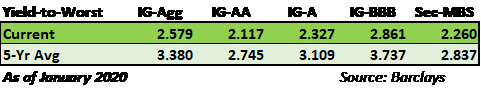
Blind Bond Markets

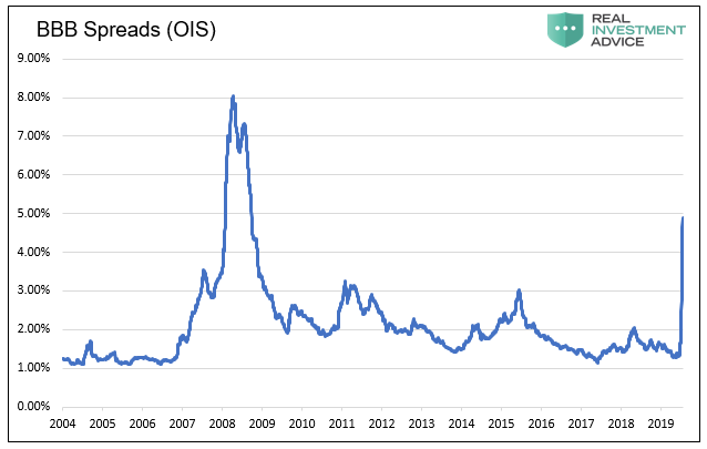
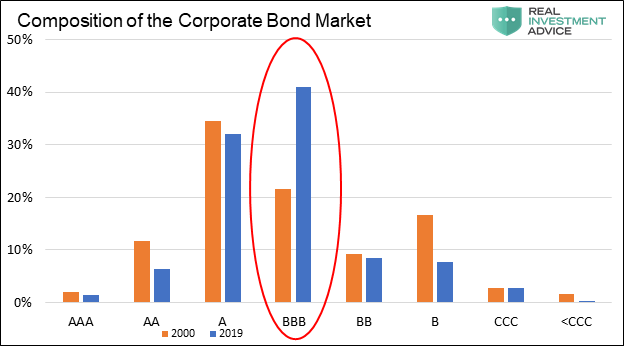
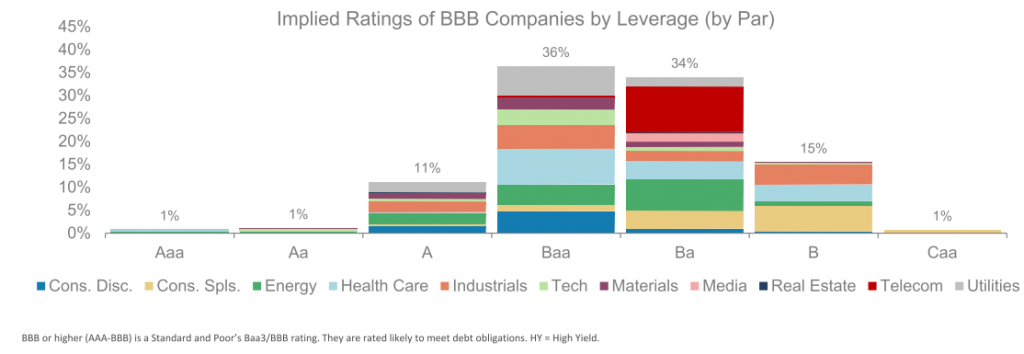
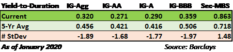
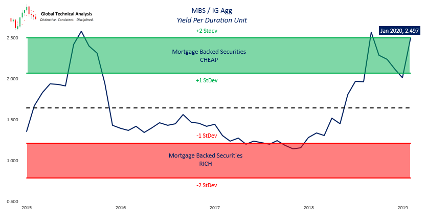
The fixed income markets were also swarming with indiscriminate buyers. The corporate bond market was remarkably overvalued with tight spreads and low yields that in no way offered an appropriate return for the risk being incurred. Investment-grade bonds held the highest concentration of BBB credit in history, most of which did not qualify for that rating by the rating agencies’ own guidelines. The junk bond sector was full of companies that did not produce profits, many of whom were zombies by definition, meaning the company did not generate enough operating income to cover their debt servicing costs. The same held for leveraged loans and collateralized loan obligations with low to no covenants imposed. And yet, investors showed up to feed at the trough. After all, one must reach for extra yield even if it means forgoing all discipline and prudence.

To say that no lessons were learned from 2008 is an understatement.

Black Swan

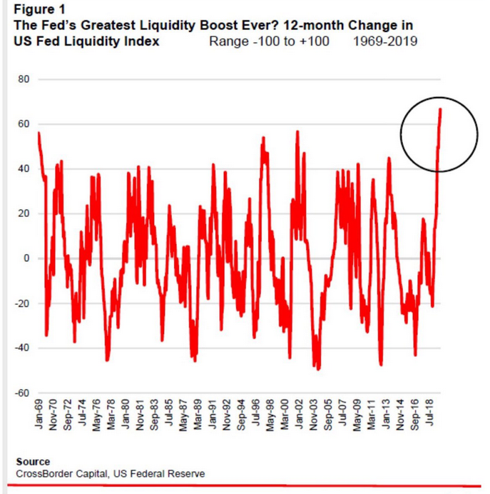
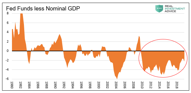
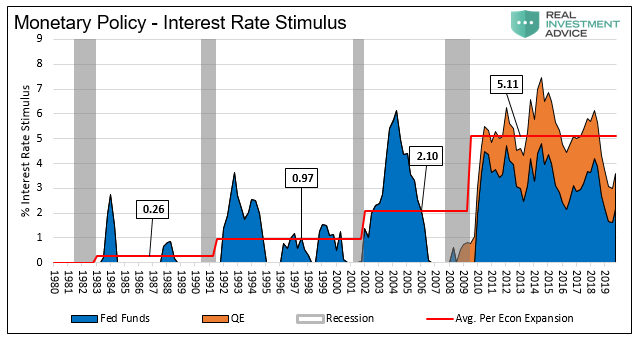
Meanwhile, as the markets priced to ridiculous valuations, corporate executives and financial advisors got paid handsomely, encouraging shareholders and clients to throw caution to the wind and chase the market ever higher. Thanks also to imprudent monetary policies aimed explicitly at propping up indefensible valuations, the market was at risk due to any disruption.

What happened, however, was not a slow leaking of the market as occurred leading into the 2008 crisis, but a doozy of a gut punch in the form of a pandemic. Markets do not correct by 30% in 30 days unless they are extremely overvalued, no matter the cause. We admire the optimism of formerly super-intelligent bulls who bought every dip on the way down. Ask your advisor not just to tell you how he is personally invested at this time, ask him to show you. You may find them to be far more conservative in their investment posture than what they recommend for clients. Why? Because they get paid on your imprudently aggressive posture, and they do not typically “eat their own cooking”. The advisor gets paid more to have you chasing returns as opposed to avoiding large losses.

Summary

We are facing a new world order of DE-globalization. Supply chains will be fractured and re-oriented. Products will cost more as a result. Inflation will rise. Interest rates, therefore, also will increase contingent upon Fed intervention. We have become accustomed to accessing many cheap foreign-made goods, the price for which will now be altered higher or altogether beyond our reach. For most people, these events and outcomes remain inconceivable. The widespread expectation is that at some point in the not too distant future, we will return to the relative stability and tranquility of 2019. That assuredly will not be the case.

Society as a whole does not yet grasp what this will mean, but as we are fond of saying, “you cannot predict, but you can prepare.” That said, we need to be good neighbors and good stewards and alert one another to the rapid changes taking place in our communities, states, and nation. Neither investors nor Americans, in general, can afford to be intellectually lazy.

The COVID-19 virus triggered these changes, and they will have an enormous and lasting impact on our lives much as 9-11 did. Over time, as we experience these changes, our brains will think differently, and our decision-making will change. Given a world where resources are scarce and our proclivity to – since it is made in China and “cheap” – be wasteful, this will probably be a good change. Instead of scoffing at the frugality of our grandparents, we just might begin to see their wisdom. As a nation, we may start to understand what it means to “save for a rainy day.”

Save, remember that forgotten word.

As those things transpire – maybe slowly, maybe rapidly – people will also begin to see the folly in the expedience of monetary and fiscal policy of the past 40 years. Expedience such as the Greenspan Put, quantitative easing, and expanding deficits with an economy at full employment. Doing “what works” in the short term often times conflicts with doing what is best for the most people over the long term.

Why QE Is Not Working

The process by which money is created is so simple that the mind is repelled.” – JK Galbraith

By formally announcing quantitative easing (QE) infinity on March 23, 2020, the Federal Reserve (Fed) is using its entire arsenal of monetary stimulus. Unlimited purchases of Treasury securities and mortgage-backed securities for an indefinite period is far more dramatic than anything they did in 2008. The Fed also revived other financial crisis programs like the Term Asset-Backed Securities Loan Facility (TALF) and created a new special purpose vehicle (SPV), allowing them to buy investment-grade corporate bonds and related ETF’s. The purpose of these unprecedented actions is to unfreeze the credit markets, stem financial market losses, and provide some ballast to the economy.

Most investors seem unable to grasp why the Fed’s actions have been, thus far, ineffective. In this article, we explain why today is different from the past. The Fed’s current predicament is unique as they have never been totally up against the wall of zero-bound interest rates heading into a crisis. Their remaining tools become more controversial and more limited with the Fed Funds rate at zero. Our objective is to assess when the monetary medicine might begin to work and share our thoughts about what is currently impeding it.

All Money is Lent in Existence.

That sentence may be the most crucial concept to understand if you are to make sense of the Fed’s actions and assess their effectiveness.

Under the traditional fractional reserve banking system run by the U.S. and most other countries, money is “created” via loans. Here is a simple example:

  • John deposits a thousand dollars into his bank
  • The bank is allowed to lend 90% of their deposits (keeping 10% in “reserves”)
  • Anne borrows $900 from the same bank and buys a widget from Tommy
  • Tommy then deposits $900 into his checking account at the same bank
  • The bank then lends to someone who needs $810 and they spend that money, etc…

After Tommy’s deposit, there is still only $1,000 of reserves in the banking system, but the two depositors believe they have a total of $1,900 in their bank accounts.  The bank’s accountants would confirm that. To make the bank’s accounting balance, Anne owes the bank $900. The money supply, in this case, is $1,900 despite the amount of real money only being $1,000.

That process continually feeds off the original $1,000 deposit with more loans and more deposits. Taken to its logical conclusion, it eventually creates $9,000 in “new” money through the process from the original $1,000 deposit.

To summarize, we have $1,000 in deposited funds, $10,000 in various bank accounts and $9,000 in new debt. While it may seem “repulsive” and risky, this system is the standard operating procedure for banks and a very effective and powerful tool for generating profits and supporting economic growth. However, if everyone wanted to take their money out at the same time, the bank would not have it to give. They only have the original $1,000 of reserves.

How The Fed Operates

Manipulating the money supply through QE and Fed Funds targeting are the primary tools the Fed uses to conduct monetary policy. As an aside, QE is arguably a controversial blend of monetary and fiscal policy.

When the Fed provides banks with reserves, their intent is to increase the amount of debt and therefore the money supply. As such, more money should result in lower interest rates. Conversely, when they take away reserves, the money supply should decline and interest rates rise. It is important to understand, the Fed does not set the Fed Funds rate by decree, but rather by the aforementioned monetary actions to incentivize banks to increase or reduce the money supply.

The following graph compares the amount of domestic debt outstanding versus the monetary base.

Data Courtesy: St. Louis Federal Reserve

Why is QE not working?

So with an understanding of how money is created through fractional reserve banking and the role the Fed plays in manipulating the money supply, let’s explore why QE helped boost asset prices in the past but is not yet potent this time around.

In our simple banking example, if Anne defaults on her loan, the money supply would decline from $1,900 to $1,000. With a reduced money supply, interest rates would rise as the supply of money is more limited today than yesterday. In this isolated example, the Fed might purchase bonds and, in doing so, conjure reserves onto bank balance sheets through the magic of the digital printing press. Typically the banks would then create money and offset the amount of Anne’s default.  The problem the Fed has today is that Anne is defaulting on some of her debt and, at the same time, John and Tommy need and want to withdraw some of their money.

The money supply is declining due to defaults and falling asset prices, and at the same time, there is a greater demand for cash. This is not just a domestic issue, but a global one, as the U.S. dollar is the world’s reserve currency.

For the Fed to effectively stimulate financial markets and the economy, they first have to replace the money which has been destroyed due to defaults and lower asset prices. Think of this as a hole the Fed is trying to fill. Until the hole is filled, the new money will not be effective in stimulating the broad economy, but instead will only help limit the erosion of the financial system and yes, it is a stealth form of bailout. Again, from our example, if the banks created new money, it would only replace Anne’s default and would not be stimulative.

During the latter part of QE 1, when mortgage defaults slowed, and for all of the QE 2 and QE 3 periods, the Fed was not “filling a hole.” You can think of their actions as piling dirt on top of a filled hole.

These monetary operations enabled banks to create more money, of which a good amount went mainly towards speculative means and resulted in inflated financial asset prices. It certainly could have been lent toward productive endeavors, but banks have been conservative and much more heavily regulated since the crisis and prefer the liquid collateral supplied with market-oriented loans.

QE 4 (Treasury bills) and the new repo facilities introduced in the fall of 2019 also stimulated speculative investing as the Fed once again piled up dirt on top of a filled hold.  The situation changed drastically on February 19, 2020, as the virus started impacting perspectives around supply chains, economic growth, and unemployment in the global economy. Now QE 4, Fed-sponsored Repo, QE infinity, and a smorgasbord of other Fed programs are required measures to fill the hole.

However, there is one critical caveat to the situation.

As stated earlier, the Fed conducts policy by incentivizing the banking system to alter the supply of money. If the banks are concerned with their financial situation or that of others, they will be reluctant to lend and therefore impede the Fed’s efforts. This is clearly occurring, making the hole progressively more challenging to fill. The same thing happened in 2008 as banks became increasingly suspect in terms of potential losses due to their exorbitant leverage. That problem was solved by changing the rules around how banks were required to report mark-to-market losses by the Federal Accounting Standards Board (FASB). Despite the multitude of monetary and fiscal policy stimulus failures over the previous 18 months, that simple re-writing of an accounting rule caused the market to turn on a dime in March 2009. The hole was suddenly over-filled by what amounted to an accounting gimmick.

Summary

Are Fed actions making headway on filling the hole, or is the hole growing faster than the Fed can shovel as a result of a tsunami of liquidity problems? A declining dollar and stability in the short-term credit markets are essential gauges to assess the Fed’s progress.

The Fed will eventually fill the hole, and if the past is repeated, they will heap a lot of extra dirt on top of the hole and leave it there for a long time. The problem with that excess dirt is the consequences of excessive monetary policy. Those same excesses created after the financial crisis led to an unstable financial situation with which we are now dealing.

While we must stay heavily focused on the here and now, we must also consider the future consequences of their actions. We will undoubtedly share more on this in upcoming articles.

Quick Take: The Dollar Problem

Over the last two weeks, the U.S. dollar index has risen by 6%. That may not seem like much to investors who are watching stocks rise and fall by that amount, and even more daily or bond yields falling in half and then doubling, but trust us; it is.

The dollar is unlike any other asset because it is the world’s reserve currency. When a Canadian tire company buys rubber from a Philippine rubber company, the payment occurs in U.S. dollars. Both countries have their own currencies, but neither currency has the liquidity, deep credit markets, and quite frankly, the world’s largest economy and military power backing it.

Because so many foreign countries and companies transact with dollars, they need to borrow in dollars, despite the fact their revenue is often not in dollars. This creates a mismatch between revenues and expenses as currency values fluctuate. If the mismatch is not hedged, as is frequently the case, foreign borrowers of U.S. dollars are subject to higher borrowing costs if the dollar rises versus their local currency. Simply the local currency depreciates versus the dollar; therefore, they need more of the local currency to make good on their debt. Because of this construct, a stronger dollar is effectively a tightening of financial conditions on the rest of the world.

This is what is occurring today as the virus is severely impacting the global economy. Revenues are deteriorating and the cost of dollar-denominated foreign debt is rising rapidly. As borrowers scramble to raise more dollars to meet their obligations, the situation worsens as the demand for dollars forces the dollar higher. In layman’s terms, there is a global run on the dollar and, in circular fashion, the run is pushing the dollar higher. Either the global economy will break or the dollar. Right now it seems that despite massive liquidity from the Fed the dollar does not want to back down.  

How Far Can Stocks Fall?

The question repeatedly asked of us last week is how much more can the stock market fall? We don’t have a crystal ball and we cannot predict the future but we can take steps to prepare for it.  Our analysis and understanding of history allow us to use many different fundamental and technical models to create a broad range of possible answers to the question. With that range of potential outcomes we adjust our risk tolerance as appropriate.

For example, in our daily series of RIA Pro charts and the weekly Newsletter, we lay out key technical, sentiment, and momentum measures for many markets, sectors, and stocks. In doing so, we provide a range of potential shorter-term outcomes. We also depend on feedback from other reliable independent services such as Brett Freeze at Global Technical Analysis. His work is exclusively and routinely featured every month in Cartography Corner on RIA Pro.

In this article, we move beyond technical analysis and share a simple fundamental valuation analysis to help provide more guidance as to where the market may trade in the coming months and even years. This analysis can be viewed as bullish or bearish. Our goal is not to persuade you towards one direction or the other, but to open your eyes to the wide range of possibilities.

CAPE

The data employed in this analysis is as of the market close on March 13, 2020.

Shiller’s Cyclically Adjusted Price to Earnings (CAPE 10) is one of our preferred valuation measures. Robert Shiller developed the CAPE 10 model to help investors assess valuations based on dependable, longer-term earnings trends. The most common CAPE analysis uses ten years of earnings data. The period is not too sensitive to transitory gyrations in earnings and it frequently includes a full economic cycle.

As shown below, monthly readings of CAPE fluctuate around the historical average (dotted line). The variance of valuations around the mean is put into further context with the right side y-axis, which shows how many sigma’s (standard deviations) each reading is from the average. The current CAPE of 25.36, or +1.10 sigma’s from the mean.

Data Courtesy Robert Shiller

The average CAPE over the 120+ years is 17.06, the maximum was 44.20, and the minimum was 4.78.   

If we use more recent data, say from 1980 to current, the average CAPE is 22.29. Due to the higher average over the period, which includes the late 90s dot com bubble and the housing bubble, the current reading is only .36 sigma’s above its average.

The following tables, using both time frames, provide price guidance based on where the S&P 500 would need to be if CAPE were to move to its average, maximum, and minimum, as well as plus or minus one sigma from the mean.

The graph below shows the S&P 500 price in relation to that which would occur if the CAPE ratio went to its average, maximum, minimum, and plus or minus one sigma from the last 120 years.

It is important to stress that the denominator, earnings, includes data from March 2010 to February 2020. That ten years did not include a recession, which, over the 120+ years in this analysis, only happened briefly one other time, the late 1990’s.

The Corona Virus will no doubt hurt earnings for at least a few quarters and could push the economy into a recession. Accordingly, the denominator in CAPE will likely be declining. Whether or not CAPE rises for falls depends on the price action of the index.

Summary

Stocks are not cheap. As shown, a reversion to the average of the last 120 years, would result in an additional 33% decline from current levels. While the massive range of outcomes may appear daunting, this analysis is designed to help better understand the bounds of the market.

The S&P 500 certainly has room to trade much lower. It can also double in price and stay within the bounds of history. Lastly, given the unprecedented nature of current circumstances, it may be different this time and write new history.   

Our Triple-C Rated Economy: Complacency, Contradictions, and Corona

“I got my toes in the water, ass in the sand

Not a worry in the world, a cold beer in my hand

Life is good today, life is good today” – Toes, Zac Brown Band

The economic and social instabilities in the U.S. are numerous and growing despite the fact that many of these factors have been in place and observable for years.   

  • Overvaluation of equity markets
  • Weak GDP Growth
  • High Debt to GDP levels
  • BBB Corporate Debt at Record Levels
  • High Leverage and Margin Debt
  • Weak Productivity
  • Growing Fiscal Deficits
  • Geopolitical uncertainty
  • Acute Domestic Political Divisiveness
  • Rising Populism
  • Trade Wars
  • Corona Virus

As we know, this list could be extended for pages, however, the one thing that will never show up on this list is…? 

Inflation.

Inflation

As reported by the Bureau of Labor Statistics (BLS) and the Bureau of Economic Analysis (BEA), inflation has been running above 2% for the better part of the last few years. Despite CPI being greater than their 2% target, the Federal Reserve (Fed) has been wringing their hands about the lack of inflation. They insist that inflation, as currently measured, is too low. We must disclaim, this all assumes we should have confidence in these measurements.

At his January 29, 2020 press conference, Chairman Powell stated:

“…inflation that runs persistently below our objective can lead longer-term inflation expectations to drift down, pulling actual inflation even lower. In turn, interest rates would be lower, as well, closer to their effective lower bound.

As a result, we would have less room to reduce interest rates to support the economy in a future downturn to the detriment of American families and businesses. We have seen this dynamic play out in other economies around the world and we’re determined to avoid it here in the United States.”

Contradictions

There are a couple of inconsistencies in Powell’s comments from the most recent January 2020 post-FOMC press conference. These are issues we have become increasingly interested in exploring because of the seeming incoherence of Fed policy. Further, as investors, high valuations and PE multiple expansion appear predicated upon “favorable” monetary policy. If investors are to rely on the Fed, they would be well-advised to understand them and properly judge their coherence.

 As discussed in Jerome Powell & the Fed’s Great Betrayal, Powell states that the supply of money that the Fed provides to the system is to be based on the demand for money – not the economic growth rate. That is a major departure from orthodox monetary policy. If investors had been paying attention, the bond market should have melted down on that one sentence. It did not because the market pays attention to the current implications for the Fed’s actions, not the future shock of such a policy. It is a myopic curse that someday could prove costly to investors.

As for Powell’s quote above, the first inconsistency is that the circumstances they have seen “play out in other countries” have not shown itself in the U.S. To front-run something that has not occurred assumes you are correct to anticipate it occurring in the future. It is pure speculation and quite a leap even for those smart PhDs at the Fed.

“Overall, the U.S. economy appears likely to expand at a moderate pace over the second half of 2007, with growth then strengthening a bit in 2008 to a rate close to the economy’s underlying trend.”  – Ben Bernanke, Testimony to Senate Banking Committee, July 2007

Although we have not actually seen this “dynamic” play out in the U.S. since the great depression, Fed officials are so concerned about deflation that they have begun telegraphing their intent to allow inflation to overshoot their 2% target. Based on current Fed guidance, periods of lesser inflation would be offset by periods of higher inflation.

Our question is, how do they come to that conclusion and based on what analytical rigor and evidence? There is, by the way, evidence from other countries throughout the history of humanity, that when money is printed to accommodate the spending incontinence of politicians, people lose confidence in the domestic currency. That would be devastatingly inflationary, and it is, without question of measurements, where we are headed.

The next inconsistency is that the Fed’s protracted engagement in quantitative easing (QE) over the past ten years has created precisely the circumstances about which Powell warns here – “less room to reduce interest rates… to the detriment of American families and businesses.”

The Chairman of the U.S. Fed, Jerome Powell, should understand how supply and demand works, but as a reminder, the less available something is, everything else constant, the more it is worth. Mr. Chairman, your predecessors removed $3.5 trillion of bonds from the market, what did you think would happen to bond prices and therefore yields?

Powell stumbled head-first into that self-contradiction, especially after watching the fantastic failure to normalize rates through rate hikes and quantitative tightening (QT) earlier in 2019, which caused him to perform a hasty 180-degree policy reversal in the fall of 2019.

We think this is a workable plan, and it will, as one of my colleagues, President Harker, described it, it will be like watching paint dry, that this will just be something that runs quietly in the background. – Janet Yellen, Federal Reserve Chairman, June 14, 2017, FOMC Press Conference

Contrary to the reassurances of Janet Yellen and many other Fed members, it (QT) was a lot more exciting than watching paint dry. That too is troubling.

Wise Owl

In a recent interview on RealVision TV, James Grant, publisher of Grants Interest Rate Observer said:

“Is inflation a thing of the past?… are forces in place today that could reproduce [the great inflation of the 1970s? Inflation by definition, represents a loss of confidence in money. How do you lose confidence in money? Well, you create too much of it to subsidize the spending habits of the politicians. That’s one possible cause and are we on the way to something like that? Well, possibly. In this splendid economy, we’re generating a trillion-dollar budget deficit.”

Grant continues:

“Then two, there is the physical structure of the economy. We live in a world of expedited delivery of just in time rather than just in case. We live in a world of ubiquitous information about supply chains, but maybe if push comes to shove in the world of geopolitics, the supply chains might break. Lo and behold, we might be on our own in America for things we now import, and if we are, those prices would not be so low, they would be much higher.”

Again, pointing back to our recent article referenced above, Jerome Powell & the Fed’s Great Betrayal, there are other indicators of inflation that contradict what the Fed believes. In that article, we discussed real-world examples such as M2 growth, and auto and housing prices, to contrast with the BLS and Fed engineered metrics. Despite a plethora of readily available data to the contrary, we are continually reminded by the Fed of the absence of inflation.

As we know, the Fed just began another round of radical policy accommodation to incite higher inflation. If you pre-suppose a confluence of circumstances that begins to constrict global supply chains, then the inflation Grant theorizes might not be so far-fetched. The Fed, as has historically been the case, would be caught looking the wrong way, and given their proclivity toward wanting more inflation, it would almost certainly be too late to respond.

“Moreover, the agencies have made clear that no bank is too-big-too-fail, so that bank management, shareholders, and un-insured debt holders understand that they will not escape the consequences of excessive risk-taking. In short, although vigilance is necessary, I believe the systemic risk inherent in the banking system is well-managed and well-controlled.” – Benjamin S. Bernanke Fed Chairman confirmation hearing November 15, 2005

“Rather than making management, shareholders, and debt holders feel the consequences of their risk-taking, you bailed them out. In short, you are the definition of moral hazard.” – Senator Jim Bunning at Bernanke second confirmation hearing December 3, 2009

In the same way, there were recorded levels of laughter in FOMC meetings at the absurd incentives homebuilders were offering to sell houses in 2004, 2005, and 2006. The Fed is now equally blind, neglect, and arrogant concerning the perceived absence of inflation. The laughter in the Eccles Building boardroom stopped abruptly in mid-2007 as the housing market stalled. The Coronavirus may be a similar wake-up call with serious economic consequences.

Here and Now

The situation that is developing illustrates the one-dimensional nature of Fed thinking. Despite having the latest news on the spread of the Corona Virus at the January 29, 2020 Federal Open Market Committee (FOMC) meeting, the Fed’s concern was for a slowdown in global growth and failed attempts to prime inflation. There was no consideration for possible second and third-order effects of the virus.

What are the possible second and third-order effects? They are the things that follow after the obvious occurs. In this case, there is no question that China’s growth is going to be hurt by the virus and quarantines, the restrictions on flight and travel, and factory shutdowns. That is obvious.

Consider the virus is now spreading rapidly to other suppliers of U.S. goods and services such as Korea, Japan, and Italy. What might not be obvious is that the growing problem will impede global commerce and cause fractures in the extensive and complex network of global supply chains. Goods and services we are accustomed to finding on the shelves of the local Wal-Mart or via the internet may not be available to us, or if they are, they may come at a cost well above the price we paid before the pandemic. If that occurs, those changes in prices will eventually find their way to the BLS inflation data collectors, and then, as the old saying goes, all bets are off.

Summary

There are plenty of uncertainties in the world. Individuals have the decision-making ability to evaluate those uncertainties and the risks they pose. That said, it is difficult to remember a time when the potential turbulence we face has been so broadly ignored by the “market” and so overlooked by the Fed and politicians. It is as though we have been tranquilized by the ever-rising stock market and net worth as an artifact of that fallacious indicator of security.

By all appearances, stock index levels convey not a worry in the world. Indeed, life is good today. We are just not so sure about tomorrow.

Digging For Value in a Pile of Manure

A special thank you to Brett Freeze of Global Technical Analysis for his analytical rigor and technical expertise.

There is an old story about a little boy who was such an extreme optimist that his worried parents took him to a psychiatrist. The doctor decided to try to temper the young boy’s optimism by ushering him into a room full of horse manure. Promptly the boy waded enthusiastically into the middle of the room saying, “I know there’s a pony in here somewhere!”

Such as it is with markets these days.

Finding Opportunity

These days, we often hear that the financial markets are caught up in the “Everything Bubble.” Stocks are overvalued, trillions in sovereign debt trade with negative interest rates, corporate credit, both investment grade, and high yield seem to trade with far more risk than return, and so on. However, as investors, we must ask, can we dig through this muck and find the pony in the room.

To frame this discussion, it is worth considering the contrast in risk between several credit market categories. According to the Bloomberg-Barclays Aggregate Investment Grade Corporate Index, yields at the end of January 2020 were hovering around 2.55% and in a range between 2.10% for double-A (AA) credits and 2.85% for triple-B (BBB) credits. That means the yield “pick-up” to move down in credit from AA to BBB is only worth 0.75%. If you shifted $1 million out of AA and into BBB, you should anticipate receiving an extra $7,500 per year as compensation for taking on significantly more risk. Gaining only 0.75% seems paltry compared to historical spreads, but in a world of microscopic yields, investors are desperate for income and willing to forego risk management and sound judgment.

As if the poor risk premium to own BBB over AA is not enough, one must also consider there is an unusually high concentration of BBB bonds currently outstanding as a percentage of the total amount of bonds in the investment-grade universe. The graph below from our article, The Corporate Maginot Line, shows how BBB bonds have become a larger part of the corporate bond universe versus all other credit tiers.

In that article, we discussed and highlighted how more bonds than ever in the history of corporate credit markets rest one step away from losing their investment-grade credit status.

Furthermore, as shared in the article and shown below, there is evidence that many of those companies are not even worthy of the BBB rating, having debt ratios that are incompatible with investment-grade categories. That too is troubling.

A second and often overlooked factor in evaluating risk is the price risk embedded in these bonds. In the fixed income markets, interest rate risk is typically assessed with a calculation called duration. Similar to beta in stocks, duration allows an investor to estimate how a change in interest rates will affect the price of the bond. Simply, if interest rates were to rise by 100 basis points (1.00%), duration allows us to quantify the effect on the price of a bond. How much money would be lost? That, after all, is what defines risk.

Currently, duration risk in the corporate credit market is higher than at any time in at least the last 30 years. At a duration of 8.05 years on average for the investment-grade bond market, an interest rate increase of 1.00% would coincide with the price of a bond with a duration of 8.05 to fall by 8.05%. In that case a par priced bond (price of 100) would drop to 91.95.

Yield Per Unit of Duration

Those two metrics, yield and duration, bring us to an important measure of value and a tool to compare different fixed income securities and classes. Combining the two measures and calculating yield per unit of duration, offers unique insight. Specifically, the calculation measures how much yield an investor receives (return) relative to the amount of duration (risk). This ratio is similar to the Sharpe Ratio for stocks but forward-looking, not backward-looking.

In the case of the aggregate investment-grade corporate bond market as described above, dividing 2.55% yield by the 8.05 duration produces a ratio of 0.317. Put another way, an investor is receiving 31.7 basis points of yield for each unit of duration risk. That is pretty skinny.

After all that digging, it may seem as though there may not be a pony in the corporate bond market. What we have determined is that investors appear to be indiscriminately plowing money into the corporate credit market without giving much thought to the minimal returns and heightened risk. As we have described on several other occasions, this is yet another symptom of the passive investing phenomenon.

Our Pony

If we compare the corporate yield per unit of duration metric to the same metric for mortgage-backed securities (MBS) we very well may have found our pony. The table below offers a comparison of yield per unit of duration ratios as of the end of January:

Clearly, the poorest risk-reward categories are in the corporate bond sectors with very low ratios. As shown, the ratios currently sit at nearly two standard deviations rich to the average. Conversely, the MBS sector has a ratio of 0.863, which is nearly three times that of the corporate sectors and is almost 1.5 standard deviations above the average for the mortgage sector.

The chart below puts further context to the MBS yield per unit of duration ratio to the investment-grade corporate sector. As shown, MBS are at their cheapest levels as compared to corporates since 2015.

Chart Courtesy Brett Freeze – Global Technical Analysis

MBS, such as those issued by Fannie Mae and Freddie Mac, are guaranteed against default by the U.S. government, which means that unlike corporate bonds, the bonds will always mature or be repaid at par. Because of this protection, they are rated AAA. MBS also have the added benefit of being intrinsically well diversified. The interest and principal of a mortgage bond are backed by thousands and even tens of thousands of different homeowners from many different geographical and socio-economic locations. Maybe most important, homeowners are desperately interested in keeping the roof over their head

In contrast, a bond issued by IBM is backed solely by that one company and its capabilities to service the debt. No matter how many homeowners default, an MBS investor is guaranteed to receive par or 100 cents on the dollar. Investors of IBM, or any other corporate bond, on the other hand, may not be quite so lucky.

It is important to note that if an investor pays a premium for a mortgage bond, say a 102-dollar price, and receives par in return, a loss may be incurred. The determining factor is how much cash flow was received from coupon payments over time. The same equally holds for corporate bonds. What differentiates corporate bonds from MBS is that the risk of a large loss is much lower for MBS.

Summary

As the chart and table above reveal, AAA-rated MBS currently have a very favorable risk-reward when compared with investment-grade corporate bonds at a comparable yield.

Although the world is distracted by celebrity investing in the FAANG stocks, Tesla, and now corporate debt, our preference is to find high quality investment options that deliver excellent risk-adjusted returns, or at a minimum improve them.

This analysis argues for one of two outcomes as it relates to the fixed income markets. If one is seeking fixed income credit exposure, they are better served to shift their asset allocation to a heavier weighting of MBS as opposed to investment-grade corporate bonds. Secondly, it suggests that reducing exposure to corporate bonds on an outright basis is prudent given their extreme valuations. Although cash or the money markets do not offer much yield, they are always powerful in terms of the option it affords should the equity and fixed income markets finally come to their senses and mean revert.

With so many assets having historically expensive valuations, it is a difficult time to be an optimist. However, despite limited options, it is encouraging to know there are still a few ponies around, one just has to hold their nose and get a little dirty to find it.

McDonald’s, Not A Shelter In The Coming Storm

The amount of time and effort that investors spend assessing the risks versus the potential returns of their portfolio should shift as the economy and markets cycle over time. For example, when an economic recovery finally breaks the grip of a recession, and asset prices and valuations have fallen to average or below-average levels, price and economic risks are greatly diminished. That is not to say there is no risk, just less risk.  

Market and economic troughs are akin to the aftermath of a forest fire. After a fire has ravaged a forest, the risks for another fire are not zero, but they are below average. Counter-intuitively, it is at these points in time when people are most fearful of fire or, in the case of investing, most worried about losses. With reduced risks, investors during these times should be more focused on the better than average rewards offered by the markets and not as concerned with the risks entailed in reaping those rewards.

Conversely, in the ninth inning of a bull market when valuations are well above the norm, and the economy has expanded for a long period, investors need to shift focus heavily to the potential risks. That is not to say there are no more rewards to come, but the overwhelming risks are substantial, and they can result in a permanent loss of wealth. As human beings are prone to do, we often zig when we should zag.

In January, we wrote Gimme Shelter to highlight that risk can be hard to detect. Sure, high flying companies with massive price gains and repeated net losses like Tesla or Netflix are easy to spot. More difficult, though, are those tried and true value stocks of companies that have flourished for decades. Specifically, we provided readers with an in-depth analysis of Coca-Cola (KO). While KO is a name brand known around the world with a long record of dependable earnings growth, its stock price has greatly exceeded its fair value.

We did not say that KO is a sure-fire short sale or even a sell. Instead, we conveyed that when a significant market drawdown occurs, KO has a lot more risk than is likely perceived by most investors. Simply, it is not the place investors should seek shelter in a market storm as they may have in the past.

We now take the opportunity to discuss another “value” company that many investors may consider a stock market shelter or safe haven.

We follow in this series with a review of McDonald’s (MCD).

You Deserve a Break Today

Please note the models and computations employed in this series use earnings per share and net income. Stock buybacks warp earnings per share (EPS), making earnings appear better than they would have without buybacks. The more positive result is simply due to a declining share count or denominator in the EPS equation. Net income and revenue data are unaffected by share buybacks and therefore deliver a more accurate appraisal of a company’s value.

Over the last ten years, the price of MCD has grown at a 13% annual rate, more than double its EPS, and over five times the rate of growth of its net income. The pace at which the growth of its stock price has surpassed its fundamentals has increased sharply over the last three years. During this period, the stock price has increased 46% annually, which is almost four times its EPS growth and more than six times the growth of its net income. 

Of further concern, revenues have declined 5% annually over the last three years, and the most recently reported annual revenues are now less than they were ten years ago when the U.S. and global GDP were only about 60% the size they are today. To pile on, the amount of debt MCD has incurred over the last ten years has increased by 355%.

MCD is a good company and, like KO, is one of the most well-known brands on the globe. Rated at BBB+, default or bankruptcy risk for MCD is remote, and because of its product line, it will probably see earnings hold up well during the next recession. For many, it is cheaper to eat at a McDonald’s restaurant than to cook at home. Although their operating business is valuable and dependable, those are not reasons to acquire or hold the stock. The issue is what price I am willing to pay in order to try to avoid a loss and secure a reasonable return.

Valuations

Using a simple price to earnings (P/E) valuation, as shown below, MCD’s current P/E for the trailing twelve months is 28, which is about 40% greater than its average over the last two decades.

The following graphs, tables, and data use the same models and methods we used to evaluate KO. For a further description, please read Gimme Shelter.    

Currently, as shown below, MCD is trading 85% above its fair value using our earnings growth model. It is worth noting that MCD, as shown with green shading, was typically valued as cheap using this model. The table below the graph shows that, on average, from 2002-2013, the stock traded 13% below fair value.

We support the graph and table above with a cash flow analysis. We assumed McDonald’s 5.6% long-run income growth rate to forecast earnings for the next 30 years. When these forecasted earnings are then discounted at the appropriate discounting rate of 7%, representing longer-term equity returns, MCD is currently overvalued by 72%.

Lastly, as we did in Gimme Shelter, we asked our friend David Robertson from Arete Asset Management to evaluate MCD’s intrinsic value. His cash flow-based model assigns an intrinsic share price value of 97.27. Based on his work, MCD is currently overvalued by 124%.

Summary

Like KO, we are not making a recommendation on MCD as a short or a sell candidate, but by our analysis, MCD stock appears to be trading at a very high valuation. Much of what we see in large-cap stocks today, MCD included, is being driven by indiscriminate buying by passive investment funds. Such buying can certainly continue, but at some point, the gross overvaluations will correct as all extremes do.

Even if MCD were to “only” decline back to a normal valuation, the losses could be significant and might even exceed those of the benchmark index, the S&P 500. Now consider that MCD may correct beyond the average and could once again trade below fair value.  Even assuming MCD earnings are not hurt during a recession, the correction in its stock price to more reasonable levels could be painful for shareholders.

Why “Not-QE” is QE: Deciphering Gibberish

I guess I should warn you, if I turn out to be particularly clear, you’ve probably misunderstood what I’ve said.”  – Alan Greenspan

Imagine if Federal Reserve (Fed) Chairman Jerome Powell told the American people they must pay more for the goods and services they consume.

How long would it take for mobs with pitchforks to surround the Mariner Eccles building?  However, Jerome Powell and every other member of the Fed routinely and consistently convey pro-inflationary ideals, and there is nary a protest, which seems odd. The reason for the American public’s complacency is that the Fed is not that direct and relies on carefully crafted language and euphemisms to describe the desire for higher inflation.

To wit, the following statements from past and present Fed officials make it all but clear they want more inflation:  

  • That is why it is essential that we at the Fed use our tools to make sure that we do not permit an unhealthy downward drift in inflation expectations and inflation,” – Jerome Powell November 2019
  • In order to move rates up, I would want to see inflation that’s persistent and that’s significant,” -Jerome Powell December 2019
  • Been very challenging to get inflation back to 2% target” -Jerome Powell December 2019
  • Ms. Yellen also said that continuing low inflation, regarded as a boon by many, could be “dangerous” – FT – November 2017
  • One way to increase the scope for monetary policy is to retain the Fed’s current focus on hitting a targeted value of inflation, but to raise the target to, say, 3 or 4 percent.” –Ben Bernanke October 2017
  • Further weakness in inflation could prompt the U.S. Federal Reserve to cut interest rates, even if economic growth maintains its momentum”  -James Bullard, President of the Federal Reserve Bank of St. Louis  May 2019
  • Fed Evans Says Low Inflation Readings Elevating His Concerns” -Bloomberg May 2019
  • “I believe an aggressive policy action such as this is required to re-anchor inflation expectations at our target.”  Neel Kashkari, President Minneapolis Fed June 2019

As an aside, it cannot be overemphasized the policies touted in the quotes above actually result in deflation, an outcome the Fed desperately fears.

The Fed, and all central banks for that matter, have a long history of using confusing economic terminology. Economics is not as complicated as the Fed makes it seem. What does make economics hard to grasp is the technical language and numerous contradictions the Fed uses to explain economics and justify unorthodox monetary policy. It is made even more difficult when the Fed’s supporting cast – the media, Wall Street and other Fed apologists – regurgitate the Fed’s gibberish.   

The Fed’s fourth installment of quantitative easing (“QE4”, also known as “Not-QE QE”) is vehemently denied as QE by the Fed and Fed apologists. These denials, specifically a recent article in the Financial Times (FT), provide us yet another opportunity to show how the Fed and its minions so blatantly deceive the public.

What is QE?

QE is a transaction in which the Fed purchases assets, mainly U.S. Treasury securities and mortgage-backed-securities, via their network of primary dealers. In exchange for the assets, the Fed credits the participating dealers’ reserve account at the Fed, which is a fancy word for a place for dormant money. In this transaction, each dealer receives payment for the assets sold to the Fed in an account that is essentially the equivalent of a depository account with the Fed. Via QE, the Fed has created reserves that sit in accounts maintained by it.

Reserves are the amount of funds required by the Fed to be held by banks (which we are using interchangeably with “primary dealer” for the remainder of this discussion) in their Fed account or in vault cash to back up a percentage of specified deposit liabilities. While QE is not directly money printing, it enables banks to create loans at a multiple of approximately ten times the reserves available, if they so choose.

Notice that “Quantitative Easing” is the preferred terminology for the operations that create additional reserves, not something easier to understand and more direct like money/reserve printing, Fed bond buying program, or liquidity injections. Consider the two words used to describe this policy – Quantitative and Easing. Easing is an accurate descriptor of the Fed’s actions as it refers to an action that makes financial conditions easier, e.g., lower interest rates and more money/liquidity. However, what does quantitative mean? From the Oxford Dictionary, “quantitative” is “relating to, measuring, or measured by the quantity of something rather than its quality.”   

So, QE is a measure of the amount of easing in the economy. Does that make sense to you? Would the public be so complacent if QE were called BBMPO (bond buying and money printing operations)? Of course not. The public’s acceptance of QE without much thought is a victory for the Fed marketing and public relations departments.

Is “Not-QE” QE?

The Fed and media are vehemently defending the latest round of repurchase market (“repo”) operations and T-bill purchases as “not QE.” Before the Fed even implemented these new measures, Jerome Powell was quick to qualify their actions accordingly: “My colleagues and I will soon announce measures to add to the supply of reserves over time,” “This is not QE.”

This new round of easing is QE, QE4, to be specific. We dissect a recent article from the FT to debunk the nonsense commonly used to differentiate these recent actions from QE.  

On February 5th, 2020, Dominic White, an economist with a research firm in London, wrote an article published by the FT entitled The Fed is not doing QE. Here’s why that matters.

The article presents three factors that must be present for an action to qualify as QE, and then it rationalizes why recent Fed operations are something else. Here are the requirements, per the article:

  1. “increasing the volume of reserves in the banking system”
  2. “altering the mix of assets held by investors”
  3. “influence investors’ expectations about monetary policy”

Simply:

  1.  providing banks the ability to make more money
  2.  forcing investors to take more risk and thereby push asset prices higher
  3.  steer expectations about future Fed policy. 

Point 1

In the article, White argues “that the US banking system has not multiplied up the Fed’s injection of reserves.”

That is an objectively false statement. Since September 2019, when repo and Treasury bill purchase operations started, the assets on the Fed’s balance sheet have increased by approximately $397 billion. Since they didn’t pay for those assets with cash, wampum, bitcoin, or physical currency, we know that $397 billion in additional reserves have been created. We also know that excess reserves, those reserves held above the minimum and therefore not required to backstop specified deposit liabilities, have increased by only $124 billion since September 2019. That means $273 billion (397-124) in reserves were employed (“multiplied up”) by banks to support loan growth.

Regardless of whether these reserves were used to back loans to individuals, corporations, hedge funds, or the U.S. government, banks increased the amount of debt outstanding and therefore the supply of money. In the first half of 2019, the M2 money supply rose at a 4.0% to 4.5% annualized rate. Since September, M2 has grown at a 7% annualized rate.  

Point 2

White’s second argument against the recent Fed action’s qualifying as QE is that, because the Fed is buying Treasury Bills and offering short term repo for this round of operations, they are not removing riskier assets like longer term Treasury notes and mortgage-backed securities from the market. As such, they are not causing investors to replace safe investments with riskier ones.  Ergo, not QE.

This too is false. Although by purchasing T-bills and offering repo the Fed has focused on the part of the bond market with little to no price risk, the Fed has removed a vast amount of assets in a short period. Out of necessity, investors need to replace those assets with other assets. There are now fewer non-risky assets available due to the Fed’s actions, thus replacement assets in aggregate must be riskier than those they replace.

Additionally, the Fed is offering repo funding to the market.  Repo is largely used by banks, hedge funds, and other investors to deploy leverage when buying financial assets. By cheapening the cost of this funding source and making it more readily available, institutional investors are incented to expand their use of leverage. As we know, this alters the pricing of all assets, be they stocks, bonds, or commodities.

By way of example, we know that two large mortgage REITs, AGNC and NLY, have dramatically increased the leverage they utilize to acquire mortgage related assets over the last few months. They fund and lever their portfolios in part with repo.

Point 3

White’s third point states, “the Fed is not using its balance sheet to guide expectations for interest rates.”

Again, patently false. One would have to be dangerously naïve to subscribe to White’s logic. As described below, recent measures by the Fed are gargantuan relative to steps they had taken over the prior 50 years. Are we to believe that more money, more leverage, and fewer assets in the fixed income universe is anything other than a signal that the Fed wants lower interest rates? Is the Fed taking these steps for more altruistic reasons?

Bad Advice

After pulling the wool over his reader’s eyes, the author of the FT article ends with a little advice to investors: Rather than obsessing about fluctuations in the size of the Fed’s balance sheet, then, investors might be better off focusing on those things that have changed more fundamentally in recent months.”

After a riddled and generally incoherent explanation about why QE is not QE, White has the chutzpah to follow up with advice to disregard the actions of the world’s largest central bank and the crisis-type operations they are conducting. QE 4 and repo operations were a sudden and major reversal of policy. On a relative basis using a 6-month rate of change, it was the third largest liquidity injection to the U.S. financial system, exceeded only by actions taken following the 9/11 terror attacks and the 2008 financial crisis. As shown below, using a 12-month rate of change, recent Fed actions constitute the single biggest liquidity injection in 50 years of data.

Are we to believe that the latest round of Fed policy is not worth following? In what is the biggest “tell” that White is not qualified on this topic, every investment manager knows that money moves the markets and changes in liquidity, especially those driven by the central banks, are critically important to follow.

The graph below compares prior balance sheet actions to the latest round.

Data Courtesy St. Louis Federal Reserve

This next graph is a not so subtle reminder that the current use of repo is simply unprecedented.

Data Courtesy St. Louis Federal Reserve

Summary

This is a rebuttal to the FT article and comments from the Fed, others on Wall Street and those employed by the financial media. The wrong-headed views in the FT article largely parrot those of Ben Bernanke. This past January he stated the following:

“Quantitative easing works through two principal channels: by reducing the net supply of longer-term assets, which increases their prices and lower their yields; and by signaling policymakers’ intention to keep short rates low for an extended period. Both channels helped ease financial conditions in the post-crisis era.”   -LINK

Bourbon, tequila, and beer offer drinkers’ very different flavors of alcohol, but they all have the same effect. This round of QE may be a slightly different cocktail of policy action, but it is just as potent as QE 1, 2, and 3 and will equally intoxicate the market as much, if not more.

Keep in mind that QE 1, 2, and 3 were described as emergency policy actions designed to foster recovery from an economic crisis. Might that fact be the rationale for claiming this round of liquidity is far different from prior ones? Altering words to describe clear emergency policy actions is a calculated effort to normalize those actions. Normalizing them gives the Fed greater latitude to use them at will, which appears to be the true objective. Pathetic though it may be, it is the only rationale that helps us understand their obfuscation.

Jerome Powell & The Fed’s Great Betrayal

“Lenin was certainly right. There is no subtler, no surer means of overturning the existing basis of society than to debauch the currency. The process engages all the hidden forces of economic law on the side of destruction, and does it in a manner which not one man in a million is able to diagnose.”

John Maynard Keynes – The Economic Consequences of Peace 1920

“And when we see that we’ve reached that level we’ll begin to gradually reduce our asset purchases to the level of the underlying trend growth of demand for our liabilities.” –Jerome Powell January 29, 2020.

With that one seemingly innocuous statement, Chairman Powell revealed an alarming admission about the supply of money and your wealth. The current state of monetary policy explains why so many people are falling behind and why wealth inequality is at levels last seen almost 100 years ago. 

REALity

 “Real” is a very important concept in the field of economics. Real generally refers to an amount of something adjusted for the effects of inflation. This allows economists to measure true organic growth or decline.

Real is equally important for the rest of us. The size of our paycheck or bank account balance is meaningless without an understanding of what money can buy. For instance, an annual income of $25,000 in 1920 was about eight times the national average. Today that puts a family of four below the Federal Poverty Guideline. As your grandfather used to say, a dollar doesn’t go as far as it used to.

Real wealth and real wage growth are important for assessing your economic standing and that of the nation.

Here are two facts:

  • Wealth is largely a function of the wages we earn
  • The wages we earn are predominately a function of the growth rate of the economy

These facts establish that the prosperity and wealth of all citizens in aggregate is meaningfully tied to economic growth or the output of a nation. It makes perfect sense.

Now, let us consider inflation and the role it plays in determining our real wages and real wealth.

If the rate of inflation is less than the rate of wage growth over time, then our real wages are rising and our wealth is increasing. Conversely, if inflation rises at a pace faster than wages, wealth declines despite a larger paycheck and more money in the bank.

With that understanding of “real,” let’s discuss inflation.

What is Inflation?

Borrowing from an upcoming article, we describe inflation in the following way:

“One of the most pernicious of these issues in our “modern and sophisticated” intellectual age is that of inflation. Most people, when asked to define inflation, would say “rising prices” with no appreciation for the fact that price movements are an effect, not a cause. They are a symptom of monetary circumstances. Inflation defined is, in fact, a disequilibrium between the amount of currency entering an economic system relative to the productive output of that same system.”

The price of cars, cheeseburgers, movie tickets, and all the other goods and services we consume are chiefly based on supply and demand. Demand is a function of both our need and desire to own a good and, equally importantly, how much money we have. The amount of money we have in aggregate, known as money supply, is governed by the Federal Reserve. Therefore, the supply of money is a key component of demand and therefore a significant factor affecting prices.

With the linkage between the supply of money and inflation defined, let us revisit Powell’s recent revelation.

“And when we see that we’ve reached that level we’ll begin to gradually reduce our asset purchases to the level of the underlying trend growth of demand for our liabilities.”

In plain English, Powell states that the supply of money is based on the demand for money and not the economic growth rate.  To clarify, one of the Fed’s largest liabilities currently are bank reserves. Banks are required to hold reserves for every loan they make. Therefore, they need reserves to create money to lend. Ergo, “demand for our liabilities,” as Powell states, actually means bank demand for the seed funding to create money and make loans.

The relationship between money supply and the demand for money may, in fact, be aligned with economic growth. If so, then the supply of money should rise with the economy. This occurs when debt is predominately employed to facilitate productive investments.

The problem occurs when money is demanded for consumption or speculation. For example:

  • When hedge funds demand billions to leverage their trading activity
  • When Apple, which has over $200 billion in cash, borrows money to buy back their stock  
  • When you borrow money to buy a car, the size of the economy increases but not permanently as you are not likely to buy another car tomorrow and the next day

Now ask, should the supply of money increase because of those instances?

The relationship between the demand for money and economic activity boils down to what percentage of the debt taken on is productive and helps the economy and the populace grow versus what percentage is for speculation and consumption.

While there is no way to quantify how debt is used, we do know that speculative and consumptive debt has risen sharply and takes up a much larger percentage of all debt than in prior eras.  The glaring evidence is the sharp rise of debt to GDP.

Data Courtesy St. Louis Federal Reserve

If most of the debt were used productively, then the level of debt would drop relative to GDP. In other words, the debt would not only produce more economic growth but would also pay for itself.  The exact opposite is occurring as growth languishes despite record levels of debt accumulation.

The speculative markets provide further evidence. Without presenting the long list of asset valuations that stand at or near record levels, consider that since the last time the S&P 500 was fairly valued in 2009, it has grown 375%. Meanwhile, total U.S. Treasury debt outstanding is up by 105% from $11 trillion to $22.5 trillion and corporate debt is up 55% from $6.5 trillion to $10.1 trillion. Over that same period, nominal GDP has only grown 46% and Average Hourly Earnings by 29%.

When the money supply is increased for consumptive and speculative purposes, the Fed creates dissonance between our wages, wealth, and the rate of inflation. In other words, they generate excessive inflation and reduce our real wealth.  

If this is the case, why is the stated rate of inflation less than economic growth and wage growth?

The Wealth Scheme

This scheme works like all schemes by keeping the majority of people blind to what is truly occurring. To perpetuate such a scheme, the public must be convinced that inflation is low and their wealth is increasing.

In 2000, a brand new Ford Taurus SE sedan had an original MSRP of $18,935. The 2019 Ford Taurus SE has a starting price of $27,800.  Over the last 19 years, the base price of the Ford Taurus has risen by 2.05% a year or a total of 47%. According to the Bureau of Labor Statics (BLS), since the year 2000, the consumer price index for new vehicles has only risen by 0.08% a year and a total of 1.68% over the same period.

For another instance of how inflation is grossly underreported, we highlighted flaws in the reporting of housing prices in MMT Sounds Great in Theory But…  To wit: 

“Since then, inflation measures have been tortured, mangled, and abused to the point where it scarcely equates to the inflation that consumers deal with in reality. For example, home prices were substituted for “homeowners equivalent rent,” which was falling at the time, and lowered inflationary pressures, despite rising house prices.

Since 1998, homeowners equivalent rent has risen 72% while house prices, as measured by the Shiller U.S. National Home Price Index has almost doubled the rate at 136%. Needless to say, house prices, which currently comprise almost 25% of CPI, have been grossly under-accounted for. In fact, since 1998 CPI has been under-reported by .40% a year on average. Considering that official CPI has run at a 2.20% annual rate since 1998, .40% is a big misrepresentation, especially for just one line item.”

Those two obscene examples highlight that the government reported inflation is not the same inflation experienced by consumers. It is important to note that we are not breaking new ground with the assertion that the government reporting of inflation is low. As we have previously discussed, numerous private assessments quantify that the real inflation rate could easily be well above the average reported 2% rate. For example, Shadow Stats quantifies that inflation is running at 10% when one uses the official BLS formula from 1980.

Despite what we may sense and a multitude of private studies confirming that inflation is running greater than 2%, there are a multitude of other government-sponsored studies that argue inflation is actually over-stated. So, the battle is in the trenches, and the devil is in the details.

As defined earlier, inflation is “a disequilibrium between the amount of currency entering an economic system relative to the productive output of that same system.”

The following graph shows that the supply of money, measured by M2, has grown far more than the rate of economic growth (GDP) over the last 20 years.

Data St. Louis Federal Reserve

Since 2000, M2 has grown 234% while GDP has grown at half of that rate, 117%. Over the same period, the CPI price index has only grown by 53%. M2 implies an annualized inflation rate over the last 20 years of 6.22% which is three times that of CPI. 

Dampening perceived inflation is only part of the cover-up. The scheme is also perpetuated with other help from the government. The government borrows to boost temporary economic growth and help citizens on the margin. This further limits people’s ability to detect a significant decline in their standard of living.

As shown below, when one strips out the change in government debt (the actual increase in U.S. Treasury debt outstanding) from the change in GDP growth, the organic economy has shrunk for the better part of the last 20 years. 

Data St. Louis Federal Reserve

It doesn’t take an economist to know that a 6.22% inflation rate (based on M2) and decade long recession would force changes to our monetary policy and send those responsible to the guillotines. If someone suffering severe headaches is diagnosed with a brain tumor, the problem does not go away because the doctor uses white-out to cover up the tumor on the x-ray film.

Despite crystal clear evidence, the mirages of economic growth and low inflation prevent us from seeing reality.

Summary

Those engaging in speculative ventures with the benefit of cheap borrowing costs are thriving. Those whose livelihood and wealth are dependent on a paycheck are falling behind. For this large percentage of the population, their paychecks may be growing in line with the stated government inflation rate but not the true inflation rate they pay at the counter. They fall further behind day by day as shown below.

While this may be hard to prove using government inflation data, it is the reality. If you think otherwise, you may want to ask why a political outsider like Donald Trump won the election four years ago and why socialism and populism are surging in popularity. We doubt that it is because everyone thinks their wealth is increasing. To quote Bill Clinton’s 1992 campaign manager James Carville, “It’s the economy, stupid.”

That brings us back to Jerome Powell and the Fed. The U.S. economy is driven by millions of individuals making decisions in their own best interests. Prices are best determined by those millions of people based on supply and demand – that includes the price of money or interest rates. Any governmental interference with that natural mechanism is a recipe for inefficiency and quite often failure.

If monetary policy is to be set by a small number of people in a conference room in the Eccles Building in Washington, D.C. who think they know what is best for us based on flawed data, then they should prepare themselves for even more radical social and political movements than we have already seen.

Quick Take: The Great “Tesla” Hysteria Of 2020

“Let us see how high we can fly before the sun melts the wax in our wings.” – E. O. Wilson

Since January 1, 2020, Tesla’s (TSLA) stock price has risen by $462 or 110%. TSLA’s market cap now exceeds every automaker except for Toyota. In fact, it exceeds not only the combined value of the “big three” automakers GM, Ford, and Chrysler/Fiat, but also companies like Charles Schwab, Target, Deere, Eli Lily, and Marriot to name a few large companies.

Seem crazy? Not as crazy as what comes next. Crazy are the expectations of Catherine Wood of ARK Invest. This well-known “disruptive innovation” based investor put out the following chart showing an expected price of $7,000 in 2024 with a $15,000 upside target.

Siren songs such as the one shown above encourage investors to chase the stock higher with reckless abandon, and maybe that is ARK’s intent. Given their large holding of TSLA, it certainly makes more sense than their price targets. Instead of taking her recommendations with blind faith, here are some statistics to illustrate what is required for TSLA to reach such lofty goals.

To start, let’s compare TSLA to their peer group, the auto industry. The chart below shows that TSLA has the second largest market cap in the auto industry, only behind Toyota. Despite the market cap, its sales are the lowest in the industry and by a lot. According to figures published on their website, TSLA sold 367,500 cars in 2019. General Motors sold 2.9 million and Ford sold 2.4 million.

Clearly investors are betting on the future, so let’s put ARK’s forecast into context.  

If the TSLA share price were to rise to their baseline forecast of 7,000, the market cap would increase to $1.26 trillion. Currently, the auto industry, as shown above, and including TSLA, aggregates to $772 billion. At the upside scenario of 15,000, the market cap of TSLA ($2.7 trillion) would be almost four times the current market cap of the entire auto industry.  More stunning, it would be greater than the combined value of Apple and Microsoft.

Even if we make the ridiculous assumption that TSLA will be the world’s only automaker, a price of 15,000 still implies a valuation that is three to four times the current industry average based on price to sales and price to earnings. At 7,000, its valuation would be 1.6 times the industry average. Again, and we stress, that is if TSLA is the world’s only automaker.

Summary

Tesla is one of a few poster children for the latest surge in the current bull market. That said, it’s worth remembering some examples from the past. For instance, Qualcomm (QCOM) was a poster child for the tech boom in the late 1990s. Below is a chart comparing the final surge in QCOM (Q4 1999) to the last three months of trading for TSLA.

In the last quarter of 1999, QCOM’s price rose by 277%. TSLA is only up 181% in the last three months and may catch up to QCOM’s meteoric rise. However, if history is any guide, QCOM likely offers what a textbook example of a blow-off top is. By 2003 QCOM lost 90% of its value and would not recapture the 1999 highs for 15 years. 

Tesla may be the next great automaker and, in doing so, own a sizeable portion of market share. However, to have estimates as high as those proposed by ARK, they must be the only automaker and assume fantastic growth in the number of cars bought worldwide. Given their technology is replicable and given the enormous incentives for competitors, we not only find ARK’s wild forecast exceedingly optimistic, but we believe it is already trading near a best-case scenario level.

One final factor that ARK Invest also seems to have neglected is the risk of an economic downturn. Although they do highlight a “Bear Case” price target of $1,500, that too seems incoherent. Given that TSLA is still losing money and is also heavily indebted, an economic slowdown would raise the risk of their demise. In such an instance, TSLA would probably become the property of one of the major car companies for less than $50 per share.

TSLA’s stock may run higher. Its price is now a function of all the key speculative ingredients – momentum, greed, FOMO, and of course, short covering. The sky always seems to be the limit in the short run, but as Icarus found out, be careful aiming for the sun.

**As we published the article Tesla was up 20% on the day. The one day jump raised their market cap by an amount greater than the respective market caps of KIA, Hyundai, Nissan, and Fiat/Chrysler!!

Maybe This Time Is Different?

“Stock prices have reached what looks like a permanently high plateau” – Irving Fisher, New York Times September 3, 1929

One of the more infamous quotes from the roaring ‘20s came within two months of a market peak, which would not be surpassed again until the 1950s. Between 1920 and September 1929, the Dow Jones Industrial Average rose over 18% on an annualized basis.  Economist Irving Fisher essentially declared that such outsized gains were the norm. As he discovered a couple of months later, that time was not different.

Today, with valuations as stretched as they were in 1929 and 1999, the calls for a lengthy continuation of the current bull market are growing to a crescendo. The sentiment is so extreme that some outlandish predictions on individual stocks and indexes are treated as gospel as opposed to the warnings they likely are.  

Despite the high likelihood of poor returns over the coming decade, more and more stock analysts are telling us this time is different. One particular article caught our attention and is worth discussing to show how data can be used to support nearly any view.

4x by 2030

The Investor’s Fallacy by Nick Magguilli, states the following:

“And the crazy part is that the red star represents “only” a doubling over the next decade.  If history were to repeat itself in some meaningful way, the S&P 500 would be 4x higher by 2030 than where it is today.” 

Magguilli’s bold statement is based on an analysis comparing prior returns to forward returns. Correctly, he assumes that periods of lower than average returns are typically followed by a period of higher returns. We wholeheartedly agree; however, one must first understand that this method of forecasting returns is heavily reliant on the dates one assigns to prior and forward periods.

The article shows several charts using different periods. The intention is to show that 20 year prior returns have a stronger correlation with ten year forward returns than other date ranges. The graph below from the article highlights his findings.

Below the graph Magguilli states the following:

“Think about how insane this would be relative to history.  If you are expecting anything less than a doubling of the S&P 500 by 2030, then you are suggesting that the red star above will be even lower on the y-axis than where I already placed it.  If this were to occur, it would be unlike anything we have ever seen before in terms of growth over such a long time period.

And the crazy part is that the red star represents “only” a doubling over the next decade.  If history were to repeat itself in some meaningful way, the S&P 500 would be 4x higher by 2030 than where it is today. 

This statement seems crazy right now, but that’s what has happened historically.  I understand that there is no law forcing U.S. markets to follow this trend indefinitely.  However, if you are forecasting an awful coming decade for U.S. stocks, I have some bad news for you—the evidence is heavily against you.

We repeat- the evidence is heavily against you. We find not only the forecast crazy but his assertion that anyone bracing for a period of weak returns is an outlier.”

With that ringing endorsement to quadruple your money in the next ten years, it is worth highlighting two significant flaws in the analysis.

Flaw #1

One of the reasons that his forecast for the 2020s is so high is that the preceding 20-year period started in 2000 at the peak of a ten-year bull market and what was clearly an equity market bubble. The total annualized return (dividends included) from that peak to today is 5.30%, as shown below. If instead he had used 17 years as his backward-looking period, the start date would have coincided with the bottom of the dot com crash, and the total annualized returns over the past period would have been significantly higher.

Recall, from his graph, the higher the prior period return, the lower the forecasted return and vice versa. The graph below shows how a relatively small change in the start date makes a big difference in the analytical conclusion.

Data Courtesy Shiller

As we will detail below, when one uses a 17-year prior period starting at the market trough, the expected annualized return is only 10% as opposed to Magguilli’s approximated 16% return using a 20-year time frame. This is certainly not the end of the world, as 10% is still an above-average return. To put the two returns in context, the 6% annualized difference on a $100,000 portfolio results in a $182,000 difference in returns over the ten-year period.

Most analysts, ourselves included, like to use even numbers when conducting long term analysis. In this case, an even 20 years coincides with an important market peak. The lesson from the first flaw is that the start and end dates and associated index values are very important.

Flaw #2

And though my process is limited by the amount of data that I have, I know that it’s not unreasonable.”

Despite Magguilli’s attestation, the amount of data he used could have been more robust. The second flaw in the article relates to the span of data used to assess correlation. We believe he is using approximately 60 years of data. While 60 years encompasses a lot of data, more data is readily available to make the analysis better. If we include data back to 1900, as shown below, the chart tells us something different about the future.

Data Shiller

The first thing to notice is that R2, or measure of correlation, drops significantly from .83 to .33. It appears a primary reason for the loss of correlation is the performance from the depression era, as shown with orange dots.   

The following graph uses prior 17-year returns from 1900 forward. The red line highlights the current prior 17 years annualized return of 9.47%.

Data Shiller

The expected total annualized return for the next decade is approximately 10%, denoted on the chart above where the red line crosses the dotted regression line. More importantly, the range of possible returns is much larger than what Nick’s graph shows.  Annualized returns could be as high as 18% but may also be as low as negative 3%. As it should, the risk-adjustment considering dispersion, or range of possible returns, raises a variety of other questions and concerns, among them, certitude in the original analysis.

Your guess is as good as ours on where returns will fall over the next ten years. However, consider that in 1929 valuations were similar to where levels stand today across a wide variety of metrics. Many valuation-based forecasts predict returns of plus or minus a few percent annualized over the next ten years.  The graph below, for example, shows that returns could easily be below zero for the next ten years.

For further perspective on valuations, the following table contrasts current valuations versus prior periods.

Additionally, the more rigorous and detailed analysis of Jeremy Grantham of GMO show 7-year projected returns which are not encouraging.

Summary

Maggiulli humbly states that he doesn’t know what the future holds, but the substance of the article suggests that you, dear investor, would be a fool not to buy and hold stocks for the next decade.

Although you cannot predict the future, you can prepare for it. What we do know is that we are well into a historically long bull market and valuations are in record territory. We believe that at this stage of the cycle investors should focus less on the potential rewards and much more on the risks. The primary reason is that market reversals are often sudden and vicious, especially from points of extreme valuation. As one example, after peaking on March 10, 2000, the NASDAQ composite wiped out 29% of its value in only three weeks and 37% in less than five weeks. Having been conditioned to “buy-the-dip” over the previous months and years, investors could not envision a lasting selloff despite the radical dislocation between market prices and fundamentals.  

For those who have enjoyed the benefits of the surging equity market over the past several quarters, congratulations on a race well run, but do not forget the importance of risk management. Those who fail to heed signs of caution or are blinded by false confidence tend to lose what they gained. Remember, the objective is compounding wealth over the long haul and not keeping up with the S&P 500 index.

We hope this article encourages you to think about current circumstances and develop plans to hedge and/or reduce exposure if and when you deem appropriate.

That “high plateau” Irving Fisher thought we had achieved in September 1929 cost him his reputation and his net worth. The cost of being prudent is not that expensive and, in part, depends on one questioning both bullish and bearish arguments.

Looking Beyond Apple and Microsoft

As the 1970s came to a close, six of the world’s ten largest companies were in the oil exploration, drilling, and services business. Just a few years earlier, on April 1, 1976, Steven Jobs and Steven Wozniak, two college dropouts working out of a garage, formed Apple Computers, Inc. In April 1975, Bill Gates and Paul Allen formed a company called Micro-Soft.

Four decades later, these two technology startups are the world’s largest companies, far surpassing the largest oil companies of the 1970s. In fact, the combined market capitalization of Microsoft and Apple is larger than the aggregate market cap of the domestic oil industry. Even more astounding, the combined market cap of Microsoft and Apple just surpassed the total market cap of the entire German stock market.

The table below shows the rotation of the world’s largest publically traded companies over the last fifty years. Of the companies shown below only five have been in the top ten for more than one decade.

Throughout history, most of the world’s largest companies are routinely supplanted by new and different companies from decade to decade. Furthermore, different industries tend to dominate each decade and then fade into the next decade as new industries dominate. For instance, in the 1970’s big oil accounted for six of the top ten largest companies. In the 1980’s, Japanese companies held eight of the top ten spots. In the 1990s it was telecom, the 2000s were controlled by banks and commodities, and this past decade was dominated by technology and social media companies.  

Throughout history, most of the world’s largest companies are routinely supplanted by new and different companies from decade to decade. Furthermore, different industries tend to dominate each decade and then fade into the next decade as new industries dominate. For instance, in the 1970’s big oil accounted for six of the top ten largest companies. In the 1980’s, Japanese companies held eight of the top ten spots. In the 1990s it was telecom, the 2000s were controlled by banks and commodities, and this past decade was dominated by technology and social media companies.  

While table offers several insights, we believe the most important lesson is that our investment strategies must focus on the future and our dependence on past strategies must be carefully considered. Today, two college dropouts in their parent’s basement fooling around with artificial intelligence, block chain, or robotics may prove to be worth more than Apple, Microsoft, or Amazon in just a few decades. The table also emphasizes the importance of selling high and rotating to that which has “value”.

To emphasize that point, we constructed the following graph. Although simple, it effectively illustrates the theme by comparing one stock looking backward and one stock looking forward as an investment strategy. The backward-looking strategy (blue line) buys the largest company at the end of each decade and holds it through the following decade. The forward-looking strategy (orange line), with the gift of 20/20 foresight, buys the company that will be the largest company at the end of the new decade and holds it for that decade.  For example, on January 1, 2010, the forward-looking strategy bought Microsoft and held it until December 31, 2019, while the backward-looking strategy bought Exxon and held it over the same period.

Due to the split-up of AT&T and poor price data, we used GM data which had the second largest market capitalization in 1969. For similar reasons, we also replaced Nippon Telephone and Telegraph (NTT) with The Bank of Tokyo. The graph is based on share price returns and is not inclusive of dividends.

The forward strategy beat the S&P 500 by over 12% a year, while the backward-looking strategy grossly underperformed with a negative cumulative annualized price return over the last 50 years. As startling as the differences are, they fail to provide proper context for the value of 50 years of compounding at the annualized rates of return as shown. If all three portfolios started with $100,000, the backward-looking portfolio would be worth $59,000 today, the S&P 500 worth $3,500,000 today, and the forward-looking portfolio would be worth $791,000,000 today.

Summary

Although no one knows what the top ten list will look like on December 31, 2029, we do know that the next ten years will not be like the last ten. The 2000’s brought two recessions and for the first time in recorded history, the 2010s brought NO recessions. Investors need to be opportunistic, flexible, creative and forward-looking in choosing investments. Investing in today’s winners is not likely to yield us the results of yesterday. It is difficult to fathom as Apple and Microsoft drive the entire market higher, but history warns that their breath-taking returns of the last decade should not be expected in the 2020’s. In fact, history and prudence argue one should sell high.

Gimme Shelter – Unlocked RIA Pro

Oh, a storm is threat’ning my very life today
If I don’t get some shelter oh yeah I’m gonna fade away
” – Rolling Stones

The graph below plots 15 years’ worth of quarterly earnings per share for a large, well known publicly traded company. Within the graph’s time horizon is the 2008 financial crisis and recession. Can you spot where it occurred? Hint- it is not the big dip on the right side of the graph or the outsized increase in the middle.

The purpose of asking the question is to point out that this company has very steady earnings growth with few instances of marked variation. The recession of 2008 had no discernable effect on their earnings. It is not a stretch to say the company’s earnings are recession-proof.

The company was formed in 1886 and is the parent of an iconic name brand known around the world. The company has matured into a very predictable company, as defined by steady earnings growth.

Fundamentally, this company has all the trappings of a safe and conservative investment the likes of which are frequently classified as defensive value stocks. These kinds of companies traditionally provide a degree of safety to investors during market drawdowns. Today, however, this company and many other “shelter stocks” are trading at valuations that suggest otherwise.

The following article was posted for RIA Pro subscribers last week.

For more research like this as well as daily commentary, investment ideas, portfolios, scanning and analysis tools, and our new 401K manager sign up today at RIA Pro and test drive our site for 30 days before being charged.

What is Value?

Determining the intrinsic value for an investment is a crucial baseline metric that investors must calculate if they want to properly determine whether the share price of a company is rich, cheap, or fair.

Investors use a myriad of computations, forecasts, and assumptions to calculate intrinsic value. As such, the intrinsic value for a company can vary widely based on numerous factors. 

We broadly define intrinsic value as the price that a rational investor would pay for the discounted cash flows, after expenses, of a company. More simply, what is the future stream of net income worth to you? As value investors, we prefer to invest in companies where the market value is below the intrinsic value. Doing so provides a margin of safety.

Jim Rogers, the former partner of George Soros, put it this way: “If you buy value, you won’t lose much even if you’re wrong.”

Calculating the intrinsic value with a high level of confidence is difficult, if not impossible, for some companies. For instance, many smaller biotech companies are formed to find a cure or treatment for one or two medical ailments. These firms typically lose money and burn through funding during the research and development (R&D) stage. If they successfully find a treatment or cure and financially survive the long FDA approval process, the shareholders are likely to receive hefty returns. The outcome may also be positive if they have a promising medication and a suitor with deep pockets buys the company. Because the outcome is uncertain, many biotech companies fail to maintain enough funding through the R&D stage.

Calculating an intrinsic value for a small biotech company can be like trying to estimate what you may win or lose at a roulette table. The number of potential outcomes is immense and highly dependent on your assumptions. 

Coca-Cola

At the other end of the spectrum, there are mature companies with very predictable cash flows, making intrinsic value calculations somewhat simple, as we will show.

Coca Cola (KO) is the company we referenced in the opening section. KO is one of the most well-known companies in the world, with an array of products sold in almost every country. KO is mature in its lifecycle with very dependable sales and earnings growth. The question we raise in this analysis is not whether or not KO is a good company, but whether or not its stock is worth buying.  To answer this question, we will determine its intrinsic value and compare it to the current value of the company.

The textbook way to calculate intrinsic value is to discount the future cash flows of the company. The calculation entails projecting net income for the next 30 years, discounting those annual income figures at an appropriate rate, and summing up the discounted cash flows. The answer is the present value of the total earnings stream based on an assumed earnings growth rate.

In our intrinsic value model for KO, we assumed an earnings growth rate of 4.5%, derived from its 20 year annualized earnings growth rate of 5.4% and it’s more recent ten year annualized growth rate of 2.9%. Recent trends argue that using 5.4% is aggressive. We used a discounting factor of 7% representing the historical return on equities. The model discounted 30 years of estimated future earnings.

The model, with the assumptions above, yields an intrinsic value of $157 billion. The current market cap, or value, of KO is $235 billion, meaning the stock is about 51% overvalued. Even if we assume the longer-term 20-year growth rate (5.4%), the stock is still 35% overvalued.

To confirm the analysis and illustrate it in a different format, we calculated what the stock price would be on a rolling basis had it grown in line with the prior rate of ten years of earnings growth. As shown in the graph and table below, the market value is currently 55% above the model’s valuation for KO.  The green and red areas highlight how much the stock was overvalued and undervalued.

To check our analysis, we enlisted our friend David Robertson from Arete Asset Management and asked him what intrinsic value his cash flow based model assigned to KO. The following is from David:

In looking at the valuation of KO, I see a couple of familiar patterns. The most obvious one is that the warranted value, based on a long-term model that discounts expected cash flows, is substantially below the current market value. Specifically, the warranted value per share is about $21, and nowhere near the mid-50s current market price. The biggest reason for this is that the discounted value of future investments has declined the last few years substantially due to lower economic returns and lower sustainable growth rates. In other words, as the company’s ability to generate future returns has diminished, its stock price has completely failed to capture the change.

The chart below from David compares his model’s current and future intrinsic value (Arete target) with the annual high, low, and closing price for KO.  David’s graph is very similar to what we highlighted above; KO has been trading at a steep premium to its intrinsic value for the last few years.

Lastly, we share a few more facts about KO’s valuations.

  • Revenues (sales) have been in decline since 2012
  • Price to Sales (6.99) is at a 20 year high and three times greater than the faster growing S&P 500
  • Price to Earnings (25.83 –trailing 12 mos.) is at a 17 year high
  • Price to Book (11.24) is at an 18 year high
  • Enterprise Value to EBITDA is at an eight-year high
  • Capital Expenditures are at a 15 year low and have declined rapidly over the last eight years
  • Book Value is at a ten year low
  • Debt has tripled over the last ten years while revenues and earnings have grown at about 15-20% over the same period

When Value Becomes Growth

In 2018 we wrote a six-part RIA Pro series called Value Your Wealth. Part of the series was devoted to the current divergence between value and growth stocks and the potential for outsized returns for value investors when the market reverts to the mean. In the article, we explored mutual funds and S&P sectors to show how value can be defined, but also how the title “value” is being mischaracterized.

One of the key takeaway from the series is that finding value is not always as easy as buying an ETF or fund with the word “value” in it. Nor, as we show with KO, can you rely on traditional individual stock mainstays to provide true value. Today’s value hunters must work harder than in years past.

Based on our model, KO traded below the model’s intrinsic value from 2003 through 2013 and likely in the years prior. As noted, its average discount to intrinsic value during this period was 41%. Since 2014 KO has traded well above its intrinsic value.

In 2014 passive investing strategies started to gain popularity. As this occurred, many companies’ share prices rose faster than their earnings growth. These stocks became connected to popular indexes and disconnected from their fundamentals. The larger the company and the more indexes they are in, the more that the wave of passive investing helped the share price. KO meets all of those qualifications. As the old saying goes, if you buy enough of them, the price will go up.

Summary

Buying “Value” is not as easy as buying shares in well-known companies with great brand names, proven track records, and relative earnings stability. As we exemplified with KO, great companies do not necessarily make great investments.

The bull market starting in 2009 is unique in many aspects. One facet that we have written extensively on is how so many companies have become overpriced due to indiscriminate buying from passive investment strategies. This has big implications for the next equity market drawdown as companies like KO may go down every bit as much or even more than the broader market.

Be careful where you seek shelter in managing your portfolio of stocks; it may not be the safe bunker that you think it is.  

In a follow-up article for RIA Pro, we will present similar analysis and expose more “value” companies.

Yeah…But

Yeah… Barry Bonds, a Major League Baseball (MLB) player, put up some amazing stats in his career. What sets him apart from other players is that he got better in the later years of his career, a time when most players see their production rapidly decline.

Before the age of 30, Bonds hit a home run every 5.9% of the time he was at bat. After his 30th birthday, that rate almost doubled to over 10%. From age 36 to 39, he hit an astounding .351, well above his lifetime .298 batting average. Of all Major League baseball players over the age of 35, Bonds leads in home runs, slugging percentage, runs created, extra-base hits, and home runs per at bat. We would be remiss if we neglected to mention that Barry Bonds hit a record 762 homeruns in his MLB career and he also holds the MLB record for most home runs in a season with 73.

But… as we found out after those records were broken, Bond’s extraordinary statistics were not because of practice, a new batting stance, maturity, or other organic factors. It was his use of steroids. The same steroids that allowed Bonds to get stronger, heal quicker, and produce Hall of Fame statistics will also take a toll on his health in the years ahead.  

Turn on CNBC or Bloomberg News, and you will inevitably hear the hosts and interviewees rave on and on about the booming markets, low unemployment, and the record economic expansion. To that, we say Yeah… As in the Barry Bonds story, there is also a “But…” that tells the whole story.

As we will discuss, the economy is not all roses when one considers the massive amount of monetary steroids stimulating growth. Further, as Bonds too will likely find out at some point in his future, there will be consequences for these performance-enhancing policies.

Wicksell’s Wisdom

Before a discussion of the abnormal fiscal and monetary policies responsible for surging financial asset prices and the record-long economic expansion, it is important to impart the wisdom of Knut Wicksell and a few paragraphs from a prior article we published entitled Wicksell’s Elegant Model.

“According to Wicksell, when the market rate (of interest) is below the natural rate, there is an incentive to borrow and reinvest in an economy at the higher natural rate. This normally leads to an economic boom until demand drives up the market rate and eventually chokes off demand. When the market rate exceeds the natural rate, borrowing slows along with economic activity eventually leading to a recession, and the market rate again falls back below the natural rate. Wicksell viewed the divergences between the natural rate and the market rate as the mechanism by which the economic cycle is determined. If a divergence between the natural rate and the market rate is abnormally sustained, it causes a severe misallocation of capital.

Per Wicksell, optimal policy should aim at keeping the natural rate and the market rate as closely aligned as possible to prevent misallocation. But when short-term market rates are below the natural rate, intelligent investors respond appropriately. They borrow heavily at the low rate and buy existing assets with somewhat predictable returns and shorter time horizons. Financial assets skyrocket in value while long-term, cash-flow driven investments with riskier prospects languish. The bottom line: existing assets rise in value but few new assets are added to the capital stock, which is decidedly bad for productivity and the structural growth of the economy.

Essentially, Wicksell warns that when interest rates are lower than they should be, speculation in financial assets is spurred and investment into the real economy suffers. The result is a boom in financial asset prices at the expense of future economic activity. Sound familiar? 

But… Monetary Policy

The Fed’s primary tool to manage economic growth and inflation is the Fed Funds rate. Fed Funds is the rate of interest that banks charge each other to borrow on an overnight basis. As the graph below shows, the Fed Funds rate has been pinned at least 2% below the rate of economic growth since the financial crisis. Such a low relative rate spanning such a long period is simply unprecedented, and in the words of Wicksell not “optimal policy.” 

Until the financial crisis, managing the Fed Funds rate was the sole tool for setting monetary policy. As such, it was easy to assess how much, if any, stimulus the Fed was providing at any point in time. The advent of Quantitative Easing (QE) made this task less transparent at the same time the Fed was telling us they wanted to be more transparent.  

Between 2008 and 2014, through three installations of QE, the Fed bought nearly $3.2 trillion of government, mortgage-backed, and agency securities in exchange for excess banking reserves. These excess reserves allowed banks to extend more loans than would be otherwise possible. In doing so, not only was economic activity generated, but the money supply rose which had a positive effect on the economy and financial markets.

Trying to quantifying the amount of stimulus offered by QE is not easy. However, in 2011, Fed Chairman Bernanke provided a simple rule in Congressional testimony to allow us to transform a dollar amount of QE into an interest rate equivalent. Bernanke suggested that every additional $6.6 to $10 billion of excess reserves, the byproduct of QE, has the effect of lowering interest rates by 0.01%. Therefore, every trillion dollars’ worth of new excess reserves is equivalent to lowering interest rates by 1.00% to 1.50% in Bernanke’s opinion. In the ensuing discussion, we use Bernanke’s more conservative estimate of $10 billion to produce a .01% decline in interest rates.

The graph below aggregates the two forms of monetary stimulus (Fed Funds and QE) to gauge how much effective interest rates are below the rate of economic growth. The blue area uses the Fed Funds – GDP data from the first graph. The orange area representing QE is based on Bernanke’s formula. 

Since the financial crisis, the Fed has effectively kept interest rates 5.11% below the rate of economic growth on average. Looking back in time, one can see that the current policy prescription is vastly different from the prior three recessions and ensuing expansions. Following the three recessions before the financial crisis, the Fed kept interest rates lower than the GDP rate to help foster recovery. The stimulus was limited in duration and removed entirely during the expansion. Before comparing these periods to the current expansion, it is worth noting that the amount of stimulus increased during each expansion. This is a function of the growth of debt in the economy beyond the economy’s growth rate and the increasing reliance on debt to generate economic growth. 

The current expansion is being promoted by significantly more stimulus and at much more consistent levels. Effectively the Fed is keeping rates 5.11% below normal, which is about five times the stimulus applied to the average of the prior three recessions. 

Simply the Fed has gone from periodic use of stimulus to heal the economy following recessions to a constant intravenous drip of stimulus to support the economy.

Moar

Starting in late 2015, the Fed tried to wean the economy from the stimulus. Between December of 2015 and December of 2018, the Fed increased the Fed Funds rates by 2.50%. They stepped up those efforts in 2018 as they also reduced the size of their balance sheet (via Quantitative Tightening, “QT”) from $4.4 trillion to $3.7 trillion.

The Fed hoped the economic patient was finally healing from the crisis and they could remove the exorbitant amount of stimulus applied to the economy and the markets. What they discovered is their imprudent policies of the post-crisis era made the patient hopelessly addicted to monetary drugs.

Beginning in July 2019, the Fed cut the target for the Fed Funds rate three times by a cumulative 0.75%. A month after the first rate cut they abruptly halted QT and started increasing their balance sheet through a series of repo operations and QE. Since then, the Fed’s balance sheet has reversed much of the QT related decrease and is growing at a pace that rivals what we saw immediately following the crisis. It is now up almost a half a trillion dollars from the lows and only $200 billion from the high watermark. The Fed is scheduled to add $60 billion more per month to its balance sheet through April. Even more may be added if repo operations expand.

The economy was slowing, and markets were turbulent in late 2018. Despite the massive stimulus still in place, the removal of a relatively small amount of stimulus proved too volatility-inducing for the Fed and the markets to bear.

Summary

Wicksell warned that lower than normal rates lead to speculation in financial assets and less investment into the real economy. Is it any wonder that risk assets have zoomed higher over the last five years despite tepid economic growth and flat corporate earnings (NIPA data Bureau of Economic Analysis -BEA)? 

When someone tells you the economy is doing fine, remind them that Barry Bonds was a very good player but the statistics don’t tell the whole story.

To provide further context on the extremity of monetary policy in America and around the world, we present an incredible graph courtesy of Bianco Research. The graph shows the Bank of England’s balance sheet as a percentage of GDP since 1700. If we focus on the past 100 years, notice the only period comparable to today was during World War II. England was in a life or death battle at the time. What is the rationalization today? Central banker inconvenience?

While most major countries cannot produce similar data going back that far, they have all experienced the same unprecedented surge in their central bank’s balance sheet.

Assuming today’s environment is normal without considering the but…. is a big mistake. And like Barry Bonds, who will never know when the consequences of his actions will bring regret, neither do the central bankers or the markets. 

Gimme Shelter

Oh, a storm is threat’ning my very life today
If I don’t get some shelter oh yeah I’m gonna fade away
” – Rolling Stones

The graph below plots 15 years’ worth of quarterly earnings per share for a large, well known publicly traded company. Within the graph’s time horizon is the 2008 financial crisis and recession. Can you spot where it occurred? Hint- it is not the big dip on the right side of the graph or the outsized increase in the middle.

The purpose of asking the question is to point out that this company has very steady earnings growth with few instances of marked variation. The recession of 2008 had no discernable effect on their earnings. It is not a stretch to say the company’s earnings are recession-proof.

The company was formed in 1886 and is the parent of an iconic name brand known around the world. The company has matured into a very predictable company, as defined by steady earnings growth.

Fundamentally, this company has all the trappings of a safe and conservative investment the likes of which are frequently classified as defensive value stocks. These kinds of companies traditionally provide a degree of safety to investors during market drawdowns. Today, however, this company and many other “shelter stocks” are trading at valuations that suggest otherwise.

What is Value?

Determining the intrinsic value for an investment is a crucial baseline metric that investors must calculate if they want to properly determine whether the share price of a company is rich, cheap, or fair.

Investors use a myriad of computations, forecasts, and assumptions to calculate intrinsic value. As such, the intrinsic value for a company can vary widely based on numerous factors. 

We broadly define intrinsic value as the price that a rational investor would pay for the discounted cash flows, after expenses, of a company. More simply, what is the future stream of net income worth to you? As value investors, we prefer to invest in companies where the market value is below the intrinsic value. Doing so provides a margin of safety.

Jim Rogers, the former partner of George Soros, put it this way: “If you buy value, you won’t lose much even if you’re wrong.”

Calculating the intrinsic value with a high level of confidence is difficult, if not impossible, for some companies. For instance, many smaller biotech companies are formed to find a cure or treatment for one or two medical ailments. These firms typically lose money and burn through funding during the research and development (R&D) stage. If they successfully find a treatment or cure and financially survive the long FDA approval process, the shareholders are likely to receive hefty returns. The outcome may also be positive if they have a promising medication and a suitor with deep pockets buys the company. Because the outcome is uncertain, many biotech companies fail to maintain enough funding through the R&D stage.

Calculating an intrinsic value for a small biotech company can be like trying to estimate what you may win or lose at a roulette table. The number of potential outcomes is immense and highly dependent on your assumptions. 

At the other end of the spectrum, there are mature companies with very predictable cash flows, making intrinsic value calculations somewhat simple, as we will show.

Coca-Cola

Coca Cola (KO) is the company we referenced in the opening section. KO is one of the most well-known companies in the world, with an array of products sold in almost every country. KO is mature in its lifecycle with very dependable sales and earnings growth. The question we raise in this analysis is not whether or not KO is a good company, but whether or not its stock is worth buying.  To answer this question, we will determine its intrinsic value and compare it to the current value of the company.

The textbook way to calculate intrinsic value is to discount the future cash flows of the company. The calculation entails projecting net income for the next 30 years, discounting those annual income figures at an appropriate rate, and summing up the discounted cash flows. The answer is the present value of the total earnings stream based on an assumed earnings growth rate.

In our intrinsic value model for KO, we assumed an earnings growth rate of 4.5%, derived from its 20 year annualized earnings growth rate of 5.4% and it’s more recent ten year annualized growth rate of 2.9%. Recent trends argue that using 5.4% is aggressive. We used a discounting factor of 7% representing the historical return on equities. The model discounted 30 years of estimated future earnings.

The model, with the assumptions above, yields an intrinsic value of $157 billion. The current market cap, or value, of KO is $235 billion, meaning the stock is about 51% overvalued. Even if we assume the longer-term 20-year growth rate (5.4%), the stock is still 35% overvalued.

To confirm the analysis and illustrate it in a different format, we calculated what the stock price would be on a rolling basis had it grown in line with the prior rate of ten years of earnings growth. As shown in the graph and table below, the market value is currently 55% above the model’s valuation for KO.  The green and red areas highlight how much the stock was overvalued and undervalued.

To check our analysis, we enlisted our friend David Robertson from Arete Asset Management and asked him what intrinsic value his cash flow based model assigned to KO. The following is from David:

In looking at the valuation of KO, I see a couple of familiar patterns. The most obvious one is that the warranted value, based on a long-term model that discounts expected cash flows, is substantially below the current market value. Specifically, the warranted value per share is about $21, and nowhere near the mid-50s current market price. The biggest reason for this is that the discounted value of future investments has declined the last few years substantially due to lower economic returns and lower sustainable growth rates. In other words, as the company’s ability to generate future returns has diminished, its stock price has completely failed to capture the change.

The chart below from David compares his model’s current and future intrinsic value (Arete target) with the annual high, low, and closing price for KO.  David’s graph is very similar to what we highlighted above; KO has been trading at a steep premium to its intrinsic value for the last few years.

Lastly, we share a few more facts about KO’s valuations.

  • Revenues (sales) have been in decline since 2012
  • Price to Sales (6.99) is at a 20 year high and three times greater than the faster growing S&P 500
  • Price to Earnings (25.83 –trailing 12 mos.) is at a 17 year high
  • Price to Book (11.24) is at an 18 year high
  • Enterprise Value to EBITDA is at an eight-year high
  • Capital Expenditures are at a 15 year low and have declined rapidly over the last eight years
  • Book Value is at a ten year low
  • Debt has tripled over the last ten years while revenues and earnings have grown at about 15-20% over the same period

When Value Becomes Growth

In 2018 we wrote a six-part RIA Pro series called Value Your Wealth. Part of the series was devoted to the current divergence between value and growth stocks and the potential for outsized returns for value investors when the market reverts to the mean. In the article, we explored mutual funds and S&P sectors to show how value can be defined, but also how the title “value” is being mischaracterized.

One of the key takeaway from the series is that finding value is not always as easy as buying an ETF or fund with the word “value” in it. Nor, as we show with KO, can you rely on traditional individual stock mainstays to provide true value. Today’s value hunters must work harder than in years past.

Based on our model, KO traded below the model’s intrinsic value from 2003 through 2013 and likely in the years prior. As noted, its average discount to intrinsic value during this period was 41%. Since 2014 KO has traded well above its intrinsic value.

In 2014 passive investing strategies started to gain popularity. As this occurred, many companies’ share prices rose faster than their earnings growth. These stocks became connected to popular indexes and disconnected from their fundamentals. The larger the company and the more indexes they are in, the more that the wave of passive investing helped the share price. KO meets all of those qualifications. As the old saying goes, if you buy enough of them, the price will go up.

Summary

Buying “Value” is not as easy as buying shares in well-known companies with great brand names, proven track records, and relative earnings stability. As we exemplified with KO, great companies do not necessarily make great investments.

The bull market starting in 2009 is unique in many aspects. One facet that we have written extensively on is how so many companies have become overpriced due to indiscriminate buying from passive investment strategies. This has big implications for the next equity market drawdown as companies like KO may go down every bit as much or even more than the broader market.

Be careful where you seek shelter in managing your portfolio of stocks; it may not be the safe bunker that you think it is.  

In a follow-up article for RIA Pro, we will present similar analysis and expose more “value” companies.

Investing Versus Speculating

Value investing is an active management strategy that considers company fundamentals and the valuation of securities to acquire that which is undervalued. The time-proven investment style is most clearly defined by Ben Graham and David Dodd in their book, Security Analysis. In the book they state, “An investment operation is one which, upon thorough analysis promises safety of principal and an adequate return. Operations not meeting these requirements are speculative.”

There are countless articles and textbooks written about, and accolades showered upon, the Mount Rushmore of value investors (Graham, Dodd, Berkowitz, Klarman, Buffett, et al.). Yet, present-day “investors” have shifted away from the value proposition these greats profess as the time-tested secret to successful investing and compounding wealth.  

The graph below shows running ten year return differentials between value and growth. Clearly, as shown, investors are chasing growth at the expense of value in a manner that is quite frankly unprecedented over the last 90 years.

Data Courtesy French, Fama, and Dartmouth

In the 83 ten year periods starting in 1936, growth outperformed value only eight times. Five of those ten year periods ended in each of the last five years.

Contrast

Value stocks naturally trade at a discount to the market. Companies with weaker than market fundamental growth leads to discounted valuations and a perception among investors that is too pessimistic about their ability to eventually achieve a stronger growth trajectory.

Growth stocks are those that pay little or no dividends but promise exceptional revenue and earnings growth in the future.

The outperformance of growth over value stocks is natural in times when investors become exuberant. Modern-day market participants claim superior insight into this Fed-controlled, growth-friendly environment. Based on the media, it appears as if the business cycle is dead, and recessions are an archaic thing of the past. Growth stocks promising terrific streams of cash flow at some point in the future rule the day. This naturally leads to investors becoming too optimistic and extrapolate strong growth far into the future.

Meanwhile, value companies tend to retain an advantage by offering higher market yields than growth stocks. That edge may only be 1 or 2% but compounded over time, it is significant. The problem is that when valuations on the broad market become elevated, as they are now, that premium compresses and diminishes the income effect. The problem is temporary, however, assuming valuations eventually mean-revert.

One other important distinction of value companies is that they, more commonly than growth companies, end up as takeover targets. Historically, this has served as another premium in favor of value investing. Over the course of the past 12 years, however, corporate capital has uncharacteristically been more focused on growth companies and the ability to tell their shareholder a tale of wild earnings growth that accompany their takeover targets. This is likely due to the environment of ultra-low interest rates, highly accommodative debt markets, and investors that are not focused on the inevitability of the current business cycle coming to an end.

Active versus Passive

Another related facet to the value versus growth discussion is active versus passive investment management. Although active management may be involved in either category, value investing, as mentioned above, must be an active strategy. Managers involved in active management require higher fees for those efforts. Yet, as value strategies have underperformed growth for the past 12 years, many investors are questioning the active management logic.

Why pay the high fees of active managers when passive management suffices at a cost of pennies on the dollar? But as Graham and Dodd defined it, passive strategies are not investing, they are speculating. As the graph below illustrates, the shift out of active management and into passive funds is stark.

Overlooking the historical benefits and outperformance of value managers, current investors seek to chase returns at the lowest cost. This behavior is reflective of a troubling lack of discipline and suggests that investors are complacent about the possibility of having their equity wealth cut in half as it was in two episodes since 2000.

Pure passive investing, investing in a mutual fund or exchange-traded fund (ETF) that mimics an index, represents a low-fee approach to speculation. It does not involve “thorough analysis,” the promise of “safety of principal,” or an “adequate return.” Capital received is immediately deployed and invested dollars are weighted most heavily toward the most expensive stocks. This approach represents the opposite of the “buy-low, sell-high” golden rule of investing.

Active management, on the other hand, involves analytical rigor by usually seasoned managers and investors seeking out opportunities in good companies in which to invest at the best price.

Definition of Terms

To properly emphasize the worth of value investing, it is important first to define a couple of key terms that many investors tend to take for granted.

Risk – Contrary to Wall Street marketing propaganda, risk is not a number calculated by a formula in a spreadsheet. Risk is simply the likelihood of a substantial and permanent loss of capital with no ability to ever recover. Exposure to risk cannot be mitigated by blind diversification. Real risk cannot be quantified by processing the standard deviation of historical returns or the sophisticated variations of Value-at-Risk. These calculations and the many assumptions within them lead to misperceptions and misplaced confidence.

Wealth – Wealth is savings. It is that which is left over after consumption and is the accumulation of savings over time. Wealth results from the compounding of earnings. Wealth is not the net value of assets minus liabilities. That is a balance sheet metric that can change dramatically and suddenly depending on economic circumstances. An investor who seeks to sell high and buy low, like a business owner who prudently waits for opportunities to buy out competitors when they are distressed, uniquely illustrates proper wealth management and are but two forms of value investors.

Economic Worldview

Understanding these terms is important because it affects one’s economic worldview and the ability to make prudent investment decisions consistently. As Dylan Grice of Edelweiss Holdings describes it:

Language is the machinery with which we conceptualize the world around us. Devaluing language is tantamount to devaluing our ability to think and understand.” Grice continues, clarifying that point, “linguistic precision leads to cognitive precision.”

Value investors understand that compounding wealth depends on avoiding large losses. These terms and their proper definitions serve as a rock-solid foundation for sound reasoning and analytical rigor of market forces, central bank policies, and geopolitical dynamics that influence global liquidity, asset prices, and valuations. They enable critical foresight.

Proper definitional terms clarify the logical framework for an investor to benchmark their wealth, net of inflation, rather than obsessing with benchmarking returns to those of the S&P 500 or other passive indexes. Redefining one’s benchmark to inflation plus some excess return properly aligns target returns with life goals. Comparisons to the returns of the stock market are irrelevant to your goals and induce one to be dangerously urgent and speculative.

Value investing is having the courage to be opportunistic when others are pessimistic, to buy what others are selling, and to embrace volatility because it is in those times of upheaval that the greatest opportunities arise. That courage is derived from clarity of goals and a sturdy premise of assessing value. This is not an easy task in a world where the discounting mechanism itself has become so disfigured as to be rendered little more than a reckless guess.  

Properly executed, value investing seeks to find opportunities to deploy capital in such a way that reduces risk by acquiring assets at prices that are sufficiently below intrinsic value. This approach also extends to potential gains and creates a desirable performance asymmetry.

In the words of famed investor and former George Soros colleague, Jim Rogers, “If you buy value, you won’t lose much even if you’re wrong.” And let’s face it, everybody in this business is wrong far more than they’re right.

Summary

Analytically, safety, and profits are rooted in buying assets with abnormally large risk premiums and then having the patience to wait for mean reversion. It often requires the rather unconventional approach of identifying those areas where there is distress and misguided selling is occurring.

As briefly referenced above in the definition of wealth, a value investor manages money as a capitalist business owner would manage his company. A value investor is more interested in long-term survival. Their decisions are motivated by investing in companies that are doing those things that will add to the substance and durability of the enterprise. They are interested in companies that aim to enhance the cash flow of the operation and, ideally, do so with a very long time-preference and as a habitual pattern of behavior.

Unlike a business owner and an “investor,” most people who buy stocks think in terms of acquiring financial securities in hopes of selling them at a higher price. As a result, they make decisions primarily with a concern about what other investors’ expectations may be since that will determine tomorrow’s price. This is otherwise known as speculation, not investing, as properly defined by Graham and Dodd.

Although value investing strategies have underperformed relative to growth strategies for the past decade, the extent to which value has become cheap is reaching its limit.

We leave you with a question to ponder; why do you think Warren Buffet’s Berkshire Hathaway is sitting on $128 billion in cash?

Comparing Yield Curves

Since August of 1978, there have been seven instances where the yields on ten-year Treasury Notes were lower than those on two-year Treasury Notes, commonly referred to as “yield curve inversion.” That count includes the current episode which only just occurred. In all six prior instances a recession followed, although in some cases with a lag of up to two years.

Given the yield curve’s impeccable 30+ year track record of signaling recessions, we think it is appropriate to compare the current inversion to those of the past. In doing so, we can further refine our economic and market expectations.

Bull or Bear Flattening

In this section, we graph the seven yield curve inversions since 1978, showing how ten-year U.S. Treasuries (UST), two-year UST and the 10-year/2 year curve performed in the year before the inversion.

Before progressing, it is worth defining some bond trading lingo:

  • Steepener- Describes a situation in which the difference between the yield on the 10-year UST and the yield on the 2y-year UST is increasing. Steepeners can occur when both securities are trending up or down in yield or when the 2-year yield declines while the 10-year yield increases.
  • Flattener- A flattener is the opposite of a steepener, and the difference between yields is declining.  As shown in the graph above, the slope of the curve has been in a flattening trend for the last five years.
  • Bullish/Bearish- The terms steepener and flattener are typically preceded with the descriptor bullish or bearish. Bullish means yields are declining (bond prices are rising) while bearish means yields are rising (bond prices are falling). For instance, a bullish flattener means that both 2s and 10s are declining in yield but 10s are declining at a quicker pace. A bearish flattener implies that yields for 2s and 10s are rising with 2s increasing at a faster pace.  Currently, we are witnessing a bullish flattener. All inversions, by definition, are preceded by a flattening trend.

As shown in the seven graphs below, there are two distinct patterns, bullish flatteners and bearish flatteners, which emerged before each of the last seven inversions. The red arrows highlight the general trend of yields during the year leading up to the curve inversion.  

Data for all graphs courtesy St. Louis Federal Reserve

Five of the seven instances exhibited a bearish flattening before inversion. In other words, yields rose for both two and ten year Treasuries and two year yields were rising more than tens. The exceptions are 1998 and the current period. These two instances were/are bullish flatteners.

Bearish Flattener

As the amount of debt outstanding outpaces growth in the economy, the reliance on debt and the level of interest rates becomes a larger factor driving economic activity and monetary and fiscal policy decisions. In five of the seven instances graphed, interest rates rose as economic growth accelerated and consumer prices perked up. While the seven periods are different in many ways, higher interest rates were a key factor leading to recession. Higher interest rates reduce the incentive to borrow, ultimately slowing growth and in these cases resulted in a recession.

Bullish Insurance Flattener

As noted, the current period and 1998 are different from the other periods shown. Today, as in 1998, yields are falling as the 10-year Treasury yield drops faster than the 2-year Treasury yield. The curve thus flattens and ultimately inverts.

Seven years into the economic expansion, during the fall of 1998, the Fed cut rates in three 25 basis point increments. Deemed “insurance cuts,” the purpose was to counteract concerns about sluggish growth overseas and financial market concerns stemming from the Asian crisis, Russian default, and the failure of hedge fund giant Long Term Capital. The yield curve inversion was another factor driving the Fed. The domestic economy during the period was strong, with real GDP staying above 4%, well above the natural growth rate.  

The current period is somewhat similar. The U.S. economy, while not nearly as strong as the ’98 experience, has registered above-trend economic growth for the last two years. Also similar to 1998, there are exogenous factors that are concerning for the Fed. At the top of the list are the trade war and sharply slowing economic activity in Europe and China. Like in 1998, we can add the newly inverted yield curve to the list.

The Fed reduced rates by 25 basis points on July 31, 2019. Chairman Powell characterized the cut as a “mid-cycle adjustment” designed to ensure solid economic growth and support the record-long expansion. Some Fed members are describing the cuts as an insurance measure, similar to the language employed in 1998.

If 1998-like “insurance” measures are the Fed’s game plan to counteract recessionary pressures, we must ask if the periods are similar enough to ascertain what may happen this time.

A key differentiating factor between today and the late 1990s is not only the amount of debt but the dependence on it.   Over the last 20 years, the amount of total debt as a ratio to GDP increased from 2.5x to over 3.5x.

Data Courtesy St. Louis Federal Reserve

In 1998, believe it or not, the U.S. government ran a fiscal surplus and Treasury debt issuance was declining. Today, the reliance on debt for new economic activity and the burden of servicing old debt has never been greater in the United States. Because rates are already at or near 300-year lows, unlike 1998, the marginal benefits from borrowing and spending as a result of lower rates are much less economically significant currently.

In 1998, the internet was in its infancy and its productive benefits were just being discovered. Productivity, an essential element for economic growth, was booming. By comparison, current productivity growth has been lifeless for well over the last decade.

Demographics, the other key factor driving economic activity, was also a significant component of economic growth. Twenty years ago, the baby boomers were in their spending and investing prime. Today they are retiring at a rate of 10,000 per day, reducing their consumption and drawing down their investment accounts.

The key point is that lower rates are far less likely to spur economic activity today than in 1998. Additionally, the natural rate of economic growth is lower today, so the economy is more susceptible to recession given a smaller decline in economic activity than it was in 1998.

The 1998 rate cuts led to an explosion of speculative behavior primarily in the tech sectors. From October of 1998 when the Fed first cut rates, to the market peak in March of 2000, the NASDAQ index rose over 300%. Many equity valuation ratios from the period set records.

We have witnessed a similar but broader-based speculative fervor over the last five years. Valuations in some cases have exceeded those of the late 1990s and in other cases stand right below them. While the economic, productivity, and demographic backdrops are not the same, we cannot rule out that Fed cuts might fuel another explosive rally. If this were to occur, it will further reduce expected returns and could lead to a crushing decline in the years following as occurred in the early 2000s.  

Summary

A yield curve inversion is the bond market’s way of telegraphing concern that economic growth will slow in the coming months. Markets do not offer guarantees, but the 2s-10s yield curve has been right every time in the last 30 years it voiced this concern. As the book of Ecclesiastes reminds us, “the race does not always go to the swift nor the battle to the strong…”, but that’s the way to bet.

Insurance rate cuts may buy the record-long economic expansion another year or two as they did 20 years ago, but the marginal benefit of lower rates is not nearly as powerful today as it was in 1998.

Whether the Fed combats a recession in the months ahead as the bond market warns or in a couple of years, they are very limited in their abilities. In 2000 and 2001, the Fed cut rates by a total of 575 basis points, leaving the Fed Funds rate at 1.00%. This time around, the Fed can only cut rates by 225 basis points until it reaches zero percent. When we reach that point, and historical precedence argues it will be quicker than many assume, we must then ask how negative rates, QE, or both will affect the economy and markets. For this there is no prescriptive answer.

The Wisdom of Peter Fisher

“In recent years, numerous major central banks announced objectives of achieving more rapid rates of inflation as strategies for fostering higher standards of living. All of them have failed to achieve their objectives.” – Jerry Jordan, former Cleveland Federal Reserve Bank President

In March 2017, former Treasury and Federal Reserve (Fed) official, Peter R. Fisher, delivered a speech at the Grant’s Interest Rate Observer Spring Conference entitled Undoing Extraordinary Monetary Policy. It is one of the most insightful and compelling assessments of the Fed’s post-financial crisis policy actions available.

Now a professor at the Tuck School of Business at Dartmouth, Fisher is a true insider with experience in the government and private sector that affords him unique insight. Given the recent policy “pivot” by Chairman Powell and all members of the Fed, Fisher’s comments from two years ago take on fresh relevance worth revisiting.

In the past, when Fed leadership discussed normalizing the Fed’s post-crisis policy actions, they exuded confidence that it can and will be done smoothly and without any implications for the economy or markets. Specifically, in a Washington Post article from 2010, Bernanke stated, “We have made all necessary preparations, and we are confident that we have the tools to unwind these policies at the appropriate time.” More recently, Janet Yellen and others have echoed those sentiments. Current Fed Chairman Jerome Powell, tasked with normalizing policy, appears to be finding out differently.

Define “Normal”

Taking a step back, there are important issues at stake if the Fed truly wants to unshackle the market economy from the influences of extreme monetary policy and the harm it may be causing. To normalize policy, the Fed first needs to explicitly define “normal.”

For instance:

  • The Fed should take steps to raise interest rates to what is considered “normal” levels. Normal can be characterized as a Federal Funds target rate in line with the average of the past 30 years or it might be a level that reflects sufficient “dry powder” were the Fed to need that policy tool in a future economic slowdown.
  • The Fed should reduce the size of their balance sheet. In this case, normal under reasonable logic would be the size of the balance sheet before the financial crisis either in absolute terms or as a percentage of nominal gross domestic production (GDP). Despite some reductions, it is not close on either count.

The Fed consistently feeds investors’ guessing games about what they deem appropriate. There appears to be little rigor, debate, or transparency about the substance of those decisions. Neither Ben Bernanke nor Janet Yellen offered details about how they would accurately characterize “normal” in either context. The reason for this seems obvious enough. If they were to establish reasonable parameters that defined normal levels in either case, they would be held accountable for differences from their prescribed benchmarks. It might force them to take actions that, while productive and proper in the long-run, may be disruptive to the financial markets in the short run. How inconvenient.

In most instances, normal is defined as something that conforms to a standard or that which has been common under historical experience. Begin by looking at the Fed Funds target rate. A Fed Funds rate of 0.0% for seven years is not normal, nor is the current rate range of 2.25-2.50%.

As illustrated in the chart below, in each of the past three recessions dating back to 1989, the Fed cut the fed funds rate by an average of 5.83%. In that context, and now resting at less than half the average historical pre-recession level, a Fed Funds rate of 2.25-2.50% is clearly abnormal and of greater concern, insufficient to combat a downturn.

Interest rates should mimic the structural growth rate of the economy. As we have illustrated in prior analysis and articles, particularly Wicksell’s Elegant Model, using a 7-year cycle for economic growth reflective of historical expansions, that time-frame should offer a reasonable proxy for “structural” economic growth. The issue of greater concern is that, contrary to the statement above, structural growth appears to be imitating the level of interest rates meaning the more the Fed suppresses interest rates, the more growth languishes.

Next, let’s look at the Fed balance sheet. Quantitative tightening began in late 2017 gradually increasing as the Fed allowed their securities bought during QE to mature without replacing them. As shown in the blue shaded area in the chart below, QT reduced the Fed balance sheet by about $500 billion, but it remains absurdly high at nearly $4.0 trillion. As a percentage of GDP, it has dropped from a peak of 25.3% to 19%. Before the point at which QE was initiated in September 2008, the size of the Fed balance sheet was roughly $900 billion or 6% of nominal GDP and was in a tight range around that level for decades. Now, with the Fed halting any further reductions in the balance sheet, are we to assume 20% of GDP to be a normal level? If so, what is the basis for that conclusion?

The bottom line: simple analysis, straight-forward logic, and common sense dictate that monetary policy remains abnormal.

Fisher helps us understand why the Fed is so hesitant to normalize policy, despite their outward confidence in being able to do so.

Second-Order Effects

As Fisher stated in his remarks at the conference, The challenge of normalizing policy will be to undo bad habits that have developed in how monetary policy is explained and understood.” This is a powerfully important statement highlighting second-order effects. He continues, “…the Fed will have to walk back from their early assurances that the “exit would be easy.” Prophetic indeed.

The “easy” part of getting rates and the balance sheet back to “normal” is now proving to be not so easy. What the Fed did not account for when they unleashed unprecedented policy was the habits and behaviors among governments, corporations, households, and investors. Modifying these behaviors will come at a debilitating cost.

Think of it like this: Nobody starts smoking cigarettes with a goal of smoking two packs a day for 30 years, but once introduced, it is difficult to stop. Furthermore, trying to stop smoking can be very painful and expensive. NOT stopping is medically and scientifically proven to be even more so.

Fisher goes on to explain in real-world terms how two households are impacted in an environment of extraordinary policy actions. One household possesses savings; the other does not. Consider their traditional liabilities such as mortgage and auto loans, “but also their future consumption expenditures, their liability to feed and clothe themselves in the future.” The family with savings may feel wealthier from gains in their invested savings and retirement accounts as a result of extraordinary policies pushing financial markets higher, but they also must endure an increase in the cost of living. In the final analysis, they end up where they started. “They may… perceive a wealth effect but, ultimately, there is only a wealth illusion.”

As for the family without savings, they had no investments to go up in value, so there is no wealth effect. This means that their cost of living rose and, wages largely stagnant, it occurred without any form of a commensurate rise in income. That can only mean their standard of living dropped. As Fisher states, given extraordinary policy imposed, “There was no wealth effect, not even a wealth illusion, just a cruel hoax.” He further adds, “…the next time you hear that the net-wealth of American households is at an all-time high, do spend a minute thinking about the present value of the unrecorded future consumption expenditures, particularly of households with no savings.”

What is remarkable about Fisher’s analysis is contrasting it with the statements of Fed officials who say they are acting in the best interest of all U.S. citizens. Quoting from George Orwell’s Animal Farm, “All animals are equal, but some animals are more equal than others.”

A man can easily drown crossing a stream that is on average 3 feet deep. Household wealth as a macro measure of monetary policy success in a period when wealth inequality is at such extremes perfectly illustrates this imperfection. As Fisher states, “Out of both humility and self-preservation, let’s hope the Fed finds a way to stop targeting the level of wealth.”

Linear Extrapolation

Fisher also addresses the issue of Fed forward guidance stating, “Implicit in forward guidance…is the idea that dampening short-term market uncertainty and volatility is a good thing. But removing uncertainty from our capital markets is not, in my view, an unambiguous blessing.”

Forward guidance, whereby the Fed provides expectations about future policy, targets an optimal level of volatility without being clear about what “optimal” means. How does the Fed know what is optimal? As we have stated before, a market made up of millions of buyers and sellers is a much better arbiter of prices, value, and the resulting volatility than is the small group of unelected officials at the Fed. Yet, they do indeed falsely portray an understanding of “optimal” by managing the prices of interest rates but theirs is a guess no better than yours or mine. Based upon their economic track record, we would argue their guess is far worse.

Fisher goes on to reference John Maynard Keynes on the subject of extrapolative expectations which is commonly used as a basis for asset pricing. Referring to it as the “conventional valuation” in his book The General Theory of Employment, Interest and Money, Keynes said this reflects investors’ assumptions “that the existing state of affairs will continue indefinitely, except in so far as we have specific reasons to expect a change.” Connecting those dots, Fisher states that “forward guidance is the process through which the Fed – through its more explicit influence on the expected rate of interest – becomes the much more explicit owner of the “conventional valuation” of asset prices… the Fed now has a heightened responsibility and sensitivity to asset pricing.

That conclusion is critically important and clarifies the behavior we see coming out of the Eccles Building. In becoming the “explicit owner” of valuations in the stock market, the Fed now must adhere to a pattern of decisions and actions that will ultimately support the prices of risky assets under all circumstances. Far from rigorous scrutiny of doubts and assumptions, the Fed fails in every way to apply the scientific method of analyzing their actions before and after they take them. So desperate are they to manage the expectations of the public, their current posture leaves no latitude for uncertainty. As Fisher further points out, the last time we saw evidence of a similar stance was in 2007 when the Fed rejected the possibility of a nation-wide decline in house prices.

Summary

Fisher fittingly sums up by restating the point he made at the beginning:

“…the Fed and other central banks appear to have avoided being candid about the uncertainty (of extraordinary monetary policies) in order to maintain their credibility. But this is backwards. They cannot regain their credibility unless they are candid about the uncertainty and how they confront it.”

The power of Fisher’s perspectives is in his candor. Now at a time when the Fed is proving him correct on every count, it is worthwhile to refresh our memories. We would encourage investors to read the transcript in full. Given the clarity of the insights he shares, summarized here, their importance cannot be overstated.

Undoing Extraordinary Monetary Policy