Tag Archives: fixed income

Digging For Value in a Pile of Manure

A special thank you to Brett Freeze of Global Technical Analysis for his analytical rigor and technical expertise.

There is an old story about a little boy who was such an extreme optimist that his worried parents took him to a psychiatrist. The doctor decided to try to temper the young boy’s optimism by ushering him into a room full of horse manure. Promptly the boy waded enthusiastically into the middle of the room saying, “I know there’s a pony in here somewhere!”

Such as it is with markets these days.

Finding Opportunity

These days, we often hear that the financial markets are caught up in the “Everything Bubble.” Stocks are overvalued, trillions in sovereign debt trade with negative interest rates, corporate credit, both investment grade, and high yield seem to trade with far more risk than return, and so on. However, as investors, we must ask, can we dig through this muck and find the pony in the room.

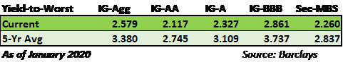
To frame this discussion, it is worth considering the contrast in risk between several credit market categories. According to the Bloomberg-Barclays Aggregate Investment Grade Corporate Index, yields at the end of January 2020 were hovering around 2.55% and in a range between 2.10% for double-A (AA) credits and 2.85% for triple-B (BBB) credits. That means the yield “pick-up” to move down in credit from AA to BBB is only worth 0.75%. If you shifted $1 million out of AA and into BBB, you should anticipate receiving an extra $7,500 per year as compensation for taking on significantly more risk. Gaining only 0.75% seems paltry compared to historical spreads, but in a world of microscopic yields, investors are desperate for income and willing to forego risk management and sound judgment.

As if the poor risk premium to own BBB over AA is not enough, one must also consider there is an unusually high concentration of BBB bonds currently outstanding as a percentage of the total amount of bonds in the investment-grade universe. The graph below from our article, The Corporate Maginot Line, shows how BBB bonds have become a larger part of the corporate bond universe versus all other credit tiers.

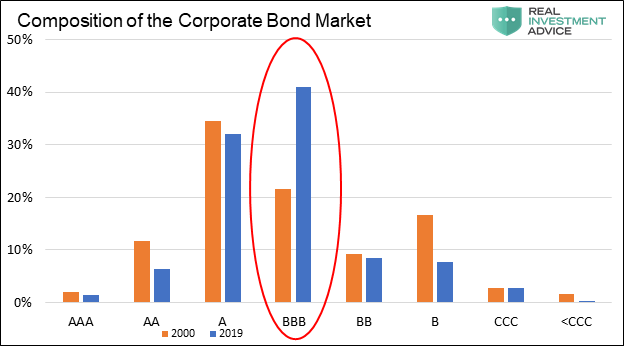
In that article, we discussed and highlighted how more bonds than ever in the history of corporate credit markets rest one step away from losing their investment-grade credit status.

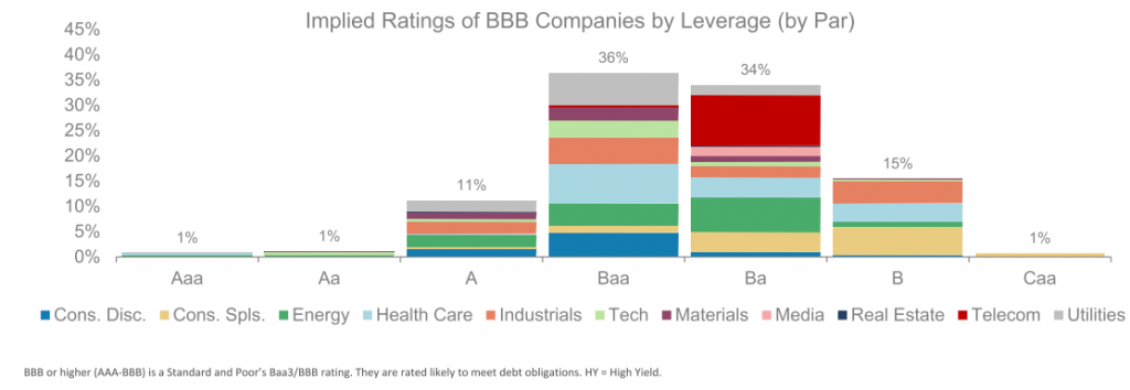
Furthermore, as shared in the article and shown below, there is evidence that many of those companies are not even worthy of the BBB rating, having debt ratios that are incompatible with investment-grade categories. That too is troubling.

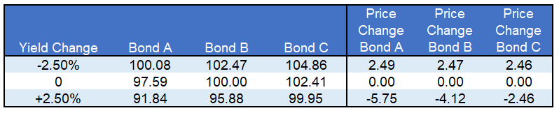
A second and often overlooked factor in evaluating risk is the price risk embedded in these bonds. In the fixed income markets, interest rate risk is typically assessed with a calculation called duration. Similar to beta in stocks, duration allows an investor to estimate how a change in interest rates will affect the price of the bond. Simply, if interest rates were to rise by 100 basis points (1.00%), duration allows us to quantify the effect on the price of a bond. How much money would be lost? That, after all, is what defines risk.

Currently, duration risk in the corporate credit market is higher than at any time in at least the last 30 years. At a duration of 8.05 years on average for the investment-grade bond market, an interest rate increase of 1.00% would coincide with the price of a bond with a duration of 8.05 to fall by 8.05%. In that case a par priced bond (price of 100) would drop to 91.95.

Yield Per Unit of Duration

Those two metrics, yield and duration, bring us to an important measure of value and a tool to compare different fixed income securities and classes. Combining the two measures and calculating yield per unit of duration, offers unique insight. Specifically, the calculation measures how much yield an investor receives (return) relative to the amount of duration (risk). This ratio is similar to the Sharpe Ratio for stocks but forward-looking, not backward-looking.

In the case of the aggregate investment-grade corporate bond market as described above, dividing 2.55% yield by the 8.05 duration produces a ratio of 0.317. Put another way, an investor is receiving 31.7 basis points of yield for each unit of duration risk. That is pretty skinny.

After all that digging, it may seem as though there may not be a pony in the corporate bond market. What we have determined is that investors appear to be indiscriminately plowing money into the corporate credit market without giving much thought to the minimal returns and heightened risk. As we have described on several other occasions, this is yet another symptom of the passive investing phenomenon.

Our Pony

If we compare the corporate yield per unit of duration metric to the same metric for mortgage-backed securities (MBS) we very well may have found our pony. The table below offers a comparison of yield per unit of duration ratios as of the end of January:

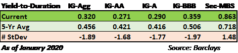
Clearly, the poorest risk-reward categories are in the corporate bond sectors with very low ratios. As shown, the ratios currently sit at nearly two standard deviations rich to the average. Conversely, the MBS sector has a ratio of 0.863, which is nearly three times that of the corporate sectors and is almost 1.5 standard deviations above the average for the mortgage sector.

The chart below puts further context to the MBS yield per unit of duration ratio to the investment-grade corporate sector. As shown, MBS are at their cheapest levels as compared to corporates since 2015.

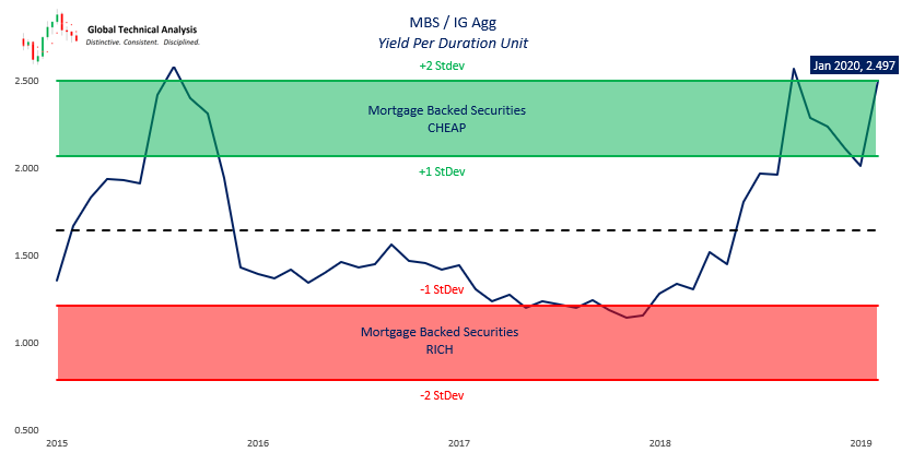
Chart Courtesy Brett Freeze – Global Technical Analysis

MBS, such as those issued by Fannie Mae and Freddie Mac, are guaranteed against default by the U.S. government, which means that unlike corporate bonds, the bonds will always mature or be repaid at par. Because of this protection, they are rated AAA. MBS also have the added benefit of being intrinsically well diversified. The interest and principal of a mortgage bond are backed by thousands and even tens of thousands of different homeowners from many different geographical and socio-economic locations. Maybe most important, homeowners are desperately interested in keeping the roof over their head

In contrast, a bond issued by IBM is backed solely by that one company and its capabilities to service the debt. No matter how many homeowners default, an MBS investor is guaranteed to receive par or 100 cents on the dollar. Investors of IBM, or any other corporate bond, on the other hand, may not be quite so lucky.

It is important to note that if an investor pays a premium for a mortgage bond, say a 102-dollar price, and receives par in return, a loss may be incurred. The determining factor is how much cash flow was received from coupon payments over time. The same equally holds for corporate bonds. What differentiates corporate bonds from MBS is that the risk of a large loss is much lower for MBS.

Summary

As the chart and table above reveal, AAA-rated MBS currently have a very favorable risk-reward when compared with investment-grade corporate bonds at a comparable yield.

Although the world is distracted by celebrity investing in the FAANG stocks, Tesla, and now corporate debt, our preference is to find high quality investment options that deliver excellent risk-adjusted returns, or at a minimum improve them.

This analysis argues for one of two outcomes as it relates to the fixed income markets. If one is seeking fixed income credit exposure, they are better served to shift their asset allocation to a heavier weighting of MBS as opposed to investment-grade corporate bonds. Secondly, it suggests that reducing exposure to corporate bonds on an outright basis is prudent given their extreme valuations. Although cash or the money markets do not offer much yield, they are always powerful in terms of the option it affords should the equity and fixed income markets finally come to their senses and mean revert.

With so many assets having historically expensive valuations, it is a difficult time to be an optimist. However, despite limited options, it is encouraging to know there are still a few ponies around, one just has to hold their nose and get a little dirty to find it.

Comparing Yield Curves

Since August of 1978, there have been seven instances where the yields on ten-year Treasury Notes were lower than those on two-year Treasury Notes, commonly referred to as “yield curve inversion.” That count includes the current episode which only just occurred. In all six prior instances a recession followed, although in some cases with a lag of up to two years.

Given the yield curve’s impeccable 30+ year track record of signaling recessions, we think it is appropriate to compare the current inversion to those of the past. In doing so, we can further refine our economic and market expectations.

Bull or Bear Flattening

In this section, we graph the seven yield curve inversions since 1978, showing how ten-year U.S. Treasuries (UST), two-year UST and the 10-year/2 year curve performed in the year before the inversion.

Before progressing, it is worth defining some bond trading lingo:

  • Steepener- Describes a situation in which the difference between the yield on the 10-year UST and the yield on the 2y-year UST is increasing. Steepeners can occur when both securities are trending up or down in yield or when the 2-year yield declines while the 10-year yield increases.
  • Flattener- A flattener is the opposite of a steepener, and the difference between yields is declining.  As shown in the graph above, the slope of the curve has been in a flattening trend for the last five years.
  • Bullish/Bearish- The terms steepener and flattener are typically preceded with the descriptor bullish or bearish. Bullish means yields are declining (bond prices are rising) while bearish means yields are rising (bond prices are falling). For instance, a bullish flattener means that both 2s and 10s are declining in yield but 10s are declining at a quicker pace. A bearish flattener implies that yields for 2s and 10s are rising with 2s increasing at a faster pace.  Currently, we are witnessing a bullish flattener. All inversions, by definition, are preceded by a flattening trend.

As shown in the seven graphs below, there are two distinct patterns, bullish flatteners and bearish flatteners, which emerged before each of the last seven inversions. The red arrows highlight the general trend of yields during the year leading up to the curve inversion.  

Data for all graphs courtesy St. Louis Federal Reserve

Five of the seven instances exhibited a bearish flattening before inversion. In other words, yields rose for both two and ten year Treasuries and two year yields were rising more than tens. The exceptions are 1998 and the current period. These two instances were/are bullish flatteners.

Bearish Flattener

As the amount of debt outstanding outpaces growth in the economy, the reliance on debt and the level of interest rates becomes a larger factor driving economic activity and monetary and fiscal policy decisions. In five of the seven instances graphed, interest rates rose as economic growth accelerated and consumer prices perked up. While the seven periods are different in many ways, higher interest rates were a key factor leading to recession. Higher interest rates reduce the incentive to borrow, ultimately slowing growth and in these cases resulted in a recession.

Bullish Insurance Flattener

As noted, the current period and 1998 are different from the other periods shown. Today, as in 1998, yields are falling as the 10-year Treasury yield drops faster than the 2-year Treasury yield. The curve thus flattens and ultimately inverts.

Seven years into the economic expansion, during the fall of 1998, the Fed cut rates in three 25 basis point increments. Deemed “insurance cuts,” the purpose was to counteract concerns about sluggish growth overseas and financial market concerns stemming from the Asian crisis, Russian default, and the failure of hedge fund giant Long Term Capital. The yield curve inversion was another factor driving the Fed. The domestic economy during the period was strong, with real GDP staying above 4%, well above the natural growth rate.  

The current period is somewhat similar. The U.S. economy, while not nearly as strong as the ’98 experience, has registered above-trend economic growth for the last two years. Also similar to 1998, there are exogenous factors that are concerning for the Fed. At the top of the list are the trade war and sharply slowing economic activity in Europe and China. Like in 1998, we can add the newly inverted yield curve to the list.

The Fed reduced rates by 25 basis points on July 31, 2019. Chairman Powell characterized the cut as a “mid-cycle adjustment” designed to ensure solid economic growth and support the record-long expansion. Some Fed members are describing the cuts as an insurance measure, similar to the language employed in 1998.

If 1998-like “insurance” measures are the Fed’s game plan to counteract recessionary pressures, we must ask if the periods are similar enough to ascertain what may happen this time.

A key differentiating factor between today and the late 1990s is not only the amount of debt but the dependence on it.   Over the last 20 years, the amount of total debt as a ratio to GDP increased from 2.5x to over 3.5x.

Data Courtesy St. Louis Federal Reserve

In 1998, believe it or not, the U.S. government ran a fiscal surplus and Treasury debt issuance was declining. Today, the reliance on debt for new economic activity and the burden of servicing old debt has never been greater in the United States. Because rates are already at or near 300-year lows, unlike 1998, the marginal benefits from borrowing and spending as a result of lower rates are much less economically significant currently.

In 1998, the internet was in its infancy and its productive benefits were just being discovered. Productivity, an essential element for economic growth, was booming. By comparison, current productivity growth has been lifeless for well over the last decade.

Demographics, the other key factor driving economic activity, was also a significant component of economic growth. Twenty years ago, the baby boomers were in their spending and investing prime. Today they are retiring at a rate of 10,000 per day, reducing their consumption and drawing down their investment accounts.

The key point is that lower rates are far less likely to spur economic activity today than in 1998. Additionally, the natural rate of economic growth is lower today, so the economy is more susceptible to recession given a smaller decline in economic activity than it was in 1998.

The 1998 rate cuts led to an explosion of speculative behavior primarily in the tech sectors. From October of 1998 when the Fed first cut rates, to the market peak in March of 2000, the NASDAQ index rose over 300%. Many equity valuation ratios from the period set records.

We have witnessed a similar but broader-based speculative fervor over the last five years. Valuations in some cases have exceeded those of the late 1990s and in other cases stand right below them. While the economic, productivity, and demographic backdrops are not the same, we cannot rule out that Fed cuts might fuel another explosive rally. If this were to occur, it will further reduce expected returns and could lead to a crushing decline in the years following as occurred in the early 2000s.  

Summary

A yield curve inversion is the bond market’s way of telegraphing concern that economic growth will slow in the coming months. Markets do not offer guarantees, but the 2s-10s yield curve has been right every time in the last 30 years it voiced this concern. As the book of Ecclesiastes reminds us, “the race does not always go to the swift nor the battle to the strong…”, but that’s the way to bet.

Insurance rate cuts may buy the record-long economic expansion another year or two as they did 20 years ago, but the marginal benefit of lower rates is not nearly as powerful today as it was in 1998.

Whether the Fed combats a recession in the months ahead as the bond market warns or in a couple of years, they are very limited in their abilities. In 2000 and 2001, the Fed cut rates by a total of 575 basis points, leaving the Fed Funds rate at 1.00%. This time around, the Fed can only cut rates by 225 basis points until it reaches zero percent. When we reach that point, and historical precedence argues it will be quicker than many assume, we must then ask how negative rates, QE, or both will affect the economy and markets. For this there is no prescriptive answer.

A Traders’ Secret For Buying Munis

Believe it or not, any domestic bond trader under the age of 55 has never traded in a bond bear market. Unlike the stock market, which tends to cycle between bull and bear markets every five to ten years, bond markets can go decades trending in one direction. These long periods of predictable rate movements may seem easy to trade, especially in hindsight, but when the trend changes, muscle memory can trump logic leaving many traders and investors offside.

If you believe higher yields are upon us in the near future, there are many ways to protect your bond portfolio. In this article, we present one idea applicable to municipal bonds. The added benefit of this idea is it does not detract from performance if rates remain stubbornly low or fall even lower.  Who says there is no such thing as a free lunch?

Munis

Municipal bonds, aka Munis, are debt obligations issued by state and local government entities. Investors who seek capital preservation and a dependable income stream are the primary holders of munis. In bear markets, munis can offer additional yield over Treasury bonds, still maintain a high credit quality, and avoid the greater volatility present in the corporate bond or equity markets.

Munis are unique in a number of ways but most notably because of their tax status. Please note, munis come in taxable and tax-exempt formats but any reference to munis in this article refers to tax-exempt bonds.

Because of their tax status, evaluating munis involves an extra step to make them comparable to other fixed income assets which are not tax-exempt. When comparing a muni to a Treasury, corporate, mortgage backed security, or any asset for that matter, muni investors must adjust the yield to a taxable equivalent yield. As a simple example, if you are in a 40% tax bracket and evaluating a muni bond yielding 2%, the taxable equivalent yield would be 3.33% (2.00% / (1-40%). It is this yield that should be used to equate it to other fixed income securities.

Negative “Tax” Convexity Matters

Thus far, everything we have mentioned is relatively straight-forward. Less well-understood is the effect of the tax rate on muni bonds with different prices and coupons. Before diving into tax rates, let’s first consider duration. Duration is a measure that provides the price change that would occur for a given change in yield. For instance, a bond with a duration of 3.0 should move approximately 3% in price for every 1% change in yield.

While a very useful measure to help quantify risk and compare bonds with different characteristics, duration changes as yields change. Convexity measures the non-linear change in price for changes in yield. Convexity helps us estimate duration for a given change in yield.

For most fixed rate bonds without options attached, convexity is a minor concern. Convexity in the traditional sense is a complex topic and not of primary importance for this article. If you would like to learn more about traditional convexity, please contact us.

Munis, like most bonds, have a small amount of negative convexity. However, because of their tax status, some muni bonds have, what we call, an additional layer of negative tax convexity. To understand this concept, we must first consider the complete tax implications of owning munis.

The holder of the muni bond receives a stream of coupons and ultimately his or her invested principal back at par ($100). The coupons are tax free, however, if the bond is sold prior to maturity, a taxable capital gain may occur.

The table below illustrates three hypothetical muni bonds identical in structure and credit quality. We use a term of 1 year to make the math as simple as possible.

In the three sample bonds, note how prices vary based on the range of coupons. Bond A has the lowest coupon but compensates investors with $2.41 ($100-$97.59) of price appreciation at maturity (the bond pays $100 at maturity but is currently priced at $97.59). Conversely, Bond C has a higher coupon, but docks the holder $2.41 in principal at maturity.

For an uninformed investor, choosing between the three bonds is not as easy as it may appear. Because of the discounted price on bond A, the expected price appreciation ($2.41) of Bond A is taxable and subject to the holder’s ordinary income tax rate. The appropriate tax rate is based on a De minimis threshold test discussed in the addendum. Top earners in this tax bracket pay approximately 40%.

Given the tax implication, we recalculate the yield to maturity for Bond A and arrive at a net yield-to-maturity after taxes of 4% (2.50% + (2.50 *(1-.40). Obviously, 4% is well below the 5% yield to maturity offered by bonds B and C, which do not require a tax that Bond A does as they are priced at or above par. Working backwards, an investor choosing between the three bonds should require a price of 95.88 which leaves bond A with an after tax yield to maturity of 5% and on equal footing with bonds B and C.

Implications in a rising yield environment and the role of “tax” convexity

Assume you bought Bond B at par and yields surged 2.50% higher the next day. Using the bond’s stated duration of .988, one would expect Bond B’s price to decline approximately $2.47 (.988 * 2.5%) to $97.53. Based on the prior section, however, we know that is not correct due to the tax implications associated with purchasing a muni at a price below par. Since you purchased the bonds at par, the tax implication doesn’t apply to you, but it will if anyone buys the bond from you after the 2.5% rise in yields. Therefore, the price of a muni bond in the secondary market will be affected not just by the change in rates, but also the associated tax implications. Assuming the ordinary income tax rate, the price of Bond B should fall an additional $1.65 to $95.88.  This $1.65 of additional decline in Bond B’s price is the penalty we call negative tax convexity.

The graph below shows how +/- 2.50% shifts in interest rates affect the prices of bonds A, B, and C. The table below the graph quantifies the change in prices per the shocks. For simplicity’s sake, we assume a constant bond duration in this example.

It is negative tax convexity that should cause investors, all else being equal, to prefer bonds trading at a premium (such as bond C) over those trading at par or a discount. It is also worth noting that the tax convexity plays an additional role in the secondary market for munis. Bonds with prices at or near par will be in less demand than bonds trading well above par if traders anticipate a near term rise in yields that will shift the par bond to a discounted price.

Summary

Yields have fallen for the better part of the last thirty years, so muni investors have not had to deal with discounted bonds and their tax implications often. Because of this, many muni investors are likely unaware of negative tax convexity risk. As we highlighted in the table, the gains in price when yields fall are relatively equal for the three bonds but the negative deviation in price in a rising yield environment is meaningful. Given this negative divergence, we recommend that you favor higher coupon/ higher priced munis. If you currently own lower priced munis, it may be worth swapping them for higher priced (higher coupon) bonds.


Addendum: De minimis

The tax code contains a provision for munis called the de minimis rule. This rule establishes the proper tax rate to apply to capital appreciation. The following clip from Charles Schwab’s Bond Insights provides a good understanding of the rule.

The de minimis rule

The de minimis rule says that for bonds purchased at a discount of less than 0.25% for each full year from the time of purchase to maturity, gains resulting from the discount are taxed as capital gains rather than ordinary income. Larger discounts are taxed at the higher income tax rate.

Imagine you wanted to buy a discount muni that matured in five years at $10,000. The de minimis threshold would be $125 (10,000 x 0.25% x five years), putting the dividing line between the tax rates at $9,875 (the par value of $10,000, minus the de minimis threshold of $125).

For example, if you paid $9,900 for that bond, your $100 price gain would be taxed as a capital gain (at the top federal rate of 23.8%, that would be $23.80). If you received a bigger discount and paid $9,500, your $500 price gain would be taxed as ordinary income (at the top federal rate of 39.6%, that would be $198).

It is important to note that some bonds are issued at prices below par. Such bonds, called original issue discount (OID), use the original offering price and not par as the basis to determine capital gains. If you buy a bond with an OID of $98 at a price of $97.50, you will only be subject to $0.50 (the difference between the OID price and the market price) of capital gains or ordinary income tax.

Short Term Gain – Long Term Pain


Stock Buybacks and the Principal/Agent Problem

“The single greatest edge an investor can have is a long term orientation.” – Seth Klarman

The most recent Nobel Prize in economics was awarded to Oliver Hart and Bengt Holmstrom for their work on how corporate contracts and incentives effect corporations. Among their many findings they discussed how incentive-laden contracts meant to solve one problem tend to create new ones.

Based on a similar premise, we wrote a series of articles discussing stock buybacks and the harm they tend to cause to the long-term financial health of corporations and ultimately the economy.  In the series, we are critical of executives motivations and the incentive structures in place that reward them handsomely for share price performance with little regard for the harm they might be doing to the long-term success of the company. The blame, however, is not just on executives and we would be remiss if we did not expand on the complicit role that shareholders play and their motivations to support executives that authorize share buybacks. When considering investors’ hunger for returns in the current extremely low interest rate environment, one better understands why corporate executives are under significant pressure from shareholders to conduct share buybacks.

The Principal-Agent Theory affords a framework from which we might develop a better appreciation for the recent popularity of buybacks. It supports the idea that shareholders are complicit partners with executives in conducting buybacks. The first step in that process requires being clear about how we should define “shareholder.” A more thorough understanding of the fundamental aspects of these dynamics, as offered here, allows for better corporate and macroeconomic analysis as well as ideas about what can be done to true-up false perceptions of value.

While this article, and the series of articles we have written on buybacks, may seem theoretical and academic it is a vital topic for investors to understand. Equity prices and corporate bond yields are based on expected earnings and cash flows. Investors may cheer buybacks today but the true cost of these transactions is steep will be extracted in the future. Failure to properly consider the cost-benefit analysis of buybacks will leave many investors at a loss to understand what went wrong with their forecasts.

Principal-Agent Theory

The Principal-Agent Problem occurs when one group, the agents, can make decisions that adversely affect another group, the principals. In the world of corporate management, the agents are the executives of corporations while the shareholders and to some degree the nation’s populace are the principals.

In the early 1970’s, economists began to argue that the motives of agents (executives) were different from those of the principals (shareholders), thus in their opinion a principal-agent problem existed. To align the interests of executive and shareholders, economists promoted a theory that executives should be given financial incentives derived from corporate stock performance. Over the last 35 years, so-called “principal-agent economists” have successfully influenced boards of directors to bestow upon executives attractive, stock-laden incentives. These rewards, in turn, motivate executives to inflate stock prices at all cost.

The guiding principle behind such incentives is that higher share prices represent increased shareholder value. While true, this is unfortunately very short sighted. Advocates of this view fail to consider that many actions designed to boost share prices in the short term can have negative effects on the company in the long run.  When an executive, for example, decides to forgo investment into a capital project and instead repurchases shares, they may push the price of their company’s stock higher, but that same decision reduces the company’s profit potential. Not only are the decisions made by an executive with a one or two-year time horizon very different from decisions made by an executive with a ten or twenty-year time horizon, but they are habit-forming in the worst way. True long-term shareholders and the prosperity of the nation as a whole suffer when the habits of short-termist logic take hold.

To illustrate the point, consider the graph below courtesy LPL Financial. From the 1940’s through the 1970’s the average holding period for equity investors was six years. Today, the average holding period has dramatically shrunk to about six months. While there are still investors that hold shares for longer time frames, most principles turn over their stock holdings much more frequently. The proper term for these short-term investors is not shareholders but rather speculators or traders who temporarily own the securities of a company. The vast majority of shareholders are not investors at all but renters with little concern for the circumstances of the company beyond their very brief holding period.

Now consider the principal-agent relationship once again. The motives of management are currently aligned with the large majority of shareholders. Both groups want a higher share price so they can profit immediately. Executives profit as their compensation package increases in value and shareholders benefit from increases in their portfolio values. Neither party is incentivized to invest in the future with an eye toward profitability of the company in the long run. While the principal-agent relationship appears to be in sync, the relationship is based on the false premise of what represents shareholder value. This relationship improperly defines “shareholder” and egregiously neglects long-term investors, employees, communities, the economy and the populace at large. 

As explained in “The Death of the Virtuous Cycle,” and a video we produced “The Animated Virtuous Cycle,” savings and investment are key to increasing productivity which fuels economic growth and national prosperity. A balanced allocation of investment into corporate capital projects allows for enhancements to the production process, the benefits of which are bestowed not only on corporations but the laborers and the population as a whole.  Alternatively, when cash flow derived from profits or debt issuance, are distributed to shareholders through share repurchases, it serves no long-term productive purpose. The intention is to alter the optics of the company’s financial statements, boost the stock price and thereby bolster executive bonuses.

Share buybacks do indeed cause earnings per share to grow by reducing the denominator, but they do not grow top-line revenue or improve the company’s market position in any way. Meanwhile, capital projects are intended to produce organic growth in revenue and earnings, but they also introduce both business risk and execution risk.  In the short run, share buybacks appear to be riskless. Hence, for “shareholders” who do not intend to maintain an interest in a company for more than a few months, their preference is for the company to grow earnings per share by engaging the “no-risk” option of buybacks.

A Solution

The concept of “maximizing shareholder value” as the over-arching determinant in corporate decision-making is seriously flawed and responsible in part for the growing misallocation of corporate capital. (Evidence supporting that idea may be found in that over the last ten years S&P 500 corporations have returned more money to shareholders via share buybacks and dividends than they have earned)  As previously discussed, the characteristics of shareholders differ markedly today from forty years ago.  Mandating the maximization of shareholder value also fails to capture the broader obligations of the agents to those who represent true stakeholders in the organization. Executives should be incentivized to promote the long-term health of their company, the prosperity of the employees who work for it and the communities in which the employees live and do their work. These objectives contrast sharply with current decision-making behavior and demands balanced investment decisions, discipline and quite often a measure of sacrifice in the short-run.

If we eliminate the theory that there is a principal-agent problem, we could radically reduce this perversion of the system imposed by extreme and misplaced financial incentives. The idea seems straight-forward until we realize that corporate executives responsible for strategic decision-making are also the beneficiaries of the maximize shareholder value concept to the tune of billions in compensation. Can corporate boards be convinced that such a change is required and are they willing to enforce such a change? That hinges on the independence of the board itself.  Anyone who espouses such ideas likely will not find themselves within a Texas mile of a corporate board seat. Without regard for the logic of the argument, asking corporate executives to behave in such an altruistic manner is naïve. Despite the fact that current decisions to use precious cash for purposes of buybacks are in almost every case negligent, it will not change from the inside out.


Special thanks to Clayton Christensen whose research inspired this article.