We have been discussing the opportunity that may be presenting itself in the Energy sector. With oil prices rising, and valuations better than other areas of the market, there are some trading opportunities starting to appear.
While the portfolios are designed to have longer-term holding periods, we understand that things do not always go the way we plan. We are entering the energy sector on a trading basis only, which could be very short-term, until both the positions and the overall thesis begins to mature.
While there are a LOT of energy companies to choose from, we have eliminated all companies which are NOT PROFITABLE from our analysis. All candidates must also pay a dividend to comply with our total return thesis and portfolio strategy.
Sector ETF’s
XLE – Energy Select Sector SPDR
With the broad energy sector on a buy signal, we are looking to add exposure to our portfolios.
We have been reluctant to move too quickly as previous rally attempts to the 200-dma have been selling opportunities.
With the sector very overbought short-term, we are looking for a pullback in the broader energy sector to add 1/2 position to the Equity and ETF portfolios.
Stop is will be set at $58 after entry.
IEO – iShares U.S. Oil & Gas Exploration
As with the broader energy space, Oil & Gas exploration has also broken about the 200-dma and is on a buy signal.
As with XLE, IEO is very overbought and needs a correction to work off the overbought position before positions can be added.
The stop is set at $53 after entry.
IEZ – iShares U.S. Oil Equipment & Services
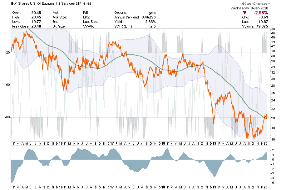
Oil & Equipment Services doesn’t look as convincing as the refining and major oil companies look.
While IEZ is very overbought it is just now making an attempt to break above the 200-dma. It is too early to consider this space as most of the companies in the sector are not profitable and are carrying a lot of debt.
Individual Securities
CVX – Chevron Corp.
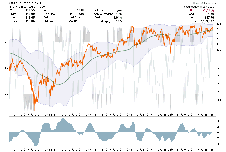
CVX hasn’t done much in the last couple of years either good or bad.
Currently, CVX is on a sell signal, which is improving and close to turning positive, and the position is currently holding the 200-dma.
With a near 5% yield, the return has almost solely come from the dividend over the last couple of years.
We like this company and will look to add a position if the buy signal turns positive and support holds.
Stop is set at $112.50 after entry.
EOG – EOG Resources
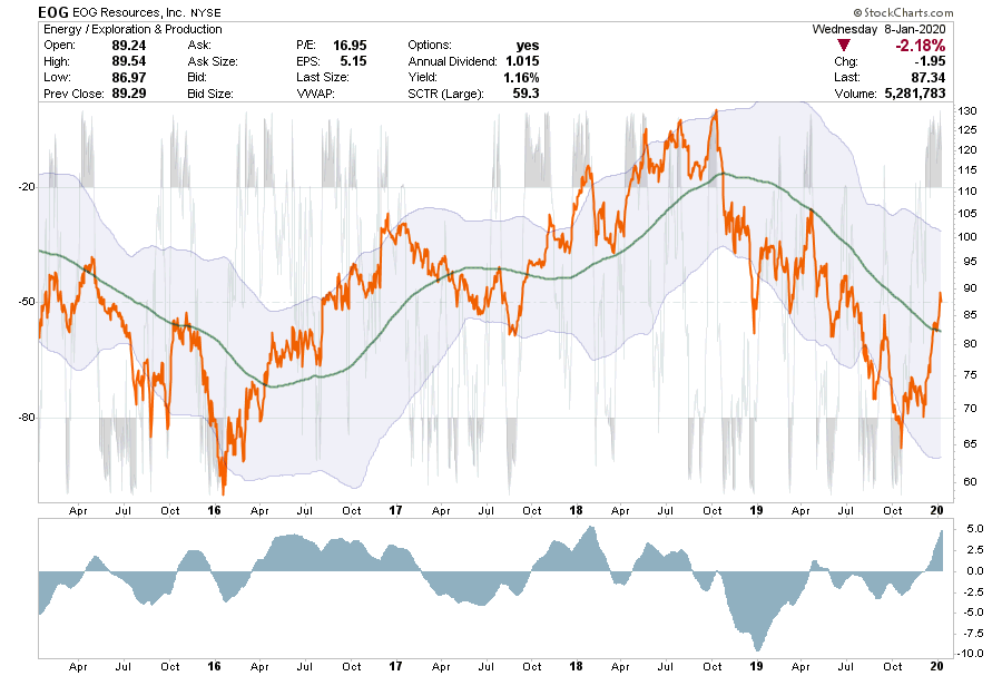
EOG has had an extremely sharp move and is overbought with a very extended buy signal currently.
EOG needs to correct, work off the overbought condition, and reduce the buy signal before an entry can be made.
Take profits if you are long currently,
Stop is set at $70
FANG – Diamond Back Drilling
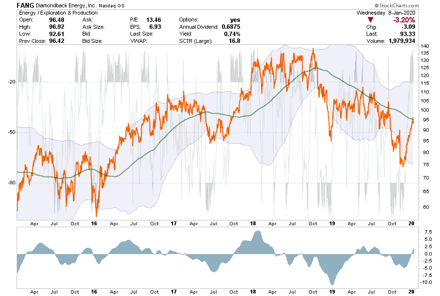
FANG is currently testing its 200-dma which has been the downtrend resistance point for the stock.
The stock is currently very overbought, but is just registering a “buy signal.”
We are going to watch this stock closely, it needs more work before becoming a potential trade.
If long currently, take profits.
Stop is set at $75
KMI – Kinder Morgan
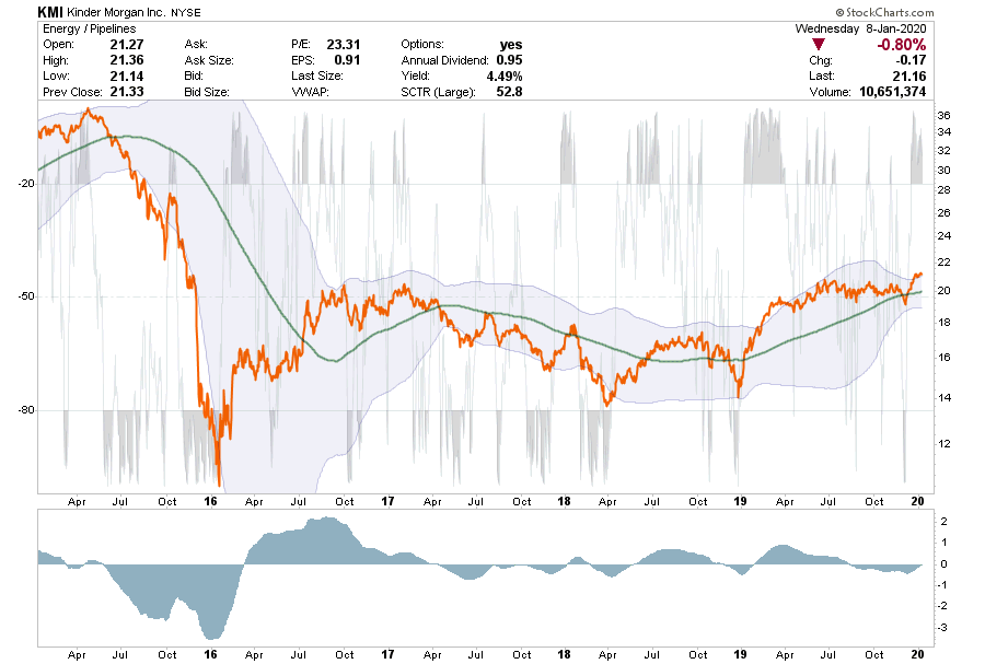
KMI has had a lot of problems since their acquisition of El Paso Energy.
The stock is currently very overbought, but is close to registering a “buy signal” after holding support at the 200-dma.
KMI needs to correct a little, and hold support at the 200-dma, to provide for a decent entry point. If oil prices correct, that entry point will be come likely.
If long the position, take profits.
Stop loss is set at $20
MPC – Marathon Petroleum Corp.
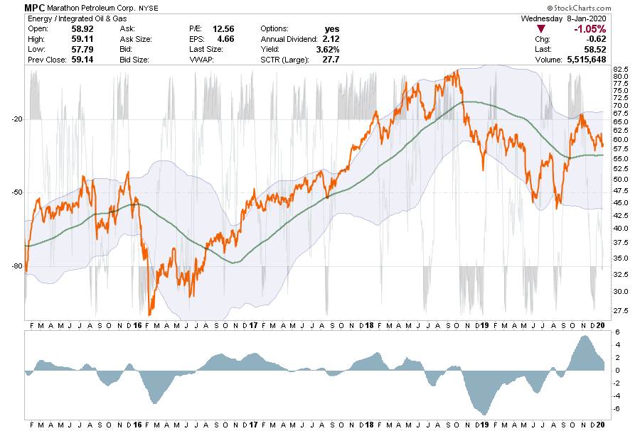
MPC is a little different picture than the others
MPC had a very strong rally, got very extended, and is now correcting that extension.
With the position holding support at the 200-dma, there is a decent trading setup to add to portfolios. We also like the 3.6% yield.
Buy 1/2 position at current levels.
Stop is tight at the 200-dma or $56.
PXD – Pioneer Natural Resources
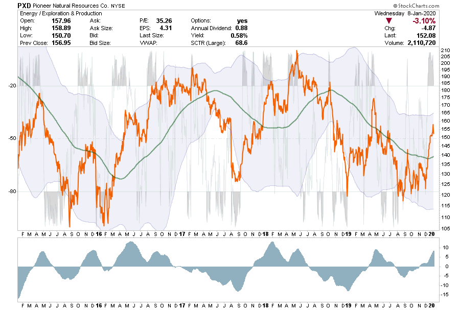
PXD has had a very strong run over and is both extended on its buy signal and very overbought.
Wait for a correction which holds support at the 200-dma and works off the overbought and extended condition.
Take profits if long the position currently.
Stop loss is set at $140
XOM – Exxon Mobil
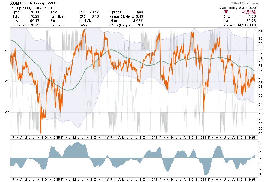
XOM has rallied off of lows where we added to our existing position last year.
However, while it has failed at the 200-dma it has registered a short-term buy signal.
While we are roughly flat in the position currently, performance has been disappointing while we are collecting the 5% yield.
We will continue to hold the position for now, but may look to reduce it on any rally in the near future.
Stop loss remains at $66
Value Your Wealth – Part Six: Fundamental Factors
In this
final article of our Value Your Wealth Series we explore four more fundamental factors. The first four articles in the
Series researched what are deemed to be the two most important fundamental
factors governing relative stock performance – the trade-off between growth and
value. In Part Five, we explored how returns fared over time based on companies
market cap. Thus far, we have learned that leaning towards value over growth
and smaller market caps is historically an investment style that generates
positive alpha. However, there are periods such as now, when these trends fail
investors.
The last ten
years has generally bucked long-standing trends in many factor/return
relationships. This doesn’t mean these factors will not provide an edge in the
future, but it does mean we need to adapt to what the market is telling us
today and prepare for the day when the historical trend reverts to normal. When they do, there will likely be abundant
opportunities for investors to capture significant alpha.
The five prior articles in the Value Your Wealth series are linked below:
In this section, we explore four well-followed factors to understand how they performed in the past and how we might want to use them within our investment decision-making process.
The graphs
in this article are based on data from Kenneth French and can be found HERE. The data encompasses a wide universe of
domestic stocks that trade on the NYSE, Amex, and NASDAQ exchanges.
Earnings to Price
Investors
betting on companies with a higher ratio of Earnings to Price (E/P), also known
as the earnings yield, have historically outperformed investors betting on companies
with lower E/P ratios. Such outperformance of companies priced at relatively
cheap valuations should be expected over time.
The following
chart compares monthly, ten year annually compounded returns for the highest
and lowest E/P deciles.
The graph of
E/P is very similar to what we showed for growth versus value. Other than a
period in the 1990s and the current period value outperformed growth and the
top E/P companies outperformed the bottom ones. This correlation is not
surprising as E/P is a key component that help define value and growth.
Investors
buying the top ten percent of the cheapest companies, using E/P, have been
docked almost 5% annually or about 50% since the recovery following the
financial crisis versus those buying the lowest ten percent of companies using
this measure.
Given our
fundamental faith in mean reversion, we have no doubt this trend will begin to
normalize in due time. To help us gauge the potential return differential of an
E/P reversion, we calculate future returns based on what would happen if the
ten-year return went back to its average in three years. This is what occurred after
the tech bust in 2000. In other words, if the ten year annualized compounded
return in late 2022 is average (4.81%) what must the relative outperformance of
high E/P to low E/P companies be over the next three years? If this occurs by
2022, investors will earn an annual outperformance premium of 28.1% for each of the next three years. The returns increase if the time to reversion is
shorter and declines if longer. If normalization occurs in five years the annual
returns drop to (only) 14.75%.
Needless to say, picking out fundamentally solid stocks seems like a no-brainer at this point but there is no saying how much longer speculation will rule over value.
Cash Flow to Price
The graph
below charts the top ten percent of companies with the largest ratio of cash
flow to price and compares it to the lowest ones. Like E/P, cash flow to price
is also a component in value and growth analysis.
Not
surprisingly, this graph looks a lot like the E/P and value vs. growth graphs.
Again, investors have shunned value stocks in favor of speculative entities
meaning they are neglecting high quality companies that pay a healthy dividend
and instead chasing the high-flying, over-priced “Hollywood” stocks. Also
similar to our potential return analysis with E/P, those electing to receive
the most cash flows per dollar of share price will be paid handsomely when this
factor reverts to normal.
Dividend Yield
Over the
last 100 years, using dividend yields to help gain alpha has not been as
helpful as value versus growth, market cap, earnings, and cash flows as the
chart below shows.
On average, higher dividend stocks have paid a slight premium versus the lowest dividend stocks.While dividend yields are considered a fundamental factor it is also subject to the level of interest rates and competing yields on corporate bonds.If we expect Treasury yield levels to be low in the future then the case for high dividend stocks may be good as investors look for alternative yield as income. The caveat is that if rates decline or even go negative, the dividend yield may be too low to meet investors’ bogeys and they may chase lower dividend stocks that have offered higher price returns.
Momentum
Momentum, in
this analysis, is calculated by ranking total returns from the prior ten months
for each company and then sorting them. Before we created the graph below, we assumed
that favoring momentum stocks would be a dependable investment strategy. Our
assumption was correct as judged by the average 10.89% annual outperformance.
However, we also would have guessed that the last few years would have been good
for such a momentum strategy.
Quite to the
contrary, momentum has underperformed since 2009. The last time momentum
underperformed, albeit to a much a larger degree, was the Great Depression.
Our initial expectation
was based on the significant rise of passive investing which favors those
companies exhibiting strong momentum. As share prices rise relative to the
average share price, the market cap also rises versus the average share and
becomes a bigger part of indexes. If we
took the top 1 or 2% of companies using momentum we think the strategy would
have greatly outperformed the lower momentum companies, but when the top and
bottom ten percent are included momentum has not recently been a good strategy.
Summary
Factors give
investors an informational edge. However, despite long term trends that offer
favorable guidance, there are no sure things in investing. The most durable
factors that have supplied decades of cycle guidance go through extended
periods of unreliability. The reasons for this vary but certainly a speculative
environment encouraged by ultra-low and negative interest rates has influence. Investors
must recognize when they are in such periods and account for it. More importantly, though, they must also
understand that when the trends are inclined to reverse back to normal. The
potential for outsized relative gains at such times are large.
At RIA
Advisors, Factor analysis is just one of many tools we use to help us manage
our portfolios and select investments. We are currently leaning towards value
over growth with the belief that the next market correction will see a revival
of the value growth trends of the past. That said, we are not jumping into the
trade as we also understand that growth may continue to beat value for months
or even years to come.
Patience,
discipline, and awareness are essential to good investing.
Value Your Wealth – Part Five: Market Cap
The first four
articles in this series focused on what might be the most important pair of fundamental
factors – growth and value. Those factors have provided investors long-standing,
dependable above-market returns. Now, we
take the series in a different direction and focus on other factors that may
also give us a leg up on the market.
The term “a
leg up” is important to clarify. In general, factor-based investing is used to
gain positive alpha or performance that is relatively better than the market. While “better” than market returns are nice, investing
based on factor analysis should not be the only protection you have when you
fear that markets may decline sharply. The combination of factor investing and adjustments
to your total equity exposure is a time-trusted recipe to avoid large drawdowns
that impair your ability to compound wealth.
We continue
this series with a discussion of market capitalization.
The four
prior articles in the Value Your Wealth series are linked below:
Market capitalization, commonly known as market cap, is a simple calculation that returns the current value or size of publicly traded companies. The formula is the number of shares outstanding times the price per share. For example as we wrote this article, Apple has 4.601 billion shares outstanding and Apple’s stock trades at roughly $210 per share. Apple’s market cap is $966.21 billion.
Most
investors, along with those in the financial media, tend to distinguish
companies market caps/size by grouping them into three broad tiers – small-cap,
mid-cap, and large-cap. Over most periods, stocks in the three categories are
well correlated. However, there are periods when they diverge, and we are
currently amidst such a deviation. Since September 1, 2018, the price of the Large
Cap S&P 500 Index has risen by 4.1%, while the price of the Small Cap
S&P 600 Index is down 12.9%. Deviations in historical relationships,
whether short or long-term in nature, can provide investors an opportunity to
capitalize on the normalization of the relationship, but timing is everything.
Historical Relative Performance
The
following graphs are based on data from Kenneth French and can be found HERE.
The data encompasses a wide universe of
domestic stocks that trade on the NYSE, Amex, and NASDAQ exchanges.
The data set
provides returns based on market cap groupings based on deciles. The
first graph compares annualized total return and annualized volatility since 1926
of the top three (High) and bottom three (Low) market cap deciles as well as
the average of those six deciles. To be clear, a decile is a discrete range of
market caps reflecting the stocks in that group. For example, in a portfolio of
100 stocks, decile 1 is the bottom ten stocks, or the smallest ten market cap
stocks, decile two is the next ten
smallest cap stocks, etc.
The next
graph below uses monthly ten year rolling returns to compare total returns of
the highest and lowest deciles. This graph is a barometer of the premium that
small-cap investing typically delivers to long term investors.
The takeaway
from both graphs is that small-cap stocks tend to outperform large-cap stocks
more often than not. However, the historical premium does not come without a
price. As shown in the first graph, volatility for the lowest size stocks is
almost twice that of the largest. If you have a long time horizon and are able
and willing to stay invested through volatile periods, small caps should fare
better than large caps.
Small-cap
stocks, in general, have high expected growth rates because they are not
limited by the constraints that hamper growth at larger companies. Unfortunately,
small-cap earnings are more vulnerable to changes in industry trends, consumer
preferences, economic conditions, market conditions, and other factors that
larger companies are better equipped and diversified to manage.
Periods of Divergence
The second
graph above shows there are only three periods where large caps outperformed
small caps stocks since 1926. Those three exceptions, the 1950’s, 1990’s and,
the post-financial crisis-era are worth considering in depth.
The 1950s The Nifty Fifty- The end of World War II coupled with a decade of historically low interest rates disproportionately helped larger companies. These firms, many global, benefited most from the efforts to rebuild Europe and partake in the mass suburbanization of America.
The 1990s
Tech Boom- With double-digit inflation a distant memory and the swelling technology
boom, larger companies that typically benefited most from lower rates, less
inflation, and new technologies prospered. While this new technology benefited
all companies in one form or another, larger ones had the investment budgets and
borrowing capacity to leverage the movement and profit most.
The 2010’s
Post Financial Crisis Era –The current period of large-cap outperformance is
unique as economic growth has been prolonged but below average and productivity
growth has been negligible. Despite relatively weak economic factors, massive
amounts of monetary stimulus has fueled record low corporate borrowing rates,
which in turn have fueled stock buybacks. Further, the mass adaptation of
passive cap-weighted investment strategies naturally favors companies with
large market caps. Circularly, passive investing feeds on itself as indexed ETFs
and mutual funds must increasingly allocate more to large caps which grow in
size relative to the other holdings.
To reiterate an important point: the
current period of outperformance is not based on solid economic fundamentals
and resulting corporate earnings growth as in the two prior periods described. This episode is a byproduct of
monetary actions.
The graph
below highlights the distinction between the current period and the two prior
periods where large caps outperformed.
Summary
Historically,
small-cap stocks tend to provide a return premium over large-cap stocks. However,
as we pointed out, there are periods where that is not the case. Currently, large-cap
stocks are the beneficiaries of overly generous monetary and fiscal policy. We
do believe the relationship will return to normal, but that will likely not
occur until a bear market begins.
As we wait
for a normalization of valuations and traditional relationships that have
become so disfigured in this cycle, we consider the current relative valuations
on small-cap stocks similar to those we described in value stocks earlier in
this series. The time to weight your stock portfolio allocation more heavily toward
small-cap opportunities is coming, but every investor must decide on their own
or with good counsel from an advisor when to make that adjustment. When appropriate, a gradual shift to small-cap
stocks from large caps depends on an investor’s risk appetite and defensive
preference.
More importantly,
have a plan in place because when the market does meaningfully correct, the
premium small-cap stocks provide will likely help cushion against a stock
market correction.
Value Your Wealth – Part Four: Mutual Fund & ETF Analysis
Parts One through Three of the series are linked below.
In Part
One, the introduction to our Value Your Wealth series, we documented
how recent returns for investors focused on growth companies have defied the
history books and dwarfed returns of investors focused on value stocks. In
particular: “There have only been eight
ten-year periods over the last 90 years (total of 90 ten-year periods) when
value stocks underperformed growth stocks. Two of these occurred during the
Great Depression and one spanned the 1990s leading into the Tech bust of 2001.
The other five are recent, representing the years 2014 through 2018.”
In this, the
fourth part of the Value Your Wealth series,
we focus on growth and value mutual funds and ETFs. Our purpose is to help determine
which professional value and growth fund managers are staying true to their stated
objectives.
Fund Analysis
A large part
of most investor’s investment process starts with the determination of an
investment objective. From this starting point, investors can appropriately determine
the asset classes and investment strategies that will help them achieve or even
exceed their objectives.
Once an investor
decides upon an objective, strategy, and asset class, they must select
individual securities or funds. This article focuses singularly on assessing
growth and value mutual funds and ETFs. In particular it shows how an investor
focused on growth or value can choose funds that are managed properly to meet
their goals.
Investors
usually key on the following factors when selecting a mutual fund or ETF:
Declared
fund strategy (Growth or Value in this case)
Prior
period returns
Fee
and expense structure
Reputation
of the fund family and possibly the manager
These four
factors provide valuable information but can be misleading.
For
instance, prior returns provide a nice scorecard for the past but can be deceptive.
As an example, if we are currently scanning for value funds based on
performance, the highest ranking funds will more than likely be those that have
leaned most aggressively toward growth stocks. While these funds may seem
better, what we believe is more important the fund managers adherence to their
objectives. Given we are looking forward
and believe value will outperform growth, we want fund managers that we can
trust will stick with value stocks.
It is also
important not to shun funds with the highest expenses and/or gravitate towards those
with the lowest. We must be willing to pay up, if necessary, to achieve our
objectives. For instance, if a fund offers more exposure to value stocks than
other comparable value funds, it may be worth the higher fee for said exposure.
Conversely, there are many examples where one can gain more exposure to their
preferred strategy with cheaper funds.
Most
investors check the fund strategy, but they fail to determine that a fund is
being effectively and cost efficiently managed towards their stated
strategy.
We now
compare the largest growth and value mutual funds and ETFs to assess which
funds offer the most value, so to speak.
Mutual Fund/ETF Analysis
In order to limit
the population of value and growth mutual funds and ETFs to a manageable number,
we limited our search to the largest funds within each strategy that had at
least 85% exposure to U.S. based companies. We further restricted the
population to those funds with a stated strategy of growth or value per
Bloomberg.
In prior
articles of this series, we have used Bloomberg growth and value factor scores
and our own growth and value composite scores. While we would prefer to use our
own computations, the large and diverse holdings of the mutual funds and ETFs
make it nearly impossible for this exercise. Accordingly, Bloomberg growth and
value factor scores provide us the most accurate description of where the
respective funds lie on the growth/value spectrum. It is important to note that
Bloomberg assigns every fund both a growth and a value score. We consider both
scores and not just the score pertinent to growth or value.
We
understand most of our readers do not have access to Bloomberg data. As such,
we provide a DIY approach for investors to track growth and value exposure
amongst mutual funds and ETFs.
Growth and Value Scores
The scatter
plot below shows the 54 funds analyzed. Each dot represents a fund and the intersection
of its respective growth (x-axis) and value scores (y-axis). The funds most
heavily skewed towards value (high value scores and low growth scores) are in
the upper left, while heavily growth oriented funds are in the bottom right
(high growth score and low value scores).
Information about the funds used in this report and their scores can be
found in the tables below the graph. Certain funds are labeled for further discussion.
A few
takeaways:
VIVAX
(Growth -.60, Value +.37): While this value fund is farthest to the left, there
are other funds that offer more value exposure. However, this fund has the
lowest growth score among value funds.
DFLVX
(Growth -.43, Value +.68): This value fund offers an interesting trade off to
VIVAX sporting a higher value score but a less negative growth score.
AIVSX
(Growth +.10, Value -.05): Despite its classification as a value fund, AIVSX
has a slight bias towards growth. Not surprisingly, this fund has recently outperformed
other value funds but would likely underperform in the event value takes the
lead.
FDGRX
(Growth +.88, Value -.64): This growth fund offers both the highest growth
score and lowest value score. For investors looking for an aggressive profile
with strong growth exposure and little value exposure, this fund is worth
considering.
VPMCX
(Growth -.04, Value +.16): Despite its classification as a growth fund, VPMCX
has a slight bias towards value.
In
our opinion, the six funds with growth and value scores near zero (+/-.20) in
the red box do not currently have a significant growth or strategy orientation,
and as such, they are similar to a broad market index like the S&P 500.
It is
important to stress that the data represents a snapshot of the fund portfolios
for one day. The portfolio managers are always shifting portfolios toward a value
or growth bias based on their market views.
(CLICK on the tables to enlarge)
Data Courtesy Bloomberg
The data above
gives us potential funds to meet our strategic needs. However, we also need to
consider fees.
Fees
The scatter
plots below isolate growth and value funds based on their respective growth or
value score and fees charged.
We circled
three groupings of the growth funds to help point out the interaction of fees
and growth scores. The four funds in the blue circle have average or above average
fees versus other growth funds yet provide a minimal bias towards growth. The
yellow circle represents a sweet spot between low fees and a good exposure to
growth stocks. Lastly, the red circle shows funds where heavy exposure to growth comes with above
average fees.
This graph
circles three groupings of value funds to help point out the interaction of
fees and growth scores. The blue circle contains funds with little to no bias
towards value. The yellow circle represents a good mix of value and cheap fees.
The red circle, our sweet spot in this graph, shows that heavy exposure to value
can be had with fees near the group average.
Alpha and Bad Incentives
Alpha is a
measure that calculates how much a portfolio manager, trader, or strategy over
or underperforms an index or benchmark. From a career perspective, alpha is
what separates good fund managers from average or bad ones.
We mention
alpha as we believe the current prolonged outperformance of growth over value
is pushing professional fund managers to stray from their stated objectives. As
an example, a value based fund manager can add exposure to growth stocks to
help beat the value index he or she is measured against.
Adding growth to a value fund may have proven to be alpha positive in the past, but we must concern ourselves with how well the fund manager is adhering to the fund’s objective Simply put, we are trying to find managers that are staying true to their objectives not those who have benefited from a deviation from stated strategy in the past.
It is
important to note that positive alpha can be attained by sticking to the stated
objective and finding stocks that outperform the index. This is the type of
alpha that we seek.
DIY
As discussed,
growth and value factors can change for funds based on the whims of the portfolio
manager. Therefore, the data provided in this article will not age well. If you
do not have access to Bloomberg to track value and growth scores we offer
another approach.
Morningstar
provides a blunt but effective style analysis tool. To access it, go to www.morningstar.com and select
your favorite fund. Then click on the tab labeled Portfolio and scroll down to
Style Details.
The following screen print shows Morningstar’s style analysis for value fund DFLVX.
The box in
the top right separates the fund’s holdings by market capitalization and value growth
classifications. We can use this data to come up with our own scores. For
instance, 59% (46+13) of DFLVX is biased toward value (red circle) while only
6% (5+1) is in growth companies (blue circle). To further demonstrate how a
fund compares to its peers, the Value & Growth Measures table on the bottom
left, compares key fundamental statistics. As shown by three of the first four
valuation ratios, DFLVX has more value stocks than the average for funds with
similar objectives.
Summary
The word “Value”
in a fund name does not mean the fund takes on a value bias at all times. As
investors, we must not rely on naming conventions. This means investors must do
some extra homework and seek the funds that are truly investing in a manner
consistent with the funds, and ultimately the investor’s, objective.
As we have
mentioned, we are at a point in the economic and market cycles where investors
should consider slowly rotating towards value stocks. Not only is the style
historically out of favor, many of the names within that style are
unjustifiably beaten down and due for mean reversion to more favorable levels. We
hope this article provides some guidance to ensure that those who heed our
advice are actually adding value exposure and not value in name only.
Sailing Versus Rowing : Active Versus Passive
Investor preferences shift between active and passive investing in a cyclical manner. Periods where the market has a strong tailwind of momentum behind it tend to attract a greater demand for passive strategies especially when that momentum carries on for a prolonged period of time. Alternatively, periods of market turbulence tend to swing sentiment back to active investing as a means of avoiding the risk of large losses. In the most recent bullish cycle the combination of market direction and the availability of index-friendly instruments like exchange-traded funds (ETFs) have resulted in an unprecedented shift towards passive strategies and securities.
To clarify the difference between the two investment approaches, active investing seeks to outperform the market by beating a benchmark such as the Dow Jones Industrial Average or the Barclays Aggregate bond index. Passive investing on the other hand pursues a strategy that mimics a benchmark index and attempts to replicate its performance. It is a contrast that has been effectively described by Ed Easterling of Crestmont Research as rowing (active) versus sailing (passive). Active investors are engaged in constant evaluation of companies and their fundamentals as means of finding value investment opportunities while passive investors are at the grace (or mercy) of the winds of the market wherever they may blow.
The graph below highlights the underperformance of active strategies versus the S&P 500 index in past years which further explains the growing popularity of passive investing.
This article is primarily focused on fixed-income passive investing, however, many of the issues brought up in this article can be applied to most asset class ETFs and securities that allow ease of passive investing.
How Passive Investing Works
The mechanics of passive investing in the stock market are straight-forward. Select an equity index to which you would like to gain exposure, for example the S&P 500 or the MSCI China Index, and then buy the stocks in the proper amounts that are tracked in that index to replicate the performance. Done manually this can be a complex and cumbersome exercise especially when trying to replicate the index of a less-liquid market. As the market moves and the value of the securities underlying the index change, one must rebalance their holdings to remain aligned with the index. For a deeper understanding of the many factors that make replicating an index diffiuclut please read our article The Myths of Stocks for the Long Run Part V.
The advent of index mutual funds and more recently exchange-traded funds handle the complexities of multiple holdings, weightings, and rebalancing allowing an investor to simply pay a small fee, buy a ticker and essentially own an index. An investor’s ability to obtain general equity exposure or to build a portfolio with customized exposures has never been easier with the proliferation of ETFs.
To offer some perspective about just how many ETFs are available, consider there are 38 ETFs available that are focused on U.S. energy stocks and over 132 ETF’s hold Exxon Mobil (XOM) shares. Looking abroad to less liquid markets, one would find ten U.S. incorporated funds holding Indian stocks. The simplicity and customizability currently offered in the market is quite powerful.
Bond Exposure
Traditionally, investors gained exposure to bonds through individual debt securities offered by brokers. Unlike stocks, the availability of most bonds, not including U.S. Treasuries, is dependent upon the inventory held by one’s broker or their ability to source a bond from another broker. As such, finding a specific bond is more challenging and comes at a higher cost for an individual investor than buying an individual stock. A similar problem can emerge in the event an investor wants to sell a specific bond. This problem results in an indirect fee called the bid/offer spread and on occasion can cost the investor multiple percentage points.
There are other considerations related to the dynamics of buying individual bonds versus acquiring bond exposure through a fund. These issue are well-articulated by Lance Roberts.
The advent of index mutual funds and ETFs relieves much of the frustration and high costs of buying and selling specific bonds.
The protocol described in selecting equity funds above is similar for bonds in that one can identify investment preferences in various major bond categories quite easily. The primary categories include:
Treasuries securities
Mortgage-backed securities, asset-backed securities and collateralized debt obligations
Agency bonds
Municipal bonds
Investment Grade corporate bonds
High yield corporate bonds
Emerging market bonds
Developed nations sovereign bonds
It is relatively easy, through these funds, to quickly gain exposure that tracks an index covering any variety of these options and specific sub-catagories of these options.
Not As Advertised
The flexibility and customizability offered through the world of index mutual funds and ETFs is remarkable. As such, there is a natural inclination by investors to assume that one will get precisely what has been advertised by these funds. However, confidence in that idea is easily challenged. Much of what has been developed over the past several years, especially with many ETFs, remains untested. The following are concerns investors should be aware of:
Tracking Error: ETF exposures to certain markets might not be precisely what the investor receives. For example, it has been documented that an investor who wishes to invest in an ETF for the equity market in Spain actually gets exposure to a variety of companies that although domiciled in Spain, produce most of their revenue outside that country. In that instance, and many others like it, an investor would not get the exposure to Spain he or she expects and may indeed be very disappointed in the ETFs tracking of the index for Spain.
Optimization: The structure of index funds and ETFs are such that in many cases the fund managers are only able to establish positions in the underlying stocks or bonds of the indexes they track with some imprecision. This means they will use creative means of gaining desirable exposures and then gradually, if possible, reposition over time in order to more closely track the index. This tends to be a much bigger problem for bond funds. Since full replication of a bond index is generally not possible, bond funds rely on “optimizing” the portfolio in order to most effectively replicate the index.
Bond offerings, like stocks, are finite so if the size of a fund grows as a percentage of the underlying index constituents, it will increasingly face the constraint of replicating the index and effectively mimicking index performance. Optimization is imperfect so the ETF will suffer performance drift from the target index. Unfortanately, the flaws of replicating are often exagerated during periods of market stress when investors expectations are the highest.
Underlying Liquidity: Another related issue that arises with bond funds is that of establishing daily market value. The market price of some bonds held in a fund, especially those that are investing in less liquid markets, may not be readily available. If a bond fund holds securities that are illiquid, meaning they do not trade very often, then a realistic current price may be difficult to obtain. Many fixed income ETFs hold thousands of securities some of which do not trade daily or even weekly. This means that pricing is dependent upon estimates of the value on those bonds. These estimates of value may be derived from a third-party pricing service, surveys of bond market trading desks and internally generated models. Mis-pricing of securities is a known problem and one not typically considered until the fund is forced to sell. If the fund receives an inordinate number of redemption requests, what happens if they have bonds that do not trade very often but are nevertheless required to liquidate based upon investor requests? It is likely the sale price could vary, and sometimes significantly, from the last assumed price. Again this is most likely to occur at the wrong time for investors.
These concerns have not yet emerged as a deterent in the new age of passive investing popularity. We have only seen slight glimpses of what may be ahead in terms of challenges for the passive investor but it is fair to say this could be a major problem.
Investors naturally assume they will be able to exit as easily as they entered these funds and at the stated value seen on their statements or trading screens. In a calm market the concerns are minor but there are serious questions about that reality should a wave of selling hit bond ETFs all at once.
Although somewhat unique in its characteristics and certainly not a bond ETF, the recent debacle related to the inverse VIX ETF, XIV, seems to foreshadow some of the issues highlighted here. The graph below shows the price of XIV over the last two years. Investors unaware of how the NAV for XIV was calculated were certainly in for quite the shock.
Data Courtesy Bloomberg
Risk Analysis – The Benefit of Stress Testing
Given the importance of the issue of liquidity and what may transpire in an adverse scenario, we decided to look at the performance of a few ETFs and their related indices through the financial crisis as an indication of what a possible “worst-case” scenario might hold. In doing so, we acknowledge no two historical events are the same but the analysis seems important to consider.
From peak to trough, between April and November 2008, the Barclays Corporate Investment Grade index fell -10.8%. At the same time the LQD ETF which tracks that index fell -12.2%. The Barclays High Yield index fell -32.3%. In the same time frame the two high yield ETF alternatives, HYG and JNK, fell -29.8% and -34.5% respectively.
Today, these funds and others like them are much larger than they were in 2008. Furthermore, Bloomberg recently reported that many corporate debt funds are reaching further down the credit and liquidity spectrum in efforts to boost returns and some are even replacing high yield bond exposure with equities. As Lisa Abramowicz put it, “While this is somewhat concerning, it’s also logical. Fund managers don’t see any imminent risks on the horizon that could shake markets, and clients will penalize lower returns.”
The remarkable thing about this observation is that paying too high a price for an asset is in itself an imminent risk. One could convincingly argue that point as the most basic definition of risk. Nonetheless, it does indeed offer an accurate profile of the current character of the market. Unlike actively managed funds where the manager evaluates individual securities, there is no price discovery mechanism for index funds and ETF’s as their only consideration is whether or not they received a dollar to invest.
Summary
According to Benjamin Graham, this approach to putting money to work in the market defines the term speculation as it does not apply “thorough analysis” nor does it “promise safety of principal and an adequate return.” Although sympathetic to the idea that it is different this time as profit margins do indeed remain unusually high, the more defining characteristic is the means companies are using to sustain those profits. It is what has been referred to as corporate self-cannibalism as debt is ever accumulated as a means of buying back shares or paying dividends. The eventuality is credit downgrades and self-destruction.
Data Courtesy St Louis Federal Reserve
The cyclical nature of passive and active investing will continue to play out and that which is wildly popular today will eventually turn unpopular. The hidden risks embedded in passive vehicles will emerge and those who so enjoyed the cheap grace of effortless and exceptional market gains will end up begging yet again for mercy amid the markets’ unforgiving justice.
Funds For The Brave – RIA Pro
The ongoing currency crisis in Turkey means emerging markets stocks and bonds have suddenly become dangerous. Addressing EM bonds, Nomi Prins thinks EM countries have benefited from an avalanche of borrowed dollars that will soon become difficult to pay back as the dollar appreciates from higher interest rates. And one missed payment, Prins argues, “could set off a chain reaction of defaults.”
Speaking of emerging markets stocks, Ben Inker of Boston-based Grantham, Mayo, van Otterloo (GMO) argues in the firm’s most recent quarterly letter that, despite their currency problems, they continue to offer the best 10-year return prospects compared to other stock markets in the world “by a large margin..” Their recent volatility owes more to their correlation to movements in their currencies. (U.S. investors also take on foreign currency exposure unless they invest through a fund that uses currency hedges.) Momentum is not on their side now, but over the long term, “valuation is much more predictive of returns for emerging (markets stocks) than momentum is,” says Inker.
Things could get worse before they get better for emerging markets securities. And if the typical emerging markets bear market is an indication, things could get much worse. But for those who want to start wading in or who just want to be ready when they think the time is right, we’ll lay out some EM stock ETFs to consider:
In the stock category the iShares MSCI Emerging Markets ETF (EEM) is a way to capture the emerging markets index. Its expense ratio is 0.69% or $69 for every $10,000 invested per year. Chinese stocks soak up a full 30% of the fund’s assets. South Korea, Taiwan, and India together absorb another 35% of the fund’s assets. South Africa and Brazil come in at 6% each. The fund isn’t currency-hedged, and it is down more than 9% for the year through August 20th.
iShares offers a slew of country-specific and currency-hedged options too. But most investors should be wary of getting country-specific exposure in emerging markets. As for currency hedged funds, the dollar could appreciate more, but it’s already had quite a run.
Another interesting option is the iShares Emerging Markets Dividend ETF (DVYE). The fund’s emphasis on dividends gives it a 5.33% yield currently, but it also causes some deviations from the plain capitalization-weighted emerging markets index. Taiwan occupies 30% of this fund’s assets instead of China, which comes in at around 9%. Russia and Thailand also have elevated exposure compared to the plain capitalization weighted index at 15% and 9%, respectively. Both GMO and Newport Beach, Calif.-based Research Affiliates have argued that not only are emerging markets stocks cheap, but the value part of emerging markets is exceptionally cheap. A dividend fund often captures more of the value (low price/earnings and price/book value) stocks. The fund is down more than 4% for the year through August 20th.
Similarly, the Invesco FTSE RAFI Emerging Markets ETF (PXH) can help an investor capture some of those cheaper stocks. This fund gains exposure to 90% of the holdings of an index comprised of companies ranked on book value, cash flow, sales, and dividends. This “fundamental” methodology was devised by Rob Arnott of Research Affiliates. The methodology isn’t a pure value strategy the way simply buying the lowest price/book value or price/earnings stocks might be, but it can capture some of the value factor. The fund is down around 6% for the year through August 20th.
A third ETF to consider is the WisdomTree Emerging Markets SmallCap Dividend Fund (DGS). This fund captures the return of small cap emerging markets stocks that pay dividends, as its name suggests. It currently yields over 3%. Its biggest country weightings are Taiwan at 27%, China at 16%, South Africa at 10%, South Korea at 8%, and Thailand at 7%. The fund is down 10% for the year through August 20th so it has exhibited more volatility as one might expect from a small cap fund.
Even if you don’t have the courage to take the plunge now, or think Inker’s analysis isn’t cogent, at some point you might decide it’s time to get exposure to the developing part of the world. When that time comes, you’ll have a group of funds from which to choose.
Inverse ETFs Don’t Always Work
Imagine two portfolios, A and B, worth $100 each. In the first time period, portfolio A gains 90% and Portfolio B loses 90%. So A is worth $190 and B is worth $10. Then, in the second period, Portfolio A loses 50% and Portfolio B gains 50%. So at the end of the second period, Portfolio A is worth $95 and Portfolio B is worth $15.
You now understand why ETFs that deliver the inverse daily return of an index don’t always work, and sometimes deliver radically unexpected returns. After the second period Portfolio A has lost 5% cumulatively; it has gone from an initial value of $100 to $95. But Portfolio B is far from being up 5% cumulatively, despite having delivered the inverse of Portfolio A for two periods. Instead Portfolio B is down 85% cumulatively.
Something like this is what happened to ETFs that shorted volatility or the VIX in February. When volatility spiked 90%, ETFs shorting it dropped by a commensurate amount. But when volatility calmed down again, the ETFs couldn’t bounce back. They were finished.
Now the stock market rarely moves more than 10% in one day. So how realistic is what happened to inverse VIX funds with regard to inverse S&P 500 funds? It’s true that there will not likely be that kind of quick meltdown in an inverse S&P 500 Index fund, but it’s also true that investors can be surprised in an inverse fund. And those surprises can be magnified in multiple inverse funds. For example, a 3x inverse fund can produce a return that more than one percentage point away from what you’d expect in just one volatile trading week.
Now, one could say that the difference between the actual return of the inverse fund and what one might have expected isn’t that large in our hypothetical example. However, the discrepancy between the actual result of the inverse fund and what one might expect occurs just after one week. A longer volatile period could create a bigger discrepancy.
In a real life situation, over a period of time greater than one week, the difference can be large. For example, in 2011, when the S&P 500 Index gained 2.11%, the ProShares UltraPro Short S&P 500 ETF (a 3x inverse fund) lost a whopping 32%, according to Morningstar. Again in 2015, when the index gained 1.38%, the fund dropped more than 16%.
Perhaps stock market inverse funds can be used over short periods of time for trading purposes. But the experiences of 2011 and 2015 with the ProShares 3x inverse fund should deter anyone from using them for an extended period of time.
A better way to short the market would be to short a long ETF like the SPDr S&P 500 ETF (SPY) or to buy put options on this or any other S&P 500 ETF. A put option gives you the right to sell an underlying security at a prearranged price conferring protection on you if the underlying security’s price drops.
Otherwise, holding some extra cash can help combat a volatile, overpriced market. That doesn’t mean selling all your stock holdings if your investment goal is years away, even if you think stocks are overpriced. Moving completely into or out of markets rarely produces a good outcome. It means making adjustments to your allocation to reflect your views. Remember your views can be wrong, or it can take a long time before you’re proven correct. So make your adjustments gently. And, if you need help managing a portfolio, please click this link.
We respect your privacy and will only send you email that is related to what you subscribed to and why you subscribed. You can unsubscribe whenever you want with just a click of your mouse. For more information please see... Disclosure & Privacy Policy.