We talk a lot about valuations and their importance, but such discussions can be hard to put into context. Therefore, I have produced a series of charts that visualize various valuations of the S&P 500 companies. Not surprisingly, such also corresponds to the current behavior of Wall Street analysts and investors. Instead of cluttering up the commentary space on RIAPro.Net, we thought you would better appreciate the charts and share them more easily in an article format.
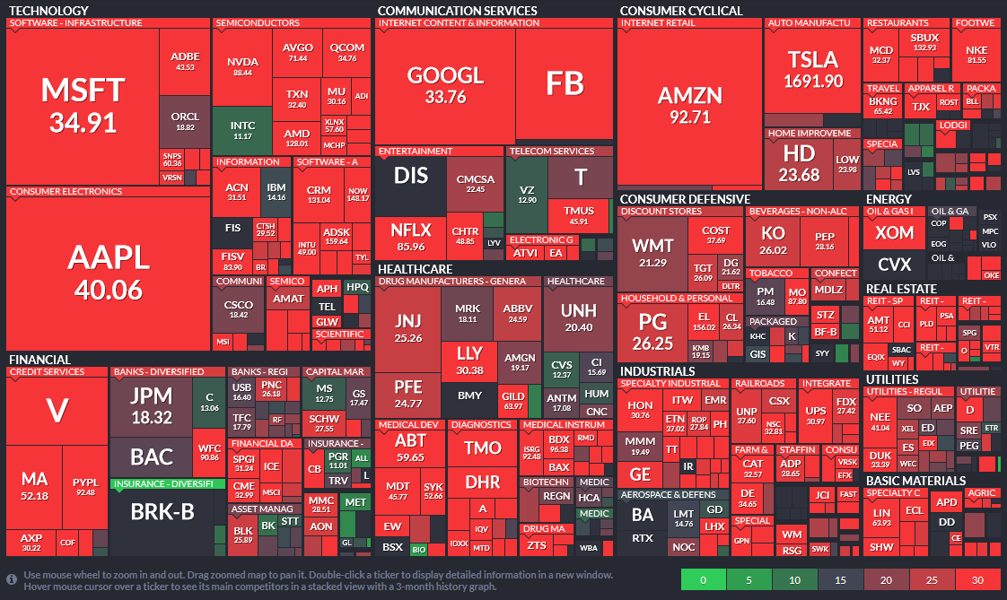
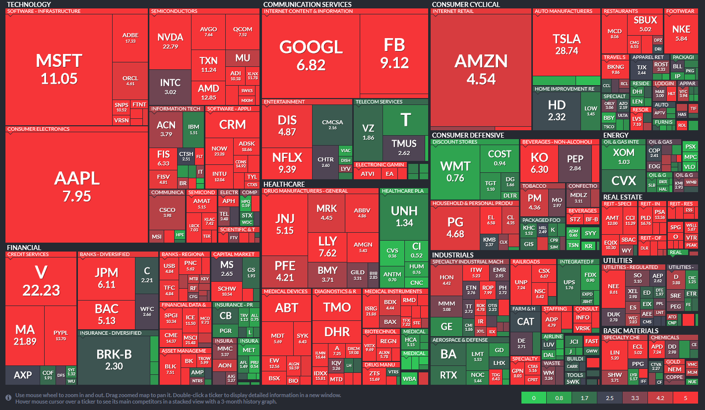
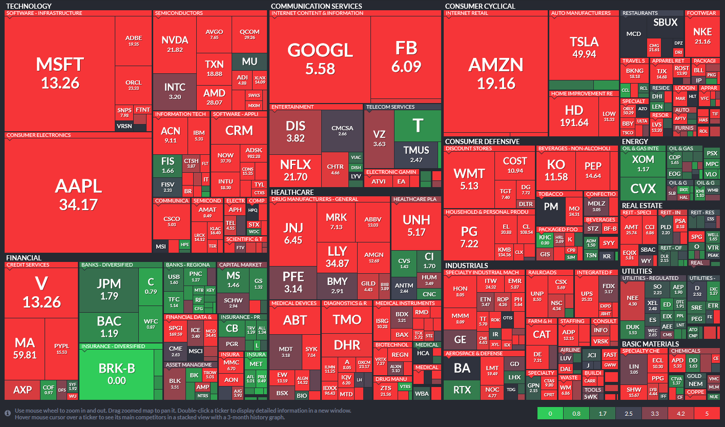
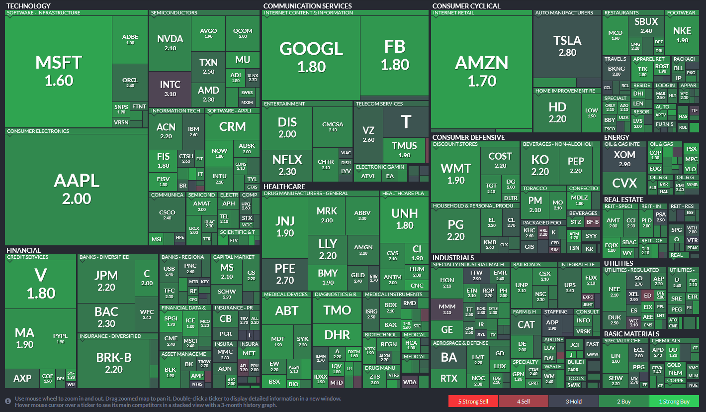
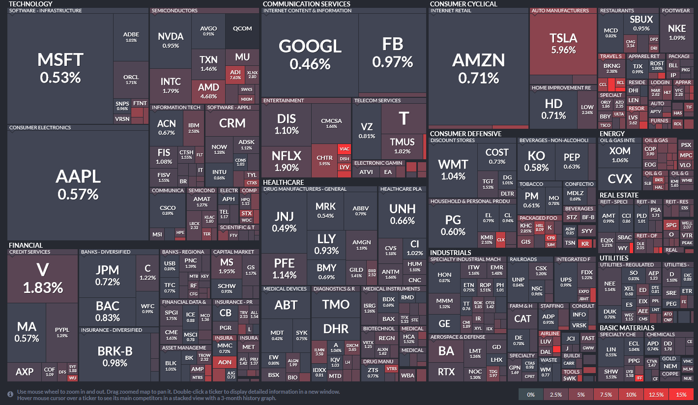
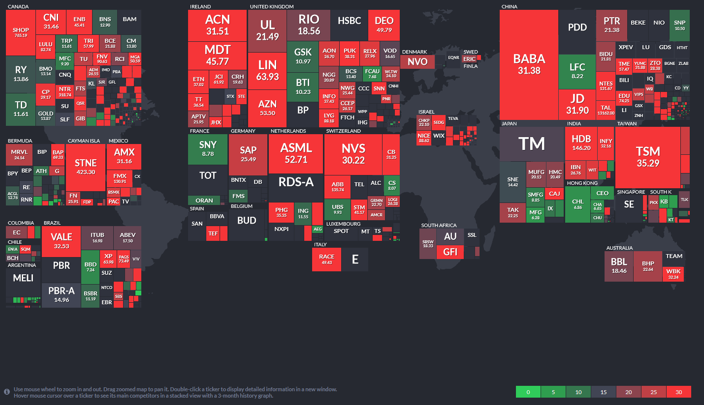
The charts below are called heat maps. What we like about heat maps is their ability to show two data points in one easy to read format. The following maps show the S&P 500 components market cap and along with a second factor. The larger the company’s market cap is in relation to other companies in the sector, the larger the square. Each graph has a scale on the bottom right relating to the second factor. In the first graph (Price to Earnings), the brighter the red, the more overvalued a company is. Conversely, green is relatively cheaper. The companies are sorted by their respective sector and sub-sectors.
The first three graphs are popular measures of valuation. The fourth graph shows that analyst recommendations, despite what valuations tell us, are pretty bullish. As shown in the fifth graph, investors are also overly bullish as there is a very low percentage of short positions in general. Lastly, the sixth graph shows this is not just domestic, but high valuations are occurring in many other countries.
1. Price to Earnings:
You have to look pretty hard to find stocks that are not very overvalued.
2. Price to Sales:
A ratio between 2-3 is considered somewhat normal, especially for well established mature companies.
3. Price to Book:
P/B is also typically in the lower single digits for mature companies.
4. Analyst Recommendations
You have to look pretty closely to find stocks that do not have buy recommendations.
5. Short Interest as a % of total float:
The continual grind higher has scared away almost all short sellers.
6. World Price to Earnings:
These are not as extreme as the U.S., but P/E ratios around the world are very high. Keep in mind that historical P/E ratios in most countries are lower than in the U.S. for many reasons. But importantly, P/E ratios are relative to the country in which the company is domiciled. Therefore, just because it may appear cheap relative to the U.S. does not necessarily mean it is a value.
No matter how you look at the markets, either from a technical or fundamental point of view, the risk/reward long-term is clearly not favorable.
What eventually derails the bullish bias is unknown. However, what is certain is that when it occurs, given the more extreme levels of leverage combined with a lack of liquidity, the reversion will be swift.
During a bull market advance, investors always take on substantially more risk than they realize. Unfortunately, it is a painful lesson taught quickly and repeatedly throughout history.


Michael Lebowitz, CFA is an Investment Analyst and Portfolio Manager for RIA Advisors. specializing in macroeconomic research, valuations, asset allocation, and risk management. RIA Contributing Editor and Research Director. CFA is an Investment Analyst and Portfolio Manager; Co-founder of 720 Global Research.
Follow Michael on Twitter or go to 720global.com for more research and analysis.
Customer Relationship Summary (Form CRS)
Also Read