
In this issue of “Everyone Is In The Pool. More Buyers Needed.”
- Everyone Is In The Pool
- Sentiment & Technicals Pushing Extremes
- A Heat Map Of Valuations
- Investor Resolutions
- MacroView: Yellen’s Arranged Marriage To The Fed
- Sector & Market Analysis
- 401k Plan Manager
Follow Us On: Twitter, Facebook, Linked-In, Sound Cloud, Seeking Alpha
RIA Advisors Can Now Manage Your 401k Plan
Too many choices? Unsure of what funds to select? Need a strategy to protect your retirement plan from a market downturn?
RIA Advisors can now manage your 401k plan for you. It’s quick, simple, and transparent. In just a few minutes, we can get you in the “right lane” for retirement.

Catch Up On What You Missed Last Week

Everyone Is In The Pool
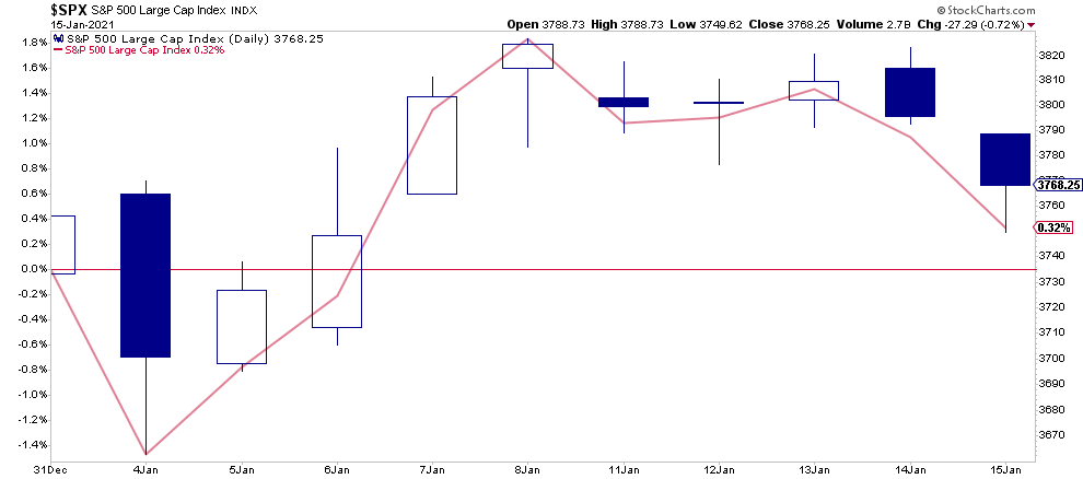
At the halfway point of January, the market has struggled to hold onto its gains. Such is surprising given the recent passage of a $900 billion stimulus bill and Biden’s proposal for another $1.9 trillion on Thursday. With another $2.8 trillion in stimulus hitting the economy, inducing the Fed to do more QE, markets were seemingly unimpressed.
For the first two weeks of January, the market is up by 0.32% YTD.
As we discussed recently in “There Is No Cash On The Sidelines,” the markets are driven by buyers’ and sellers’ supply and demand.
“In the current bull market advance, few people are willing to sell, so buyers must keep bidding up prices to attract a seller to make a transaction. As long as this remains the case, and exuberance exceeds logic, buyers will continue to pay higher prices to get into the positions they want to own.”
Such is also the definition of the “Greater Fool Theory:”
“The greater fool theory states that it is possible to make money by buying securities, whether or not they are overvalued, by selling them for a profit at a later date. This is because there will always be someone (i.e. a bigger or greater fool) who is willing to pay a higher price.”
The problem comes when buyers are no longer willing to pay a higher price. When sellers realize the change, there will be a rush to sell to a diminishing pool of buyers. Eventually, sellers begin to “panic sell” as buyers evaporate and prices plunge.
3-Risks In 2021
As we will discuss in a moment, there is ample evidence that “everyone is currently in the pool.” Such leaves the market vulnerable to three risks we debated over the past week:
- More stimulus and direct checks into the economy lead to an inflationary spike that causes the Fed to discuss hiking rates and tapering QE.
- The current rise in interest rates continues over higher inflation concerns until it impacts a debt-laden economy causing the Fed to implement “yield curve control.”
- The dollar, which has an enormous net-short position against it, reverses moves higher, pulling in foreign reserves, causing a short-squeeze on the dollar.
The reality is that both a rise in the dollar, with higher yields, is likely to start attracting reserves from countries faced with economic weakness and negative-yielding debt. Such would quickly reverse the tailwinds that have supported the equity rally since March.
The following video covers the current market exuberance and the importance of the dollar.
The Problem With Monetary Policy
There is also the problem of monetary policy. As discussed in “Moral Hazard,” investors are chasing risk assets higher because they believe they have an insurance policy against losses, a.k.a. the Fed.
However, this brings us to the one question everyone should be asking:
“If the markets are rising because of expectations of improving economic conditions and earnings, then why are Central Banks pumping liquidity like crazy?”
Despite the best of intentions, Central Bank interventions, while boosting asset prices may seem like a good idea in the short-term, in the long-term has harmed economic growth. As such, it leads to the repetitive cycle of monetary policy.
- Using monetary policy to drag forward future consumption leaves an enormous void that must get continually refilled in the future.
- Monetary policy does not create self-sustaining economic growth and therefore requires ever-larger amounts of monetary policy to maintain the same activity level.
- The filling of the “gap” between fundamentals and reality leads to consumer contraction and, ultimately, a recession as economic activity recedes.
- Job losses rise, the wealth effect diminishes, and real wealth gets destroyed.
- The middle class shrinks further.
- Central banks act to provide more liquidity to offset recessionary drag and restart economic growth by dragging forward future consumption.
- Wash, Rinse, Repeat.
If you don’t believe me, here is the evidence.
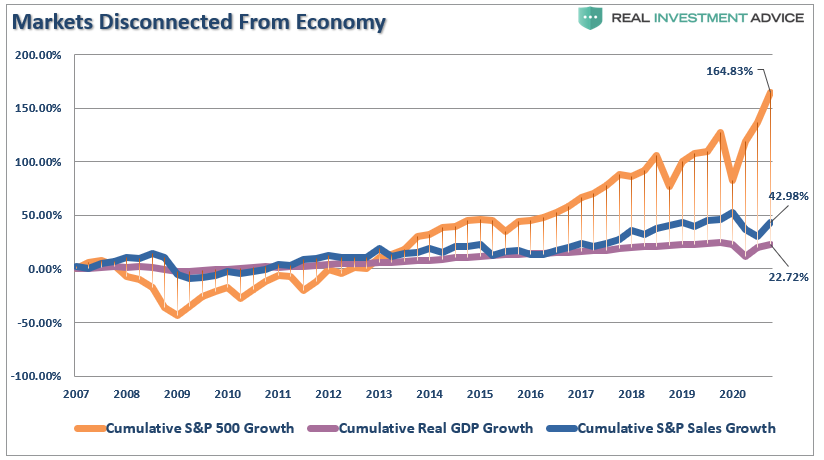
The stock market has returned more than 164% since the 2007 peak, which is more than 3.8x the growth in corporate sales, and 7.5x more than GDP.
But, for the 10% of the population that owns 90% of the stock market, the sentiment is now getting extreme.

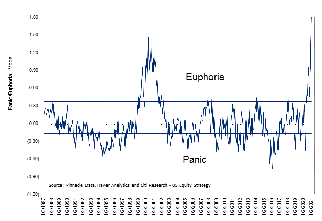
Sentiment Is Getting A Bit Extreme
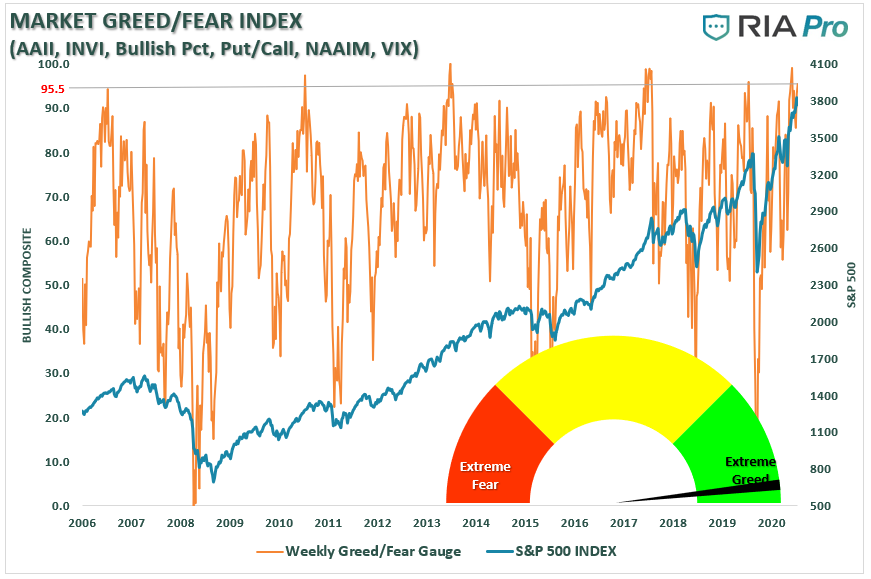
While the video discusses some of the extremes currently developing in the market, none better shows this than our investor sentiment gauge. As explained previously, this gauge compiles several measures of investor “positioning” in the markets in terms of actual equity exposure. As shown, we are at levels that have historically had poor outcomes.
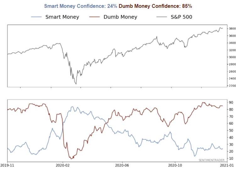
Of course, seeing that, you shouldn’t be surprised to see that retail investor confidence (dumb money) is near its highest levels on record.
The interesting thing about the market is that investors are rushing into equities in anticipation of an economic recovery. However, while there will indeed be a recovery, it is likely to fall far short of investor expectations. Such is generally the case. However, with “euphoria” now at mania levels, the only question is just how disappointed they will be?
As noted above, it is quite clear everyone is “now in the pool.” Such raises the question of:
“Who is left to buy?”

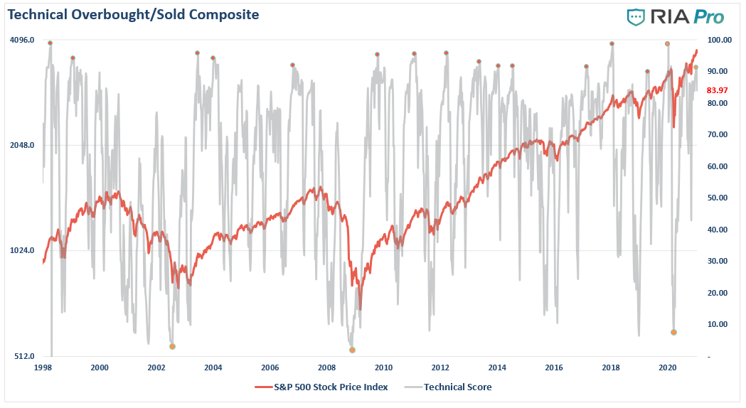
Technical Warning Signs
While sentiment measures are certainly worth considering, as the old axiom goes, “markets can remain irrational longer than you can remain solvent.” Therefore, from a portfolio management point of view, we want to focus on the technical signs, suggesting that starting to hedge against “risk” is likely prudent.
When markets are exuberantly bullish, along with investors believing there is “no risk” to investing, you see virtually every stock moving higher. We can view this specifically in looking at the number of stocks trading above their 200-dma. As noted by Sentimentrader:
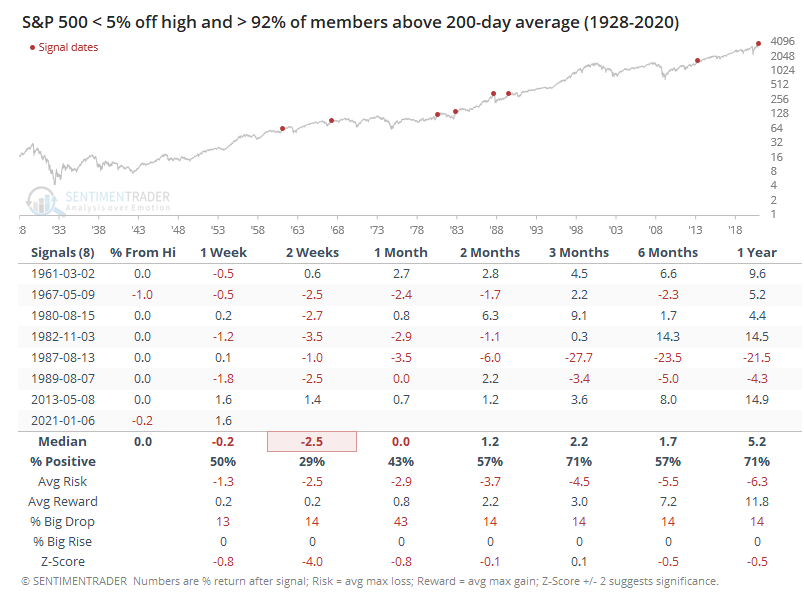
Of course, to no surprise, the put/call ratio is back to a record that usually has preceded short-term corrections.
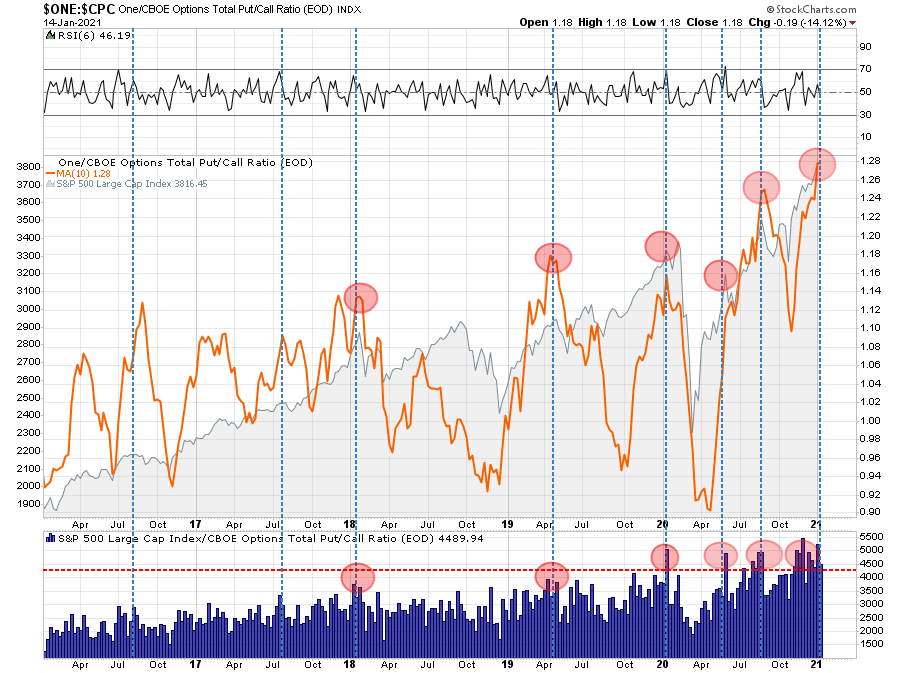
Such does not mean the market is about to crash, although such would not be unprecedented. The combination of these indicators does suggest that a correction between 5-10% is likely within the next couple of weeks.
What will cause that correction? Who knows. But such is why we have slowly started adding some “risk hedges” back into our portfolios this week. Profit-taking will come next.

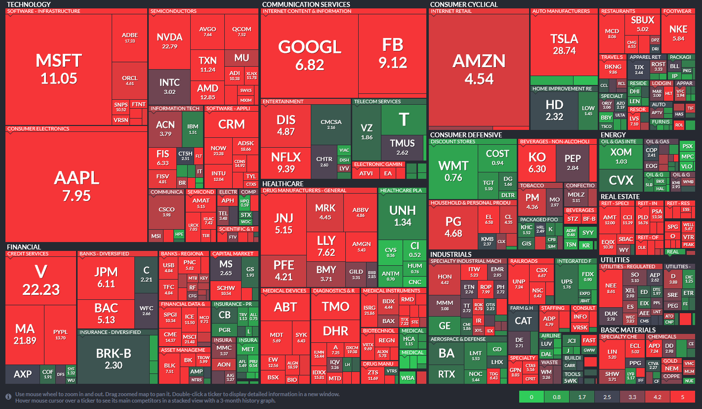
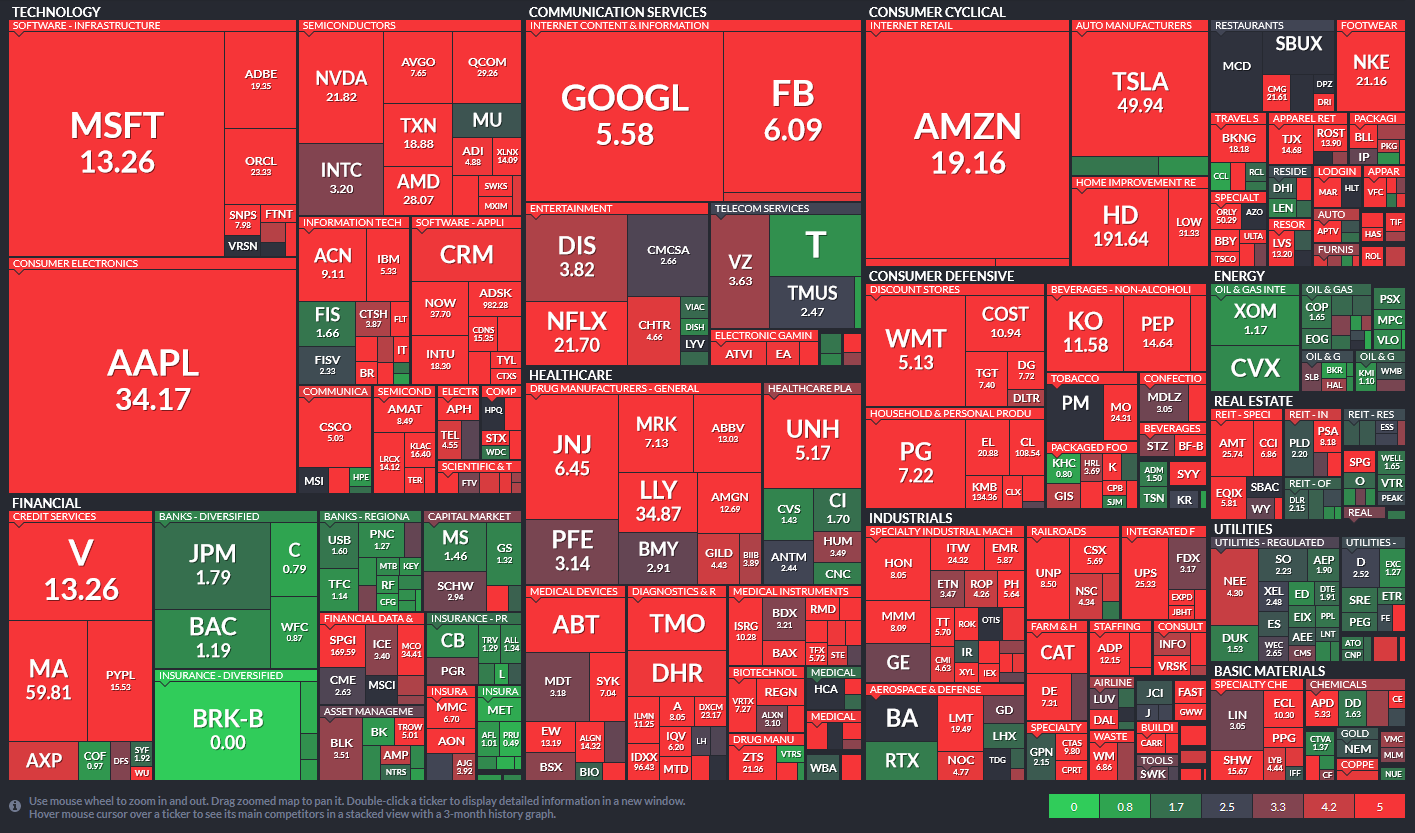
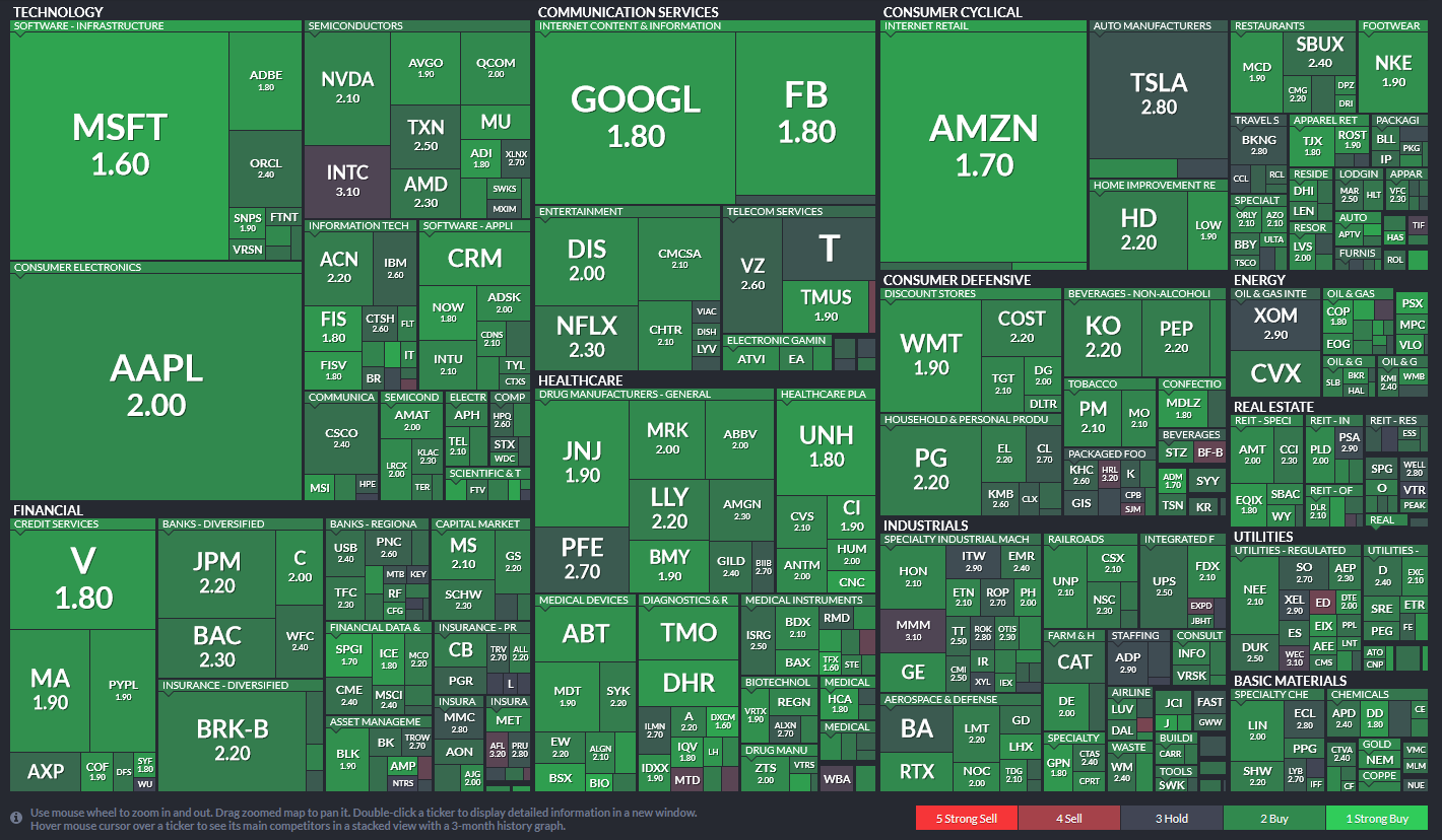
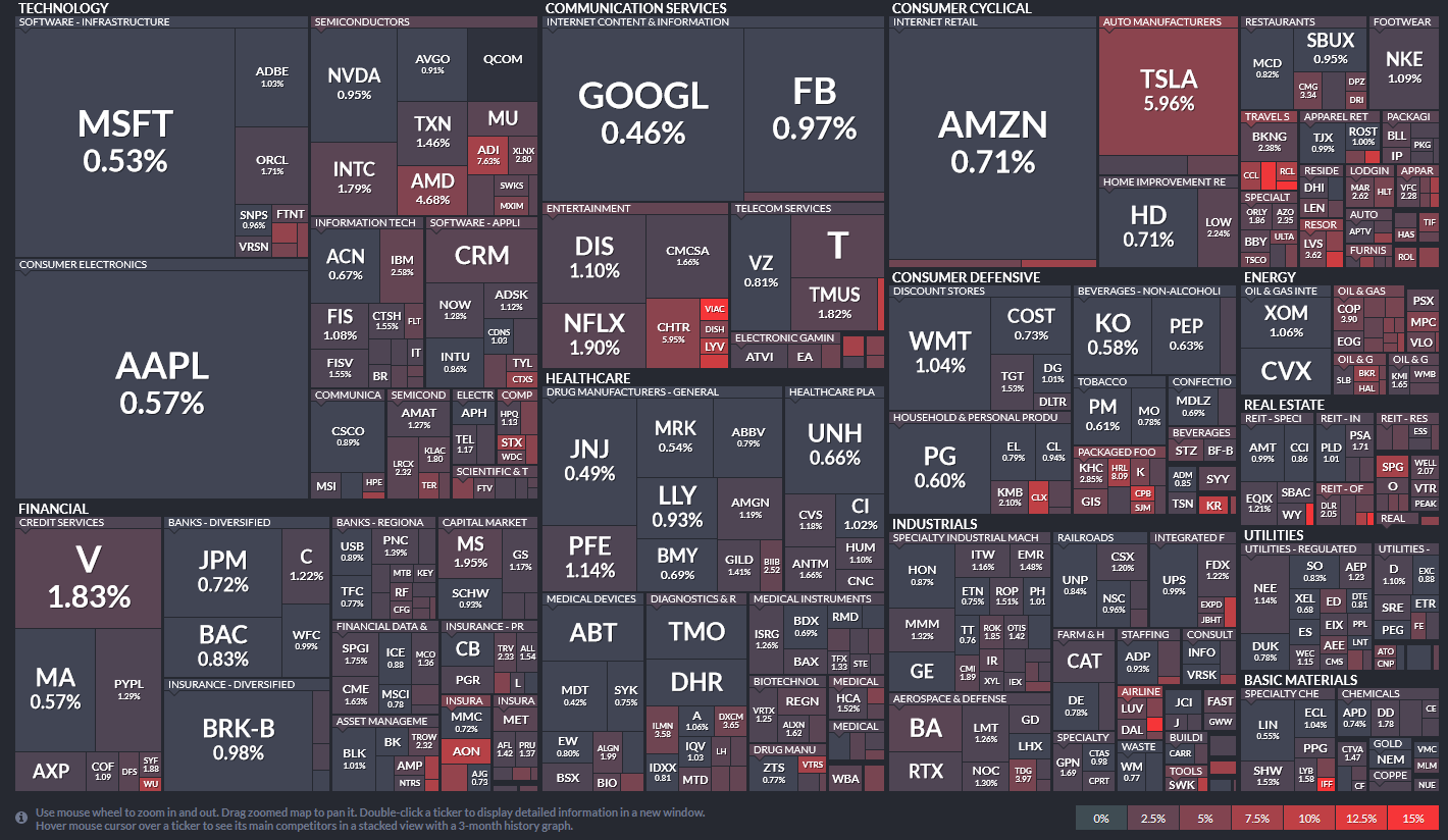
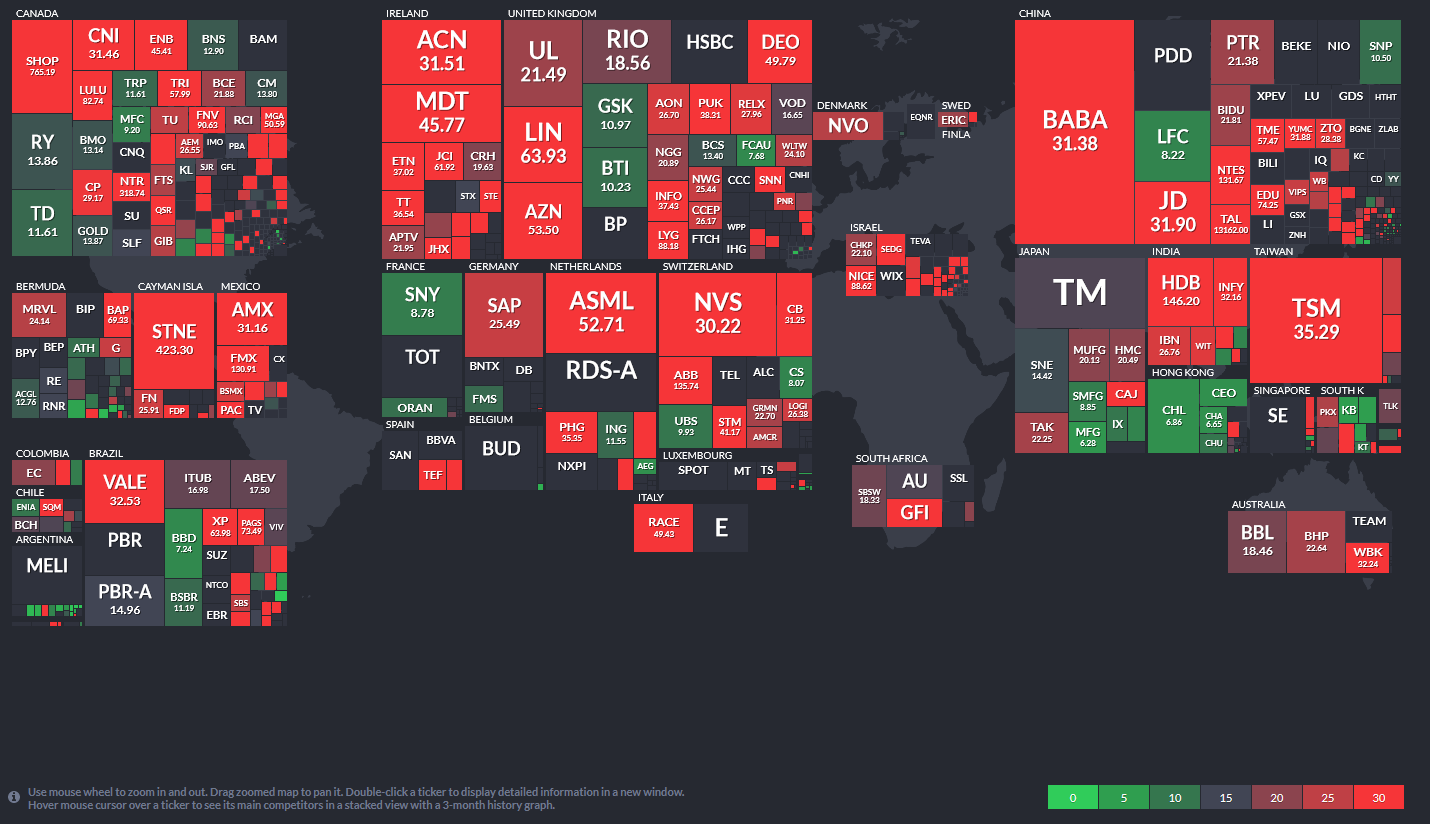
A Heat Map Of Valuations
By Michael Lebowitz, CFA
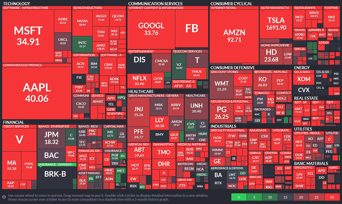
We talk a lot about valuations and their importance, but such discussions can be hard to put into context. Therefore, I have produced a series of charts that visualize various valuations of the S&P 500 companies. Not surprisingly, such also corresponds to the current behavior of Wall Street analysts and investors. Instead of cluttering up the commentary space on RIAPro.Net (30-day Risk-Free Trial), we thought you would better appreciate the charts and can share them more easily in an article format.
The charts below are called heat maps. What we like about heat maps is their ability to show two data points in one easy to read format. The following maps show the S&P 500 components market cap and along with a second factor. The larger the company’s market cap is in relation to other companies in the sector, the larger the square. Each graph has a scale on the bottom right relating to the second factor. In the first graph (Price to Earnings), the brighter the red, the more overvalued a company is. Conversely, green is relatively cheaper. Companies are sorted by their sectors and sub-sectors.
The first three graphs are popular measures of valuation. The fourth graph shows that analyst recommendations, despite valuations, are pretty bullish. As shown in the fifth graph, investors are also overly bullish as there is a very low percentage of short positions in general. Lastly, the sixth graph shows this is not just domestic, but high valuations are occurring in many other countries.
1. Price to Earnings:
You have to look pretty hard to find stocks that are not wildly overvalued.
2. Price to Sales:
A ratio between 2-3 is considered somewhat normal, especially for well established mature companies.
3. Price to Book:
P/B is also typically in the lower single digits for mature companies.
4. Analyst Recommendations
You have to look pretty closely to find stocks that do not have buy recommendations.
5. Short Interest as a % of total float:
The continual grind higher has scared away almost all short sellers.
6. World Price to Earnings:
These are not as extreme as the U.S., but P/E ratios around the world are very high. Keep in mind that historical P/E ratios in most countries are lower than in the U.S. for several reasons. But importantly, P/E ratios are relative to the country that domiciles the company. Therefore, just because it may appear cheap relative to the U.S. does not necessarily mean it is a value.
No matter how you look at the markets, either from a technical or fundamental point of view, the long-term risk/reward is not favorable.
What eventually derails the bullish bias is unknown. However, what is certain is that when it occurs, given the more extreme levels of leverage combined with a lack of liquidity, the reversion will be swift.
During a bull market advance, investors always take on substantially more risk than they realize. Unfortunately, it is a painful lesson taught quickly and repeatedly throughout history.
Investor Resolutions
Here are my annual resolutions for the coming year to be a better investor and portfolio manager:
I will:
- Do more of what is working and less of what isn’t.
- Remember that the “Trend Is My Friend.”
- Be either bullish or bearish, but not “hoggish.” (Hogs get slaughtered)
- Remember it is “Okay” to pay taxes.
- Maximize profits by staging my buys, working my orders, and getting the best price.
- Look to buy damaged opportunities, not damaged investments.
- Diversify to control my risk.
- Control my risk by always having pre-determined sell levels and stop-losses.
- Do my homework. I will do my homework. I will do my homework.
- Not allow panic to influence my buy/sell decisions.
- Remember that “cash” is for winners.
- Expect, but not fear, corrections.
- Expect to be wrong, and I will correct errors quickly.
- Check “hope” at the door.
- Be flexible.
- Have the patience to allow my discipline and strategy to work.
- Turn off the television, put down the newspaper, and focus on my analysis.
These are the same resolutions I attempt to follow every year. There is no shortcut to being a successful investor. There are only the basic rules, discipline, and focus that is required to succeed long-term.

The MacroView
If you need help or have questions, we are always glad to help. Just email me.
See You Next Week
By Lance Roberts, CIO
Market & Sector Analysis
Analysis & Stock Screens Exclusively For RIAPro Members
S&P 500 Tear Sheet

Performance Analysis

Technical Composite
The technical overbought/sold gauge comprises several price indicators (RSI, Williams %R, etc.), measured using “weekly” closing price data. Readings above “80” are considered overbought, and below “20” is oversold.
Portfolio Positioning “Fear / Greed” Gauge
The “Fear/Greed” gauge is how individual and professional investors are “positioning” themselves in the market based on their equity exposure. From a contrarian position, the higher the allocation to equities, to more likely the market is closer to a correction than not. The gauge uses weekly closing data.
NOTE: The Fear/Greed Index measures risk from 0-100. It is a rarity that it reaches levels above 90. The current reading is 95.50 out of a possible 100.
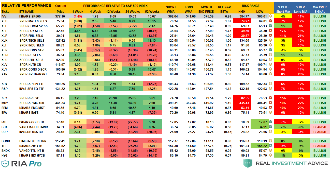
Sector Model Analysis & Risk Ranges
How To Read.
- The table compares each sector and market to the S&P 500 index on relative performance.
- The “MA XVER” is determined by whether the short-term weekly moving average crosses positively or negatively with the long-term weekly moving average.
- The risk range is a function of the month-end closing price and the “beta” of the sector or market.
- The table shows the price deviation above and below the weekly moving averages.
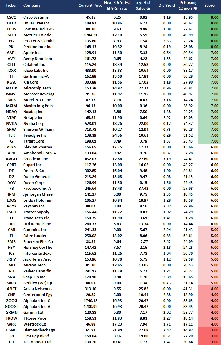
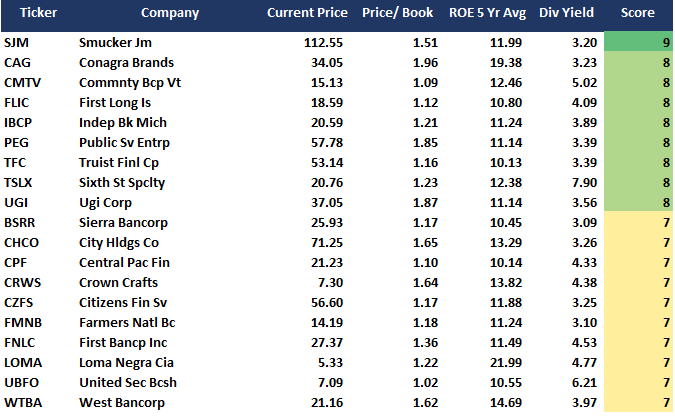
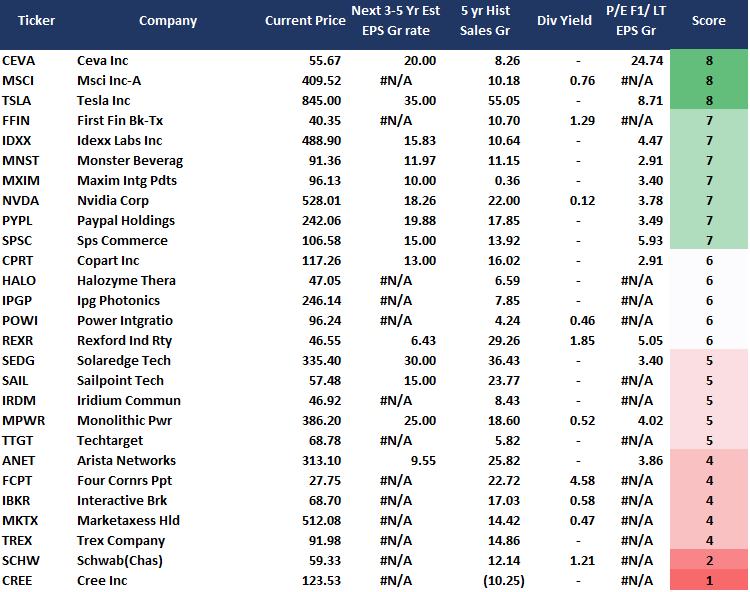
Weekly Stock Screens
Currently, there are 3-different stock screens for you to review. The first is S&P 500 based companies with a “Growth” focus, the second is a “Value” screen on the entire universe of stocks, and the last are stocks that are “Technically” strong and breaking above their respective 50-dma.
We have provided the yield of each security and a Piotroski Score ranking to help you find fundamentally strong companies on each screen. (For more on the Piotroski Score – read this report.)
S&P 500 Growth Screen
Low P/B, High-Value Score, High Dividend Screen
NEW! Fundamental Growth Screen

Aggressive Growth Strategy
Portfolio / Client Update
With the first two weeks of the year behind us, exuberance remains a clear partner with the market. As we have discussed this past week in several of our videos, we haven’t seen a period where investors were this leveraged and confident since 1999.
However, these periods can last longer than logic would predict, which is why we continue to rebalance portfolios, reduce laggards, trim winners, and add hedges as necessary. While there are undoubtedly many indicators that suggest the “bull market” is very much intact, which is why we currently carry full weightings to equities in portfolios, there are just as many suggesting risk is more than present.
Such is why we started adding duration back into our bond portfolio this past week, as noted below.
Portfolio Changes
During the past week, we made minor changes to portfolios. We post all trades in real-time at RIAPRO.NET.
“The market is getting egregiously overbought, and exuberant, which suggests that we will likely move into a corrective mode sooner than later. We are currently VERY underhedged at the moment and carrying greater than 60% equity exposure. With bonds extremely oversold we are adding a 5% position of TLT to portfolios for a short-term hedge. This move has less risk than trying to short the market directly at this point.”
- Initiate a 5% position of TLT at the open / Stop-loss is $150
“We are adding a 2% position of ZM (Zoom Video) to the portfolio. We will add to our position if the longer-term MACD also turns positive. This is a purely technical based trade so we are carrying a fairly tight stop for now, but if the position migrates into a stronger technical position by breaking above the recent downtrend at $400, then we will consider it a longer-term hold.”
- Buy 3% of the portfolio in ZM / Stop-loss is $330
- Rebalanced FANG (Diamond Back Energy) back to original position weight 1%.
While we like the Utilities sector defensively, we were stopped out of both of our positions this week:
- Sell 100% of D (Dominion Energy)
- Sell 100% of WEC (WEC Energy)
We are aware of the risks and are carrying tight stops on all positions.
As always, our short-term concern remains the protection of your portfolio. We have now shifted our focus from the election back to the economic recovery and where we go from here.
Lance Roberts
CIO
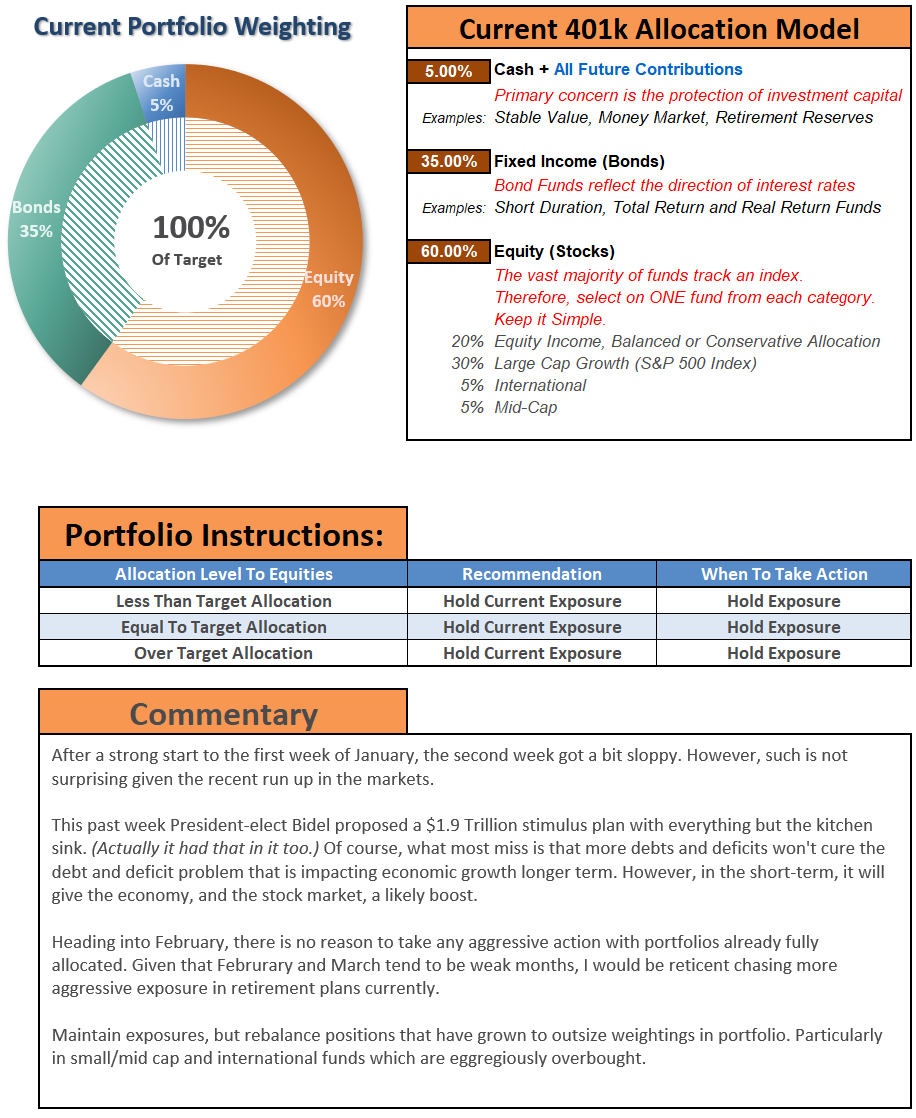
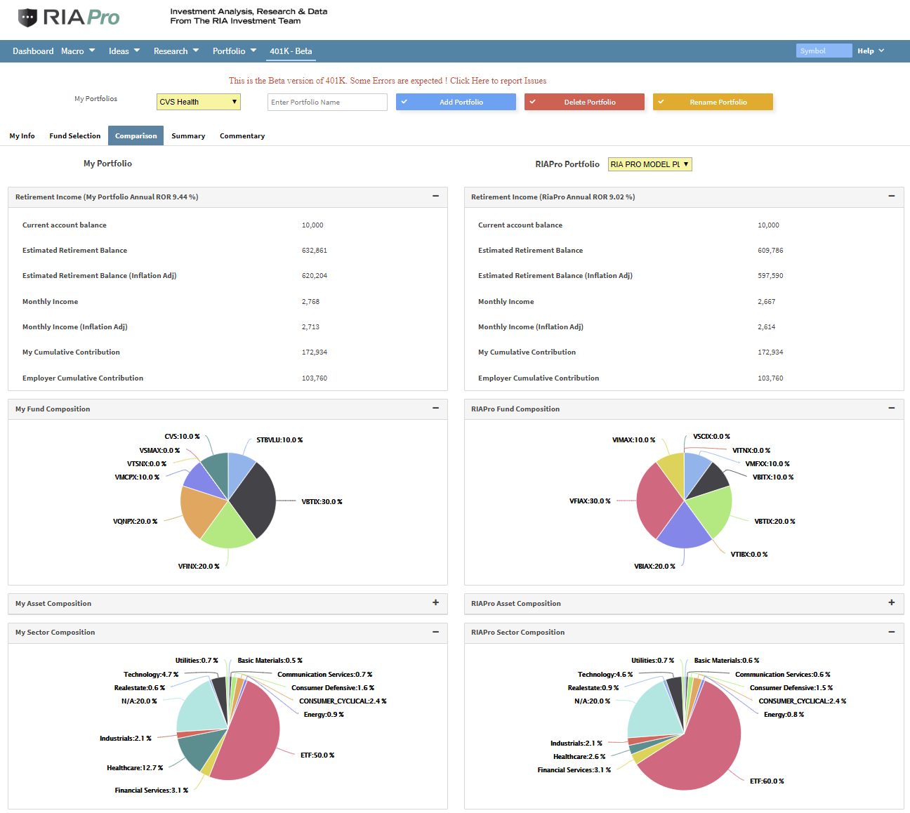
THE REAL 401k PLAN MANAGER
A Conservative Strategy For Long-Term Investors

If you need help after reading the alert, do not hesitate to contact me.

Model performance is a two-asset model of stocks and bonds relative to the weighting changes made each week in the newsletter. Such is strictly for informational and educational purposes only, and one should not rely on it for any reason. Past performance is not a guarantee of future results. Use at your own risk and peril.
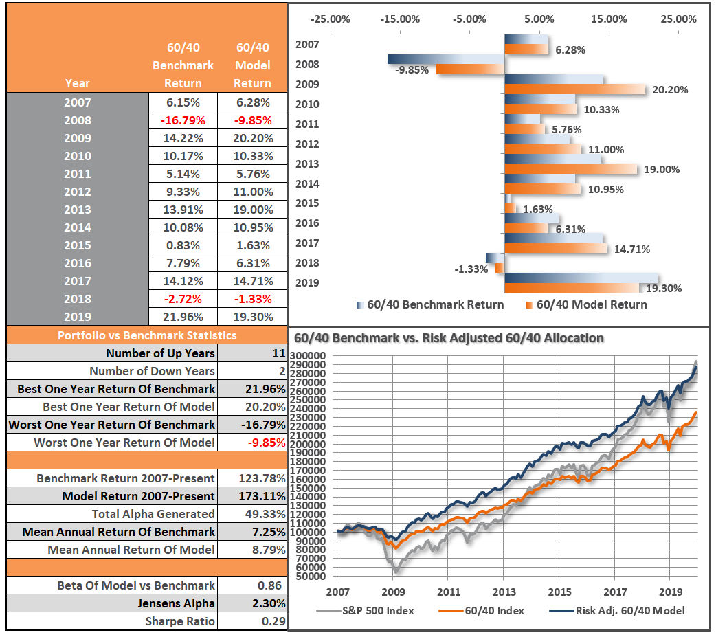
401k Plan Manager Live Model
As anRIA PRO subscriber (You get your first 30-days free), you can access our live 401k plan manager.
Compare your current 401k allocation to our recommendation for your company-specific plan and our 401k model allocation.
You can also track performance, estimate future values based on your savings and expected returns, and dig down into your sector and market allocations.
If you would like to offer our service to your employees at a deeply discounted corporate rate, please contact me.


Lance Roberts is a Chief Portfolio Strategist/Economist for RIA Advisors. He is also the host of “The Lance Roberts Podcast” and Chief Editor of the “Real Investment Advice” website and author of “Real Investment Daily” blog and “Real Investment Report“. Follow Lance on Facebook, Twitter, Linked-In and YouTube
Customer Relationship Summary (Form CRS)
Also Read