In this issue of “Bulls Are Loving The ‘Heads I Win, Tails I Win’ Market“
- Bulls Loving The “Heads I Win, Tails I Win” Market
- The Risk To The Bullish View
- Is The Reflation Trade Over?
- Portfolio Positioning Update
- MacroView: The Two Primary Risks In 2021
- Sector & Market Analysis
- 401k Plan Manager
Follow Us On: Twitter, Facebook, Linked-In, Sound Cloud, Seeking Alpha
RIA Advisors Can Now Manage Your 401k Plan
Too many choices? Unsure of what funds to select? Need a strategy to protect your retirement plan from a market downturn?
RIA Advisors can now manage your 401k plan for you. It’s quick, simple, and transparent. In just a few minutes, we can get you in the “right lane” for retirement.

Catch Up On What You Missed Last Week

Bulls Loving The Heads I Win, Tails I Win Market
It was a close call, but Santa finally delivered with a strong rally this past week, pushing the markets to all-time highs. Interestingly, despite the “Blue Sweep” of the Georgia elections, the markets quickly turned from worrying that such would be harmful to the markets. Markets quickly dismissed concerns of higher taxes by justifying it with more stimulus and more significant deficits. In other words, “buy everything in sight.”
As I tweeted out on Tuesday:
Here is my prediction of how the market reacts tomorrow.
– Dem's win…market up.
– Rep's win…market up.
– Split win…market upIt really doesn't matter because they are all the same. Regardless of who wins inequality will wide, and economy will weaken. pic.twitter.com/tdR2Bu19Jq
— Lance Roberts (@LanceRoberts) January 6, 2021
While I do jest a bit, market participants quickly justify paying continually higher prices for investments.
Why not? Mainly when it’s a “Heads I win, Tails I win” market.
As I noted last week, it certainly seems as if there is no “risk” in investing. As markets continue to rise, investors are becoming increasingly confident. But therein lies the risk as confidence breeds complacency.
In the short-term, the bullish trends remain intact. After a month-long choppy process, the S&P 500 finally set a new all-time high. The good news is that short-term MACD signals and money flows are favorable, suggesting prices could rise higher in the short-term.
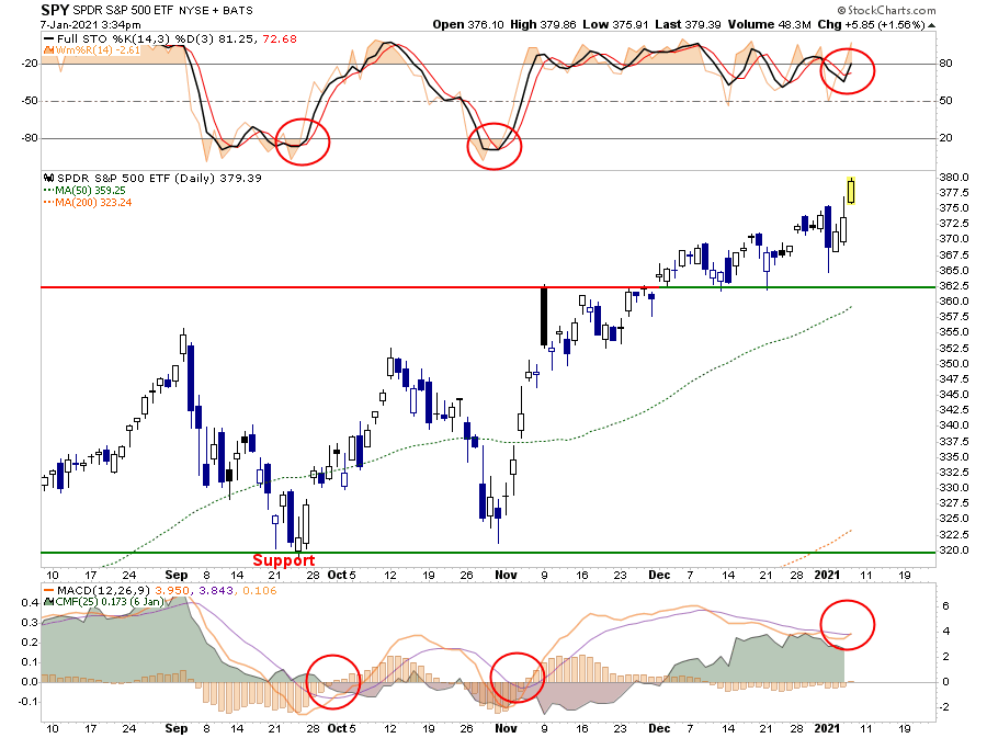
However, notice that while the MACD, and money flow, are positive, the market remains significantly overbought short-term. Such suggests that while markets could rise, it could be somewhat limited return relative to the risk.
On a longer-term basis, the markets remain grossly extended from long-term means. The only other times we have seen these extensions in recent years often resulted in the loss of short-term gains rather quickly.
A correction within the next 2-months would not be surprising given the deviations from long-term means. However, such does not preclude more upside first.


The Risk Of The Bullish View
As we noted last week:
“Currently, every single analyst has the same story going into 2021.
- Prepare for an economic boom.
- Interest rates will rise.
- Inflation is coming back.
- The stock market is going to 4100-4500
- Small-caps are the new ‘new trade.'”
You get the idea. Everyone is incredibly “bullish” about the coming year with hopes of more stimulus, infrastructure spending, and a vaccine.
Somehow, despite millions of people still unemployed, the economy has just shifted into a “Golden Age” not seen since the 1950s.
However, therein lies the problem.
We Can’t Go Back
There have been two previous periods in history that have had the necessary ingredients to support a rising trend of interest rates, inflation, and economic growth over an extended period.
The first was during the previous century’s turn as the country became more accessible via railroads and automobiles. Production ramped up for World War I, and America began shifting from an agricultural to an industrial economy. (Read more on why this isn’t the “Roaring 20s.”
The second period was post-World War II. The war left America the “last man standing” after France, England, Russia, Germany, Poland, Japan, and others were devastated. It was here that America found its most substantial run of economic growth in its history as the “boys of war” returned home to start rebuilding the countries that they had just destroyed.
The U.S. is no longer the manufacturing powerhouse it once was, and globalization has sent jobs to the cheapest labor sources. Technological advances continue to reduce the need for human labor and suppress wages as productivity increases. Today, the number of workers between the ages of 16 and 54 participating in the labor force is near the lowest level relative to that age group since the late 70s.
There is also a structural and demographic problem that continues to drag on economic growth as nearly 1/4th of the American population is now dependent on some form of governmental assistance. These issues are only going to worsen due to long-term demographic trends, not only domestically but globally.
In other words, the ingredients required for sustained levels of more robust economic growth and prosperity are not available.
Trending In The Wrong Direction
As shown below, there is a correlation between the three major components of economic growth: inflation, interest rates, and wage growth.
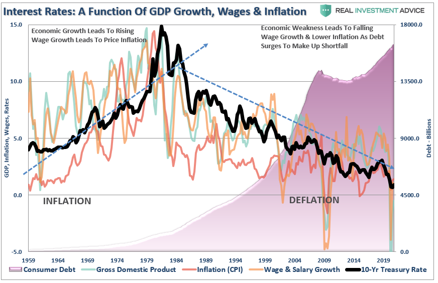
Interest rates are not only a function of the investment market, but rather the level of “demand” for capital in the economy. When the economy is expanding organically, the demand for capital rises as a business increases production to meet rising demand. Increased production leads to higher wages, which in turn fosters more aggregate demand. As consumption increases, so does producers’ ability to charge higher prices (inflation) and for lenders to increase borrowing costs. (Currently, we do not have the type of inflation that leads to more robust economic growth, just inflation in the costs of living that saps consumer spending – Rent, Insurance, Health Care)
Note that “production” is the key to economic growth. Consumption that is dependent solely on increases in debt, or stimulus, has a negative impact on growth.
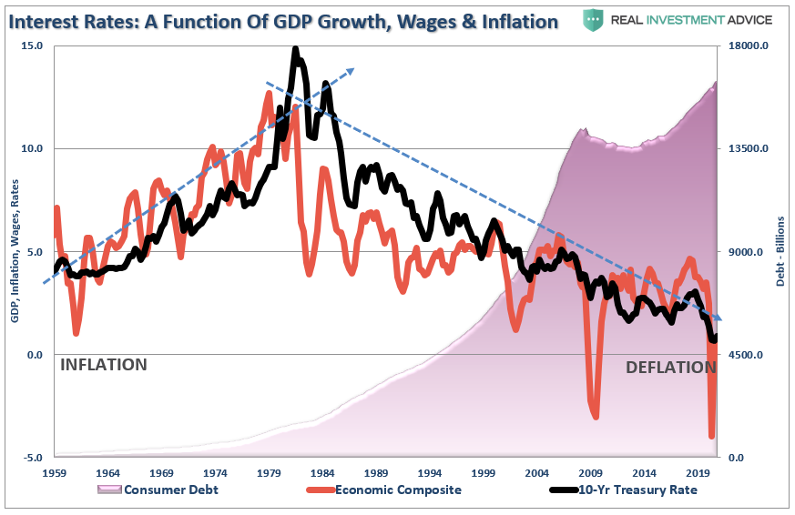
The chart above is a bit busy. If we combine the individual subcomponents into a composite index, the correlation with interest rates becomes clearer.
Blue Plans Won’t Lead To Growth.
Currently, investors hope that with a “Blue Wave,” more stimulus, increased deficits, and infrastructure spending is soon on their way. Goldman Sachs just upgraded their estimate of GDP growth based on the expectation of another $750 billion stimulus bill.
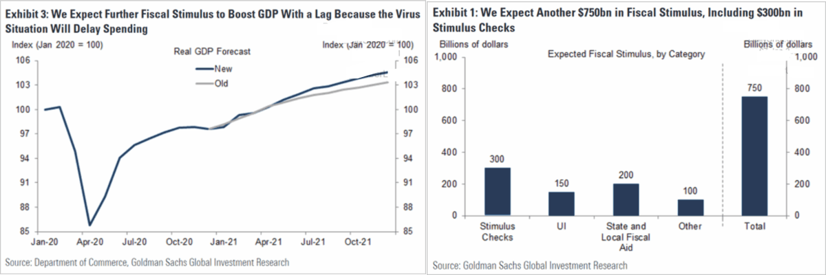
The surge in deficit spending, combined with the pick up in short-term demand for construction and manufacturing processes, will give the appearance of economic growth. Such will likely get both the Federal Reserve and the “bond bears” on the wrong side of the trade.
The impacts of these “one-off” inputs into the economy will fade rather quickly after implementation as organic productivity fails to increase. While many always hope these programs will lead to an ongoing economic expansion, a look at the last 40 years of fiscal and monetary policy suggests it won’t.
Why?
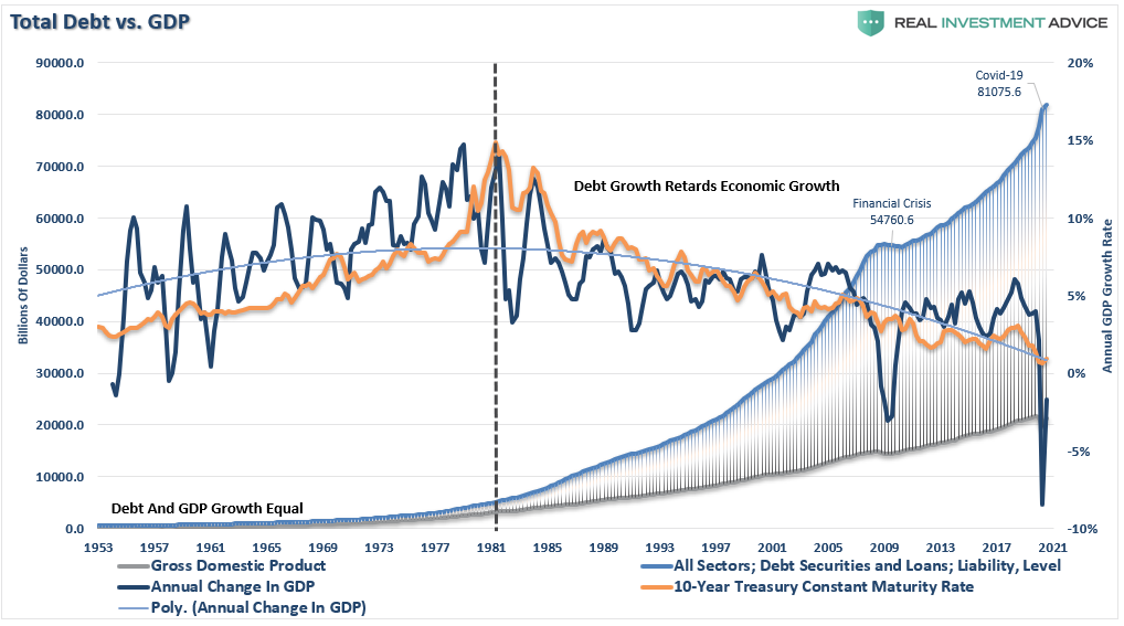
Because you can’t create economic growth when financed by deficit spending, credit, and a reduction in savings.
You can create the “illusion” of growth in the short-term, but the surge in debt reduces both productive investments and the output from the economy. As the economy slows, wages fall, forcing consumers to take on more leverage and decrease their savings rate. As a result, of the increased leverage, more of their income is needed to service the debt, which requires them to take on more debt.
While more stimulus and infrastructure spending may spur the economy and markets initially, the payback tends to be severe. Such is why we keep ending up at this point, demanding more spending to fix the last drawdown.
Wash. Rinse. Repeat.

Is The Reflation Trade Over?
The trade du jour has been to buy stocks that benefit the most from inflation. Energy and materials have been the hottest sectors over the last few weeks, and bitcoin is on fire. Conversely, utilities and REITs have suffered as higher interest rates tend to accompany inflationary expectations.
As such, the graph below is essential for stock investors to follow. Yes, we know it is TIP bonds, but it accurately quantifies the inflationary sentiment driving stocks.
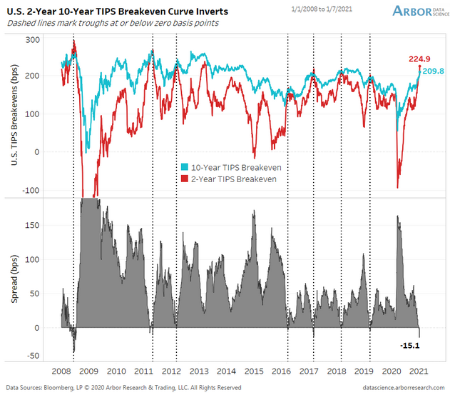
The graph compares 2-year, and 10-year implied inflation levels. By comparing TIP yields to nominal Treasury yields, we extract the breakeven, or implied, inflation rate that makes investors indifferent between the two securities. As shown, short term expectations have risen from nearly -1% in April to 2.25% today. Short term expectations are at the highest level since 2013. 10-year inflation expectations are less volatile but have risen sharply.
The genius of the graph is the interaction of inflation expectations to the spread between the two. Short term inflation expectations tend to be lower than long term expectations. However, when they reach or exceed long-term expectations, they tend to peak and reverse sharply. The dotted lines highlight the seven times in the last 12 years this has occurred.
The bulls argue this time is different and inflation is a real threat, unlike the past. The bears rely on the past relationship and forecast a rapid decline in inflation expectations.
The eagles, ourselves included, have the luxury of watching the data and adjusting our stance as we see how the two rates react to the curve inversion.

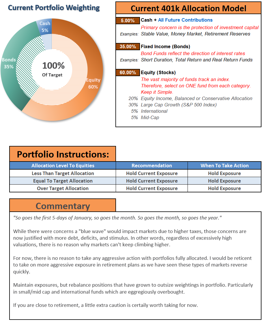
Portfolio Positioning Update
With January kicking off with a bang, we are maintaining our long bias with reduced hedges at the moment.
We made some changes to align our portfolio more with our equal-weighted benchmark index during the past week by reducing some of our overweight in technology, healthcare, and communications. While many other sectors of the market are grossly overbought short-term, we added a 5% weighting of RSP (S&P Equal Weight ETF) and SPY (S&P Market Weight) to our portfolios for the time being as placeholders.
We are currently slightly overweight equities and underweight our hedges in fixed income as interest rates press higher.
As noted last week, the rally this week was not unexpected:
“With the stimulus bill passed, and checks going out, we won’t be surprised to see a short-term pop in economic activity. However, given the checks are 50% smaller than the first round, along with extended unemployment benefits, the economic bump will be short-lived. The real question going into 2021 is whether President Biden can spend further into debt to do more stimulus. Or, will a shift toward fiscal responsibility begin to take hold? Much will depend on the Senate run-off outcome in Georgia.
Regardless, the evidence is mounting that economic and earnings data will likely disappoint overly optimistic projections currently. Furthermore, investors are way too confident. Historically, such has always turned out to be a poor mix for a continued bull market advance in the short-term.
Even with the Senate now a 50/50 split, more moderate Democrats may start to balk at massive increases in debt. There may also be some pushback against some of the more far-left socialistic policies as well.
We will have to wait and see.
For now, we will continue to trade accordingly.

The MacroView
If you need help or have questions, we are always glad to help. Just email me.
See You Next Week
By Lance Roberts, CIO
Market & Sector Analysis
Analysis & Stock Screens Exclusively For RIAPro Members
S&P 500 Tear Sheet
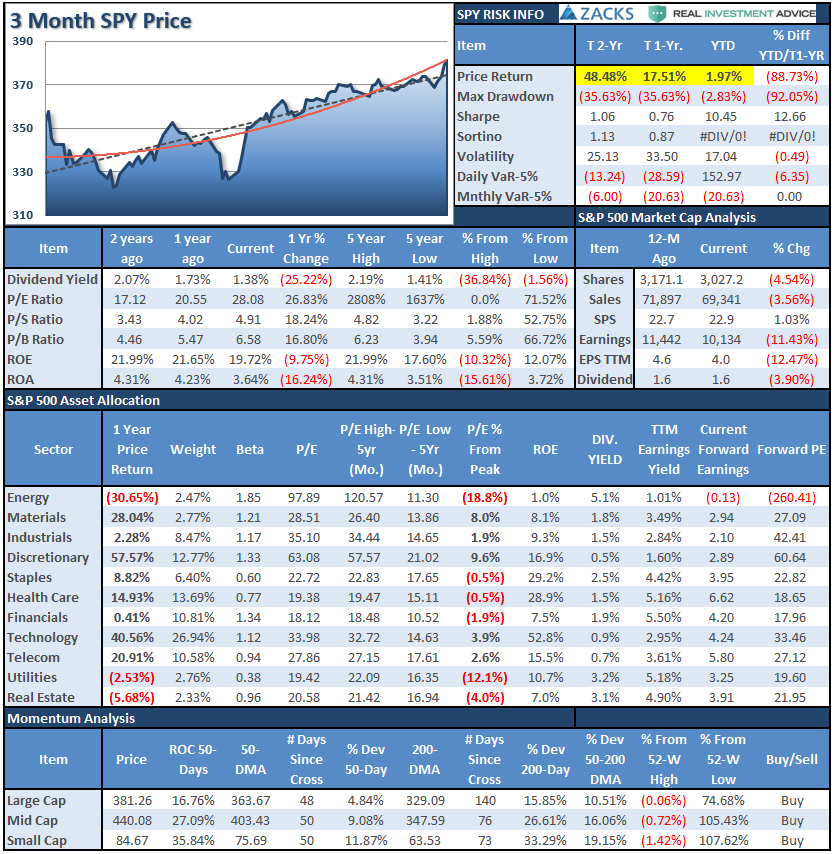
Performance Analysis
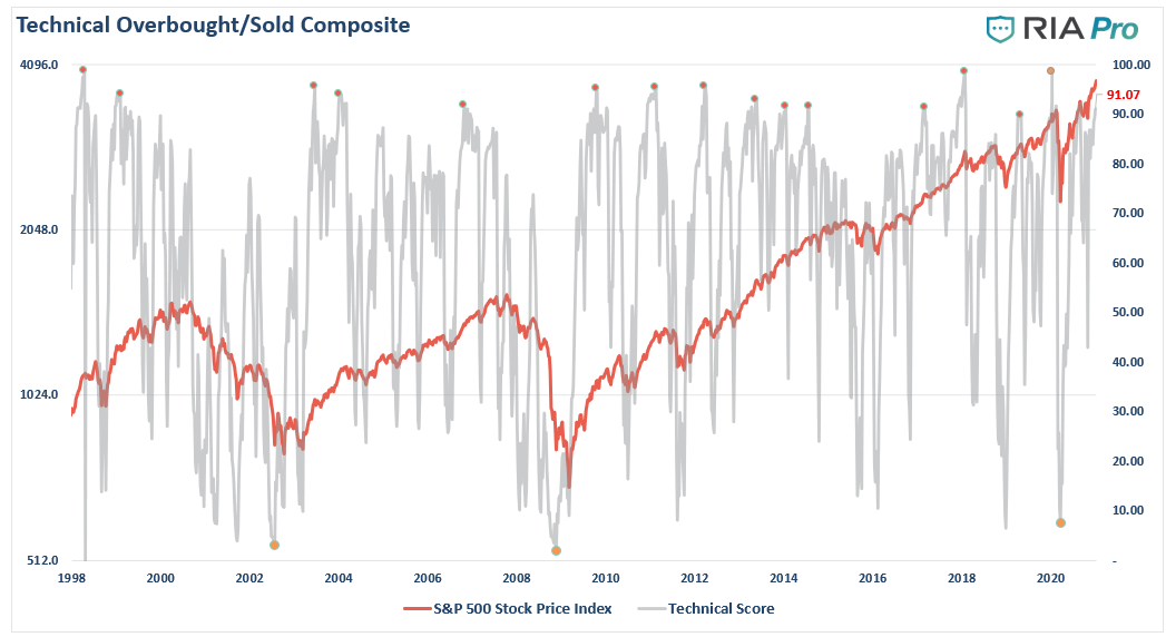
Technical Composite
The technical overbought/sold gauge comprises several price indicators (RSI, Williams %R, etc.), measured using “weekly” closing price data. Readings above “80” are considered overbought, and below “20” is oversold.
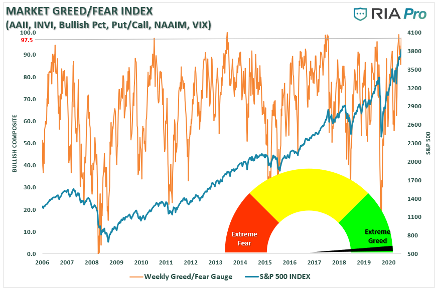
Portfolio Positioning “Fear / Greed” Gauge
The “Fear/Greed” gauge is how individual and professional investors are “positioning” themselves in the market based on their equity exposure. From a contrarian position, the higher the allocation to equities, to more likely the market is closer to a correction than not. The gauge uses weekly closing data.
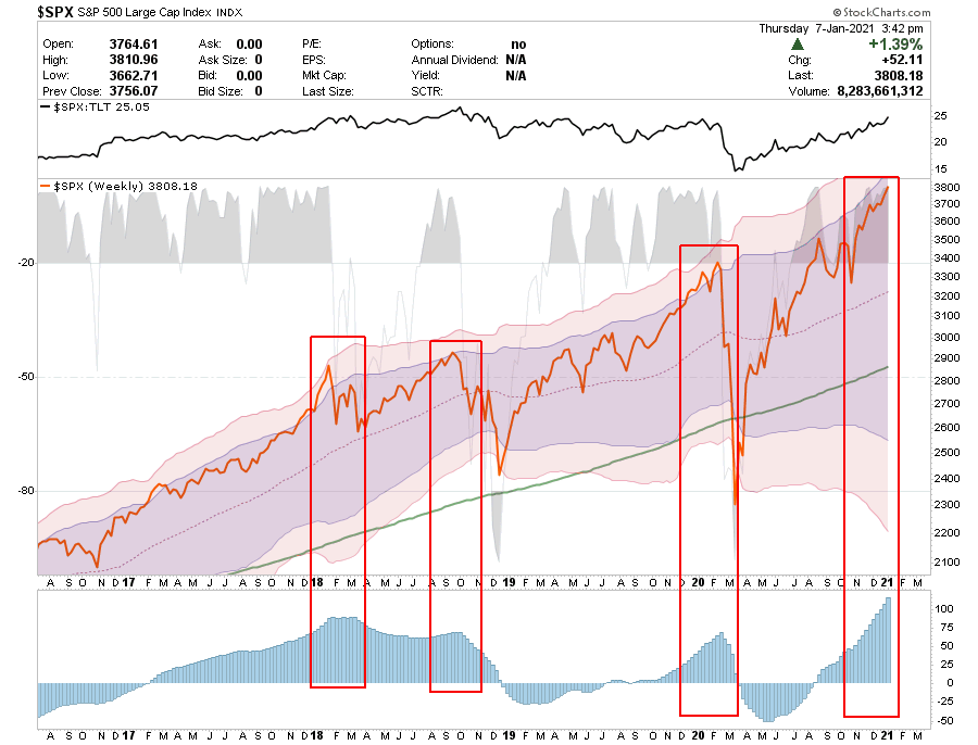
NOTE: This week, I published the 4-Week Average of the Fear/Greed Index. It is a rarity that it reaches levels above 90. The current reading is 96.07 out of a possible 100.
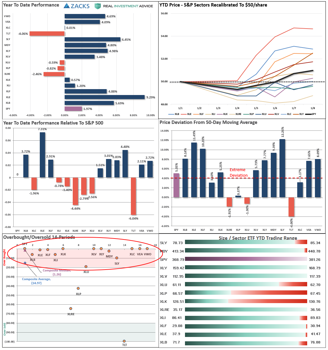
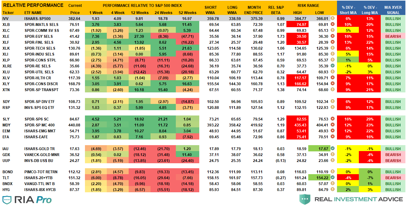
Sector Model Analysis & Risk Ranges
How To Read.
- The table compares each sector and market to the S&P 500 index on relative performance.
- The “MA XVER” is determined by whether the short-term weekly moving average crosses positively or negatively with the long-term weekly moving average.
- The risk range is a function of the month-end closing price and the “beta” of the sector or market.
- The table shows the price deviation above and below the weekly moving averages.
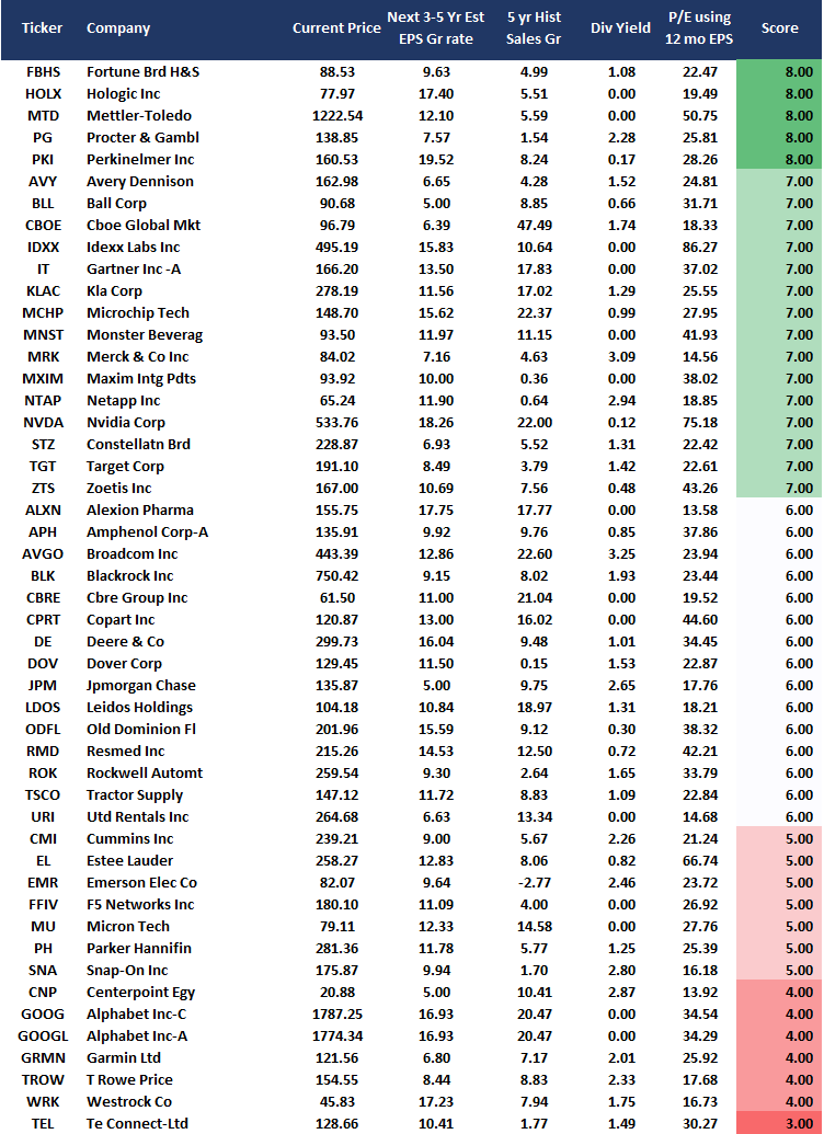
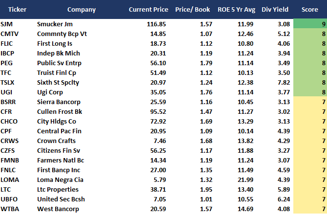
Weekly Stock Screens
Currently, there are 3-different stock screens for you to review. The first is S&P 500 based companies with a “Growth” focus, the second is a “Value” screen on the entire universe of stocks, and the last are stocks that are “Technically” strong and breaking above their respective 50-dma.
We have provided the yield of each security and a Piotroski Score ranking to help you find fundamentally strong companies on each screen. (For more on the Piotroski Score – read this report.)
S&P 500 Growth Screen
Low P/B, High-Value Score, High Dividend Screen
Aggressive Growth Strategy

Portfolio / Client Update
It’s a new trading year, and we are entering into it with a fully weighted portfolio with reduced hedges. Such makes us uncomfortable, but the “market exuberance” has gone “off the chart.”
While market momentum can last a lot longer than logic would predict, it doesn’t necessarily mean a smooth ride higher. For now, we are maintaining our exposures and will look for short-term corrections to rebalance risk and adjust our allocation models for the new administration and the economic outlook.
For now, the general bias is that no matter what, markets can only go higher. While that certainly does seem to be the case, the thesis is on a fairly unstable foundation. Rising interest rates and inflation on a debt-laden economy will likely not have the outcome most expect.
The significant risk to the markets currently, besides more extreme overvaluation, is the disappointment in both earnings and economic growth. Given the more extreme expectations now, the risk of that occurring is elevated.
I have traded through many markets over the last 30-years, and I have only seen this type of market exuberance once previously. Yes, it was in 1999.
Portfolio Changes
During the past week, we made minor changes to portfolios. We post all trades in real-time at RIAPRO.NET.
We are rebalancing the equity model. We reduced the following stocks below (tech, communication, and healthcare) and added 5% of RSP as a placeholder for now.
While this is a net reduction of equity exposure, it is only temporary as we look for short-term corrections to add to current holdings or add new holdings.
Currently, the equity model has 64% equity, and the sector model has 66%. Both figures include gold and gold miners.
In Both Models
- CLX – Selling 100% of the position
- GDX – Selling 100% of the position
- IAU – Selling 100% of the position
- SPY – Added 5% to current holdings.
In the Equity Model
- AMZN – Reduce to 1.5%
- AAPL – Reduce to 2%
- NFLX – Reduce to 2%
- ADBE – Reduce to 1.5%
- CRM – Reduce to 1.5%
- MSFT – Reduce to 2%
- JNJ – Reduce to 2%
- ABT – Reduce to 2%
- UNH – Reduce to 1%
- CMCSA – Reduce to 1%
- VZ – Reduce to 1.5%
As always, we are aware of the risks and are carrying tight stops on this position.
Our short-term concern remains the protection of your portfolio. We have now shifted our focus to 2021 and where markets go in the New Year.
Lance Roberts
CIO
THE REAL 401k PLAN MANAGER
A Conservative Strategy For Long-Term Investors
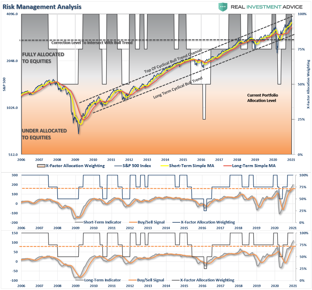
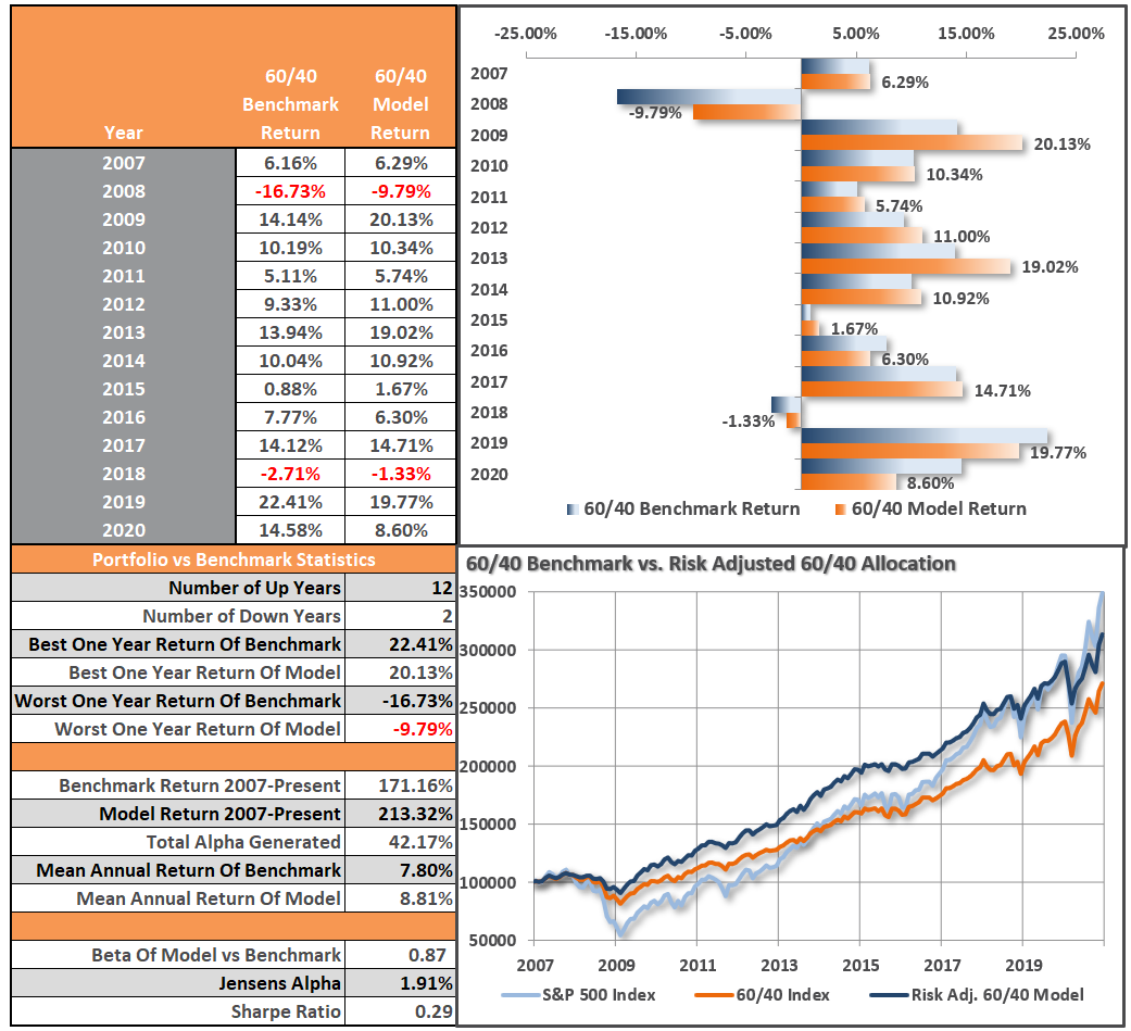
Model performance is a two-asset model of stocks and bonds relative to the weighting changes made each week in the newsletter. Such is strictly for informational and educational purposes only, and one should not rely on it for any reason. Past performance is not a guarantee of future results. Use at your own risk and peril.
401k Plan Manager Live Model
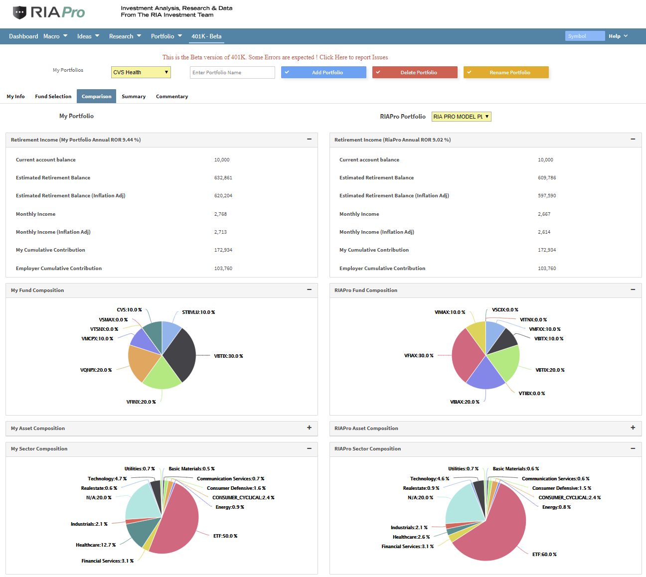
As anRIA PRO subscriber (You get your first 30-days free), you can access our live 401k plan manager.
Compare your current 401k allocation to our recommendation for your company-specific plan and our 401k model allocation.
You can also track performance, estimate future values based on your savings and expected returns, and dig down into your sector and market allocations.
If you would like to offer our service to your employees at a deeply discounted corporate rate, please contact me.


Lance Roberts is a Chief Portfolio Strategist/Economist for RIA Advisors. He is also the host of “The Lance Roberts Podcast” and Chief Editor of the “Real Investment Advice” website and author of “Real Investment Daily” blog and “Real Investment Report“. Follow Lance on Facebook, Twitter, Linked-In and YouTube
Customer Relationship Summary (Form CRS)
Also Read