Fed Chair Jerome Powell Suggests “Higher For Longer”


Inside This Week’s Bull Bear Report
- Fed Chair Jerome Powell Suggests “Higher For Longer”
- How We Are Trading It
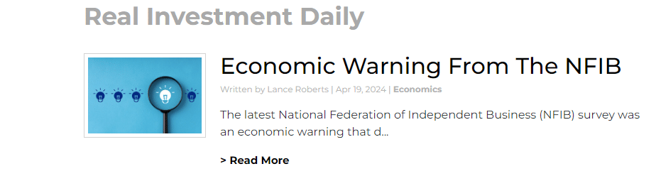
- Research Report –Economic Warning From The NFIB
- Youtube – Before The Bell
- Market Statistics
- Stock Screens
- Portfolio Trades This Week
Market Correction Continues
Last week, we discussed the market’s break of the bullish trend. To wit:
“The market did break below the previous low on Friday after failing to reclaim that previous support at the 20-DMA. The failure to reclaim that support turns the previous 20-DMA into resistance and makes the 50-DMA new critical support over the next few days. (Note: If the market makes a confirmed break of the 50-DMA, the 100- and 200-DMAs become the following logical targets.)”
Over the two months, we repeatedly warned that a correction process was likely. As noted in “Market Top or Bubble:”
“As noted, the market remains in a bullish trend. The 20-DMA, the bottom of the trend channel, will likely serve as an initial warning sign to reduce risk when it is violated. That level has repeatedly seen ‘buying programs’ kick in and suggests that breaking that support will cause the algos to start selling. Such a switch in market dynamics would likely lead to a 5-10% correction over a few months.“
While it took longer than expected, that correction process arrived last week and continued earnestly, with the market falling to the 100-DMA. With the market short-term oversold, a reflexive rally in the next week is likely, with the 50-DMA being notable resistance. Investors should use any market rally toward 5100 to rebalance risk and hedge portfolios.
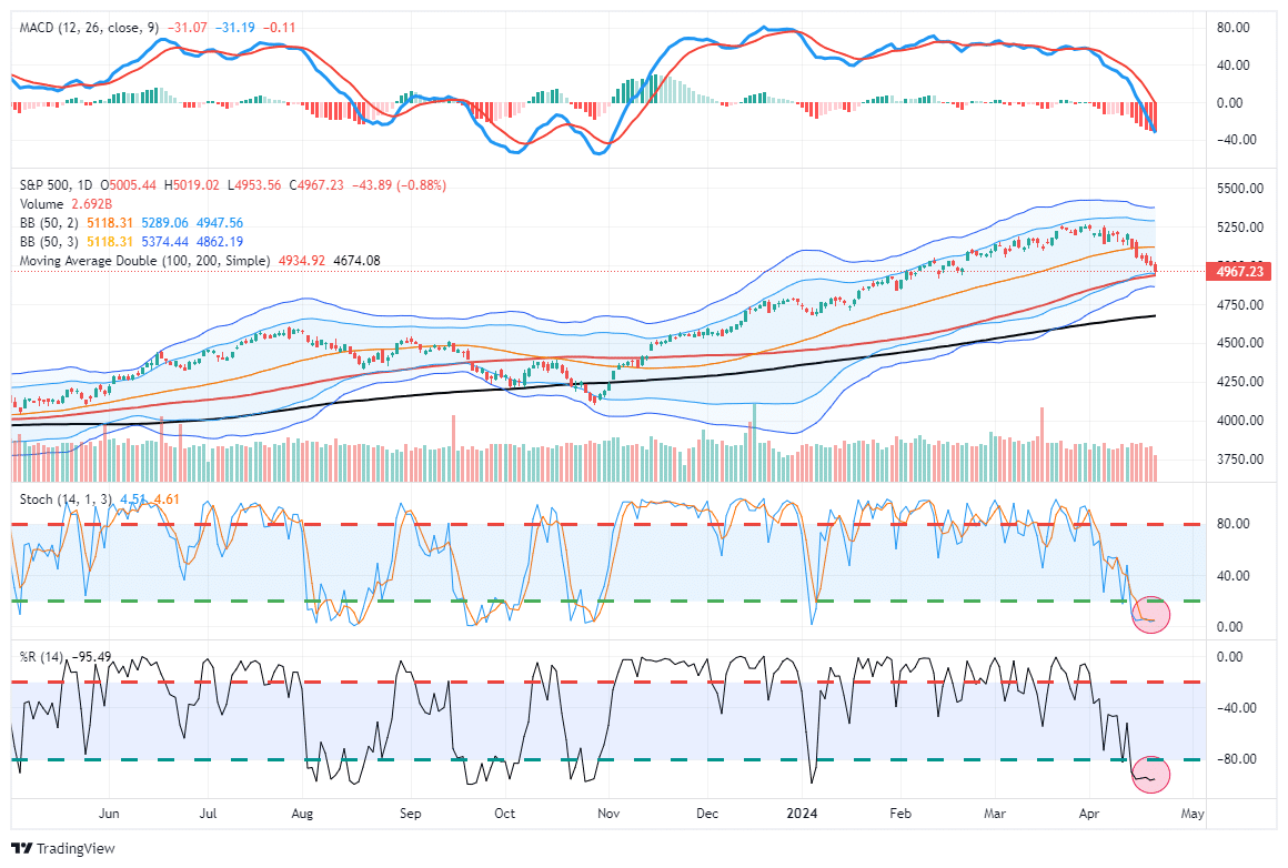
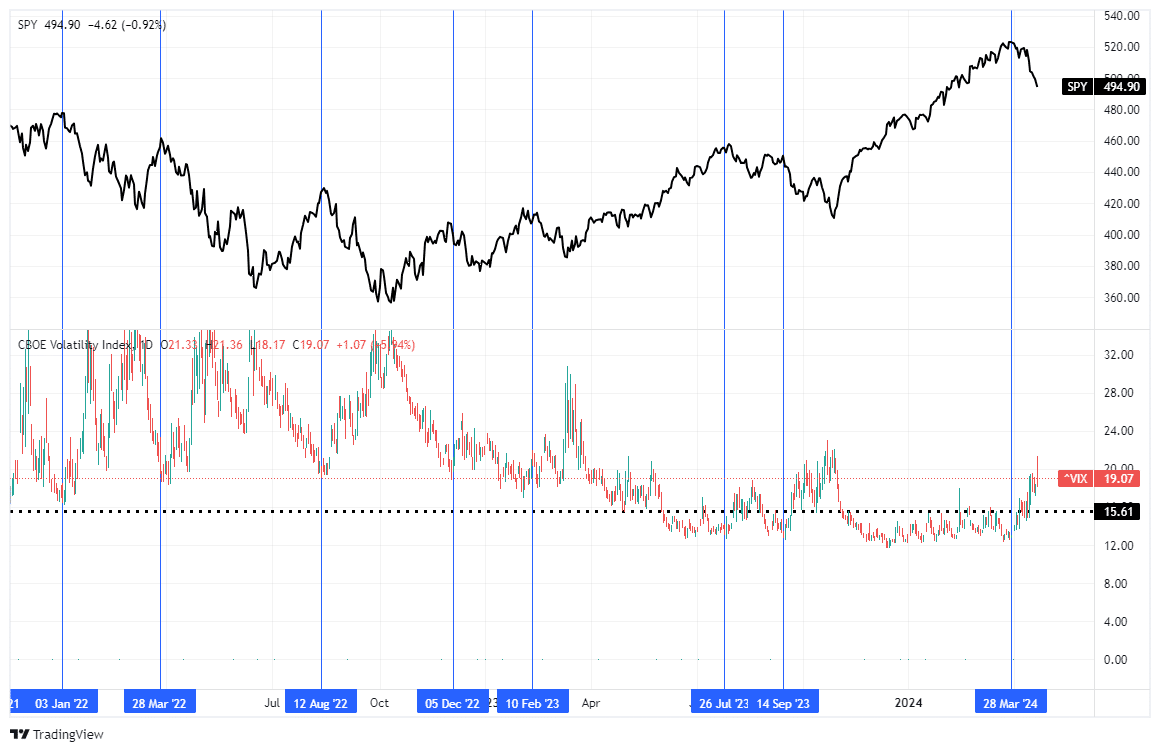
Notably, this has been a very orderly correction. While there has undoubtedly been selling in the markets, particularly in some of the previous “momentum” names, volatility has risen in a controlled manner. Such suggests that this correction process is just a normal correction within an ongoing bullish trend. You will note very similar actions during the decline last summer.
As noted last week:
“The confirmed break of support suggests reviewing portfolio allocations and taking profits in well-performing positions. However, while some stocks have only begun to correct from previously overbought conditions, many have already corrected by 10% or more over the last few weeks. Those companies may see inflows as a rotation trade in the market occurs.
In other words, as is always the case, be careful “throwing the baby out with the bathwater.” Opportunities to acquire better-priced companies always exist, even during a corrective process.”
Let’s tackle the other big “elephant in the room:” sticky inflation, the Fed, and interest rates.
Need Help With Your Investing Strategy?
Are you looking for complete financial, insurance, and estate planning? Need a risk-managed portfolio management strategy to grow and protect your savings? Whatever your needs are, we are here to help.

Fed Chair Jerome Powell Suggests “Higher For Longer”
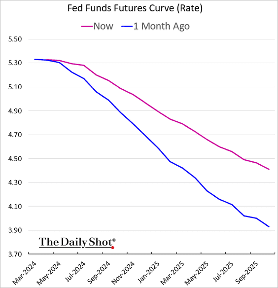
Since the bullish rally started in November, the premise for the rush into equities was that the Fed would cut rates seven (7) times in 2024. However, those expectations have dwindled to just a little more than one rate cut this year. As shown, the markets are only expecting 0.40% in rate cuts.
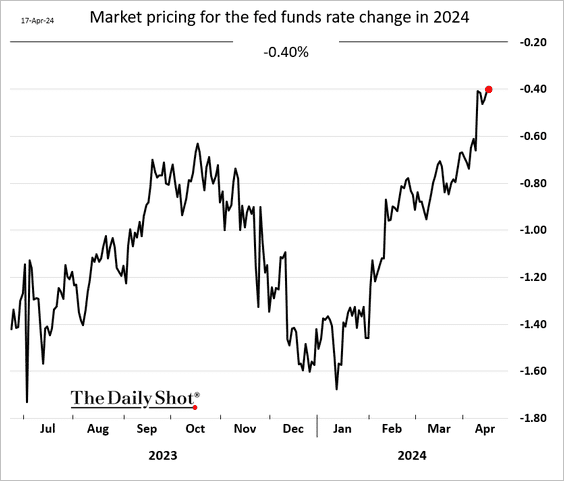
There has been a very rapid repricing of expectations in just the last month.
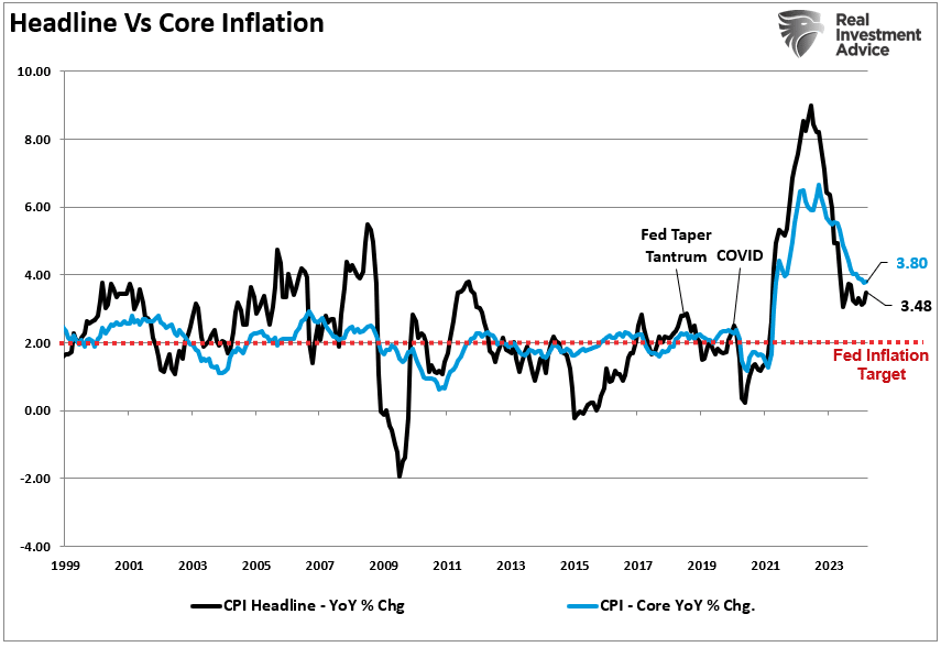
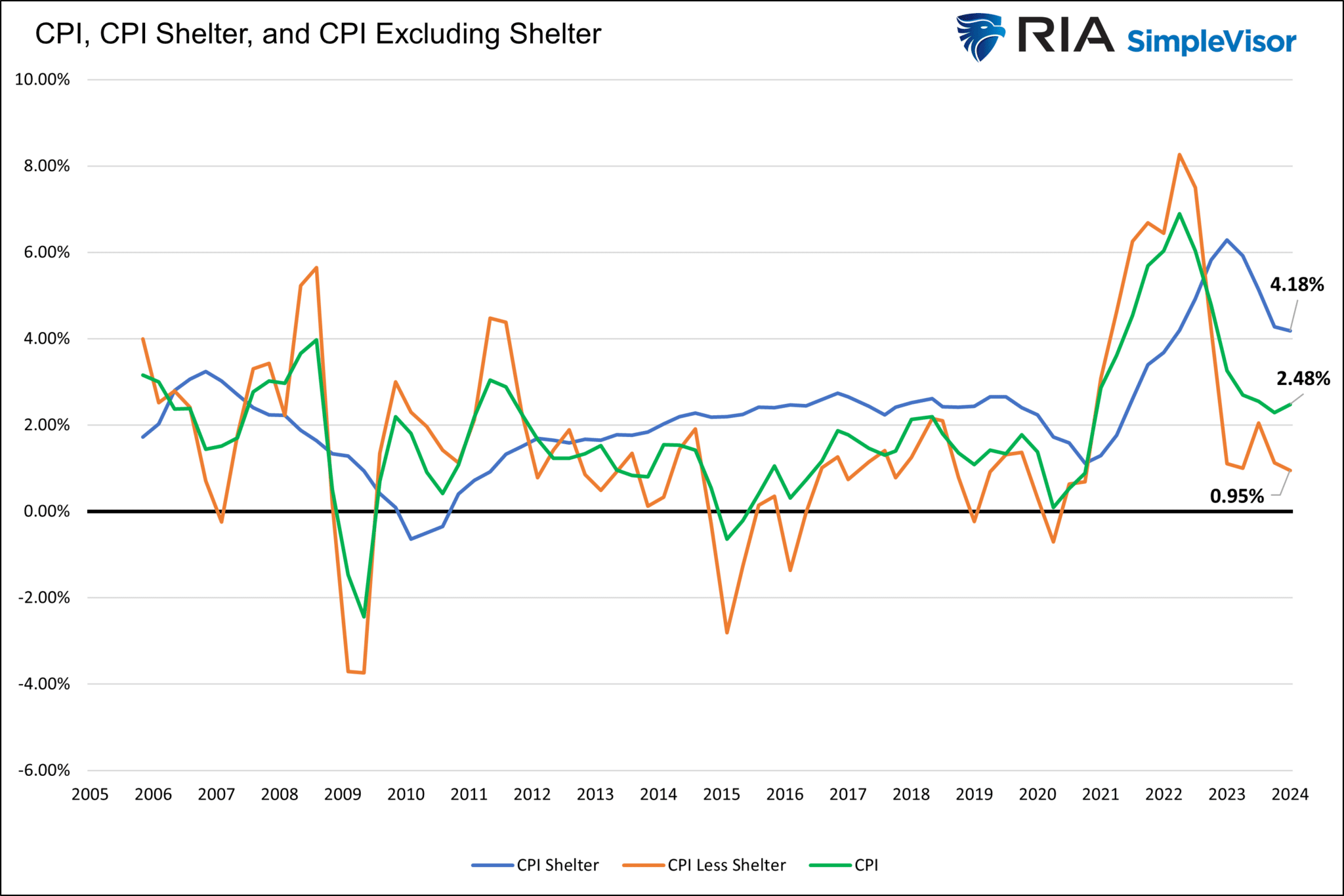
Of course, much of this repricing has come from the recent increase in inflation since the beginning of the year. As shown, inflation, as measured by the Consumer Price Index (CPI), increased to 3.5%, while the core inflation rate held steady at 3.8%. Both measures remain solidly above Fed Chair Jerome Powell’s inflation target.
Just this past week, Fed Chair Jerome Powell, during a press conference, noted that inflation was remaining “stickier” than expected. To wit:
“More recent data shows solid growth and continued strength in the labor market, but also a lack of further progress so far this year on returning to our 2% inflation goal. The recent data have clearly not given us greater confidence, and instead indicate that it’s likely to take longer than expected to achieve that confidence. That said, we think policy is well positioned to handle the risks that we face.” – Fed Chair Jerome Powell
While the bond market immediately revolted to the commentary, sending interest rates higher, Fed Chair Jerome Powell made two key points worth noting.
First, he acknowledged that the recent data has remained more robust than expected and will take longer to achieve lower inflation rates. Second, he noted that the current “policy is well positioned,” suggesting no inclination to hike rates further.
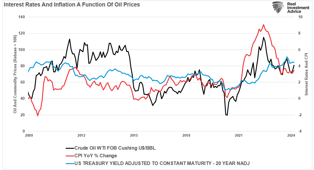
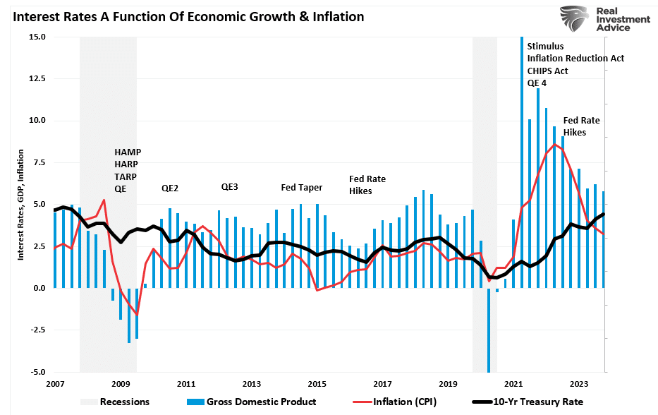
We agree with both of these points, as the recent uptick in interest rates and inflation is a function of a short-term surge in commodity prices – primarily energy prices, as shown.
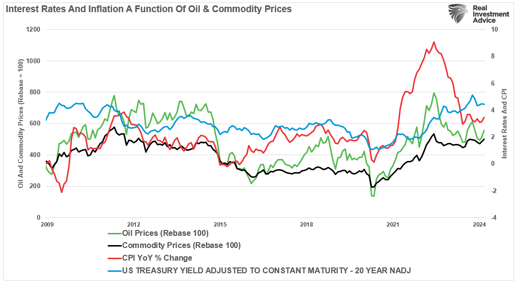
In other words, commodity prices, inflation, and interest rates will follow when oil prices begin their subsequent cyclical decline. Given that oil prices affect prices from manufacturing to delivery to consumption, it is unsurprising that a high correlation between rates and inflation exists.
However, as Fed Chair Jerome Powell notes, the longer current monetary policy rates, combined with increased consumption and borrowing costs, exist, the greater the drag on economic growth will be.
Rates And Economic Growth
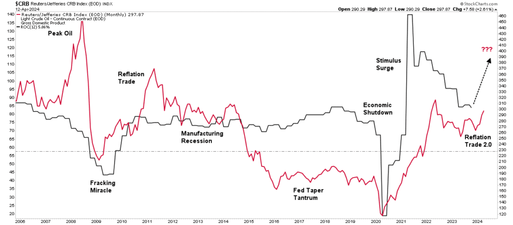
Last week, we discussed the bullish reasoning behind the ramp-up in commodities – “The Reflation Trade.”
“Interest rates, gold, and commodity prices have increased in the past few months. Unsurprisingly, the bullish narrative to support that rise has gained traction. Interestingly, this “reflation” narrative tends to resurface by Wall Street whenever there is a need to explain the surge in commodity prices. Notably, the last time Wall Street focused on the reflation trade was in 2009, as noted by the WSJ:
The most talked-about investing strategy these days isn’t stuffing money in a mattress, it’s the reflation trade — the bet that the world economy will rebound, driving up interest rates and commodities prices.
While that ‘reflation trade’ lasted for about two years, it quickly failed as economic growth returned to 2%-ish growth along with inflation and interest rates. As shown, oil and commodity prices have a very high correlation. The critical reason is that higher oil prices reduce economic demand. As consumption falls, so does the demand for commodities in general. Therefore, if commodity prices are to ‘reflate,’ as shown, such will depend on more robust economic activity.”
Therefore, if interest rates are to sustain higher levels, economic growth must accelerate to accommodate them. However, as we noted in the reflation article, that is unlikely to be the case.
“Following the “Financial Crisis” and recession, the Government and the Federal Reserve engaged in various monetary and fiscal supports to repair the economy. While the economy initially recovered from the recessionary lows, inflation, economic growth, and interest rates remained subdued despite ongoing interventions.
That is because debt and artificially low interest rates lead to malinvestment, which acts as a wealth transfer mechanism from the middle class to the wealthy. However, that activity erodes economic activity, leading to suppressed inflation and a surging wealth gap.“
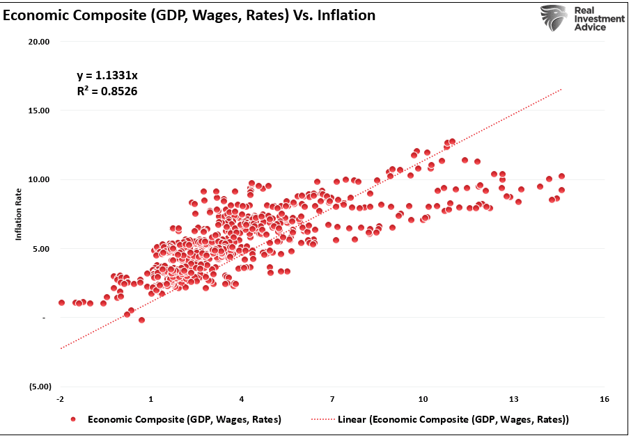
However, that correlation between economic growth, wages, inflation, and rates, which should be unsurprising given the inherent relationship, has a very long history.
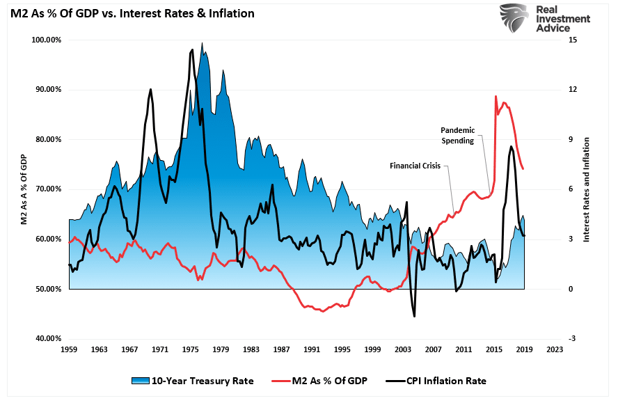
Furthermore, as the excess monetary infusions continue to evaporate, the systemic drivers for higher inflation and, ultimately, rates will reverse. Interest rates have about a six-month lag to changes in M2 and inflation.
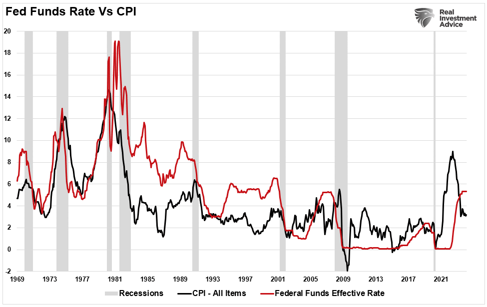
Such likely aligns with Fed Chair Jerome Powell’s view that current policy rates are tight enough and are now just a function of time. As shown, increases in the Fed Funds rate correlate highly with increases in inflation. Conversely, when the Fed cuts rates, it is usually because of slower economic growth and disinflationary pressures. Such is unlikely to be different this time.
One Big Driver
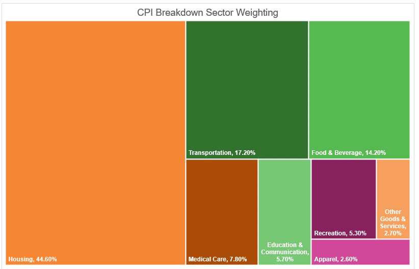
When discussing inflation, it is crucial to remember the makeup of the inflation data as it relates to Fed Chair Jerome Powell’s views on monetary policy. While rising oil and food prices certainly are “front and center” for most Americans, as shown, what ultimately drives the inflation calculation is shelter.
As noted by Michael Lebowitz on Friday:
“We have often written about how the surge in shelter costs within the CPI inflation calculation grossly distorts CPI. The problem is not necessarily whether shelter costs, primarily rent and imputed rent, should be over a third of CPI. Instead, we bemoan the lagging nature of the BLS’ CPI shelter data. The price of bread, cell phones, and every other good and service in CPI is based on current prices. Rents, however, are based on surveys. Given that only about 1/12ths of rents are reset in any given month, 11/12ths of the data is old. Unlike other goods and services, the BLS effectively uses rent and imputed rental prices, which is about six months stale on average.
“With this lag in mind, we focus on the Cleveland Fed’s All Tenants Regressed Rent Index (ATRR) and its New Tenant Rent Index (NTR) along with the BLS’ CPI, CPI-Shelter, and CPI-less Shelter. Our analysis of this data exposes the lag and, more importantly, forecasts how current rental prices will impact CPI later this year. For starters, we share the graph below. CPI Shelter costs are well above CPI, and CPI excluding Shelter Costs are below CPI. After the Market Update below, we continue this discussion.”
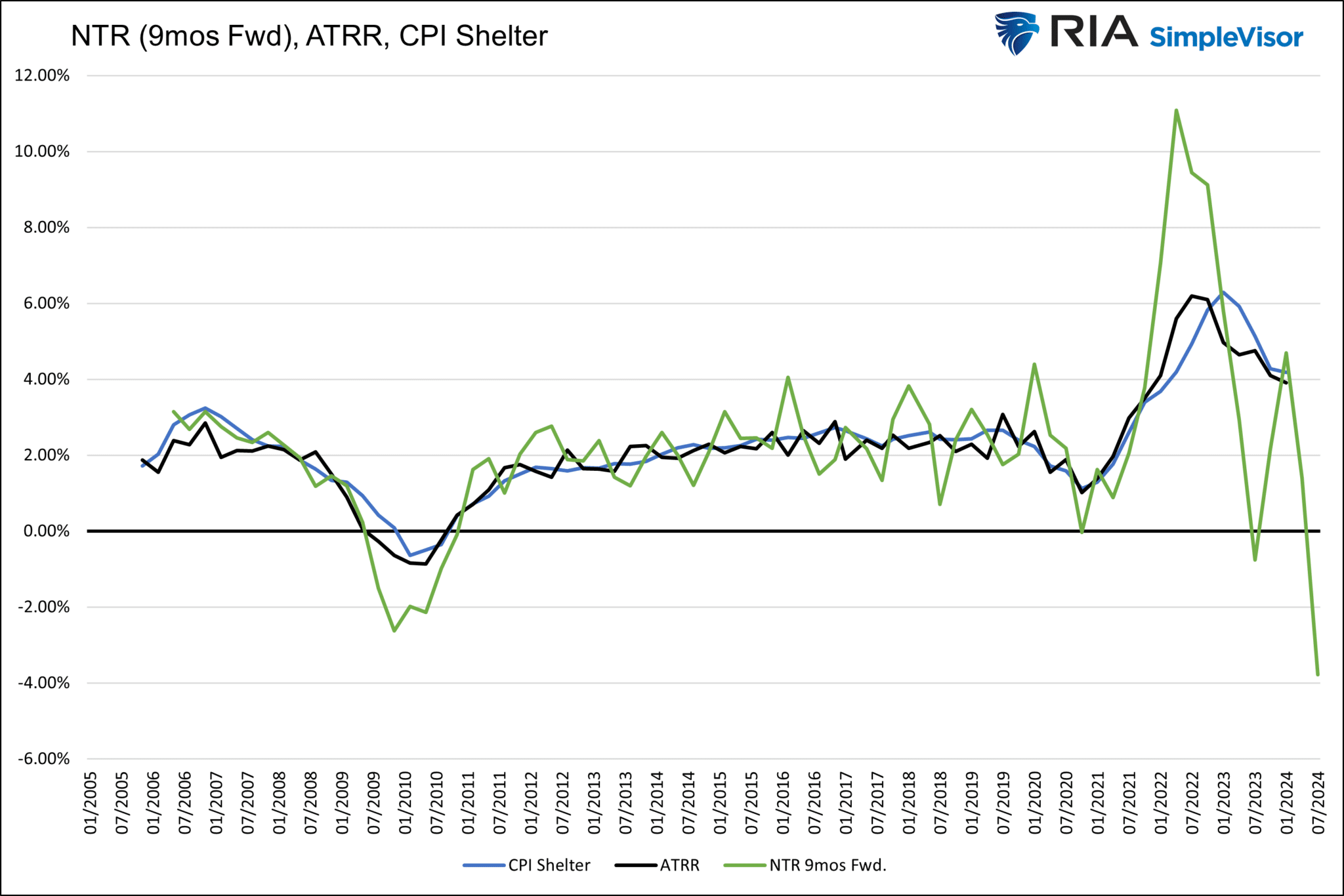
“The graph below charts the Cleveland Fed’s Average Tenant Rentals (ATRR) and their New Tenant Rentals (NTR) alongside BLS CPI-Shelter. We pushed the NTR data forward nine months to better show how well it leads the ATRR and CPI Shelter prices. There are a few essential takeaways from the graph. First, the ATRR and CPI-Shelter are nearly identical. Second, NTR is more volatile than the other two rent indicators because it’s not an average. Third, and most importantly, NTR tends to lead CPI Shelter and ATRR by nine months.”
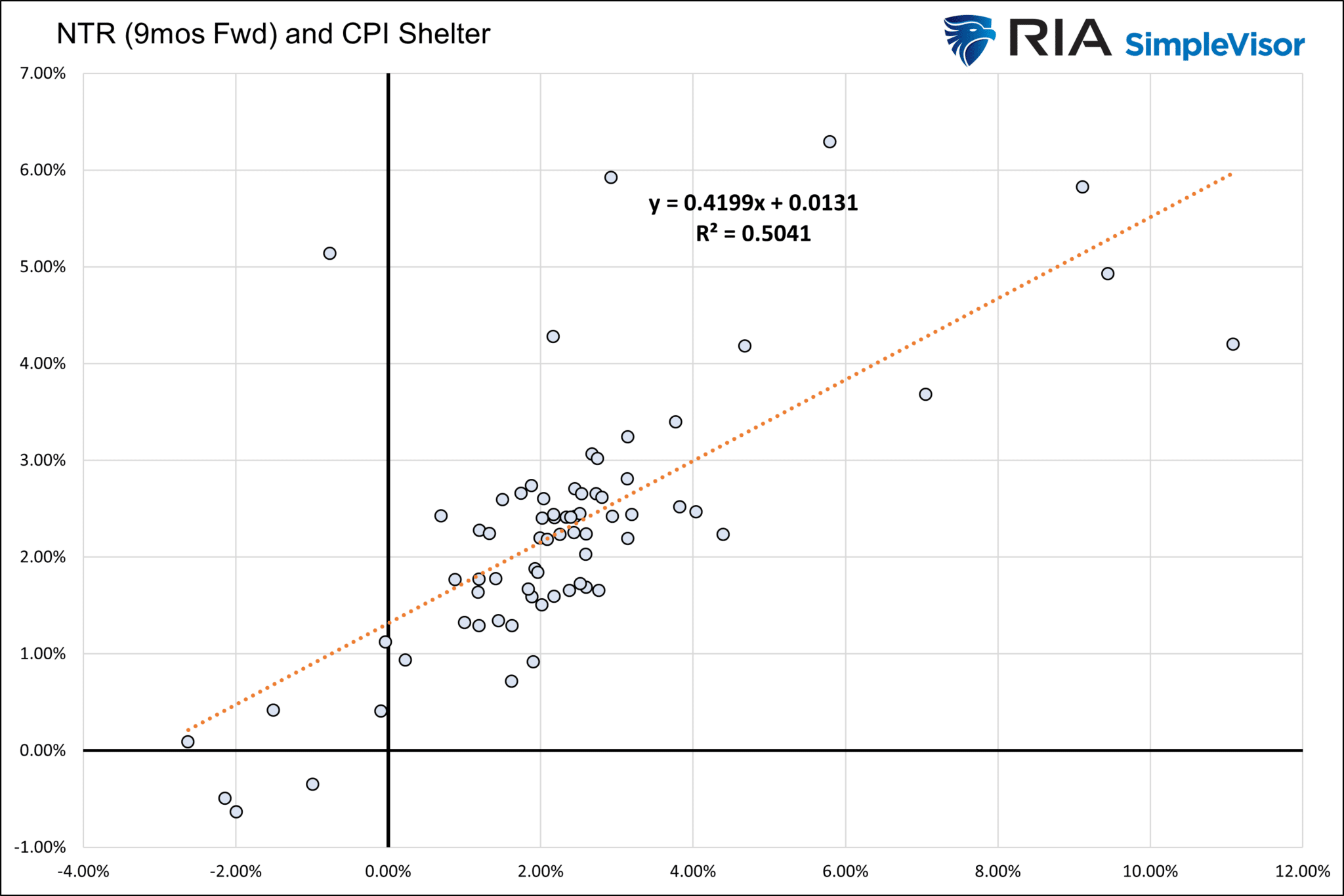
“The scatter plot below highlights the strong correlation between NTR nine months in advance and CPI Shelter. The outliers are a function of the volatility of the NTR data. If we presume the relationship holds and, to be conservative, ATR is closer to zero than negative, we should expect inflation to be nearing 2% by year-end.“
Michael shows that while the “surging inflation” narrative has grabbed headlines, the Fed’s comments explain why it is not discussing hiking rates. As Fed Chair Jerome Powell noted, it will take time for inflation to reflect the impact of declining shelter costs.
While rising commodity costs may soon exert pressure, the “elephant” in the CPI calculation will outweigh its small contribution. The risk to the Fed is a slowdown in economic activity that threatens a deflationary environment.
However, we will likely discuss and debate this topic until the end of the year.
How We Are Trading It
While we wait for Fed Chair Jerome Powell to cut rates eventually, the market is going through the expected correction. This past week, we made minor portfolio adjustments and will likely continue that action on market rallies back to resistance.
Notably, this is just a normal and healthy correction process and will unlikely devolve into something more egregious. Therefore, making minor portfolio adjustments and looking for oversold opportunities to add exposures as needed is critical. We are confident that a much larger correction will eventually occur, but given the still underlying solid bullish sentiment, it is likely not now. Things can certainly change; if they do, we will evolve accordingly.
As noted last week, continue with the primary risk management rules, and we will update you accordingly.
- Tighten up stop-loss levels to current support levels for each position.
- Hedge portfolios against major market declines.
- Take profits in positions that have been big winners
- Sell laggards and losers
- Raise cash and rebalance portfolios to target weightings.
Notice, nothing in there says “sell everything and go to cash.”
Investing is like a football: it’s a game of inches. For investors, winning the long game is a function of consistently moving the ball down the field.
Have a great week.
Research Report
Subscribe To “Before The Bell” For Daily Trading Updates
We have set up a separate channel JUST for our short daily market updates. Please subscribe to THIS CHANNEL to receive daily notifications before the market opens.
Click Here And Then Click The SUBSCRIBE Button
Subscribe To Our YouTube Channel To Get Notified Of All Our Videos
Bull Bear Report Market Statistics & Screens

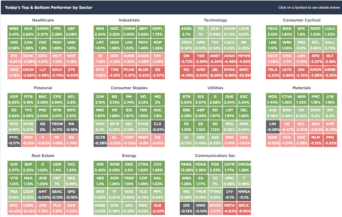
SimpleVisor Top & Bottom Performers By Sector
S&P 500 Weekly Tear Sheet
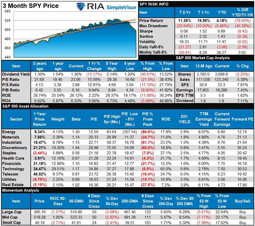
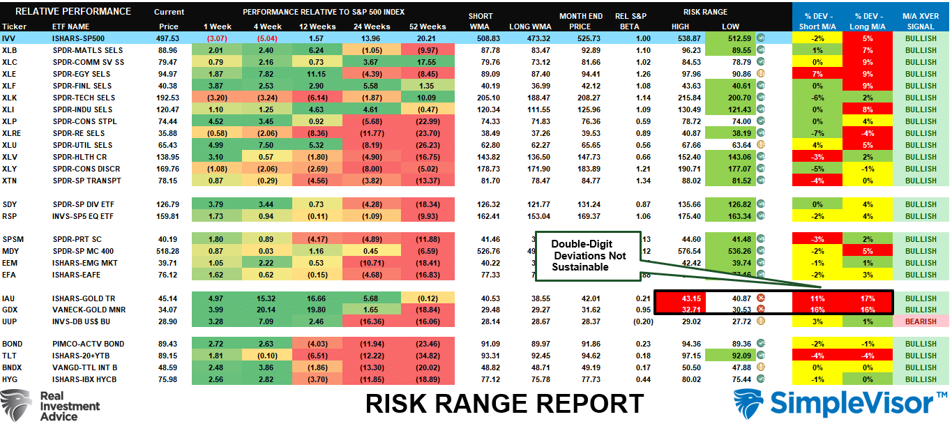
Relative Performance Analysis
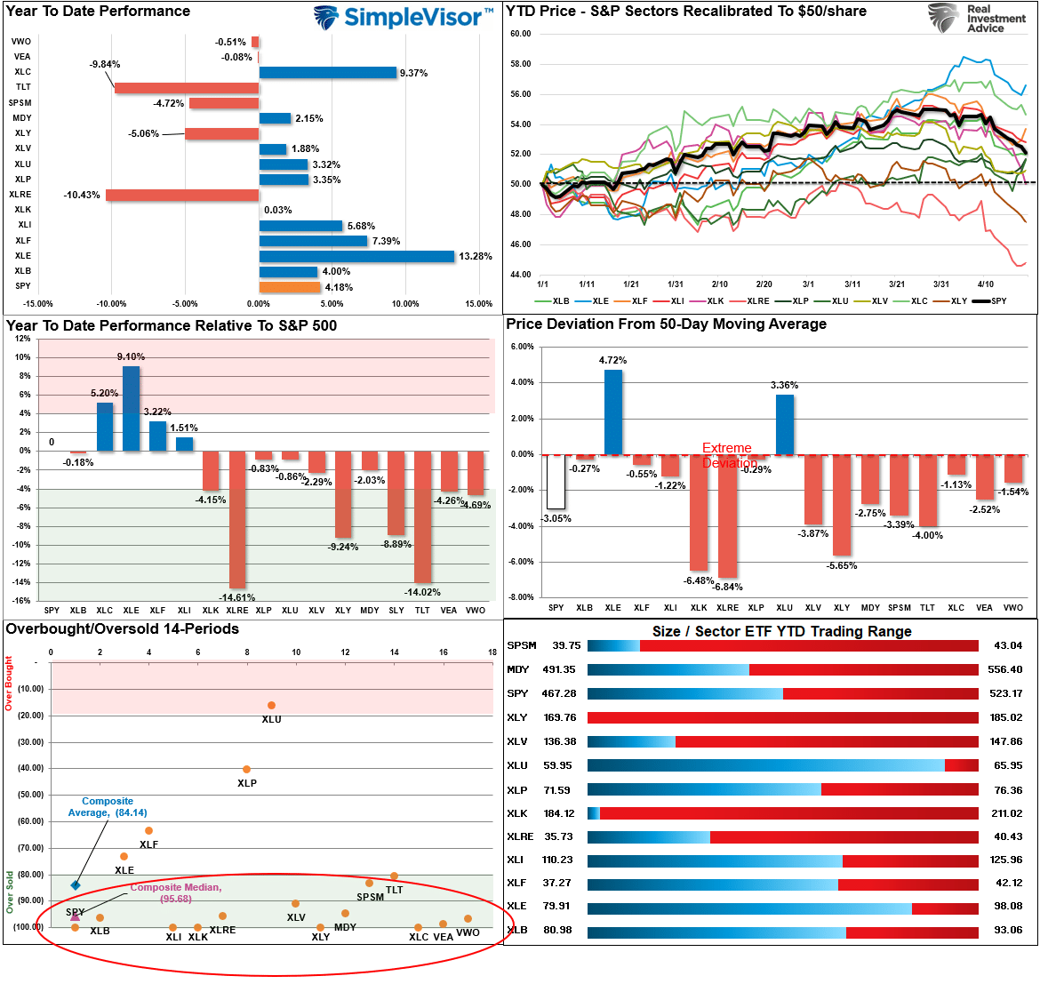
On Friday, despite the slide in Semiconductors and Technology, there was some decent strength in Financials, Utilities, Energy, and Real Estate. As shown below, most markets and sectors are now oversold, which suggests we could see a bit of buying next week with the market sitting on the 100-DMA. Use rallies to 50-DMA to reduce risk, as the current correction process is incomplete.
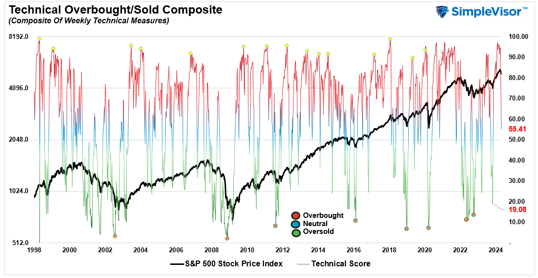
Technical Composite
The technical overbought/sold gauge comprises several price indicators (R.S.I., Williams %R, etc.), measured using “weekly” closing price data. Readings above “80” are considered overbought, and below “20” are oversold. The market peaks when those readings are 80 or above, suggesting prudent profit-taking and risk management. The best buying opportunities exist when those readings are 20 or below.
The current reading is 55.41 out of a possible 100.
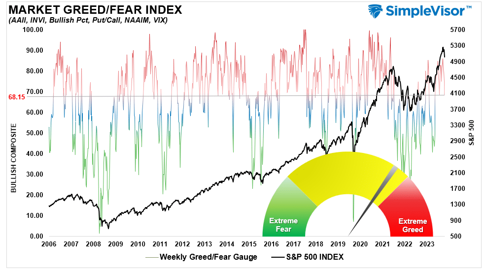
Portfolio Positioning “Fear / Greed” Gauge
The “Fear/Greed” gauge is how individual and professional investors are “positioning” themselves in the market based on their equity exposure. From a contrarian position, the higher the allocation to equities, the more likely the market is closer to a correction than not. The gauge uses weekly closing data.
NOTE: The Fear/Greed Index measures risk from 0 to 100. It is a rarity that it reaches levels above 90. The current reading is 68.15 out of a possible 100.
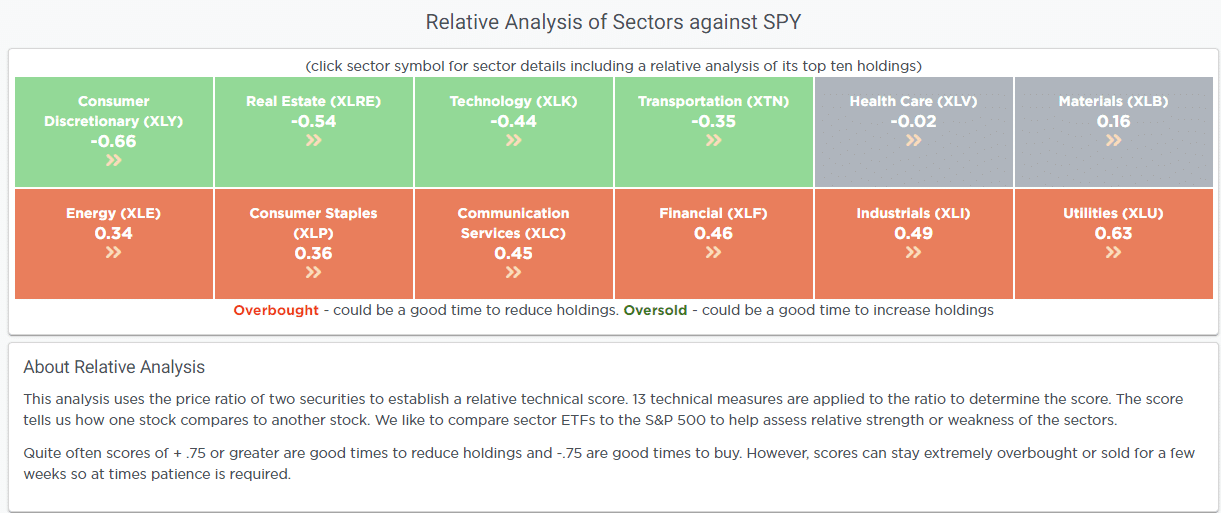
Relative Sector Analysis
Most Oversold Sector Analysis
Sector Model Analysis & Risk Ranges
How To Read This Table
- The table compares the relative performance of each sector and market to the S&P 500 index.
- “MA XVER” (Moving Average Crossover) is determined by the short-term weekly moving average crossing positively or negatively with the long-term weekly moving average.
- The risk range is a function of the month-end closing price and the “beta” of the sector or market. (Ranges reset on the 1st of each month)
- The table shows the price deviation above and below the weekly moving averages.
The correction process we warned about over the last two months is progressing. While that correction is not yet likely complete, a majority of markets and sectors have reached levels that suggest a bounce. However, use that bounce to rebalance risks, as the overall correction is likely incomplete. There are many “trapped longs” looking for an exit. Gold and Gold Miners are significantly extended above normal ranges. Don’t forget to take profits. As we noted before going into the current correction, double-digit deviations from longer-term means are unsustainable.
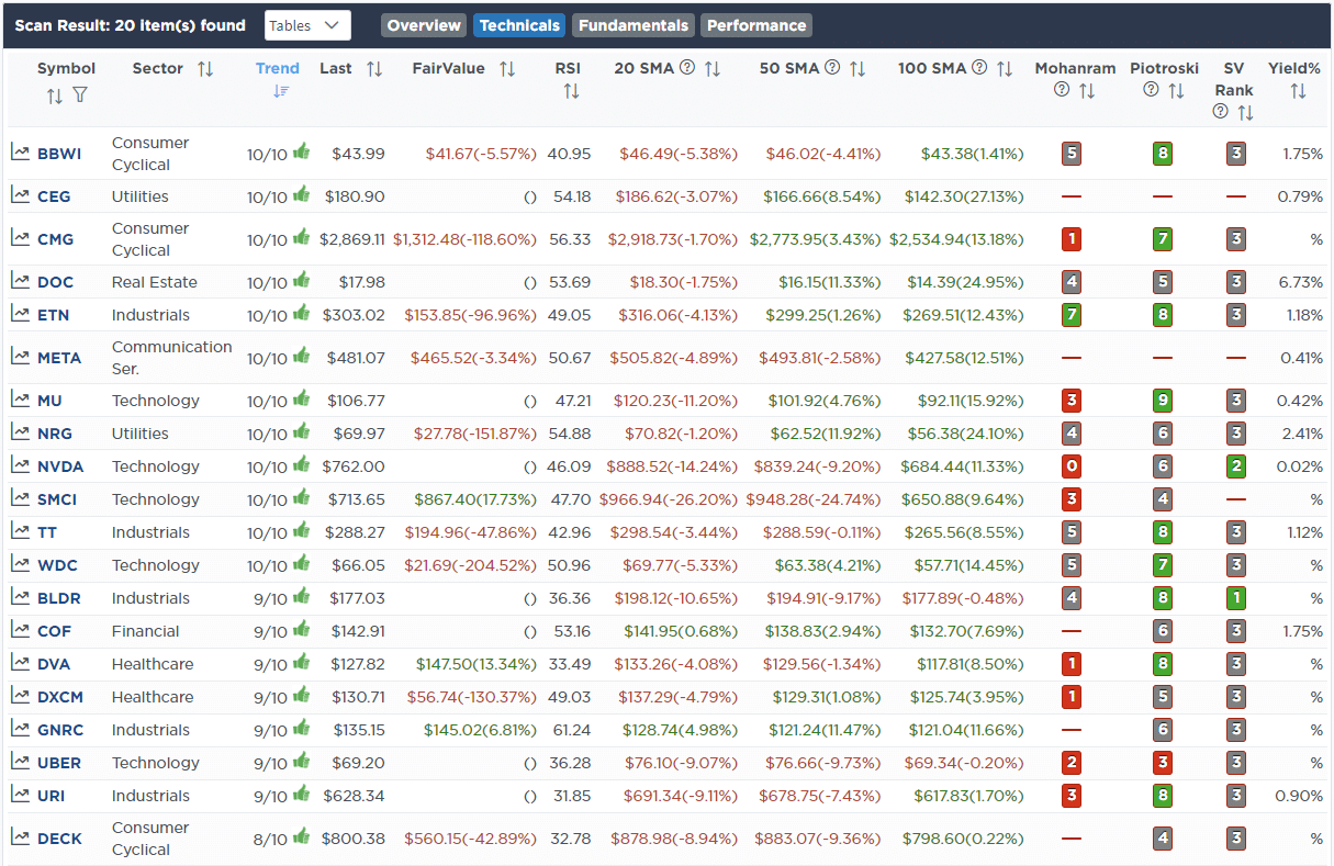
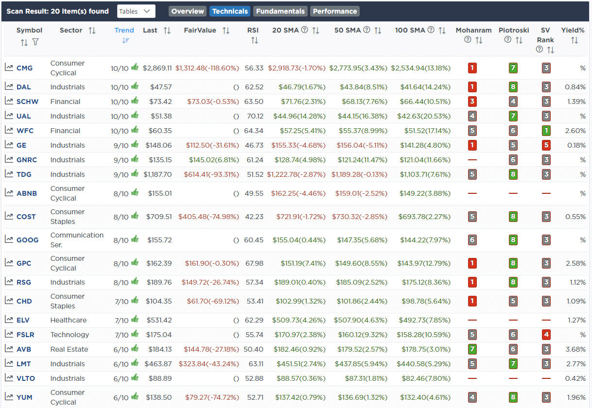
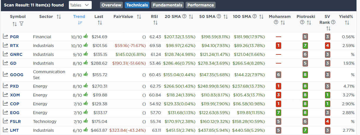
Weekly SimpleVisor Stock Screens
We provide three stock screens each week from SimpleVisor.
This week, we are searching for the Top 20:
- Relative Strength Stocks
- Momentum Stocks
- Fundamental & Technical Strength W/ Dividends
(Click Images To Enlarge)
R.S.I. Screen
Momentum Screen
Fundamental & Technical Strength
SimpleVisor Portfolio Changes
We post all of our portfolio changes as they occur at SimpleVisor:
April 16th
“This morning, United Healthcare (UNH) reported results that beat expectations and pushed the stock price higher. However, while earnings were good, the ongoing issues with Medicare have plagued the company for the last few quarters, and those issues are not abating. Therefore, we will use the rally to leave the stock for now and somewhat reduce our exposure to healthcare.
With that said, we are using the recent selloff to add to a couple of smaller holdings. We are adding to Ely Lilly (LLY), benefitting from the surging demand for weight loss drugs, and to Palo Alto Networks (PANW) for ever-increasing cybersecurity needs, particularly with the rise of Artificial intelligence.”
Equity Model
- Sell 100% of United Healthcare (UNH)
- Increase Ely Lilly (ELY) to 2.5% of the portfolio.
- Add to Palo Alto Networks (PANW), increasing it to a 1.5% weighting.
April 19th
“This morning, we added 1% of Genuine Auto Parts (GPC) to the equity model. This purchase will bring our discretionary exposure in line with the sector model. If personal consumption continues to weaken, GPC should benefit as consumers keep their cars for longer periods, thus require more repairs. On a technical basis, the stock has already corrected decently this year and is turning higher. It is a value stock with a Forward P/E of 15 and P/S of .93, and pays a 2.5% dividend.
We also sold the shares of SOLV received in the spinoff from our 3M (MMM) holdings in the dividend equity model. This was a dividend, so we moved it to cash and will reallocate those funds elsewhere in the model.”
Equity Model
- Initiate a 1% portfolio position in Genuine Auto Parts (GPC)
Dividend Equity Model
- Sell 100% of the shares of SOLV.

Lance Roberts, C.I.O.
Have a great week!